The carefully thought out transformation of a derelict barn has resulted in a unique and sophisticated new home for a couple who were keen to preserve its agricultural history and heritage
Driving past a derelict barn every day and dreaming about transforming it into a home to live in is one thing – and maybe something that many of us imagine doing, actually managing to live out that dream and turn it into a stunning reality is quite another, requiring the opposite of dreaming. It takes a daunting combination of tenacity, grit and a practical ability to translate design intentions into tangible existence. In other words, it’s a hard thing to do.
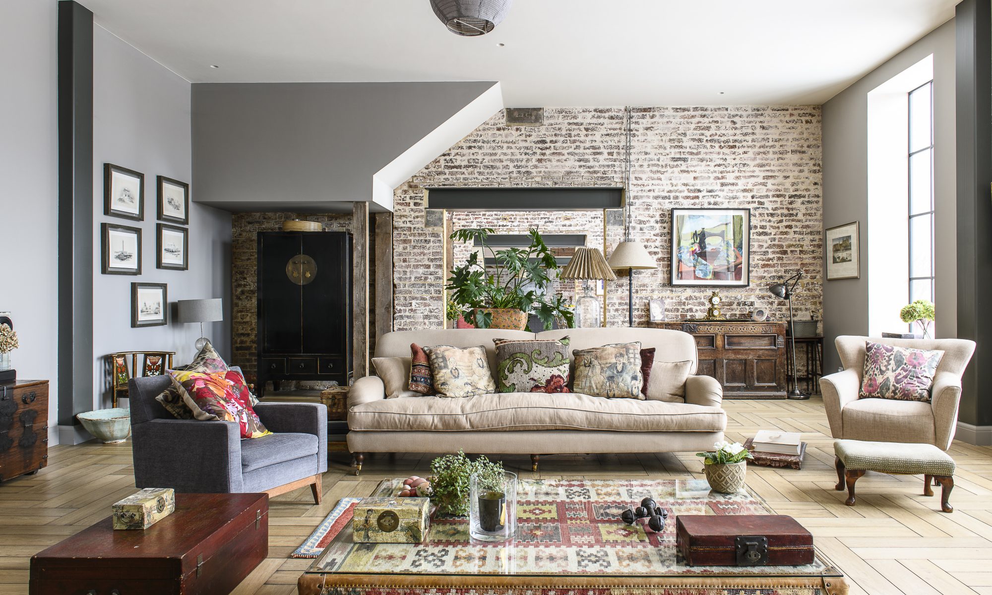
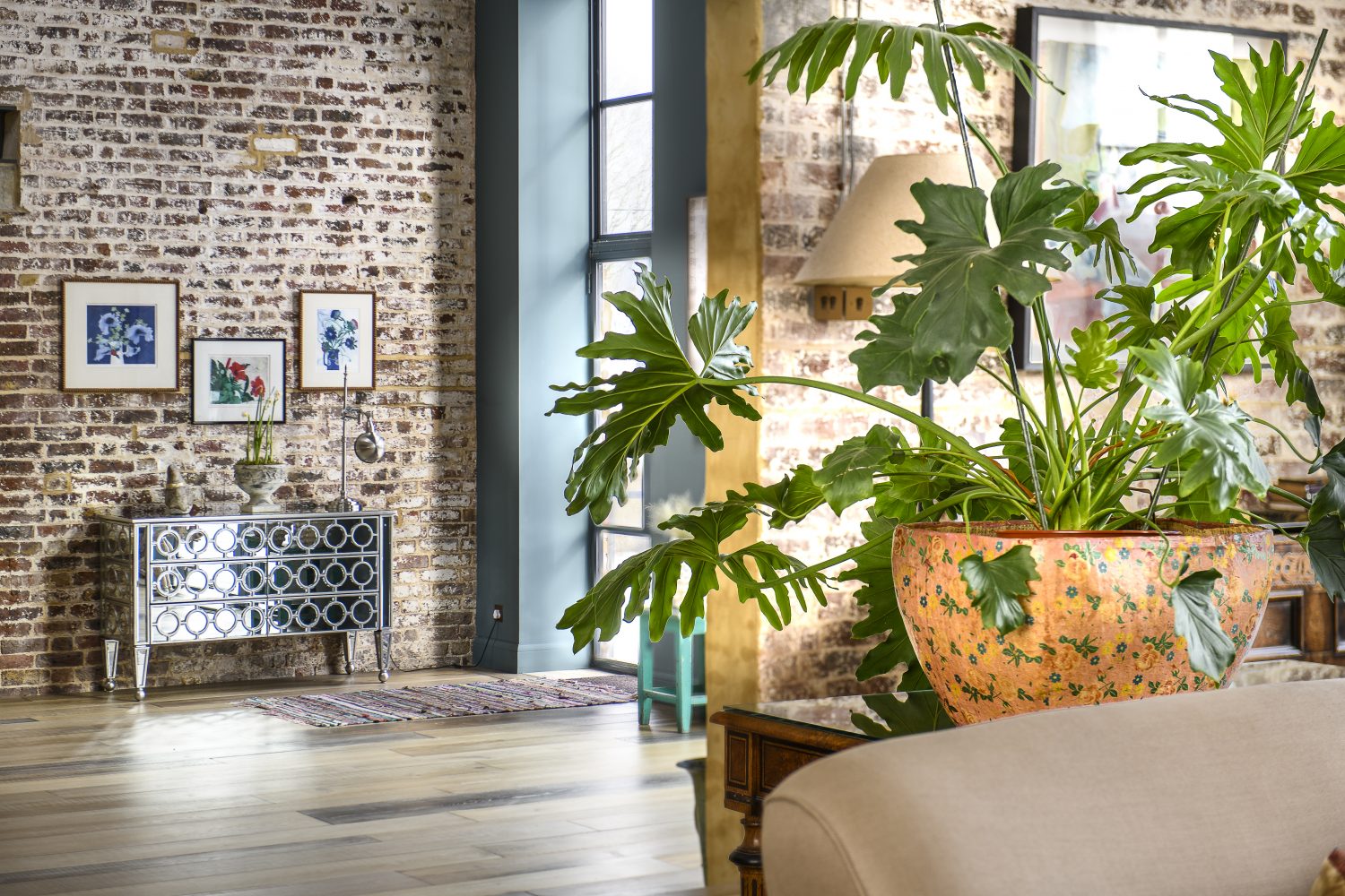
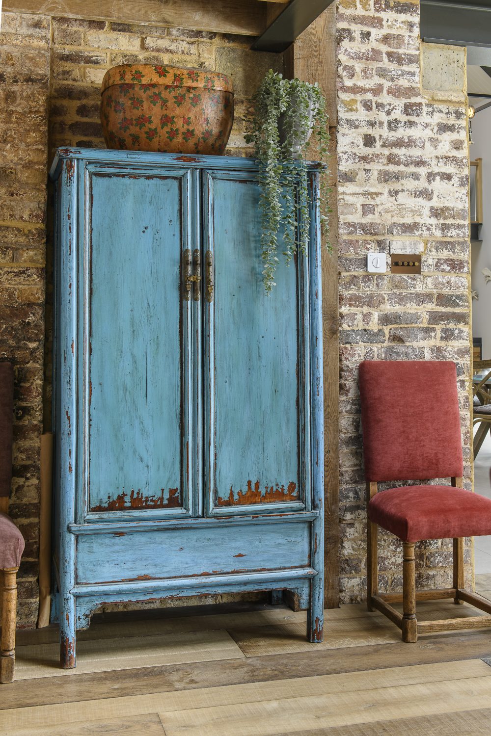
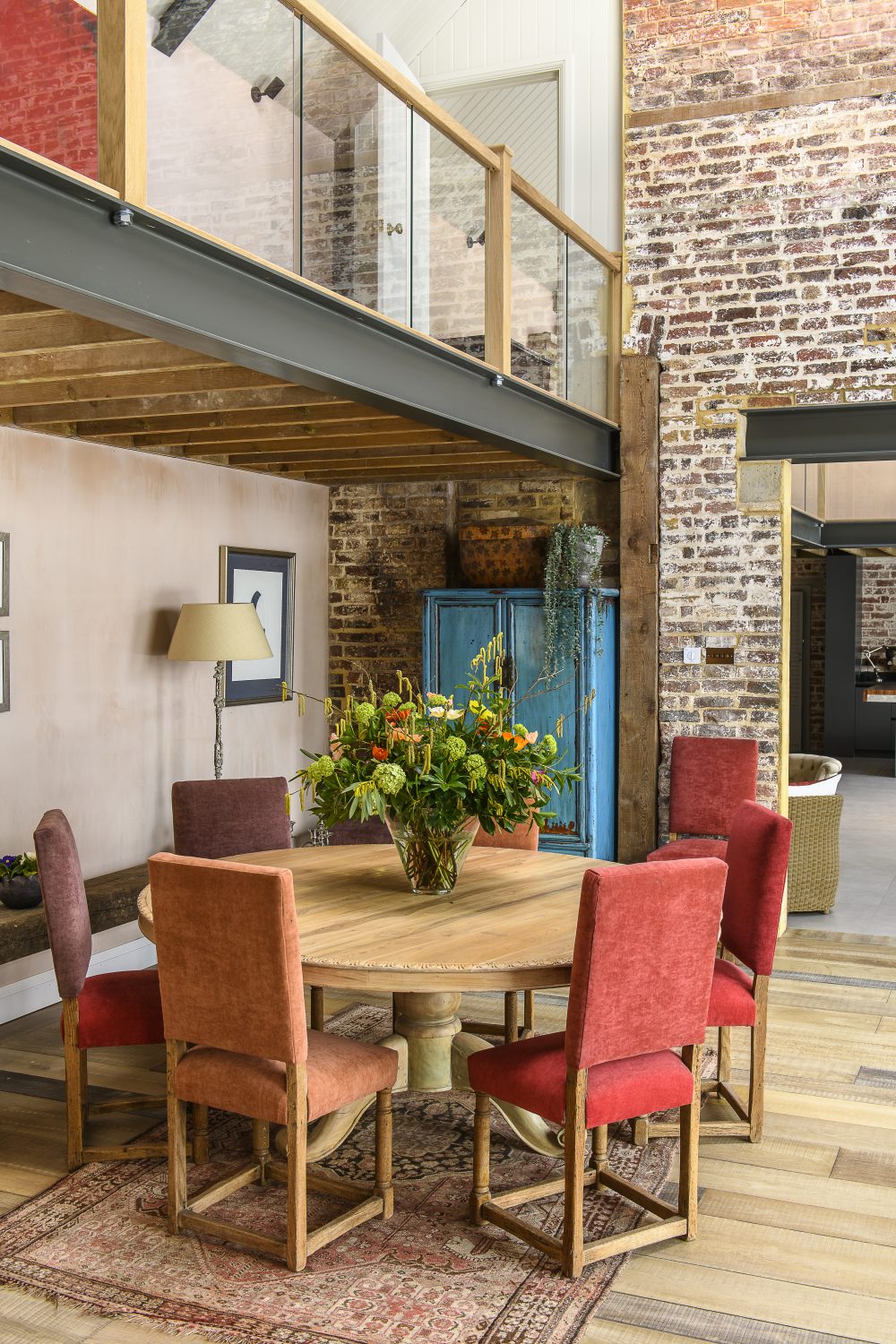
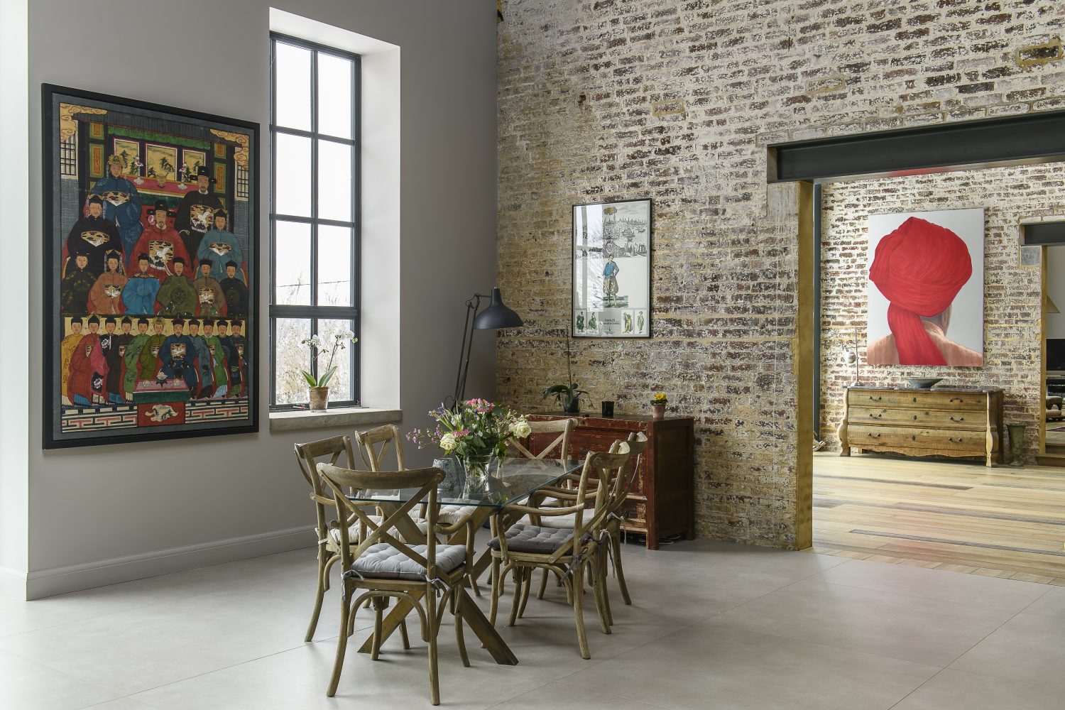
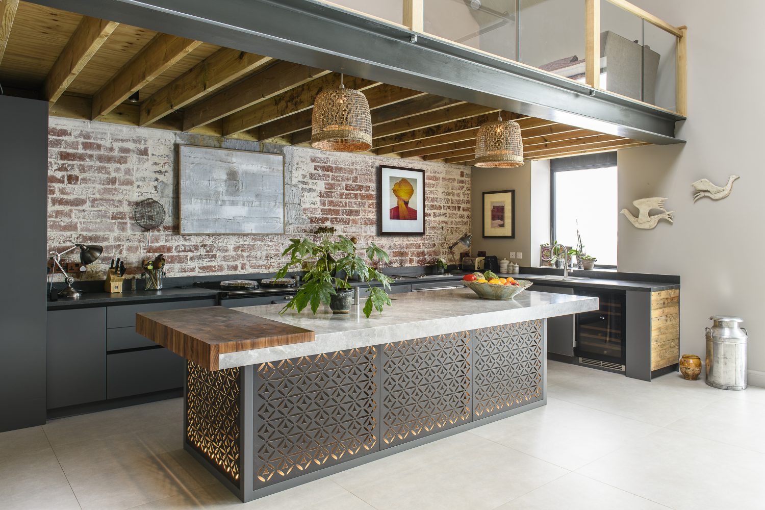
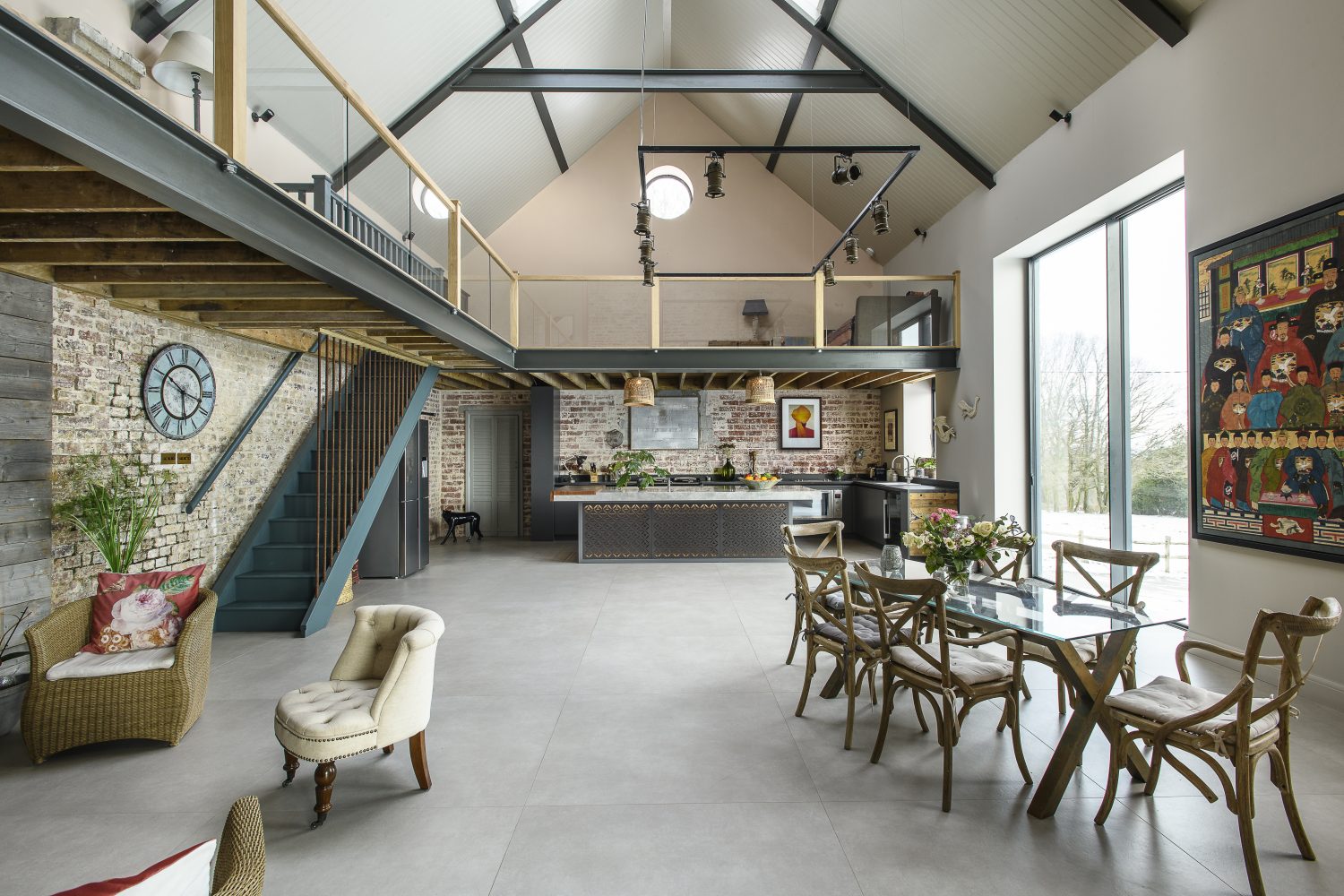
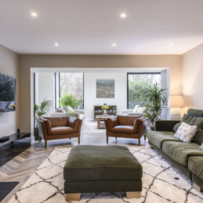
From the outside it’s not difficult to discern this glamorously industrial building’s original existence as a storage barn. Now it appears at once agricultural and sophisticated – a huge rhomboid with enormous windows and massive glass doors – the epitome of agri-chic. Once inside, having first marvelled at the height of the ceiling and the feeling of light and space, your eye is drawn to a fabulous painting by Lincoln Seligman (he has an exhibition in May), of a turbaned head painted in richest red. It is a welcoming focal point and also serves to set off the colour scheme, as the red colour appears in smaller features around the space, contrasting perfectly with the zing of the bright topaz blue of an Indian cupboard opposite the front door.
The red is also picked up in the untouched and unrendered bricks on the exposed walls of the barn. “We wanted to keep the original bricks just as they were,” explains the owner. “It took a while to explain this to the builders, – they found it hard to imagine that this was really what we wanted, but I love the look and the feel of them, the rustic raw edge that reminds me of the original building.”
Built in the nineteenth century as a storage barn belonging to a famous stud – which even has a race named after it at Newmarket – the building’s rich history has seen it commandeered by the Land Army in the war and used as a workshop for fixing farm machinery. German and Italian prisoners worked here once too – evidence of their existence still remains in a painting that one of them did, adding more layers to the story of the place.
The process of transforming the barn has taken two years, which seems a remarkably short time – especially when you consider that change of use from agricultural to domestic had to be applied for and granted. The main services of water and electricity needed to be installed and connected and various building regulations had to be met before the project could begin in earnest. There was also the small matter of the windows, which were about half the size and much higher, “so that you couldn’t see out. I think if we hadn’t been able to change the windows we might not have gone ahead.” the owner says, “but luckily it wasn’t a problem.”
Contractors were appointed – and this is a key factor in the success of any project, whatever the size. “We could not have done it without a fantastic team,” the owner says. “People talk about builders from hell, well, these guys were builders from heaven. Tom and Dean from Cosgrove Design & Build and their team deserve a special mention. They arrived on day one at 7am and didn’t stop. Nothing fazed them.”
“We could not have done it without a fantastic team,” the owner says. “People talk about builders from hell, well, these guys were builders from heaven.”
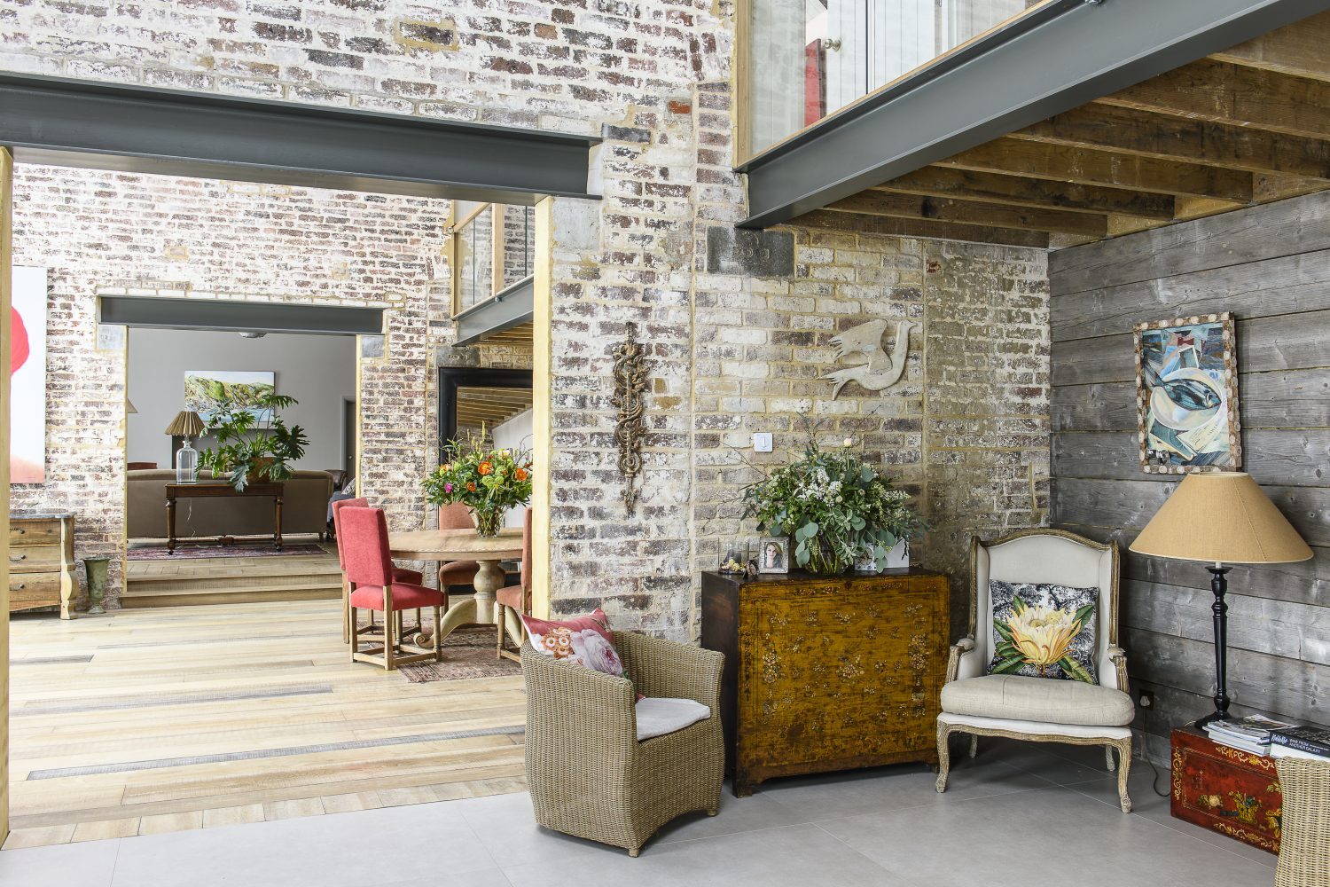
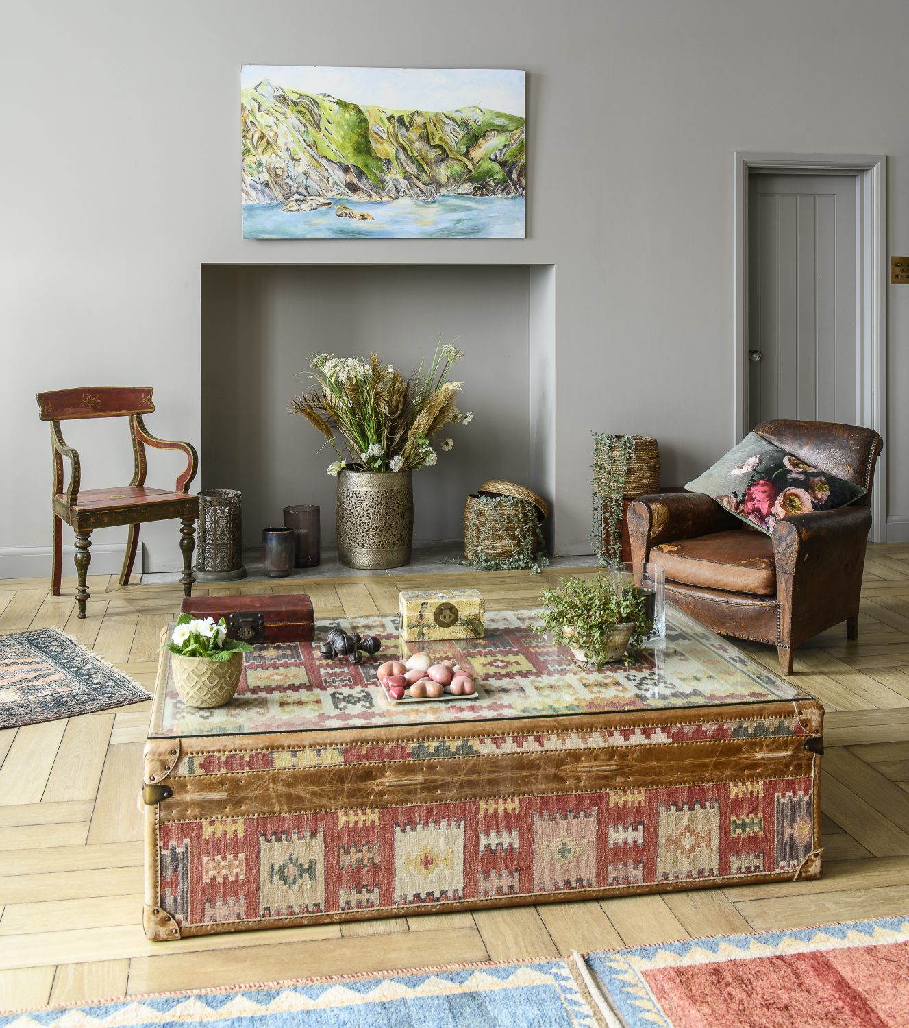
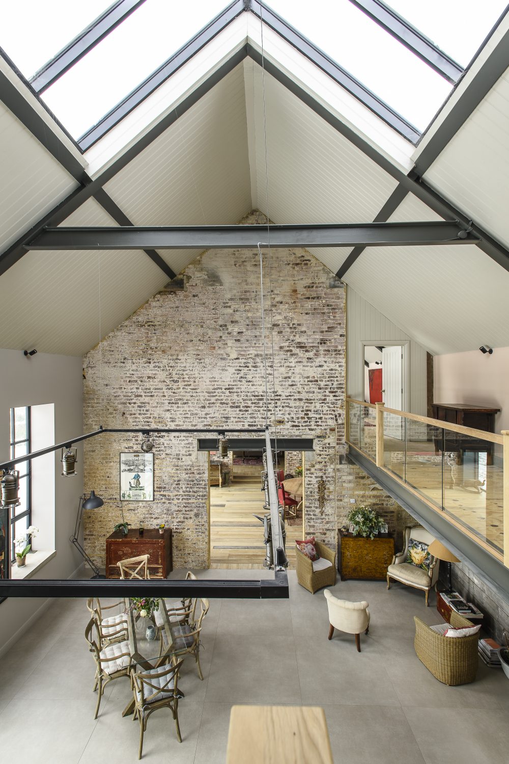
The original internal dividing walls have been knocked through in the centre so that your eye is drawn all the way down the length of the building from the kitchen at one end to a feature fireplace at the other. A mezzanine expands over the sitting room and the kitchen, linked by a long glass balcony. Areas for seating and eating are subtly zoned. The floor changes from mammoth, but practical, porcelain tiles at the kitchen end of the building to reclaimed wood in the hall and sitting room. The wooden floors have been carefully laid using pieces of different lengths and widths and bring a warm solidity across the ground floor. “Wherever possible we have reused and upcycled,” the owner explains. Old planks have been made into benches and shelving, and add a rustic nod to the buildings humble origins.
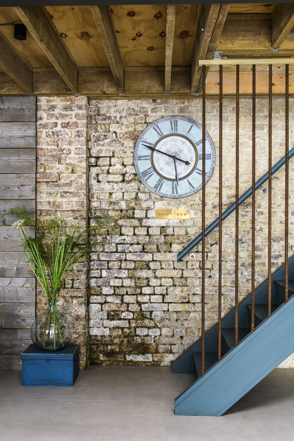
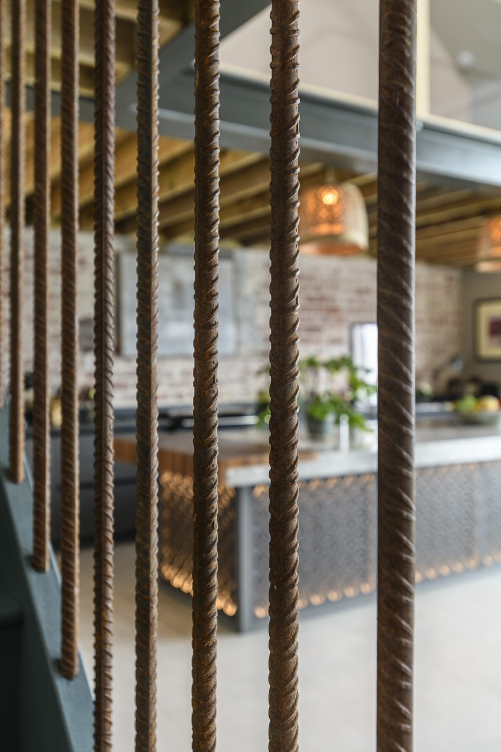
Elemental textures of rust, concrete and red brick help to anchor the interior, paying homage to its roots and bringing authenticity to the build. This is echoed in little touches all through the barn – from the rusted metal light switches by The Workshop Below, to the staircase with its banister made from rebar (the metal rods used to reinforce expanses of concrete). These were sliced up and “installed in a trice.” It is agri-chic, but executed to the highest standards and pulled together with flair.
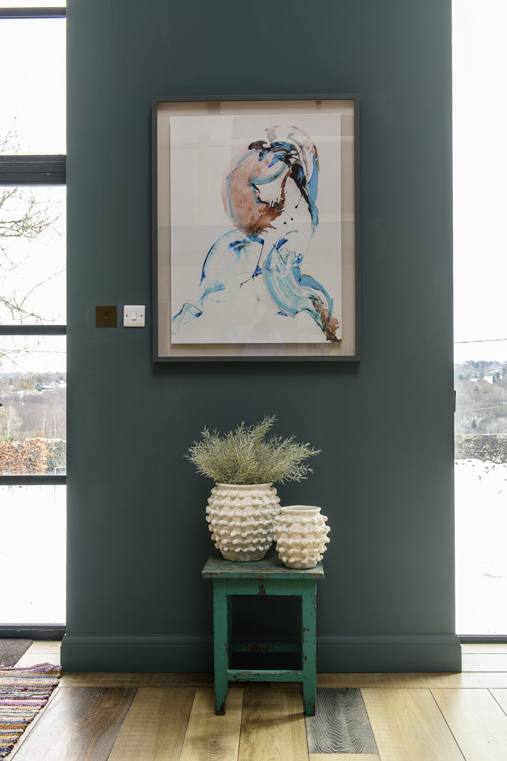
The wall colours have been carefully thought out – to contrast with the neutrals and touches of red, but also to help the spaces become more human in scale. While white and pale colours make rooms feel more airy, darker hues and warm tones work well to make a large expanse feel more intimate. The main colour in the hall is Farrow & Ball’s Inchyra Blue, a deep shade of teal that contrasts effectively with the splashes of red and highlights the blue Indian cupboard. “I’ve had that cupboard for so many years,” says the owner. “It follows me everywhere!” The wall opposite the front door has not been painted at all and remains as bare plaster – a pale muddy pink with a tactile chalky texture. If you should wish to replicate the look of raw plaster in paint, as the owners have done directly above this space, you’ll get a very good match from the Paint and Paper Library’s Plaster III.
The wall colour in the David Haugh kitchen is Oak Apple from Fired Earth, a lighter colour is used here as a contrast; the kitchen nestles under part of the mezzanine. There’s no room for high wall cupboards, but luckily more storage space exists in an adjacent utility room. What draws you to this end of the building is the clever use of lighting within the island unit, so that instead of a blocky line of blank cupboards, the focal point is an elegantly backlit fretwork panel. Hey presto, a utilitarian piece magically turns into a feature in its own right. Above it an oiled walnut chopping board has been seamlessly sleeved into one end of the porcelain worktop – a great example of the design adage ‘form ever follows function’. Behind this unit an unbroken line of kitchen units run right along the end wall, the reconditioned range has been painted exactly the same dark grey and blends chameleon-like with the units. Well thought out details like this bring unity and an understated sleekness to the kitchen end of the building.
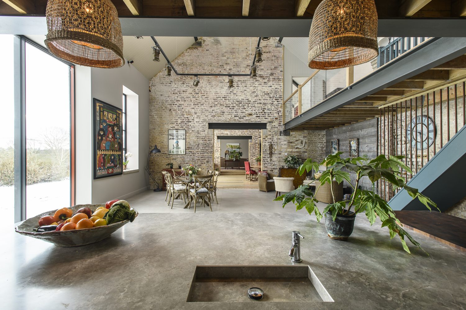
Lighting is so important, especially in a large space like this. “It was very hard to design overhead lights for this building. In the end we had this metal structure made and suspended it from the roof.” The rectangular gantry system supports a series of large articulated spotlights, reminiscent of a lighting system in a theatre or film set, each one can be directed independently around the space.
Above the island unit, a nifty and original lighting trick is revealed. What appear to be bespoke lamp shades are in fact upturned wastepaper baskets slotted over the existing shades. “I hate seeing the light source,” the owner explains, “this way you get the diffusion of light but the bulb is invisible.”
Lighting is so important, especially in a large space like this. “It was very hard to design overhead lights for this building. In the end we had this metal structure made and suspended it from the roof.” The rectangular gantry system supports a series of large articulated spotlights, reminiscent of a lighting system in a theatre or film set, each one can be directed independently around the space.
Controlling the lighting is easier in the sitting room at the other end of the building. The ceiling, which would be considered high in a conventional house, is lower and the sitting room, painted in warm neutral Worsted from Farrow & Ball is classically relaxing and proportioned.
Few of the windows have any treatments at all and have monolithic, unfinished concrete sills. The sort of softening that curtains might bring would definitely detract from the impressive shape and effect of the windows – and, as the owner says, “We’re not overlooked here, so we don’t really need curtains.” The building faces east and all the windows are on this side, so the light comes flooding in at just the right time – in the morning, rather than at the other end of the day when the strong afternoon light might come blasting in and make the interior too hot. The natural light, as it changes through the day,c makes interesting changes to the appearance and effects of the interior colours.
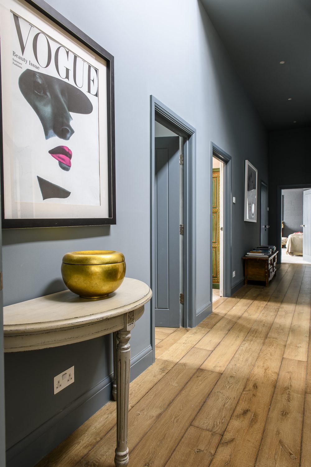
Beyond the sitting room is an altogether different space, in fact almost a separate apartment. In here the rooms are linked by a windowless hallway and light is noticeable by its absence – and by the dramatic use of a single colour – a dark shade of grey aqua, Farrow & Ball’s De Nimes. The owner’s advice to anyone painting a room and trying out colours is to be bold, not to go with small tester pots on sections of wall, as the light changes in different areas, but to paint the whole room. “That’s the only way that you’ll get an idea of how the colour works. And if it’s wrong, it can be painted over. It might take you a day or two longer, but it’s important to get the right colour and to be able to live with it. If you’re in any way doubtful,”’ she adds, “the best colours to go for are the greeny-blue greys. They set off other colours well, either toning in or contrasting.”
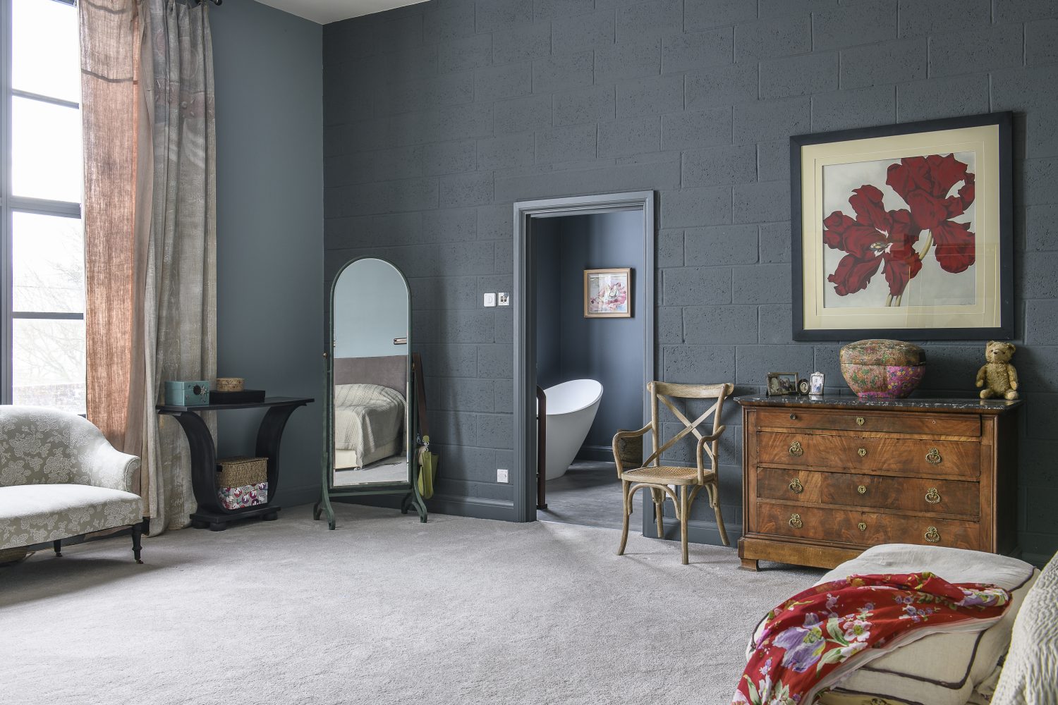
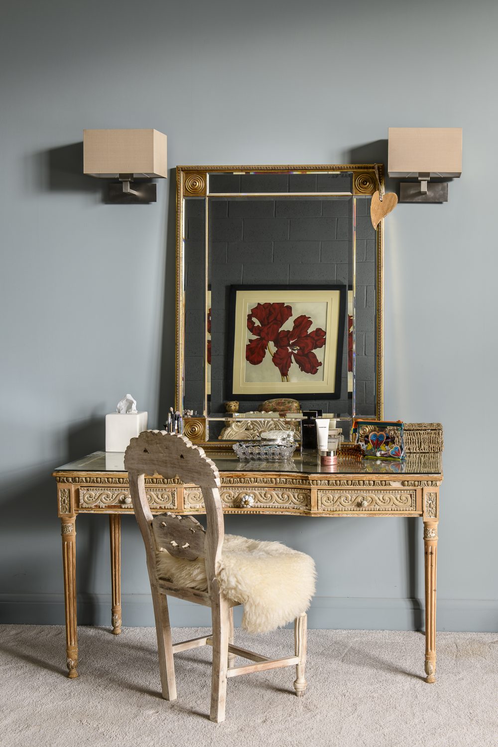
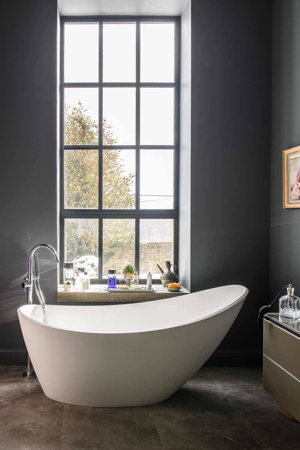
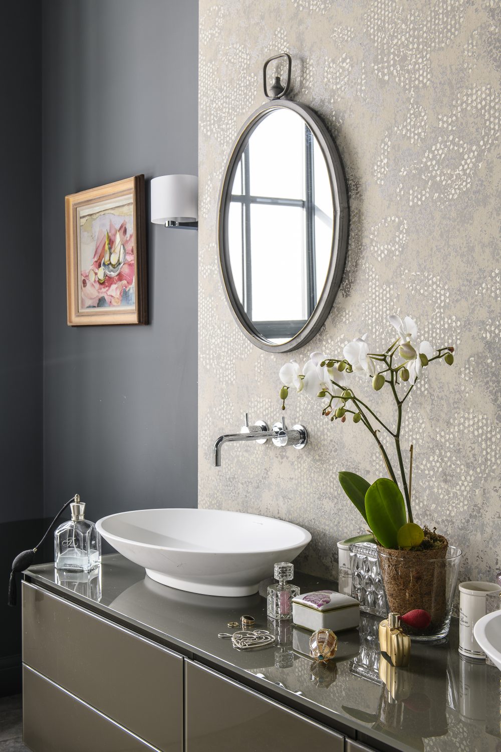
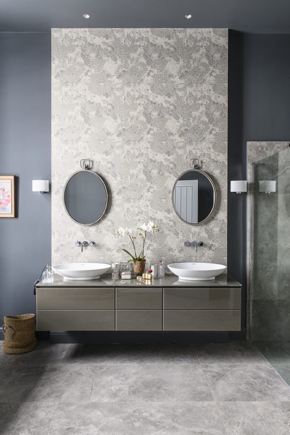
Leading off the hall in a conventional way are an office, a studio and the master bedroom and bathroom. The master bedroom en suite’s luxurious, sculptural bath from C P Hart in Tunbridge Wells reclines next to the curtain-less window and the clever use of a panel of wallpaper over the unit (from Designers Guild) unites the colour scheme perfectly.
Touching on more interior design solutions, the owner says, “Artwork and lighting are the key to it all.” Pictures help to define the space and act as focal points, contrasting or harmonising with the wall treatments and furnishings. This adds a layer of narrative and a richness to an interior. But it does help to have a bold vision for the overall space, confidence with colour and an understanding of space and proportion – all of which is gloriously demonstrated at this very special building.
Address Book:
Architect: John Bullock Design johnbullockdesign.com
Building contractors: Cosgrove Design & Build cosgrovedesignandbuild.co.uk
Chinese pieces: YiJu The Pantiles, Tunbridge Wells 01892 51700
Cushions & home furnishings: @One, Wadhurst at-one.co.uk
Glass balconies: Stairbox stairbox.com
Kitchen: Andrew Moore at David Haugh davidhaugh.co.uk
Lighting: Mr Resistor mr-resistor.co.uk
The Workshop Below theworkshopbelow.com
Lighting designer: Anaïs Barceló at Lighting Design London anais@lightingdesignlondon.com
Lincoln Seligman lincolnseligman.com
Oak Floors: Oak Artisans oakartisans.co.uk
- words: Jo Arnell
- pictures: David Merewether
You may also like
Change it up
Neil and Sharon Maidment’s reconfigured family home is the result of a very successful partnership with OPEN architecture, who opened their eyes to a new layout they never imagined was possible Words: Fiona Patrick Photographs: David Merewether The green modular...
Building Connections
After nearly a decade of planning, Dominic and Eve were finally given permission to convert a pair of derelict barns, linking them together to create one very beautiful dwelling Words: Jo Arnell Photographs: David Merewether The story arc of an...
Cut to Fit
Deborah Harrison downsized to a three bedroom house, which she renovated and reconfigured, reinstating the original Victorian features and editing family heirlooms to suit her new home and lifestyle “As William Morris says, ‘Everything has to be beautiful or useful,’”...