Careful to inject plenty of each homeowner’s personality into every project, interior designer Jenny Branson’s gentle and measured approach has won her many clients who adore her use of colour, pattern and mood-lifting design
There is something instantly connecting when you walk into a home that has been designed not just to look good, but to feel just right. Amie and Jon were looking for that special something when they began renovating their five-bedroom detached home in Surrey. Although the couple had embarked on a full-scale renovation, stripping the property back to its bones, extending upwards and outwards and reimagining the flow entirely, they were faced with the familiar challenge: how to turn a building site into a home.
Enter interior designer Jenny Branson, whose approach to decorating is refreshingly unpretentious. “The first question I always ask,” explains Jenny, “is what key words are at the heart of the home that you want to achieve?” For Amie, the answer came quickly: earthy, simple, calm, natural, light and cosy. These six words then became the foundation for everything that followed. Rather than providing her clients with a prescriptive idea of what she thinks her clients should have, Jenny starts the other way round, putting her clients’ needs and lifestyle at the heart of her suggested design scheme.
Working collaboratively Amie created an abstract mood board, a collage of colour, pattern and texture that had nothing to do with layouts and everything to do with an emotional response to colour, to pattern and to texture.
That initial palette of soft greens and teals, earthy reds, natural linens and warm neutrals that Amie put on her mood board, was the spark for Jenny to work from, and its influence now threads its way through the entire house. It is what allows each room to feel distinct yet connected, layered but never chaotic. “It gives people confidence,” Jenny says. “Creating a mood board means that my clients get the chance to know what they love, and then we can build everything else around it.”
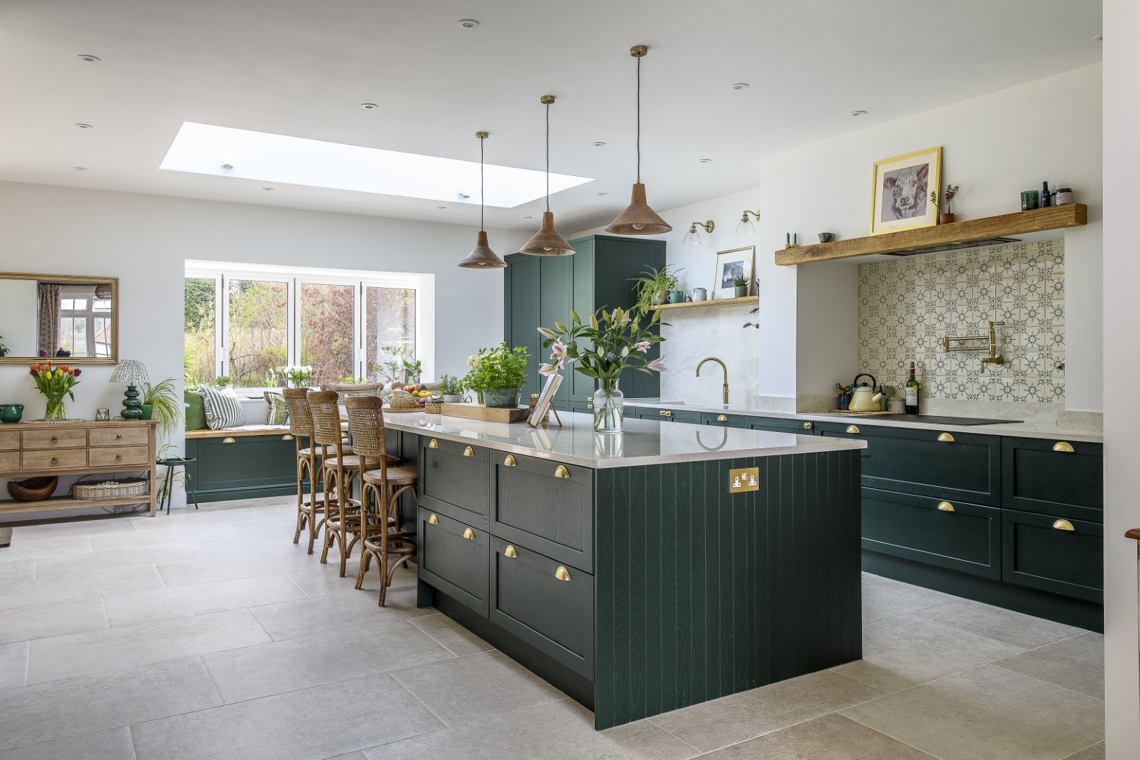
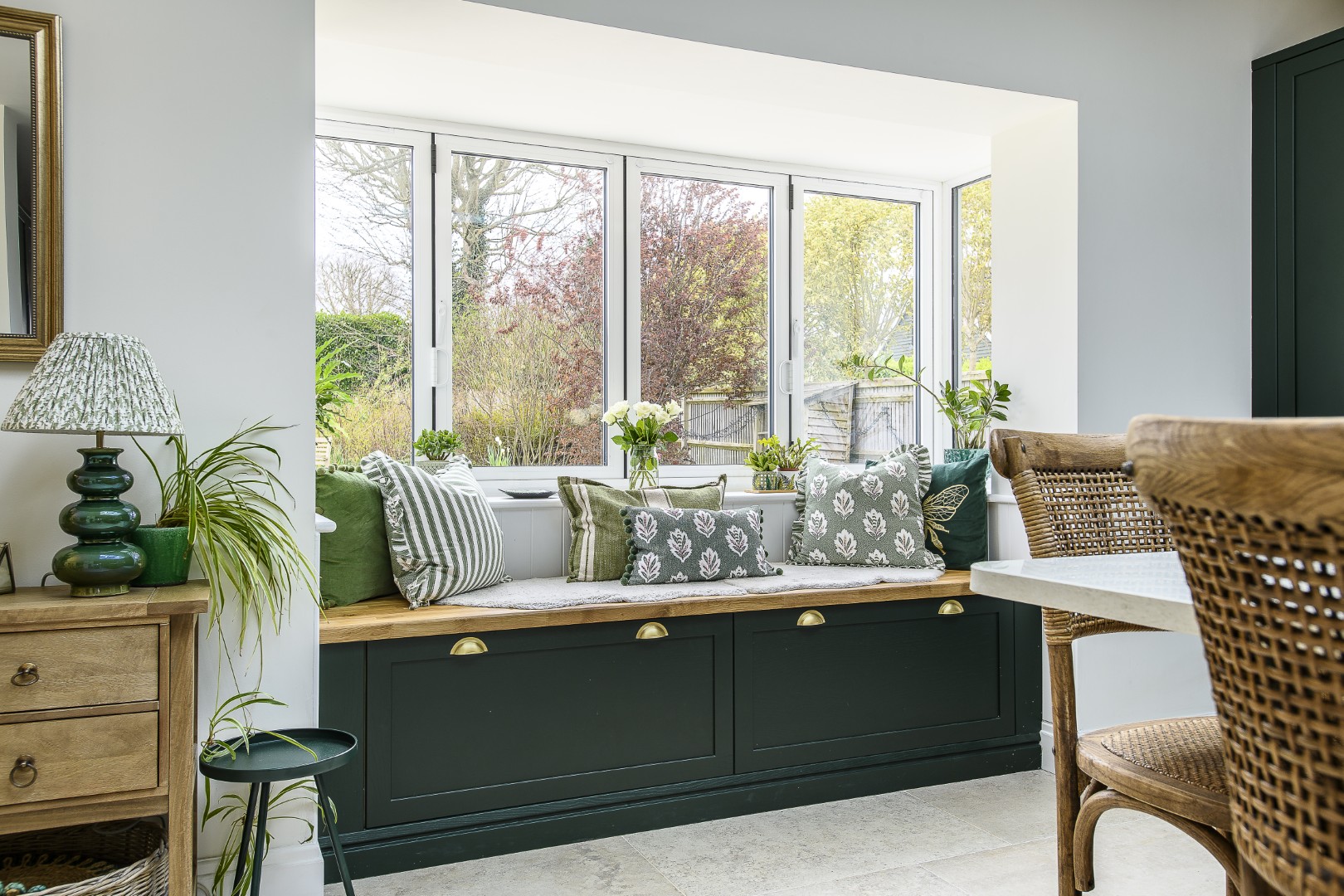
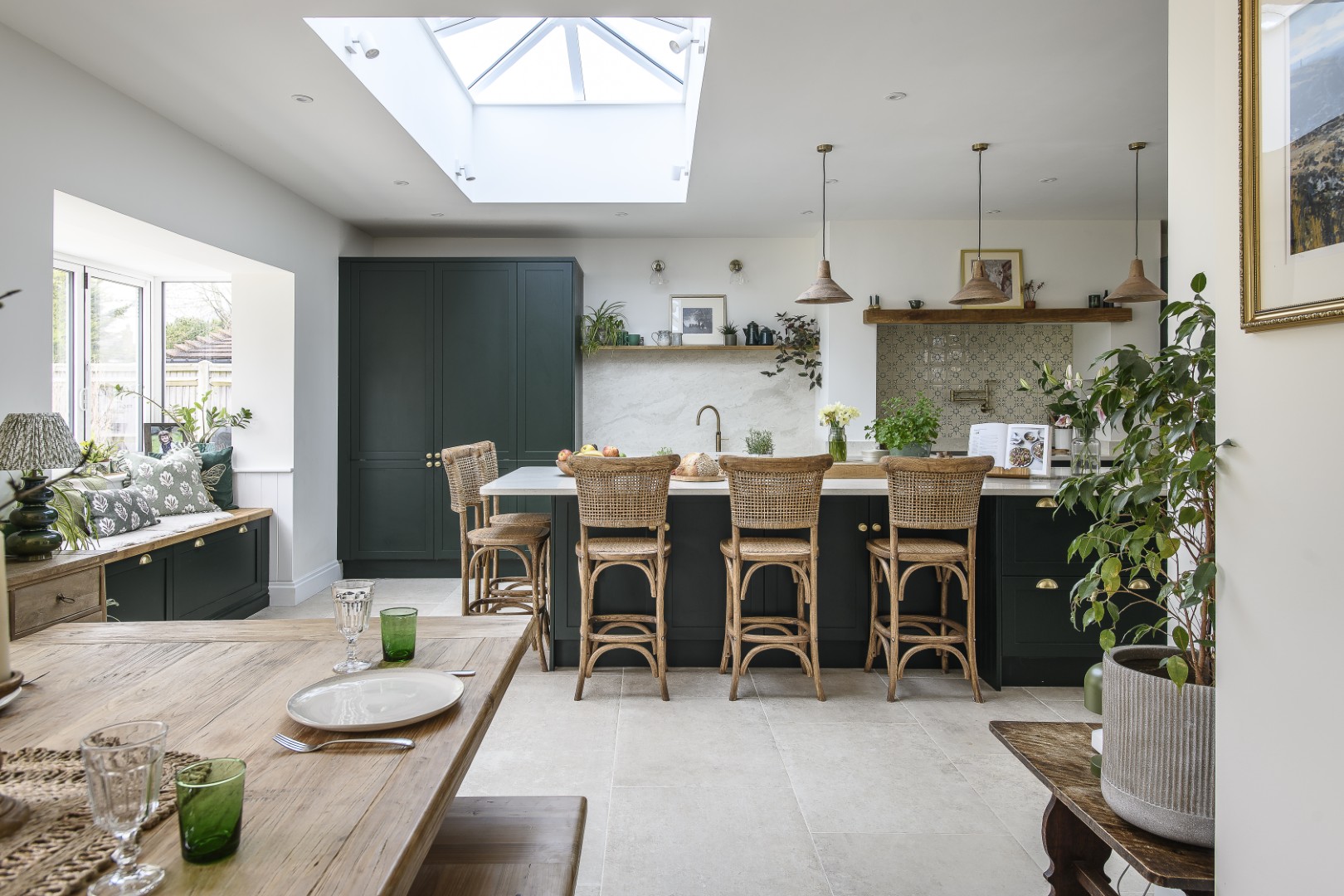
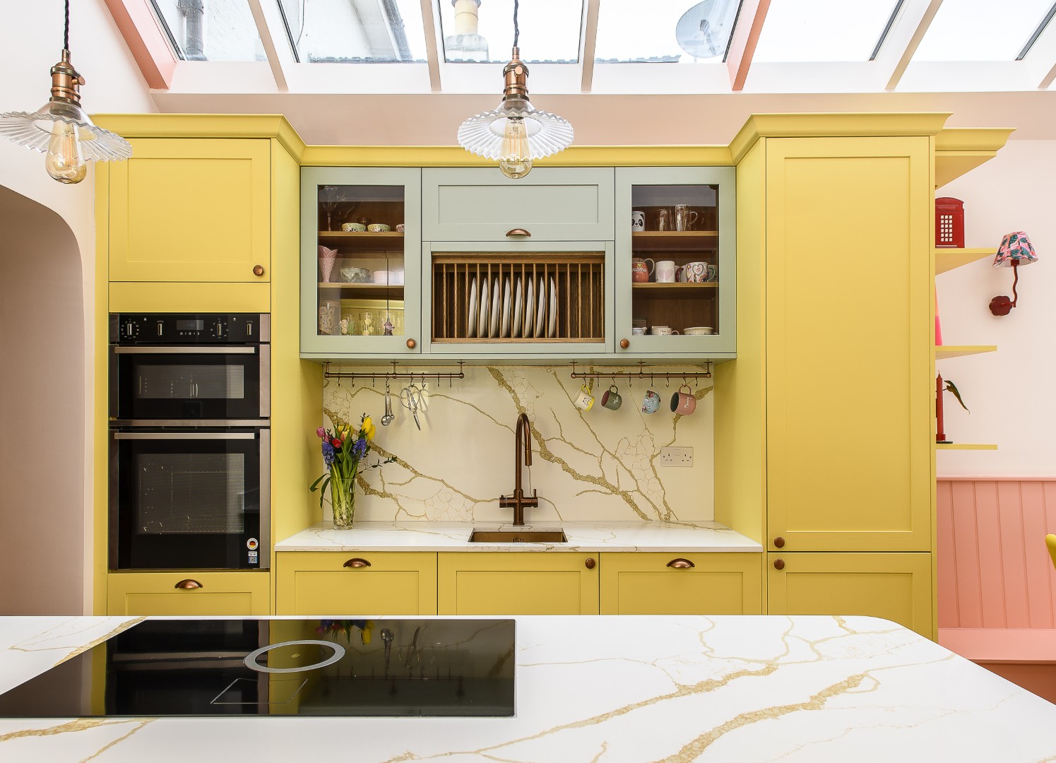
At the heart of the house, set at the back overlooking the garden, is a spacious light-filled open-plan kitchen and dining area with an adjacent snug, the engine room of family life. While the kitchen layout itself was handled separately, Jenny’s role was to bring a sense of cohesion to the space, creating a room that would work not only with the orientation, as a south-facing space with lots of windows, but also bringing in warmth and personality, ensuring it was somewhere that looked good but also fitted Amie and Jon’s family’s needs.
Deep green cabinetry anchors the room, softened by natural materials and tactile finishes. Hand-painted Portuguese splashback tiles from Everett & Blue introduce subtle pattern, while woven rattan and timber prevent the space from feeling overly sleek or clinical.
“I really wanted there to be a deliberate sense that this was not just a functional zone,” says Jenny. “I wanted to ensure it was a living space, one layered with fabrics, ceramics and lighting that echo the rest of the house.” Patterned curtains in Ashleigh Mercier Autumn’s End fabric add softness and movement, while rattan pendants and bar stools alongside wooden furniture reinforce the home’s connection to nature.
Crucially, it is also a space designed for real life. With two working parents and teenagers coming and going, the layout had to support connection, without chaos. Sightlines between the kitchen, dining area and snug ensure the family can be together – even when doing different things – which offers a subtle but important shift away from the compartmentalised homes of the past.
What is striking is not the individual elements, but how seamlessly they connect. The palette shifts subtly from room to room, pushed and pulled to suit each space, yet always rooted in that original mood board
One of Jenny’s key roles in the project was acting as a counterbalance to the purely architectural thinking of the development. While expansive glazing and large roof lanterns maximise light, they can also create practical challenges. “Architects are brilliant at form,” says Jenny, “but sometimes you have to bring it back to how a family actually lives.” Here, that meant carefully considering window treatments to soften glare, ensuring the scale of the roof lantern wouldn’t overheat the space, and choosing durable materials such as porcelain flooring that mimics stone but withstands the realities of daily life. It is this balance between beauty and practicality that underpins the entire house.
Perhaps the most telling spaces are the ones that might otherwise be overlooked. The utility room, for instance, is anything but an afterthought. Painted in Farrow & Ball’s vibrant Danish Lawn, it is a burst of pure fun and energy, a space designed to uplift rather than simply function. Jenny explains, “Amie wanted to give herself an uplift when she went into the utility. I mean, no-one likes doing the laundry do they, especially if you have been working all day, so it was fun to add a pop of colour that makes Amie and Jon smile, but also a space where you could shut the door, so it didn’t dominate, so you get the best of both worlds.”
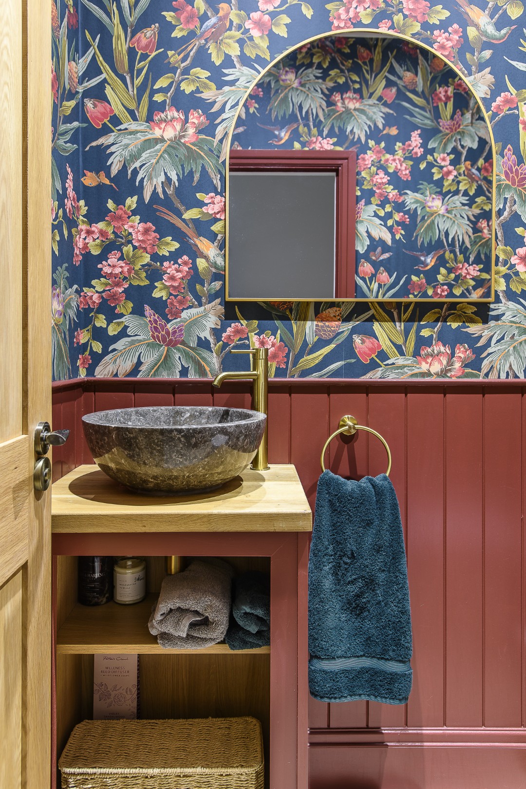
Similarly, the downstairs cloakroom is another moment of pure escapism. Wrapped in Warner House’s Fleurs Exotique wallpaper, it is bold, playful and unapologetically decorative. A reminder that not every room needs to be restrained. “These are the places, like the downstairs loo, where you can be brave,” Jenny explains. “It’s not on show the whole time, but when you open the door, it instantly makes you smile.”
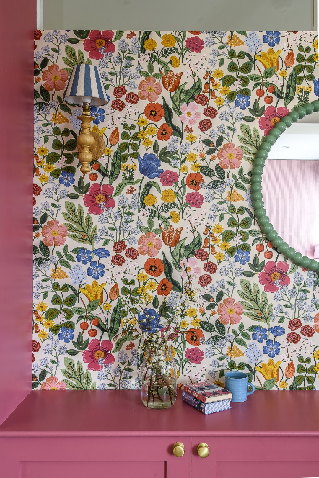
Jenny had a similar approach to Amie’s office at the front of the house which again has a bold floral wallpaper by the Rife Paper Co called Third Edition Blossom and a strong Rhubarb paint by Paint & Paper Library for the woodwork and cabinetry. “It was designed as Amie’s room, so we could really lean into having elements that were personal to her.”
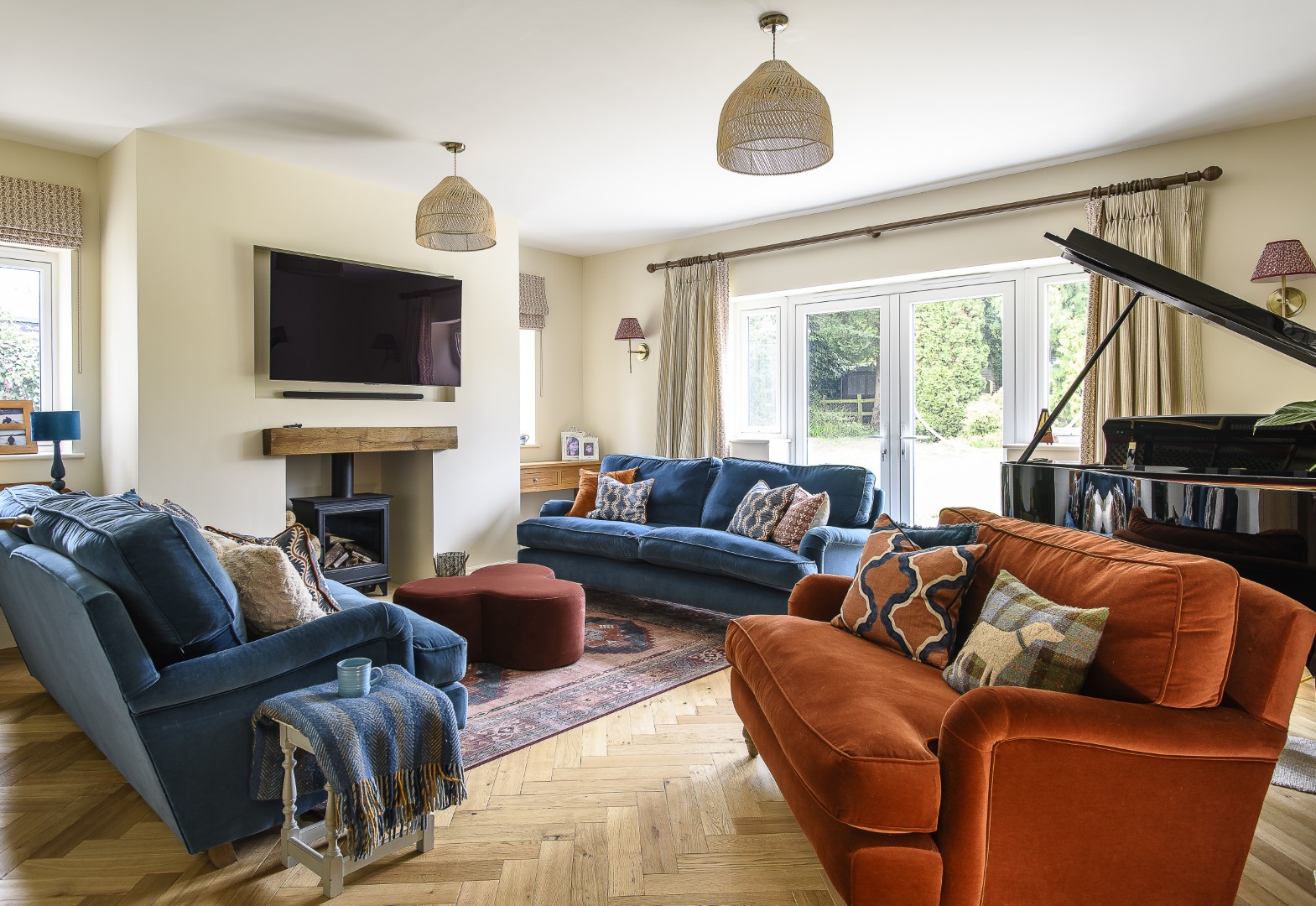
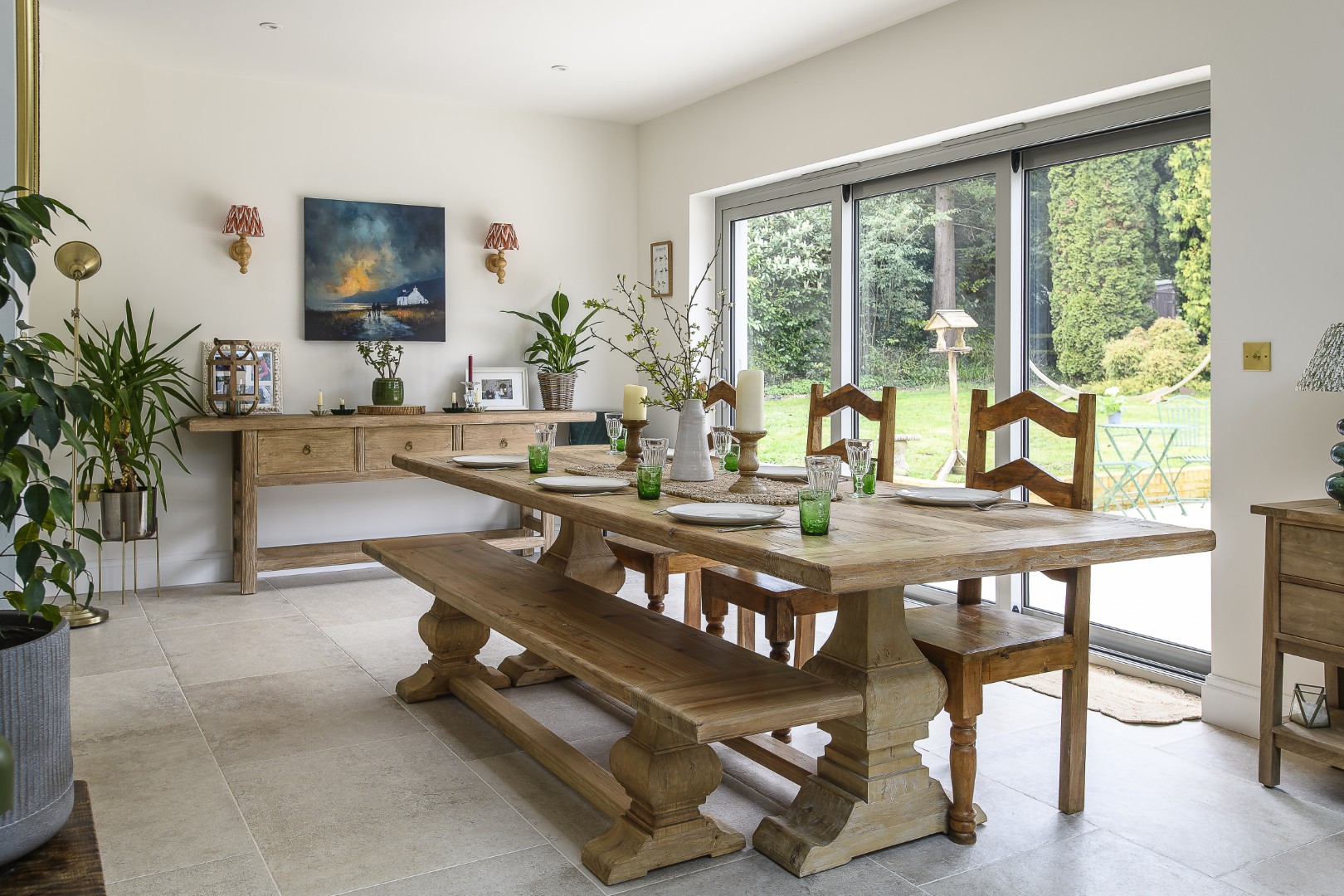
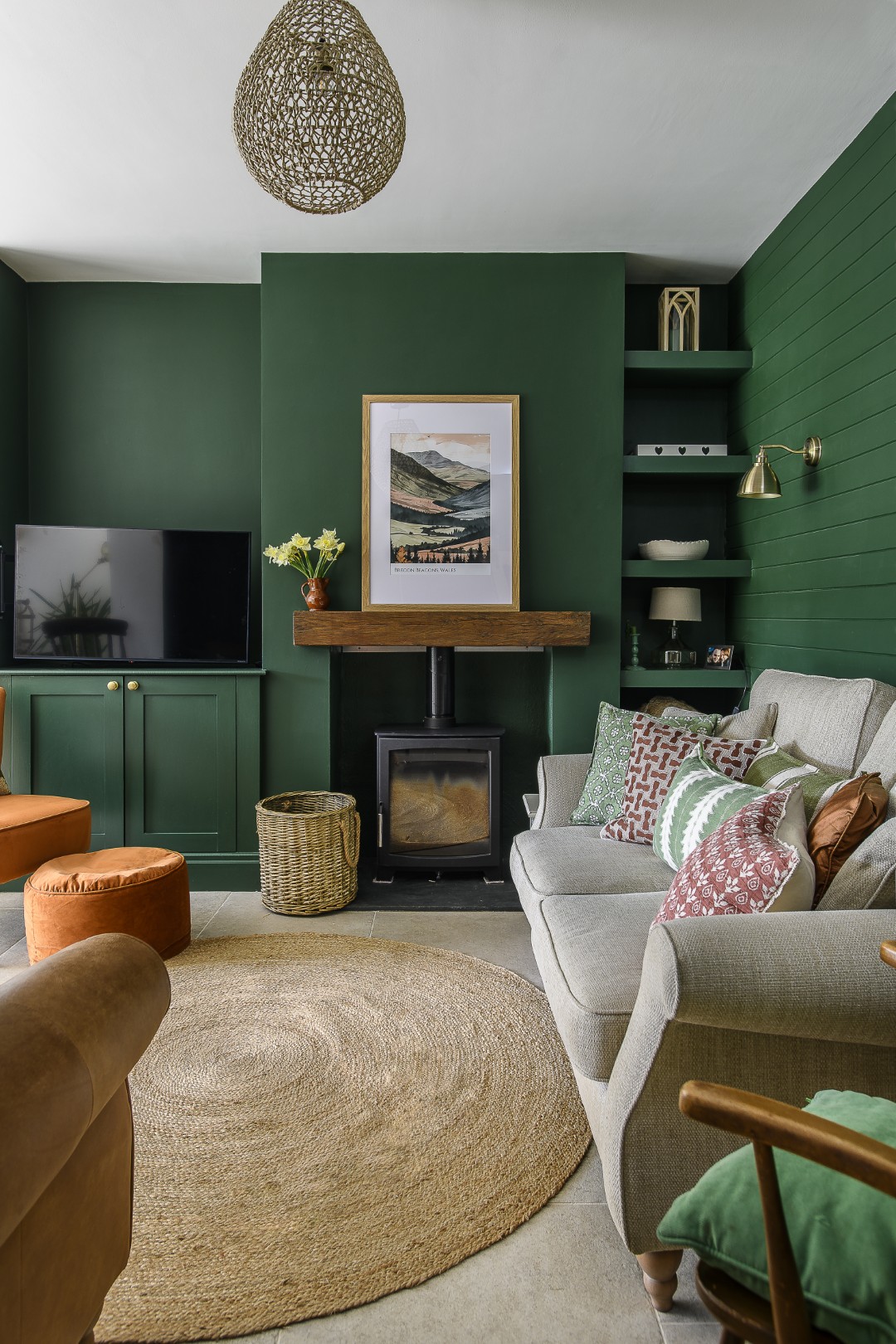
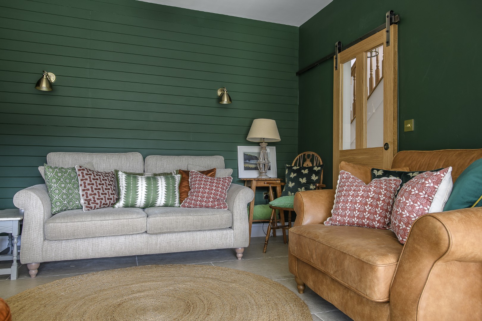
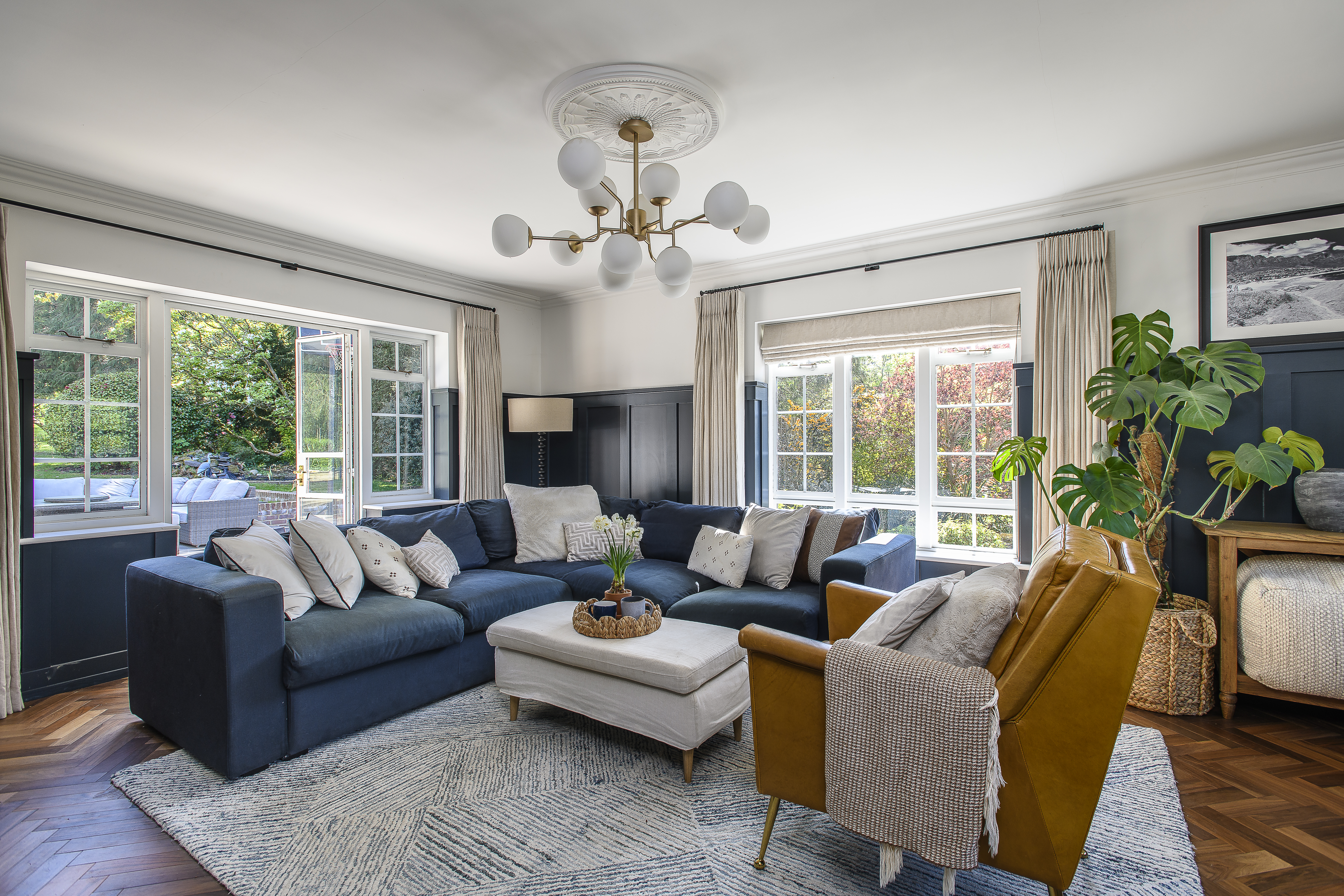
While the kitchen is informal and sociable, the separate living room offers something more grown-up. Designed as an adult retreat and entertaining space, it centres around a grand piano, a nod to Amie and Jon’s daughter’s musical talent. Here, the palette deepens. Rust-toned upholstery from Loaf contrasts with cooler blues, while a patterned rug from Ruggable anchors the space. Linen curtains edged in rust tones from Ellen Merchant add a tailored finish, made by Jenny’s curtain maker Clare Young, and cushions in Linwood fabrics introduce a subtle play of pattern.
It is a room that feels considered rather than styled, comfortable enough for everyday use, but elevated enough to feel special.
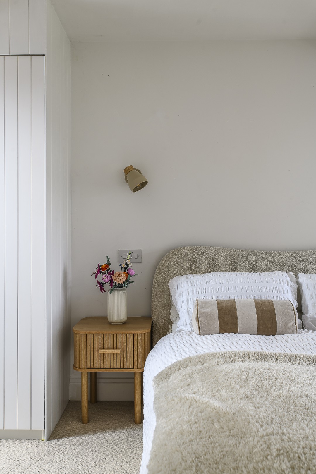
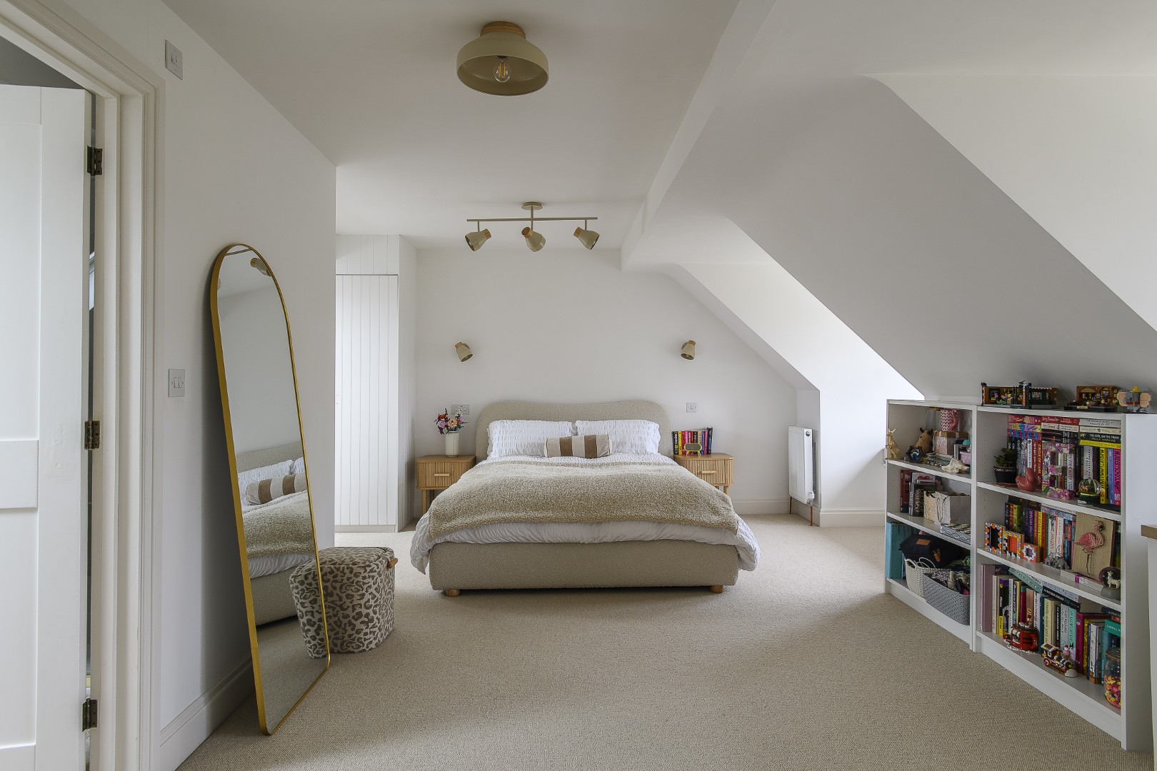
Upstairs, the individuality of each family member comes into sharper focus. Amie and Jon’s son’s bedroom leans into deeper, more masculine tones, with Paint & Paper Library’s Blue Gum setting a calm, grounded backdrop. Whilst their daughter’s top-floor room, by contrast, embraces a softer, Scandinavian-inspired palette. Initially requesting an all-white space, she was gently guided by Jenny towards a warmer interpretation, layering the space with subtle stripes and textures to avoid the starkness of a blank canvas.
“My role is about listening,” Jenny says. “But also helping people to see what’s possible.”
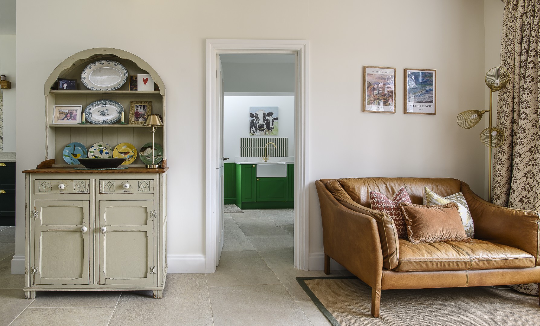
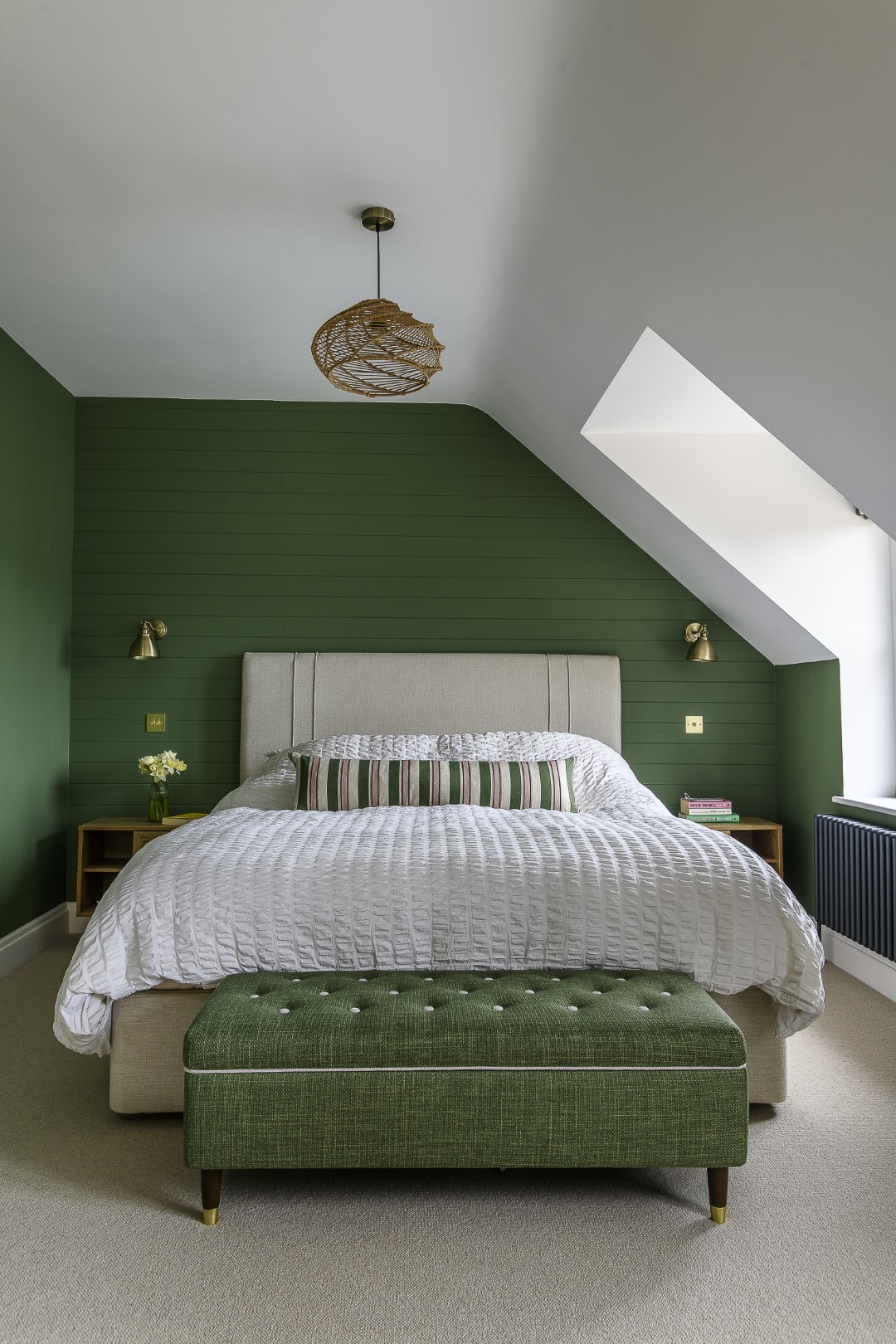
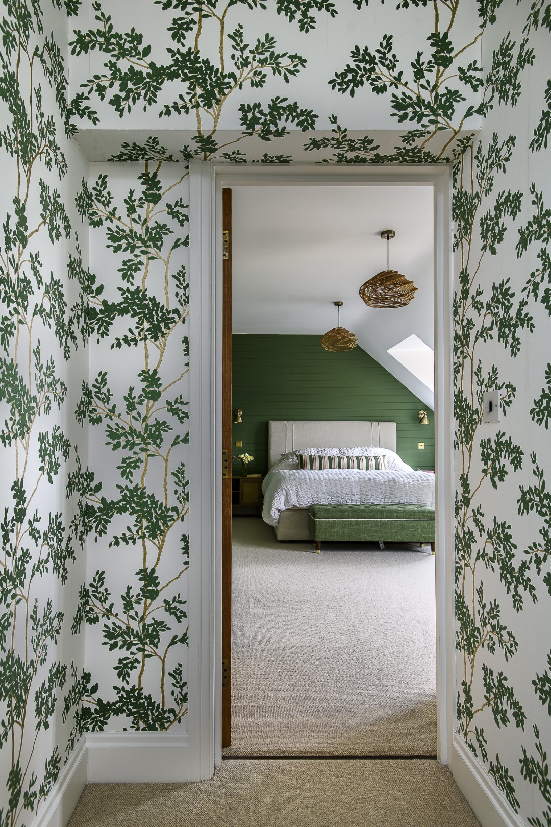
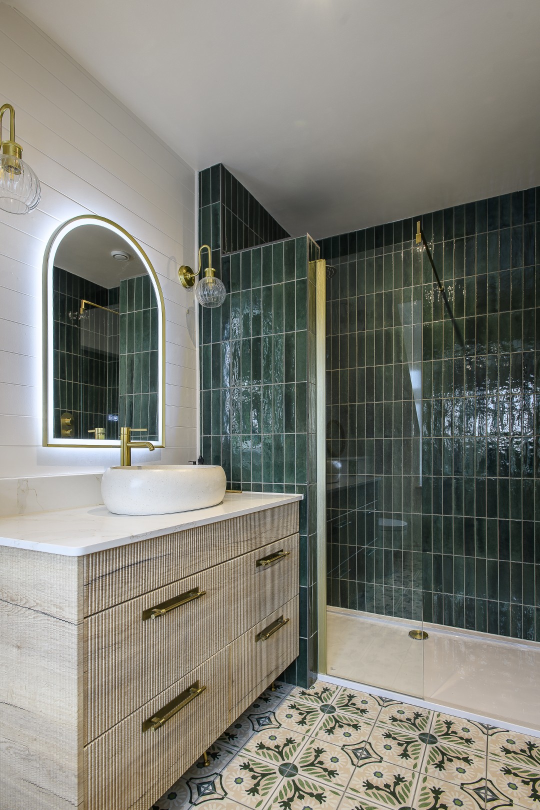
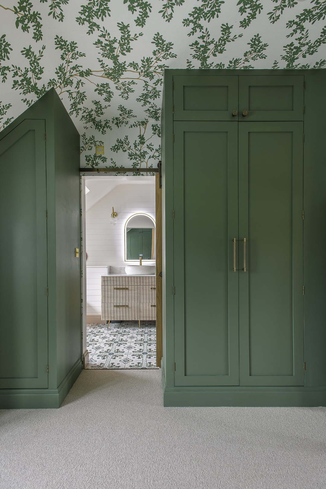
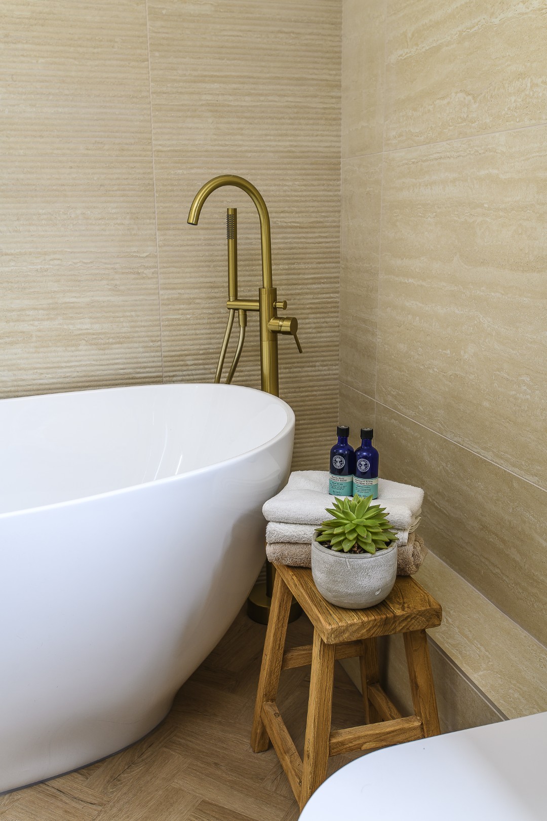
The principal suite is where the design reaches its most immersive. A botanical wallpaper from York’s Blooms Second Edition wraps the dressing room and extends through the corridor, creating a sense of total fantasy and immersion. In the bedroom, Farrow & Ball’s Calke Green provides a rich, cocooning backdrop. In the adjoining bathroom the green is joined by a very soft pink, mirroring the patterned Moroccan-style floor tiles and glossy green wall tiles that together create an elegant, layered, textural finish.
What is striking is not the individual elements, but how seamlessly they connect. The palette shifts subtly from room to room, pushed and pulled to suit each space, yet always rooted in that original mood board. Jenny, who runs her interior design consultancy as well as online courses and workshops via The Good Mood House Method, feels that it is important for people to reject the idea that interiors should be intimidating or exclusively expensive. Her ethos is firmly rooted in accessibility, showing that good design is not about budget, but about understanding colour, pattern and our emotional connections to our homes.
From high street finds to carefully sourced fabrics, the emphasis for Jenny is on thoughtful choices rather than extravagant ones and about knowing where to invest and where to be practical, a philosophy that resonates strongly in a home designed for family life.
“People shouldn’t feel they have to apologise for where something comes from,” Jenny says. “Good design is about how it works together and ultimately how it makes you feel.”
What makes this house so successful is not any single room or feature, but the way it all comes together as a whole.
It is a home that reflects the people who live in it, their tastes, their routines, their personalities and their lifestyle. There is a quiet confidence, nothing feels forced or overly curated, instead, it is a house that evolves naturally, grounded in a clear vision but one that is also entirely adaptable. Ultimately what Jenny has helped the family to achieve is a home designed not just to be seen, but to be lived in, and to make those who live there feel entirely at ease.
Address Book:
For more information about Jenny Branson Interiors,
to see previous projects, and to get in touch, visit jennybranson.com
- words: Antonia Deeson
- pictures: David Merewether
- location: Surrey
You may also like
Design Partnership
A family home has been reconfigured for modern living with the help of an expert team of designer, builders and architects who have managed to bring a little South African al fresco living to the heart of Reigate There’s a...
A House With Purpose
Charity founder Katie Dockery’s incredible home, designed by Richard Hawkes on the site of a former Qatari prime minister’s stud farm, has allowed her to create a safe and welcoming countryside retreat where she and her team tap into the...
Colour Care
Award-winning architect Patty Leo embarked on a joyfully creative project to remodel a mid-terrace Victorian property for a mother and daughter, transforming it from cramped and awkward to spacious and expressive We all love colour but at home most of...