Interior designer Justine Hodgson-Barker was tasked with creating a rural retreat for a couple who divide their time between town and country, taking into account their love of fabrics, texture and colour
Down a leafy lane, in the picturesque middle of nowhere, is an architect-designed home that was built on the site of a bungalow. It is unassuming, and apparently low-rise from the outside, but cleverly utilises its sloping site to create two storeys. A fabulous garden – both ornamental and productive – wraps around the house and beyond its boundaries there are far-reaching views out across the countryside.
The owners knew from the outset that so much thought had gone into the design and structure of this building it deserved an equally thoughtful interior – one that could incorporate a combination of styles, enhance the existing structure and bring in the natural beauty of the surrounding landscape. But how to do it?
It is hard enough to create an interior scheme if you have firm tastes and clear style ideas, but when you have just moved into a fairly stark contemporary space and want to mix florals, patterns and texture – and add in the sleek lines of some mid-century style too – the process becomes complicated. How can you marry seemingly disparate styles, soften a stark and industrial look and yet keep its edge? What, if anything, can be kept from a previous property that was so vastly different?
“We didn’t know where to start. Our previous house was pre-Victorian – the interior was Arts and Crafts, William Morris prints and lots of texture and pattern. This is very modern. We wanted to incorporate design, pattern and texture here. That’s where Justine stepped in.”
Enter Justine Hodgson-Barker of Barkerdesign, who has helped the couple to re-imagine the interior, tailoring it to meet their needs, both practical and aesthetic. The project was broken down into phases. “Phase one was the kitchen, living area and master bedroom,” says Justine, explaining a little about how they approached the initial brief. “The building is very contemporary – it was built in 2007 and there’s a lot of pure light that comes in. It has such a bright feel, we didn’t want to lose that and respecting the bones of the building was very important. The clients are putting their own stamp on the interior by injecting their personality into the decor, while remaining true to the building.”
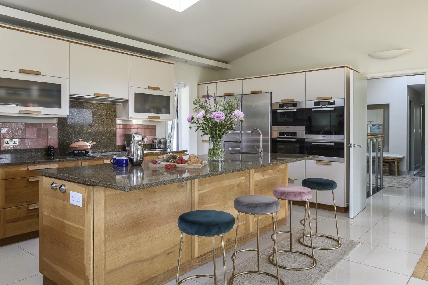
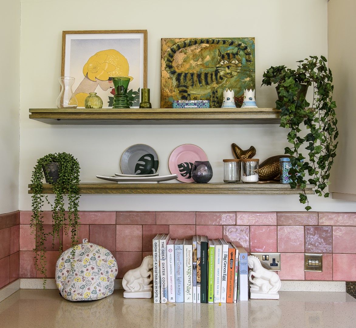
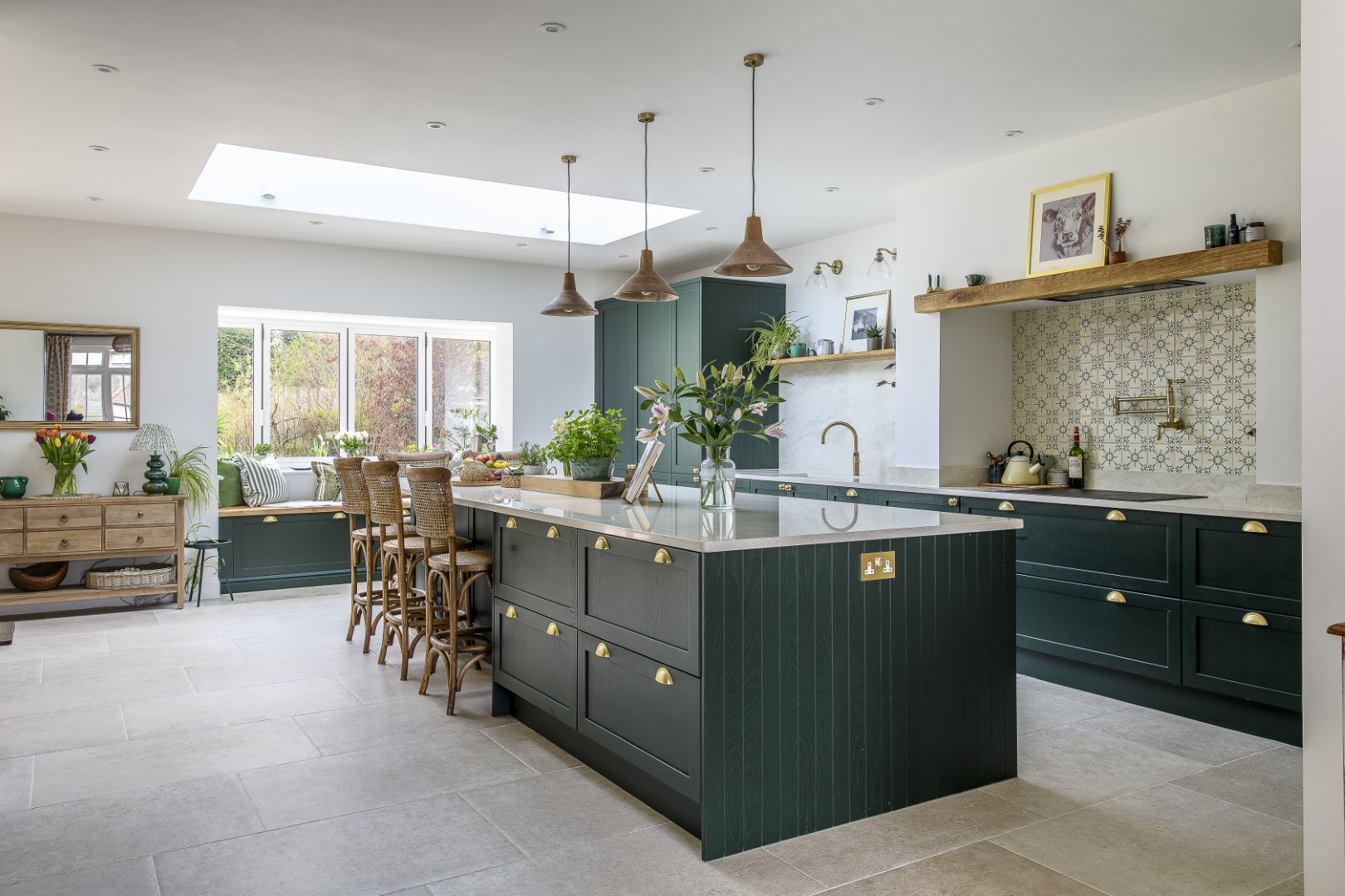
A beautiful kitchen had already been installed by the previous owners, but it had an industrial feel that was a little too clinical for its new owners. “We took out some of the steel and made it more organic. It was really pared back and a different style – exposed beams and steely fixtures – so we softened it, changing the handles, adding the pink tiles and playing to more of a retro feel.”
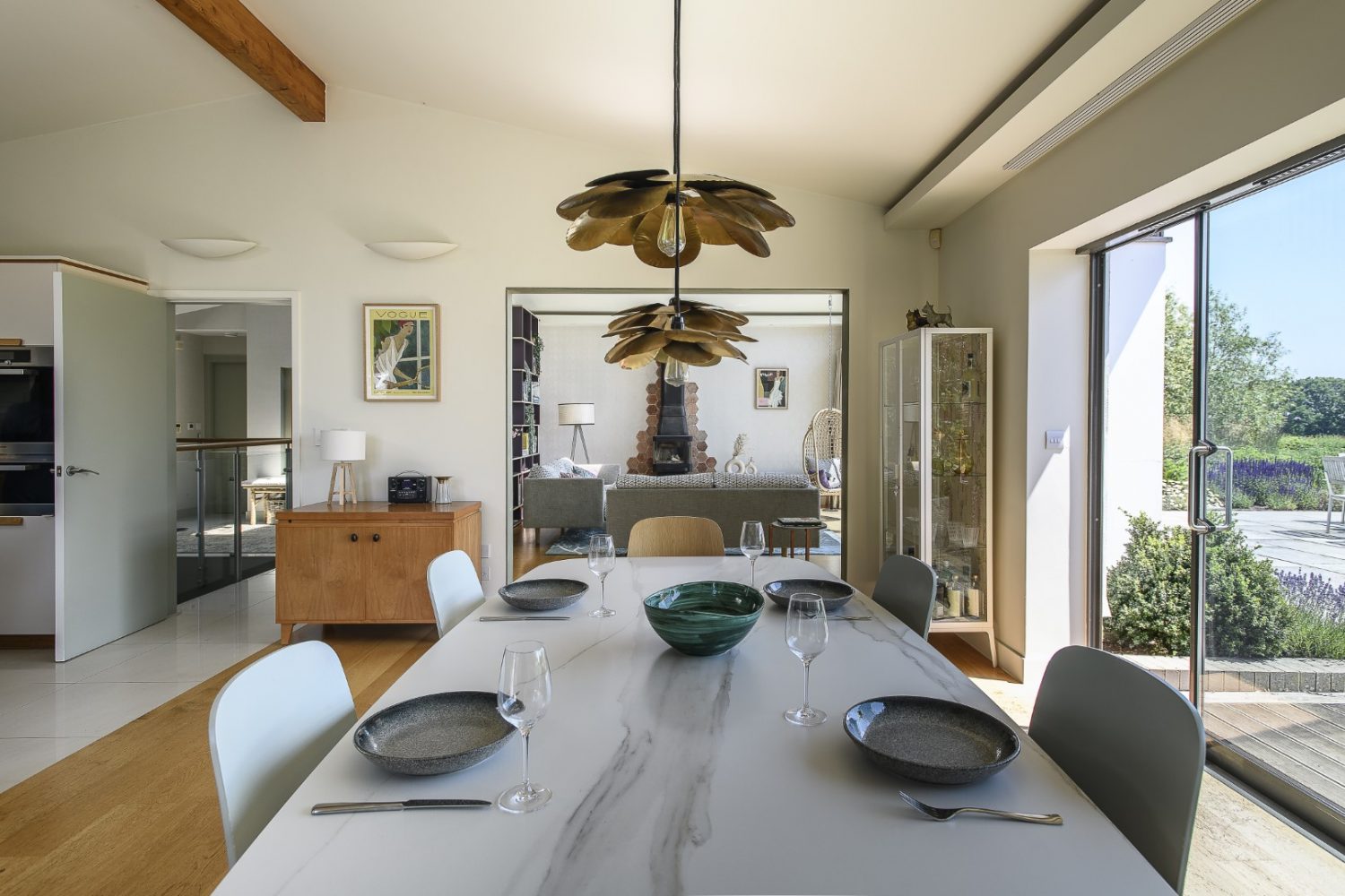
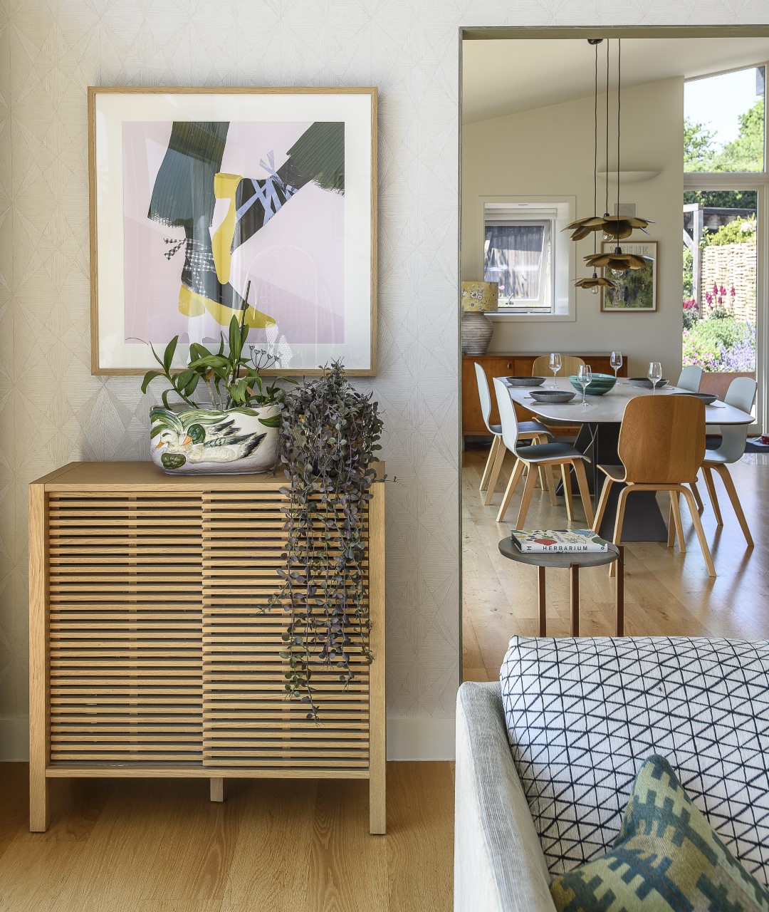
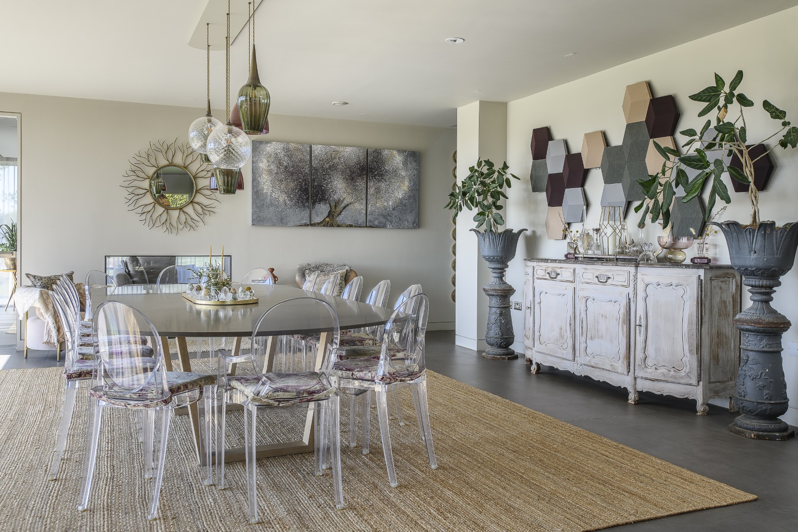
Justine stresses that it’s important to make sure that, “everything flows and different eras come together.” An example of this is the shapely Bontempi table that she sourced for the dining area. It is sleek and contemporary, with a nod to mid-century modern, but has a timelessness about it too. “It’s a very architectural piece,” says Justine, “and the legs make lovely angles.”
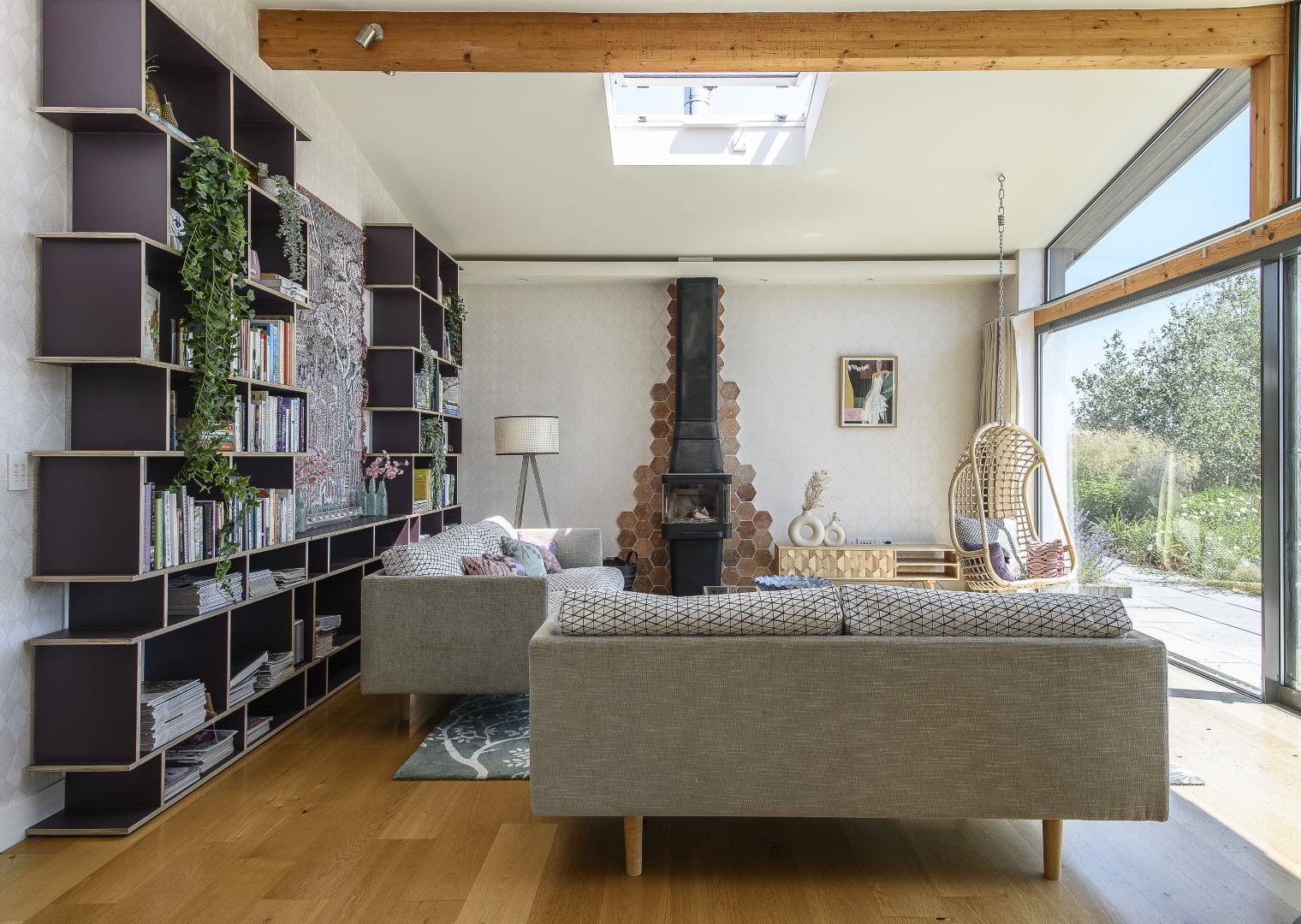
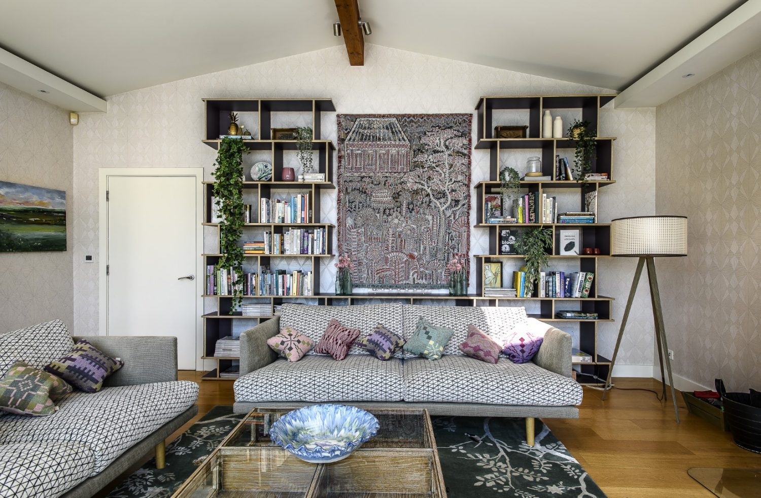
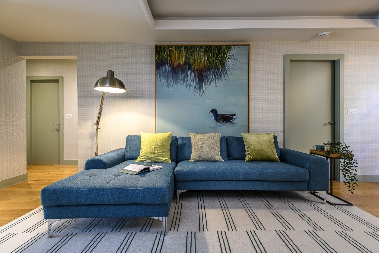
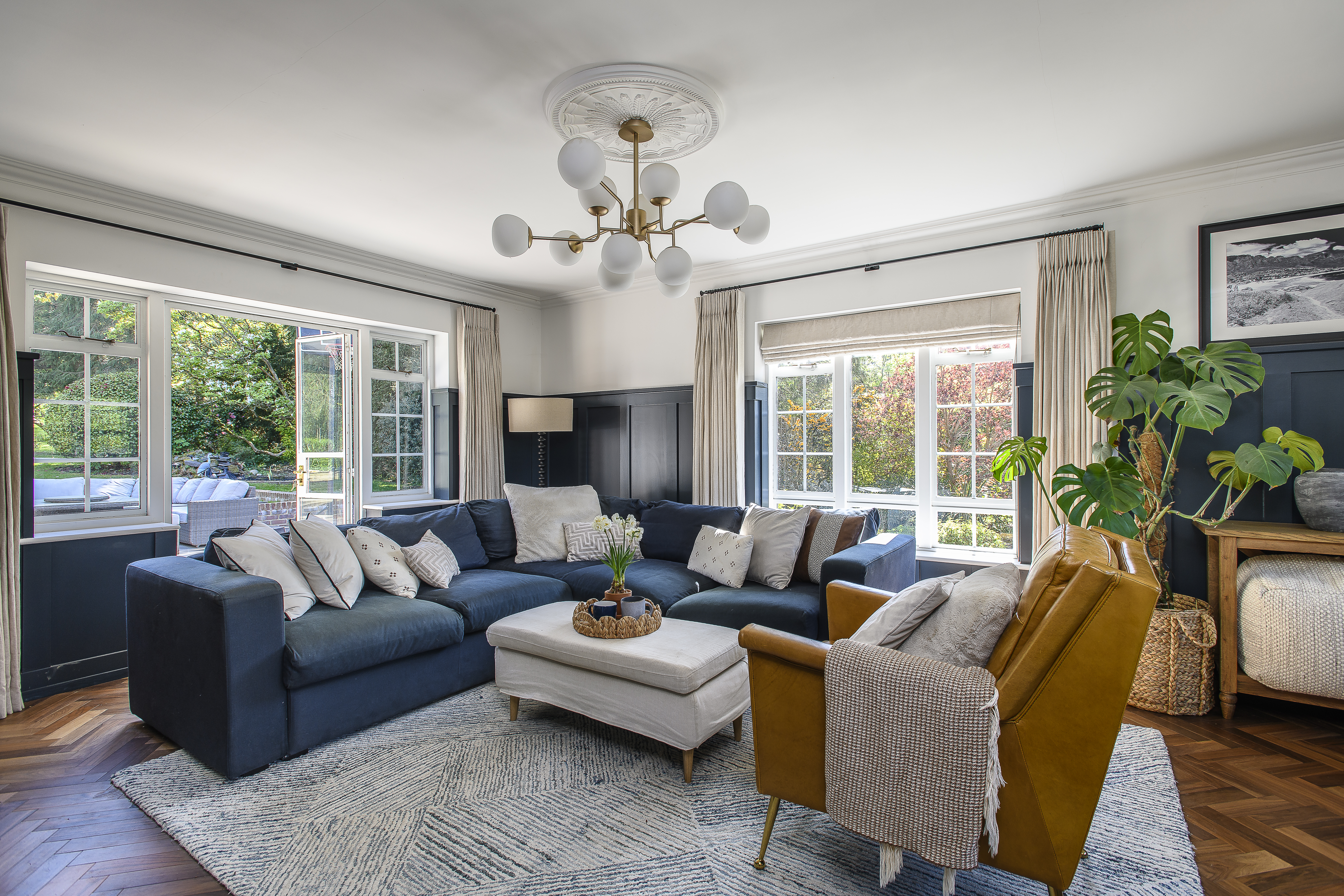
The whole of the living space opens out into the garden – and to the beautiful countryside beyond and while it is the outside view that captivates, Justine has cleverly woven elements from the outside into the interior – the initial inspiration for the living room came directly from the garden.
This is a large room with a high ceiling and Justine was keen to make use of the height. “Everything was standard room level,” she says, “so I wanted to take the eye up.” The shelf unit is deliberately tall and she has cleverly enhanced the wood burner with wall tiles, tapering up like geometric smoke behind the flue.
The cased opening to the living space has been lined with green painted wood – “it’s a detail that creates a subtle effect and helps to define the zones.” The green colour goes on to echo throughout the rest of the house, quietly linking it all together.
Once the initial process of the general design direction is chosen, the enjoyable part – deciding on colour schemes and detailing – is made simpler by using sample boards, where paint, wallpaper, price points, and areas where they want to save, or splurge, can be discussed and finalised.
“We decided on a backdrop of soft colours,” says Justine, “adding texture to the walls with a vinyl wallpaper, so that when the light hits, the subtle geometric shapes show up. To add more texture we chose a hand-loomed rug by Wendy Morrison and on the wall within the shelf unit, a wall hanging by Lucy Tiffany. The colours within this, together with inspiration from the flower beds outside, are picked up by the sofas and cushions, which mix a chunky geometric print with patterned cushions. “I wanted the pretty elements to contrast with the contemporary style of sofa.”
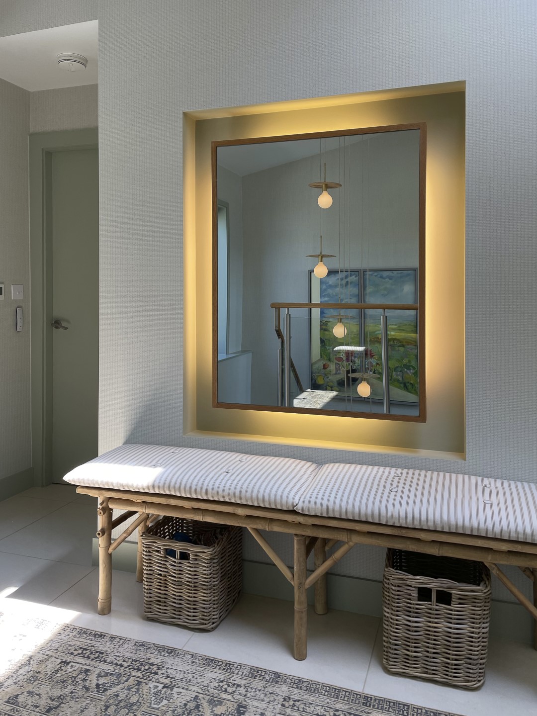
The other rooms on this floor are along a corridor leading from an atrium. This large space is full of light that comes in from all directions, amplified by a backlit mirror by the front door. “The mirror was there already, but the background was a stark white,” says Justine. “We softened it down.” The walls throughout the house are now a soft green, which makes a serene backdrop, enhances the feeling of light and space and tunes into the themes in the other rooms.
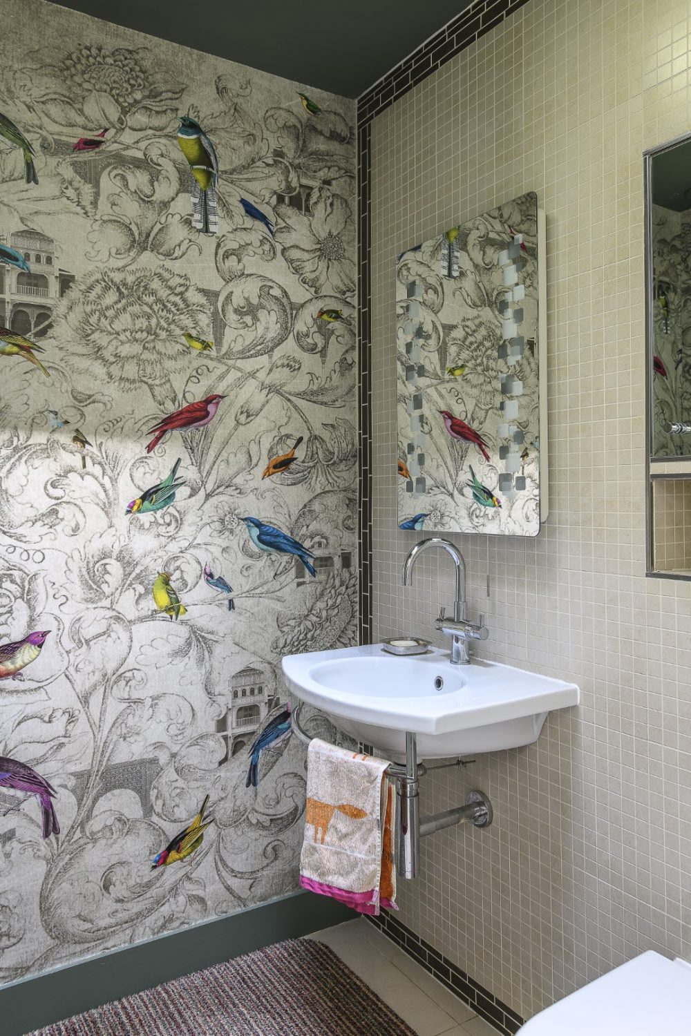
We pass the smallest room on the way to the master bedroom, wallpapered with a bold bird print from Rebel Walls – a case of going big in small places – and going bold wherever you can, as evidenced in the master bedroom.
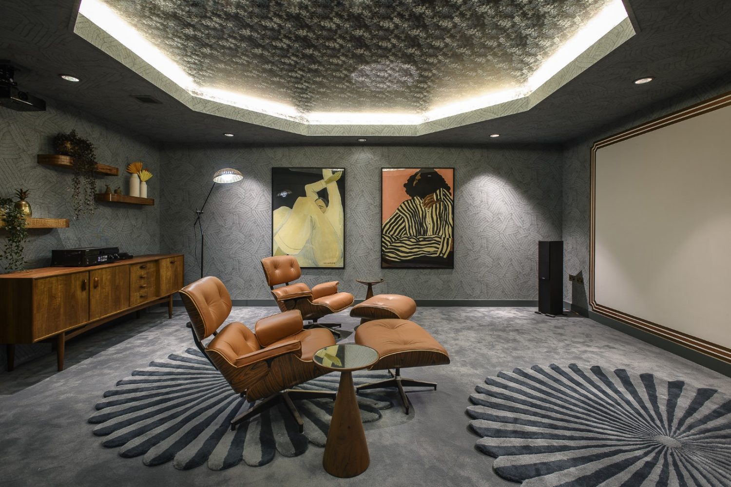
Justine had a lot of fun designing the cinema space, playfully harking back to the heydays of Hollywood with a 1930s vibe, and a nod to Pearl & Dean, all given a contemporary twist with some very textural wallpaper, a ‘feature’ ceiling panel and some sumptuous rugs by Niki Jones
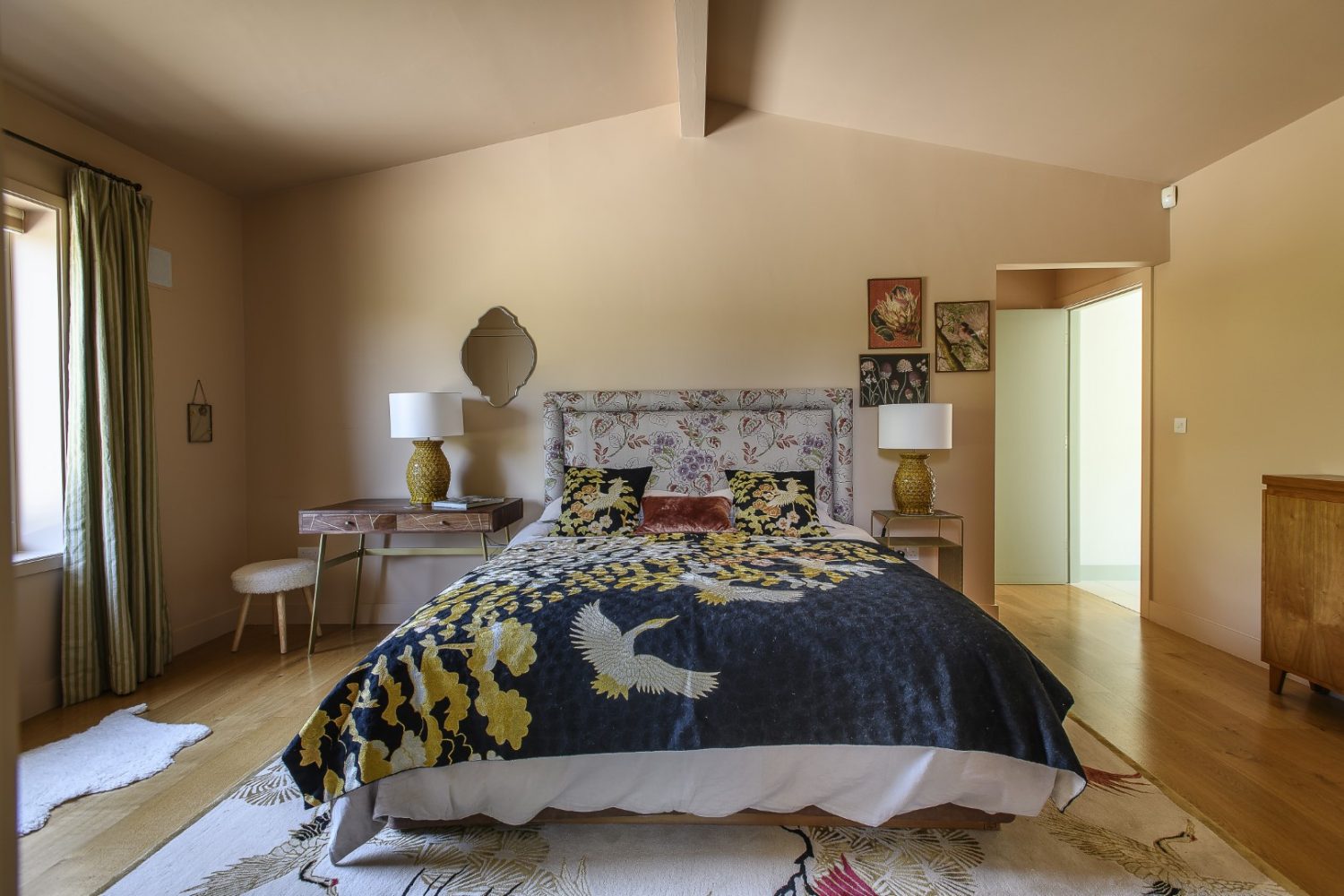
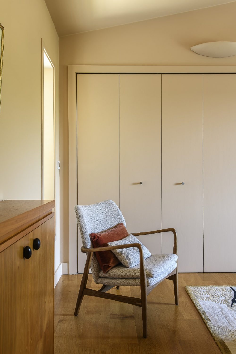
While it was the headboard in the master bedroom that was the inspiration for the decor, it is the fabulous bedspread and cushions that are the focal point. “The whole room, including the built in wardrobe, is colour washed which helps to hero the colours in the centre,” says Justine. There are simple curtains at the window, and keeping the background all one warm, soft colour is soothing and restful.
In the dressing room, Justine has ramped up the natural theme. “There are little nods to other rooms – I went back to revisit and pick up motifs and elements. It is all inspired by nature.” Cascading gently down the pale blue wall, as if creeping in from the sky above, is a delicate Clematis mural by Sian Zeng. “Its a small room,” says Justine, “but it’s high, so we need to make use of the height and raise the eye.”
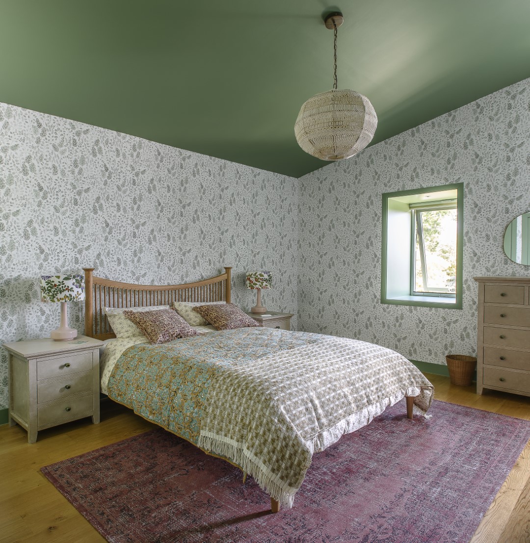
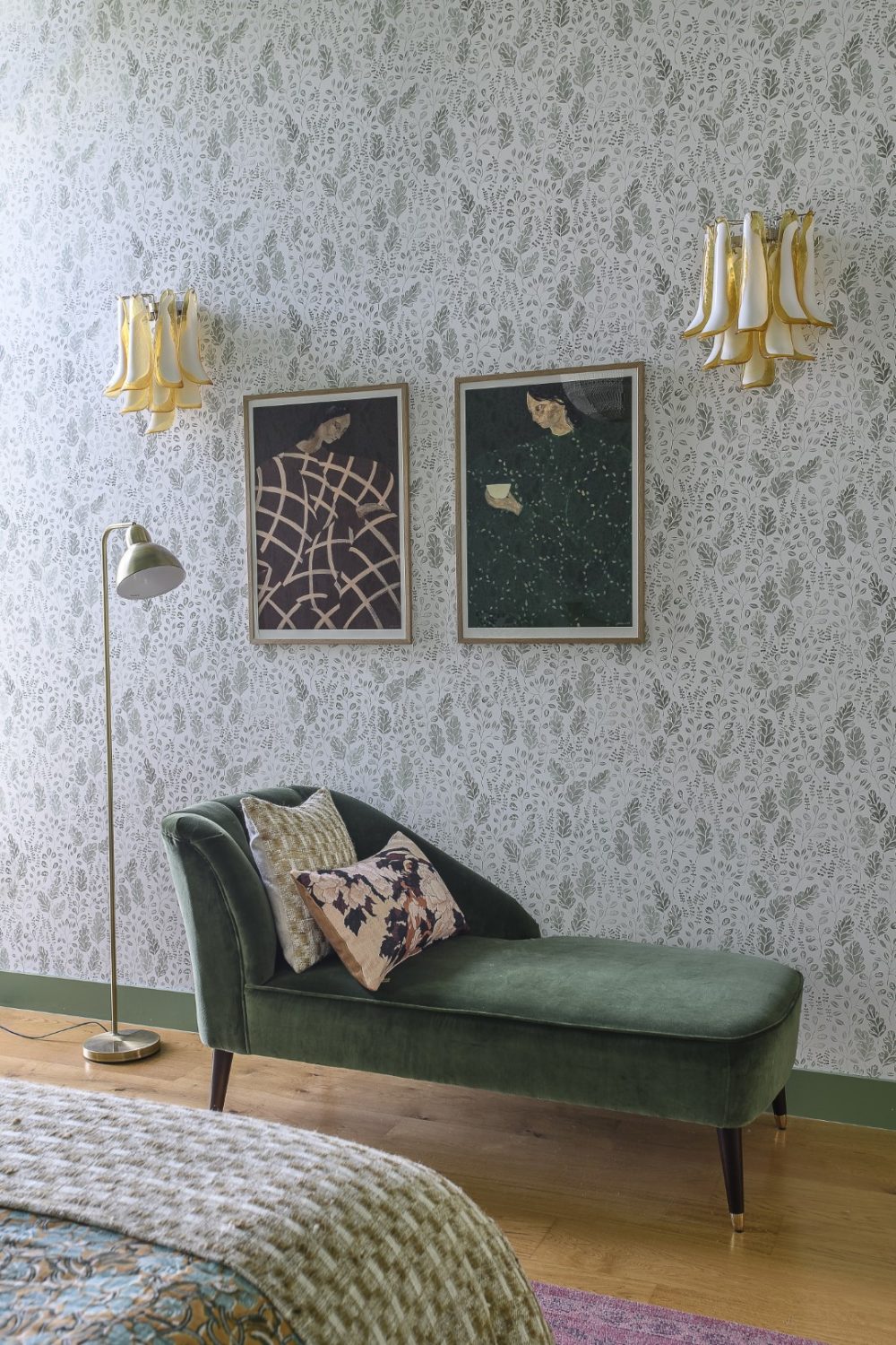
The colours in the spare room continue the mood with cool and gentle green shades. “The spare room was part of the third phase,” she says, “carrying through the same level of spec – it has a botanical theme and lovely views out over the garden.” The dreamily leafy wallpaper in here wraps seamlessly all the way around the walls – and then the fifth wall (the ceiling) has been painted deep sage green to match with the door and window frames and the chaise longue, which is the only other piece of furniture in this tranquil room.
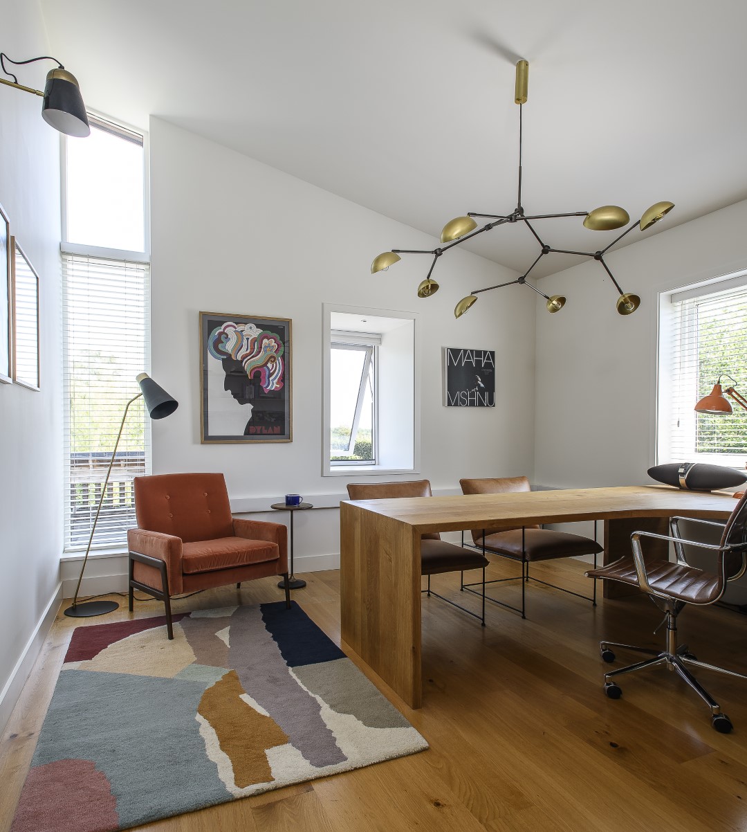
Another cool room, but this time, cool as in Danish mid-century, is the office. This was originally an architect’s studio. “The desk went all the way around the walls of the room. We’ve re-used it and the joiner re-fashioned it into a smaller desk that we moved into the middle of the room,” says Justine. Above the desk is a 101 Copenhagen light and completing the Nordic theme, original String shelving from the 1970s.
It’s hard to tear myself away from the living area (which is simultaneously on the ground floor and upstairs on the second floor). The owners admit that it would be easy to spend most of the time just living in here, but Justine has ensured that the whole of the house is put to use. “Tasks are related to rooms,” she says firmly. “Every room has a purpose – it’s important to use each space for what it’s intended for.” This way the design has integrity, each space can shine within its remit and the owners are encouraged to use all of the house. This is especially the case on the lower floor, where there is a gym, an office and – as part of the exciting third phase of the project – luxury of luxuries and all the enticement I need to go downstairs: a cinema room.
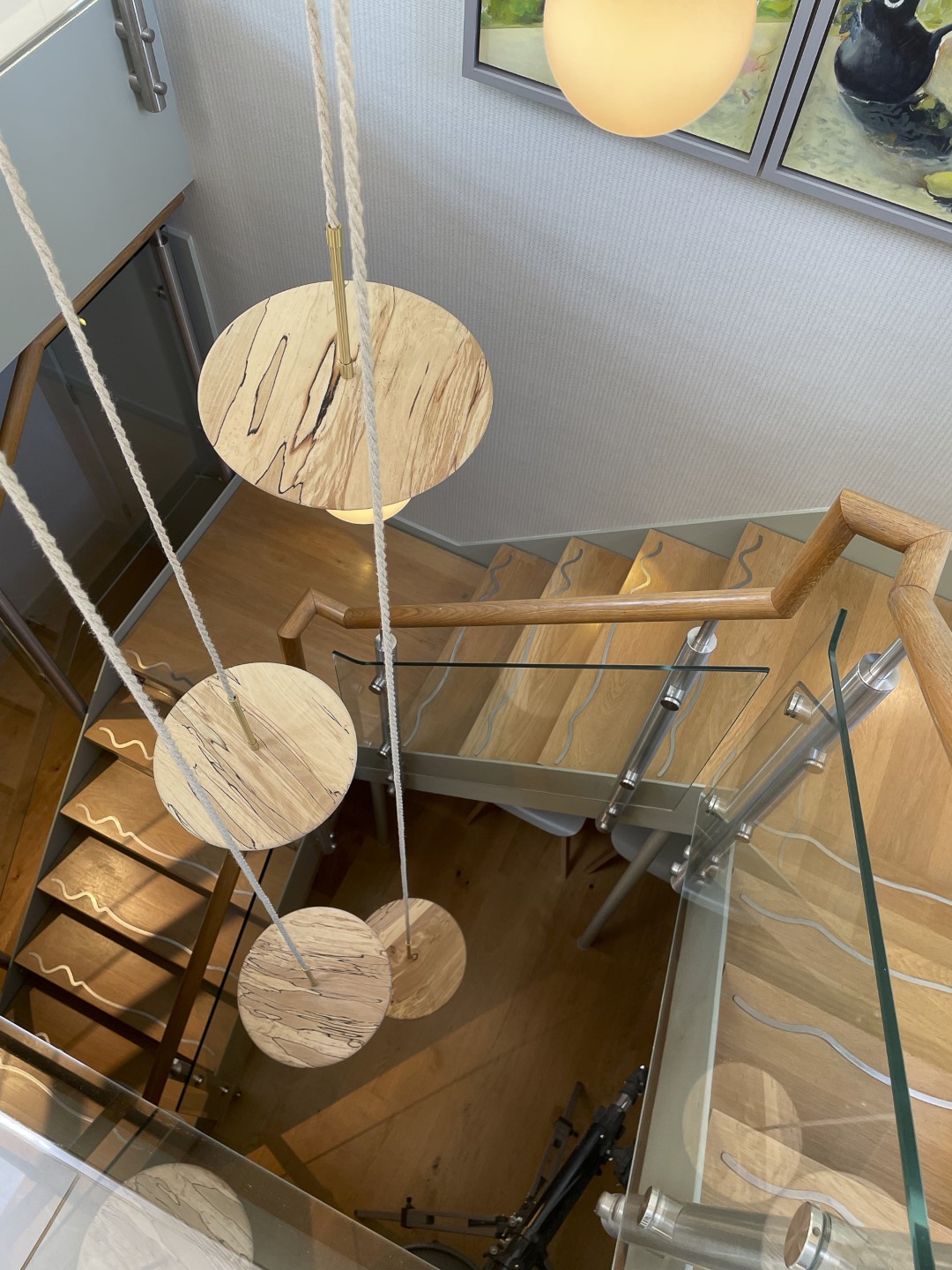
After pausing at the top of the stairs to admire the views through the centre of the house to the outside in several directions, my eye is drawn to the stairwell – and to the longest pendant light that I’ve ever seen. “There was a light here already,” says Justine, “but something bespoke was needed. The bulbs were from Spark & Bell and we commissioned a handmade multi-drop ceiling rose that they were able to assemble. It’s a natural looking structure that fits the space really well.”
Down in the cinema room there’s a big contrast with the light and airy upstairs spaces, but Justine has been careful to keep to a similar palette of colours, albeit more muted, plush and, well, cinema-like. This room has been recently finished and she is pleased with the result. She’s had a lot of fun designing the space, playfully harking back to the great days of cinema with a 1930s vibe, and a nod to Pearl & Dean, all given a contemporary twist with some very textural wallpaper, a ‘feature’ ceiling panel and some sumptuous rugs by Niki Jones.
Immediately outside the cinema room is the TV room – a space that was once a wide corridor, but now transformed into a sleek, but cosy place in which to watch television. The garden is accessed at this level too, through wide doors that lead out to another terrace and round the corner to an enticing swimming pool.
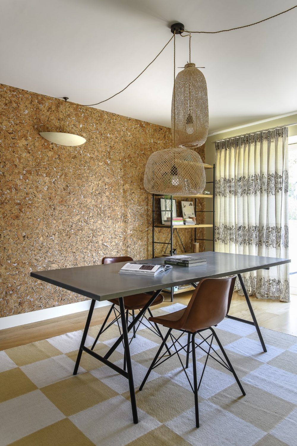
The large downstairs office/design room is made more airy with long sheer curtains, a neutral colour scheme – apart from one gloriously textural and really useful, cork lined wall – and simple, uncluttered furniture. The mood in here is cool, almost colonial, thanks to the cork wall, the large rattan pendant lights, fuss-free furnishings and the flat weave of a Nordic Knots rug. This room also leads out and up into the garden.
As we take one last look back through the atrium and out through the living area towards the view beyond, it’s clear that Justine has totally fulfilled her brief. What at first seemed an impossible task – a marrying of the interior with the garden and landscape, blending a pared back contemporary style with a mix of textures, patterns and colours, the softness of a botanical vibe and the sleekness of mid-century modern. This mash-up of ideas could have gone disastrously awry, but the owners, with the expertise of Justine and her team, have pulled it off – masterfully.
Address Book:
Visit barker-design.com to see a range of projects completed by Justine Hodgson Barker and her team at Barkerdesign
You may also like
Love where you live
Careful to inject plenty of each homeowner’s personality into every project, interior designer Jenny Branson’s gentle and measured approach has won her many clients who adore her use of colour, pattern and mood-lifting design There is something instantly connecting when...
Design Partnership
A family home has been reconfigured for modern living with the help of an expert team of designer, builders and architects who have managed to bring a little South African al fresco living to the heart of Reigate There’s a...
A House With Purpose
Charity founder Katie Dockery’s incredible home, designed by Richard Hawkes on the site of a former Qatari prime minister’s stud farm, has allowed her to create a safe and welcoming countryside retreat where she and her team tap into the...