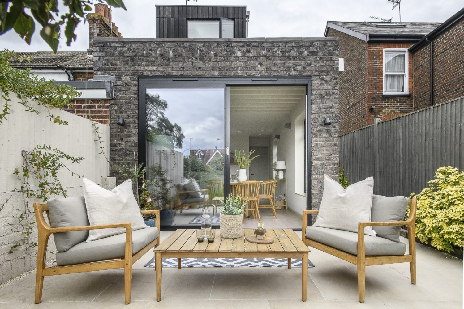
Architect Sophie and civil engineer Sarah certainly brought their work home with them when they took on the tricky extension of their own Victorian end-of-terrace. Making use of every centimetre of space possible, they designed side and rear extensions which are almost completely invisible from the front of the house
We’ve all seen weird and unbalanced loft extensions, ground floors that creep too far down the garden or jut out at odd angles. There are regulations set in place to guard against many issues, but it is hard to legislate for beauty and taste. Extensions can appear incongruous, charmless – or worse, be a faux copy of the original style, ending up neither matching nor contrasting, but undermining a building’s integrity. It is all too easy to focus on how the internal space will be, to focus on details and not think about the overall look – and end up with a weird box sticking out of the side of your house. Avoiding this can be tricky. Employing a good architect will help.
There are no photos of the front of Sophie and Sarah’s extended period home here, you will need to visit Sophie’s website sgarchitects.co.uk, or take my word for the fact that this is a shining example of how to extend. Both the loft and kitchen extensions have been designed with enormous care and attention to detail, inside and out, so that the end result truly enhances the external appearance of the property.
“The bricks on the extension are deliberately a different colour,” explains Sophie. “They tone in with the bricks of the original house, which are dark brown. There’s a contemporary contrast and juxtaposition – we didn’t want a pastiche of the Victorian.” The clever mix of bricks complements the original style, tying the old and new together into a cohesive whole on the outside.
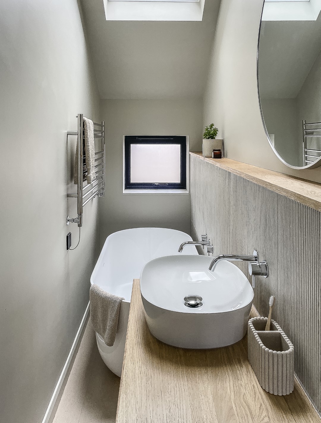
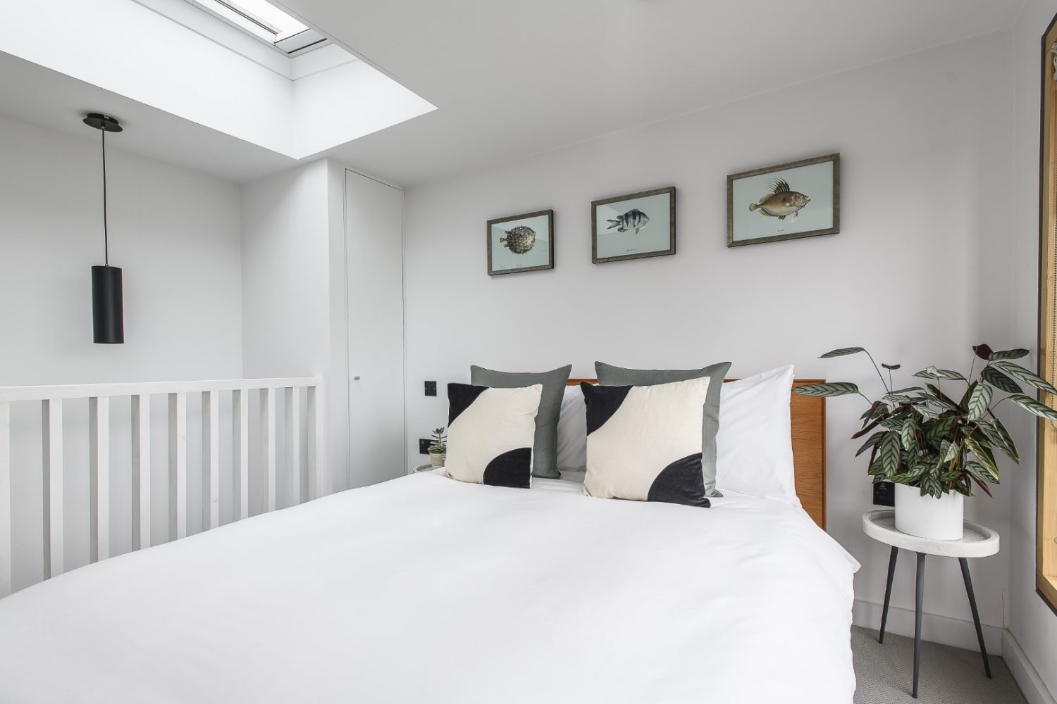
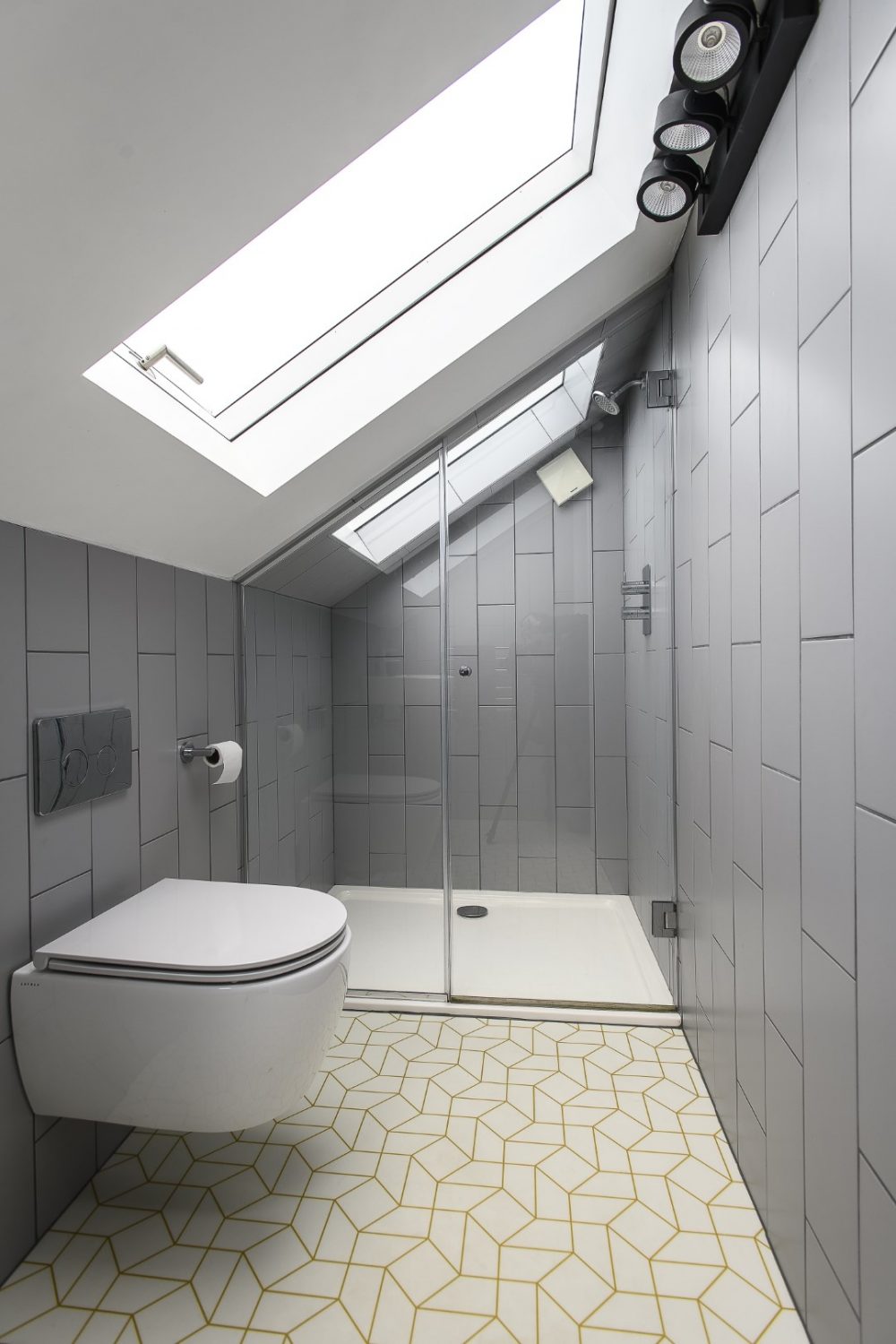
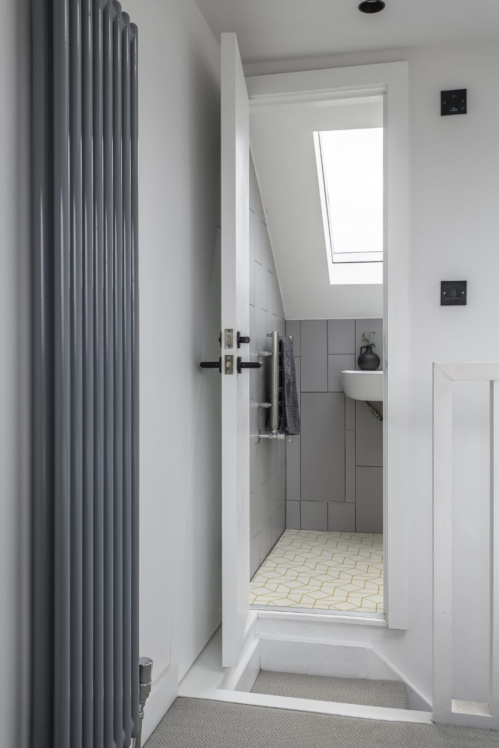
The careful blend of classic and contemporary continues throughout the interior, and the new spaces blend seamlessly with the original. It has all been very well thought out, but when the couple first bought the house it was far from certain that they’d even be able to do a loft conversion, as Sophie explains. “For my work I do lots of loft conversions. Sarah asked if we could do a loft here, and if it had been a client asking, I’d have said no, because the roof ridge height was lower than ideal; through careful planning we were able to find a solution with a large dormer at the back and rooflights over the en suite which is tucked into the slope of the front roof.” This has meant that they’ve managed to squeeze a whole bathroom into what normally becomes a cupboard or waste of space. It was a tight fit though and the shower door had to be made and fitted precisely to match the angle of the ceiling.
Ingeniously the staircase up into the loft is not separated into what could have been a gloomy, narrow access point, but incorporated into the room, so that valuable space is saved and the third floor feels open and airy.
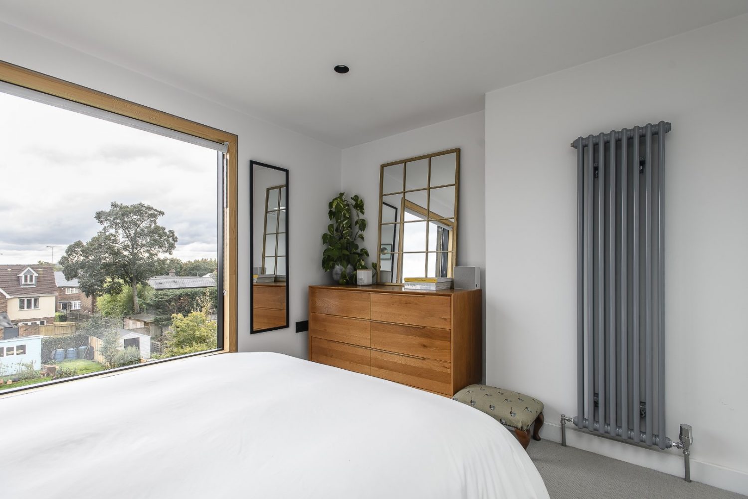
Light comes flooding into the loft room through a large window and from the rooflights. “The picture window runs full width at the back, which brings in so much natural light. It is a lovely place to wake up in – and have the view.”
The loft extension was the first project the couple completed when they moved in, and Sophie has a huge tip for anyone going through the house renovation or extension process, especially undertaking work in phases, as and when affordable. “When we first moved here it was a two bedroomed house with one double bedroom and a single. We decided to do the loft extension immediately to create an en suite bedroom, which meant we could have family and friends to stay, and that we had also turned it into a three bedroomed house. Doing it this way – rather than doing the kitchen first, as many people do – meant that we added tangible value straight away. You add far less value doing a kitchen extension than if you add a bedroom and bathroom.”
Imagining the mess that loft conversions create, it makes sense to start at the top of the house, but it was a massive help money-wise too. “We had always imagined undertaking work in phases and by converting the loft first we were able to remortgage and release equity to finance the later extensions,” says Sophie.
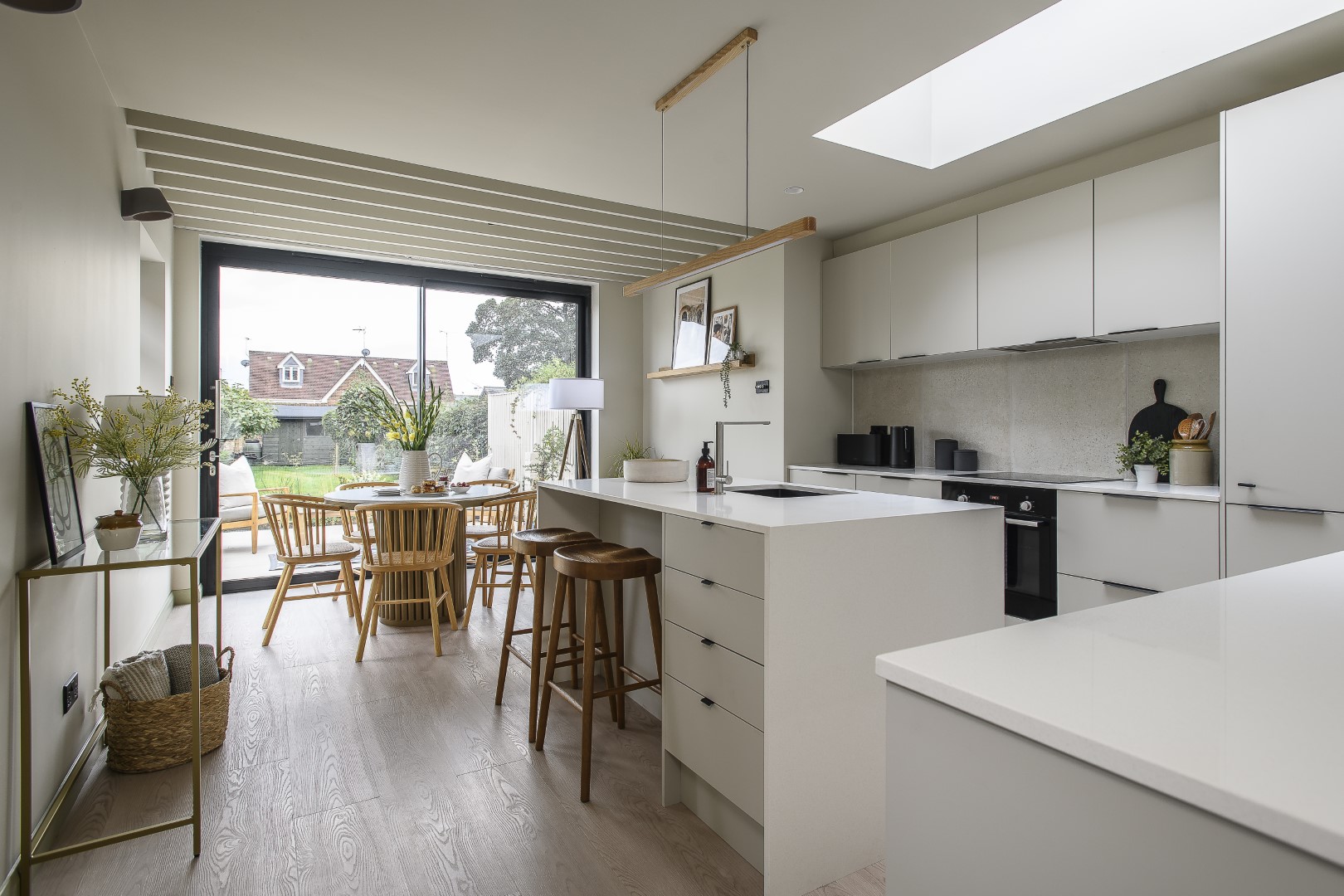
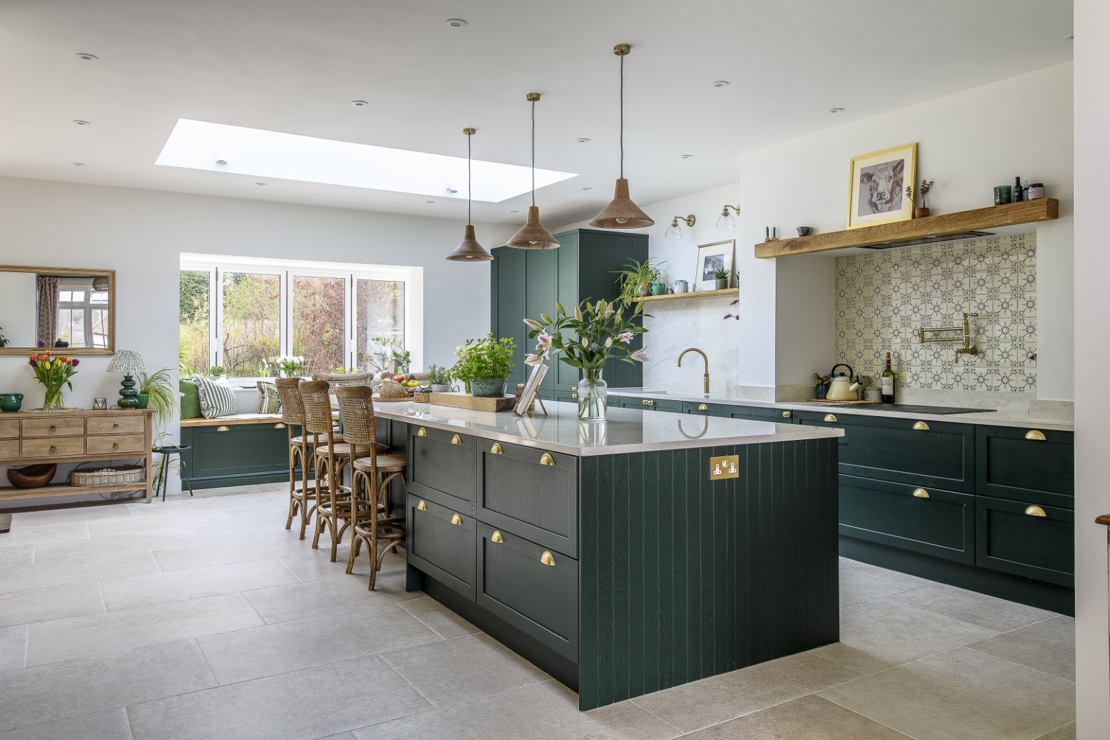
By the time they were ready to start on the kitchen – something they’d been itching to do, due to the poor layout of the existing downstairs rooms – they had a much clearer idea of how to make it flow. “If possible, it’s best to live in a house for a time before making changes,” she says, “to see how the light comes in – how to make the most of that and the space.
“There was already a 1980s extension with a kitchen and a loo at the back,” she explains, “and we badly needed to change that because the best view of the garden on the ground floor was from the loo.”
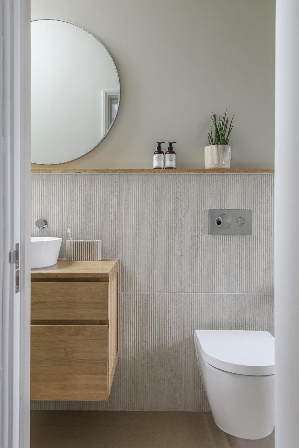
An understanding of scale and proportion helped them to be bold and create a workable and beautiful space downstairs. “We were keen that the extension didn’t push further into the garden than the previous footprint of the bathroom, so the extension is very modest and makes use of the dead space that existed to the side of the house. By adding just over a metre in width, the transformation of the space is staggering. Upstairs it has made a very narrow family bathroom,” she adds, “but it works well.”
Another successful addition is the living roof on top of the kitchen extension, which acts as a leafy thermal regulator. “It’s great from an architectural point of view – cool in summer and warm in winter, like having a carpet on the roof – and an extra garden.” The only problem with it was the installation. “Having upsized the roof joists to support the additional weight, we had planned to lay the green roof ourselves if the budget allowed at the end of the project. We hadn’t anticipated the sedum sheets being as large and heavy as they were when they arrived fully saturated after heavy rain, so followed a comedy sketch-worthy process of Sarah cutting the sheets in half to carry them upstairs through the house, soil dropping as she went, to pass them through an upstairs window to me to lay. Thankfully the joints grew over very quickly and now it looks lovely – and there are bees all over it in summer.”
“There was already a 1980s extension with a kitchen and a loo at the back, and we badly needed to change that because the best view of the garden on the ground floor was from the loo.”
The living roof blends well with the natural look of the charred texture on the wooden clad extension above – achieved via a Japanese wood preserving process called Shou Sugi Ban – which in turn blends perfectly with the brownish bricks of the kitchen extension.
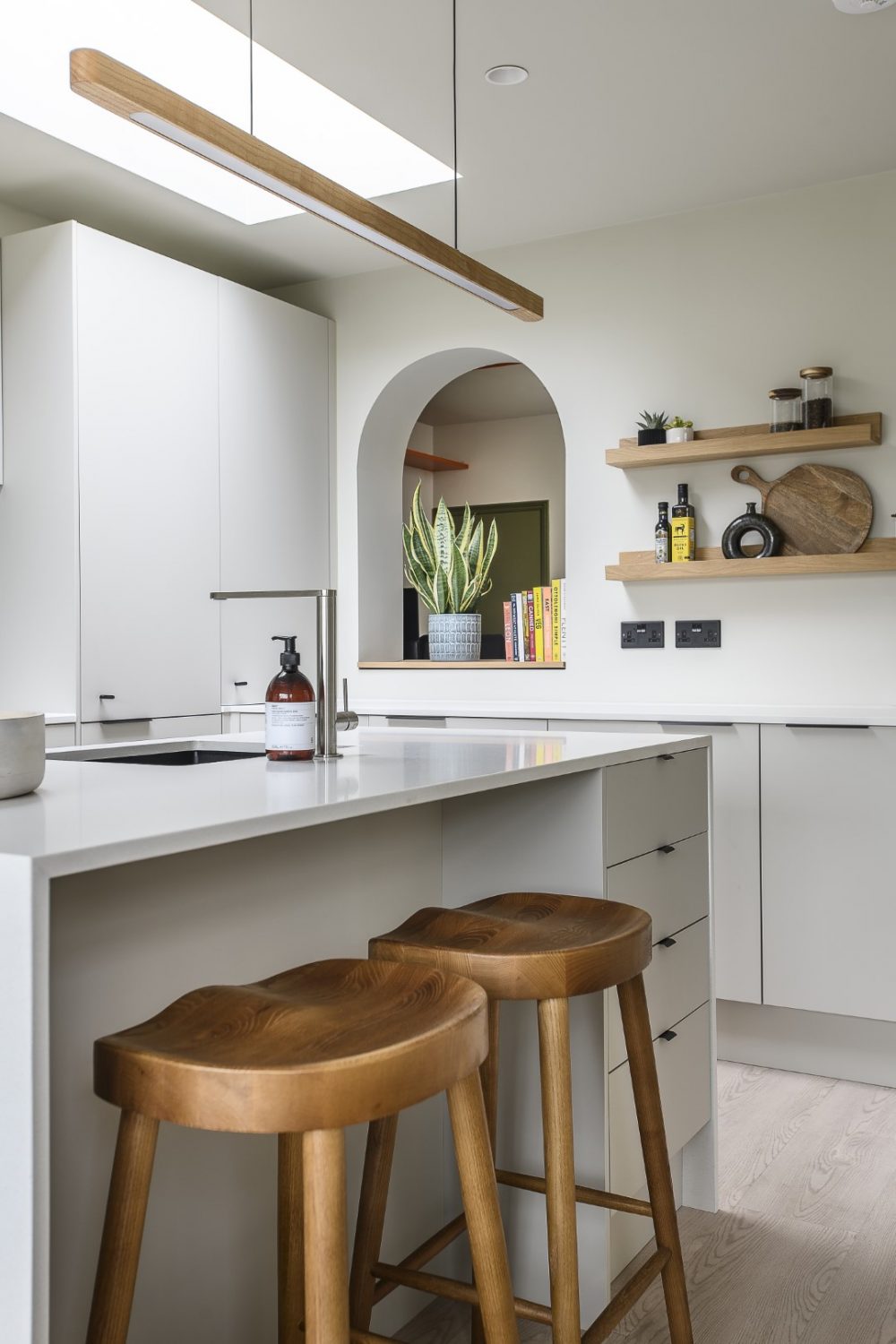
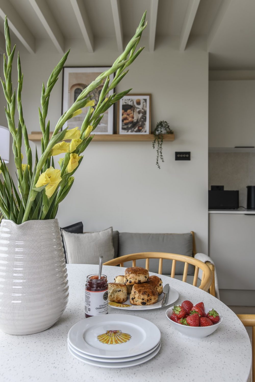
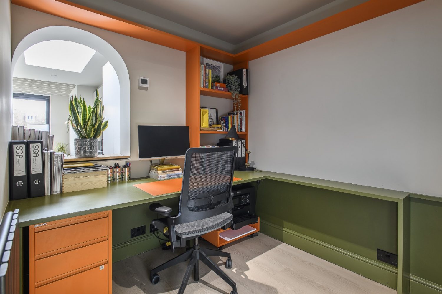
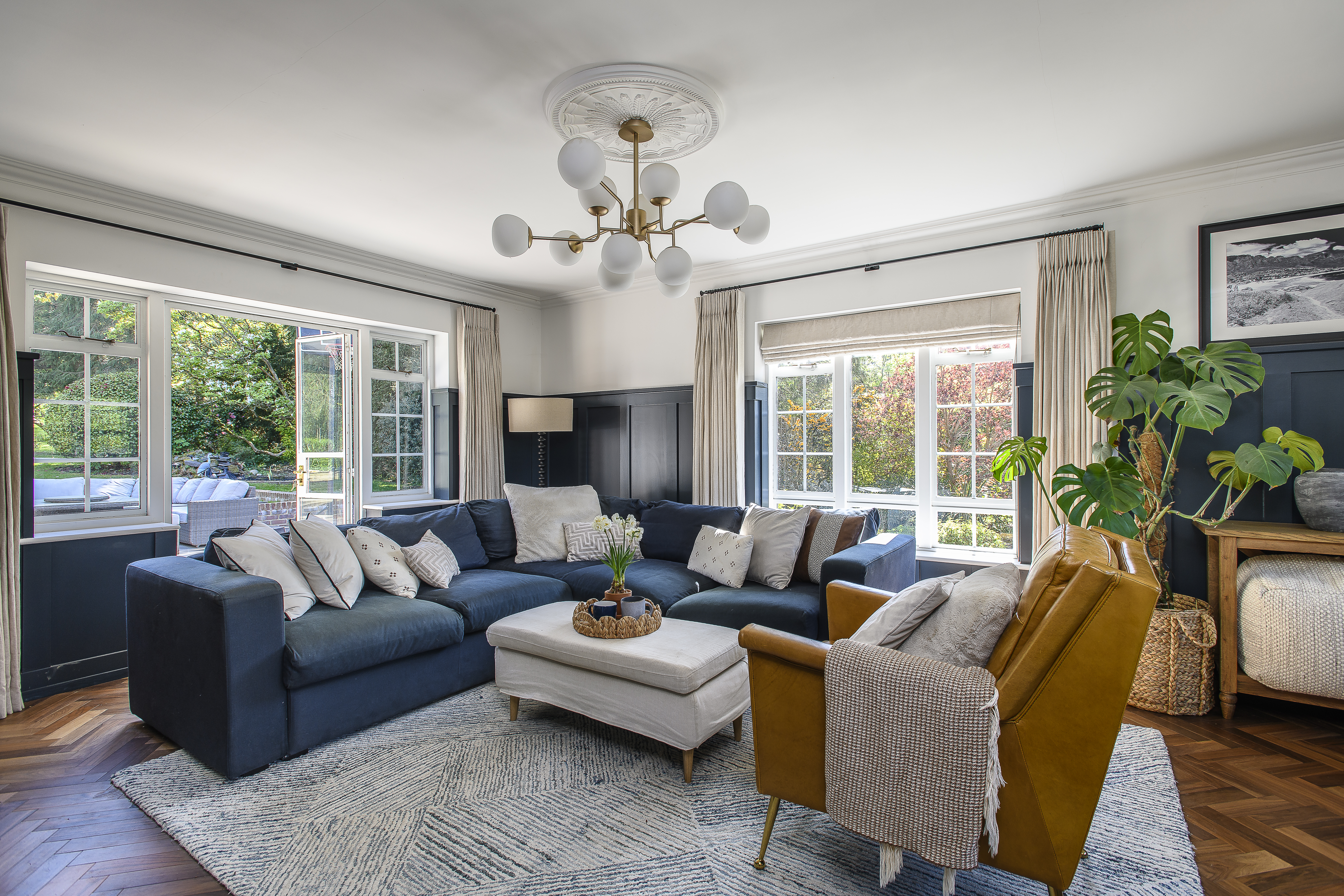
There is an uninterrupted view from the front entrance through to a huge sliding door at the other end of the house, that leads straight out into the garden, so that light floods all around the ground floor. A room that could have been dark and poky is Sophie’s study, but this borrows light from the kitchen through what was an original opening into the galley kitchen, now cleverly made into an internal archway that links the two rooms.
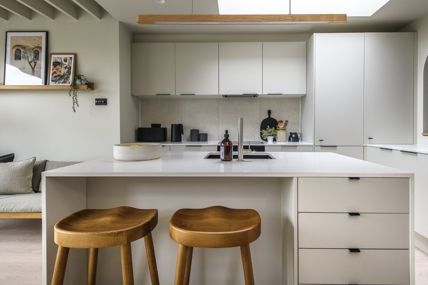
Small Victorian houses have a tendency to be cramped and dark, divided into several small rooms, but by opening up the new kitchen and dining space, Sophie and Sarah have brought in masses of light. They have added in more windows in the form of rooflights. “A key to creating a feeling of space in a small house is to use light cleverly,” explains Sophie. “Ask to add rooflights to bring light into the darkest corners – they can make a huge difference.”
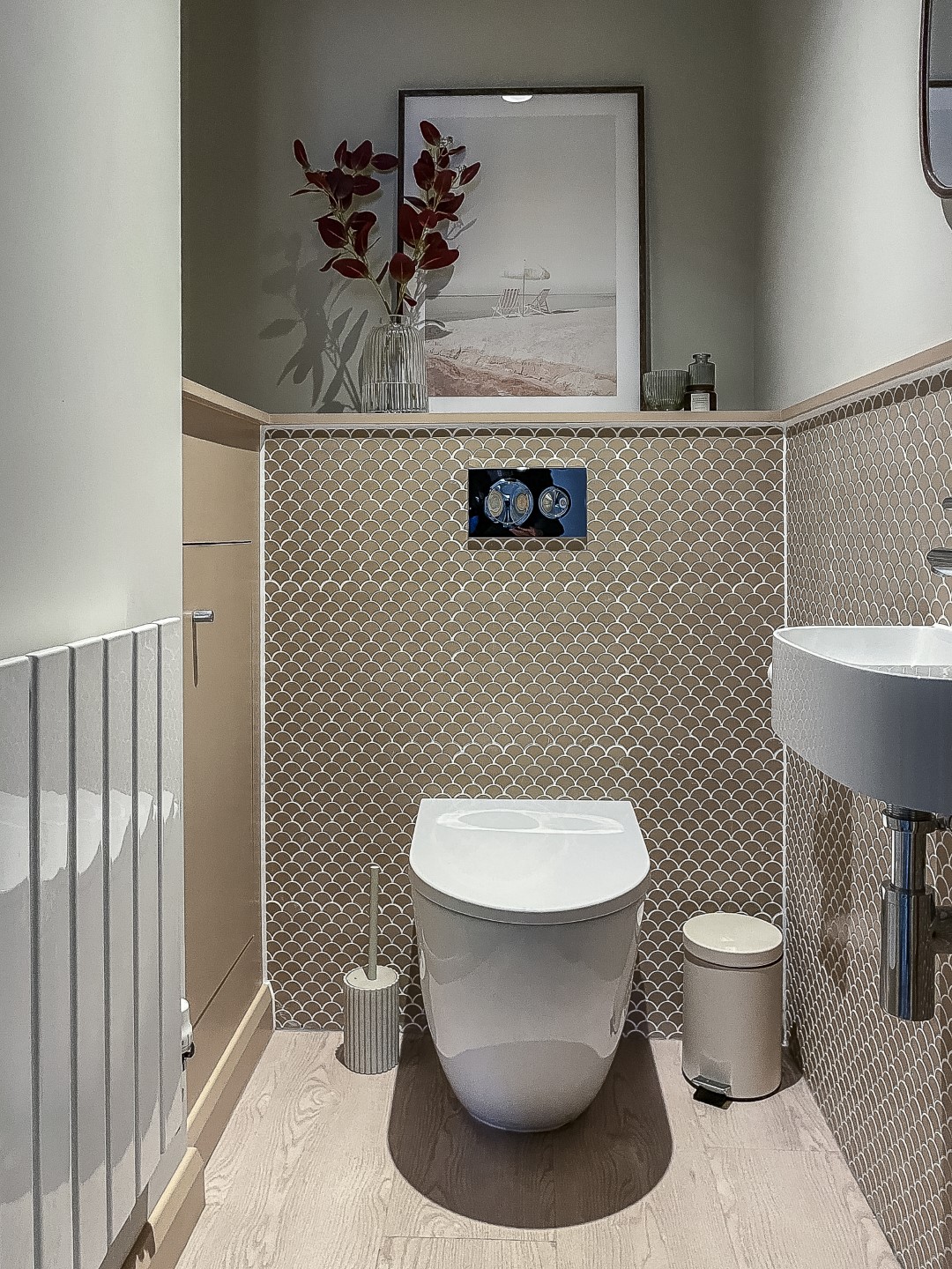
But it is the streamlining of the space that makes the main living area feel so calm and open. The walls and ceiling are painted in soft oatmeal or off white throughout. The floor tiles are a similar colour too, which creates an almost floating effect. “This is what makes it feel spacious,” explains Sophie. “You can then bring colour and warmth to the space with artwork and plants, and use shelves and objects. We have a great interior stylist, Molly Hill, who has helped us create the look.” Having the main living area all as one and co-ordinated all the way through allows for some of the smaller rooms to have their own characters. The loo has been tiled with quirky salmon coloured scallop tiles. Elements in Sophie’s study – her desk and shelving units, tucked behind the arch – have been made in her company colours of bold green and orange.
Detail is important, as is working with trusted suppliers, a case in point being their builders Sixmile Construction, who Sophie has worked with on many projects. “That’s how I approach my projects with clients,” she says, “it’s all about the smaller details and gaining an understanding of one another, so that you and your wider team are always working together.”
“I always start by using hand drawing to communicate ideas to clients – CAD software looks so final and is not collaborative in the early stages of design – it’s vital to understand how people live and what’s important to them. It can be a bit like being a therapist at times,” she adds, and it’s obvious that it’s something she has a flair for.
There are some brilliant tips and solutions to space issues here – insights gleaned from the lessons learned in creating both their previous flat, this house and from Sophie’s experience in helping her clients achieve their aims.
Period houses can be tricky to update sympathetically. Transforming small dark rooms into light and spacious living areas, without ruining their character, is hard. Expanding an existing building, while preserving the spirit of the original, harder still. It takes empathy, respect and an understanding of how to best inhabit a space to make it fit for contemporary living and at the same time retain a sense of place. Using Sophie’s architectural experience, Sarah’s engineering prowess and the combined skills of their interior specialist and building contractor, they have more than achieved it here.
Address Book:
To speak to Sophie about a design project,
visit sgarchitects.co.uk
- words: Jo Arnell
- pictures: David Merewether
You may also like
Love where you live
Careful to inject plenty of each homeowner’s personality into every project, interior designer Jenny Branson’s gentle and measured approach has won her many clients who adore her use of colour, pattern and mood-lifting design There is something instantly connecting when...
Design Partnership
A family home has been reconfigured for modern living with the help of an expert team of designer, builders and architects who have managed to bring a little South African al fresco living to the heart of Reigate There’s a...
A House With Purpose
Charity founder Katie Dockery’s incredible home, designed by Richard Hawkes on the site of a former Qatari prime minister’s stud farm, has allowed her to create a safe and welcoming countryside retreat where she and her team tap into the...