Years of absorbing so many images, of desiring so many things, of flirting with trends and decorating fads have made me understand how helpful rigour can be. How freeing. Several decades ago, I met a girl who only dressed in black and white; some days all white, others all black, and she would also mix the two. She always looked wonderful in her self-imposed uniform; elegant, crisp, classic, like an MGM movie-star publicity shot. She stood out. And I’ll bet my Farrow & Ball paint chart that getting dressed was easier for her than it ever has been for me, with my magpie approach to clothes. I’m sure she would look just as smart today. She might have changed details and silhouettes, but her no-colour edited wardrobe would always ‘work’.
Scrolling through hundreds of stylish monochrome interiors on Pinterest convinced me that applying the same black and white formula to the home was an approach every bit as chic, effective and timeless as the Uniform Girl’s wardrobe. Should I consider a colour cleanse? I’ve always veered towards large doses of white or grey but could never resist adding a dollop of turquoise, chartreuse or pale pink somewhere or other. What would it be like to eschew colour completely? How do people do that? And why do they resist the siren call of the paint chart?
After much research, I’ve discovered that the reasons for limiting a scheme to neutrals are almost always the same. Monochrome interiors are restful, timeless and practical. By restricting the colour palette, any number of eclectic elements can exist happily together, inexpensive or simple things look more sophisticated and decorating decisions are made easier. Creativity flourishes within the boundaries of black, white, grey and all the shades in between.
Monochromists seem to divide into two camps: those who err on the brighter side, preferring shades of white, light-flooded rooms, pale or bleached floors and a smattering of black for details; and the others, who would happily swap day for night, veering towards darker neutrals and unafraid of the liberal use of black, creating rooms that are enveloping retreats. Both tribes understand how to shift the balance of light and dark when needed, reserving black for a bedroom or white for a kitchen, where light keeps the mood energetic rather than soporific.
Committing to a monochrome scheme might sound restrictive, but it affords the decorator considerable freedom to experiment with mixing pieces from different decades, adding pattern and layering texture. If it’s all neutral, it all works together; there’s a flexibility that allows you to change your arrangements without having to wonder ‘Where can I put that chartreuse upholstered chair now that my living room is turquoise?’ It might take some discipline at first, but once you start editing, decisions become remarkably simple. Those hours spent contemplating paint swatches, combining them, imagining a way for all the different spaces in a home to flow visually, creating a cohesive whole are over.
There is a sub-tribe of monochromists who have not abandoned colour altogether but who opt for grey in all its variety. That might mean lilac-tinged feminine shades, a rich brownish grey the colour of dried mud and beach pebbles or a greenish sea-grey and so on. Grey is a softer, more subtle option that works best when combined in several different tones and saturations.
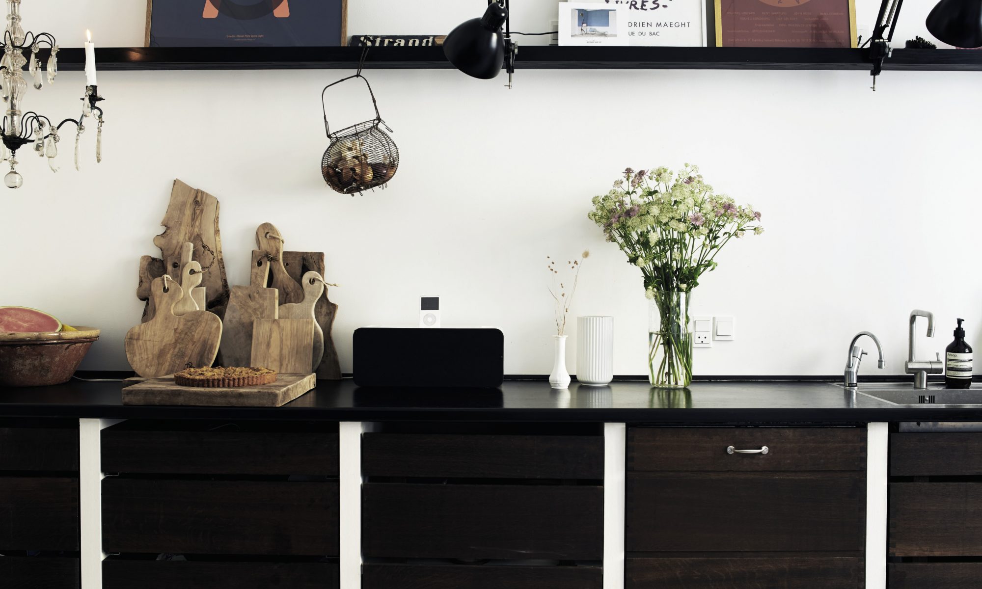
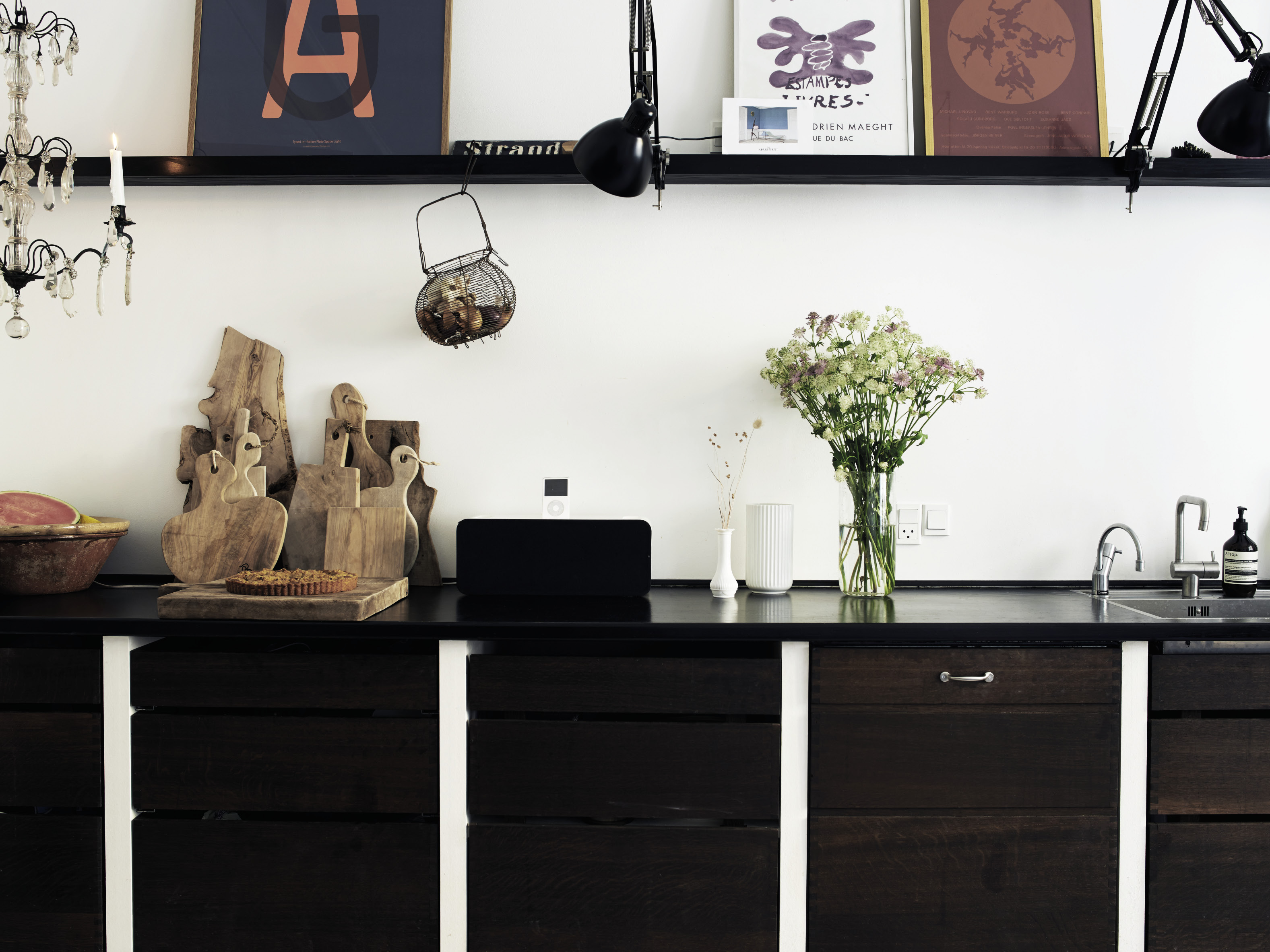
Black & White
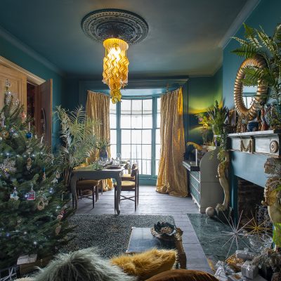
White loves black. Black loves white. Exploiting their symbiotic relationship builds an interior that is timeless, flexible, practical and liberating. The interior that combines both black and white is greatly affected by the balance of each, the percentage of one extreme to the other. The white envelope approach (with both pale walls and floors) that wraps a space in light demands some defining characteristics if it is to be anything but a blurry snow scene. Mixing black furniture, black and white photography and a lamp or two adds punctuation to a room, and a rug combining both colours will ground it; there is something awkward about a room where objects float, offering nowhere for the eye to rest.
Given that paint companies offer so many temptingly named versions of white or black and a variety of finishes from matt to shiny, the monochromist has many choices to make: chalkboard paint is a softer black that works well with vintage and antique pieces, while gloss and lacquer suit crisper modern spaces. Brilliant whites have a more contemporary feel than softer shades, which sit well next to objects with some patina and age. Texture is all important in the monochrome interior, which relies on the tension created between hard, soft, rough and smooth to add character.
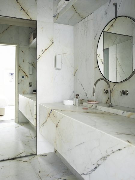
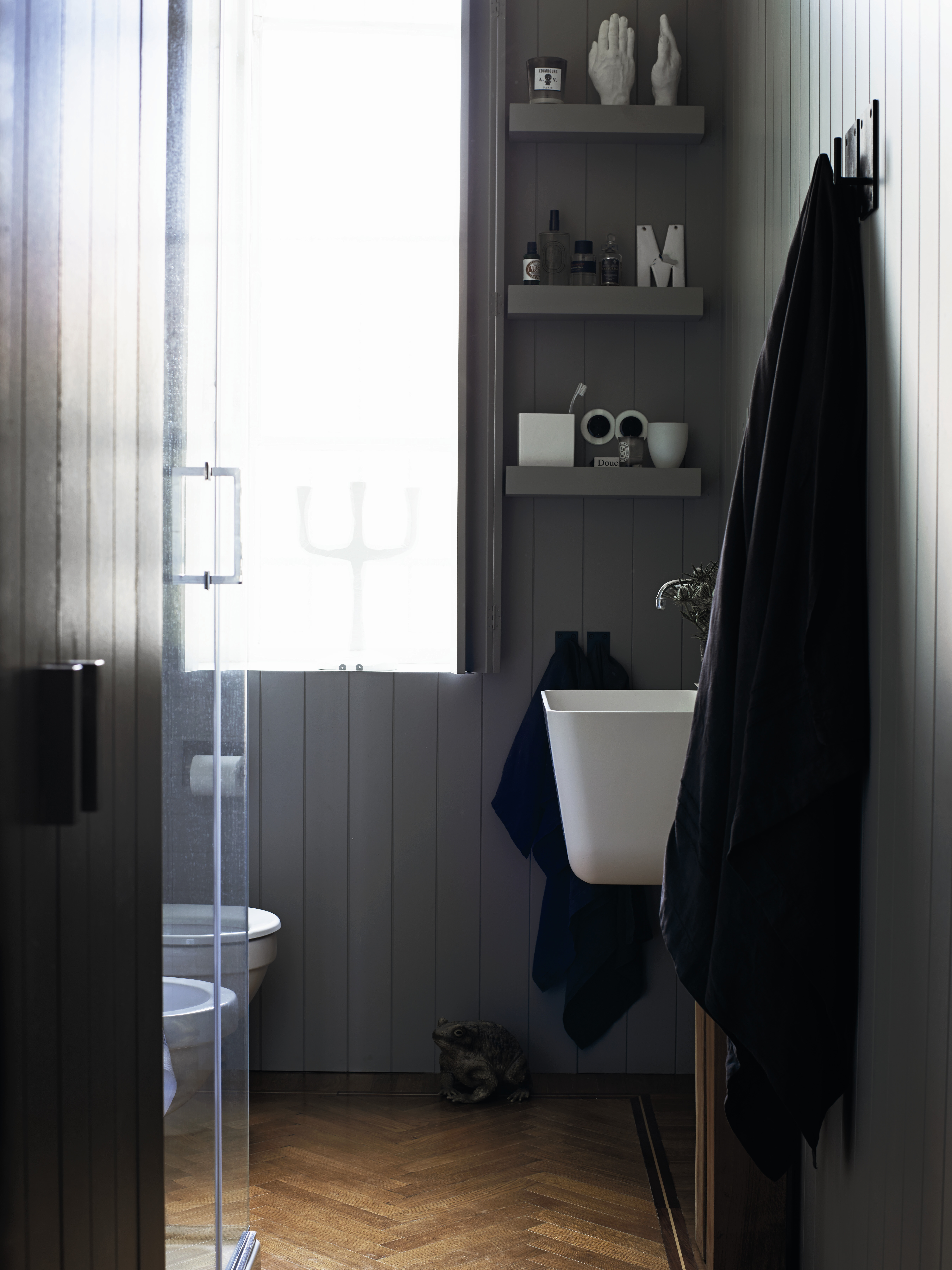
Grey Matters
Welcome to the middle ground. The uninitiated might accuse the grey interior of a tendency to blandness, of being as dull as the proverbial dishwasher, neither one thing nor the other, a cop-out for the undecided or those that prefer to play safe. But as ever Farrow & Ball paint chart aficionado can testify, there is much more to grey than a politician’s conservative flannel suit. Fashionably complex greys with names like Pigeon, Down Pipe or Plummett are far from a basic mix of black and white. The most successful execution of a grey-on-grey scheme combines several paint shades (with green, blue, brown or violet undertones) and naturally grey materials such as slate, zinc, steel or wood weathered to a shade of silver.
The éminence grise delights in it for its mutability; grey may be warm or cool, it plays nicely with other colours, tones down brighter shades and illuminates softer ones. It is calming and restful and, when used judiciously, far from boring. Dutch master colourist Axel Vervoordt uses the most sophisticated range of greys in the soothing interiors he designs: shades that veer towards green or brown, letting light, texture and scale operate as the decorative elements completing his sober colour schemes. In Sweden, 18th century Gustavian interiors employed a pale blue-grey as both the backdrop and the shade used for painted furniture popular at the time, a device which produced some pared-down but atmospheric interiors that made the most of the available light.
Shades of Pale
There are countless good reasons to choose white. So many, in fact, that I’m baffled by people who insist on asking if I don’t worry about it being cold, sterile, empty. No, no and no, I reply, quite the opposite. White is reflective, peaceful and restorative. It is the optimum choice for Scandinavians, who live in a harsh, chilly climate under leaden grey skies for much of the year. Their interiors are made for comfort not ostentation, but they have developed an extraordinary ability to create relaxed yet simultaneously sophisticated homes that put human life and its quotidian needs at the centre of design. They choose white because it maximises the daylight that they do have and because it serves as the perfect neutral, unobtrusive canvas for their furniture and decorative objects. White and its related shades of pale seem to enlarge a space. Not only do Scandinavians like to paint their walls white, but they are also keen on cloaking floors in coats of heavier-duty white floor paint or rubbing a liming paste into wooden boards so that light bounces around from surface to surface. White isn’t tricky or self-conscious; it doesn’t dominate or demand attention but simply allows you to focus on living your life, to lend your character to it.