Tucked away in a peaceful street, Matt Setchell’s beautifully colourful apartment is testament to the motivation to open his shop – to spread more joy
We are in Hastings – the town that welcomes day trippers and here-to-stay creatives in equal measure. The sea air, the coastal light and an edginess – the liminal space where the land meets the sea – inspires artistry and a salty sense of adventure. Stepping into the home of Matt Setchell, owner and creator of Dept of Joy in St Leonards on Sea, it’s evident that he embodies a bright and colourful sense of creativity and a clear vision – honed long before he came to live here, but set free in recent times.
“I moved here from London,” says Matt. “I lived there for 28 years before this.” It was a hectic life, with a career as a consultant working with major names in the fashion industry, and as Creative Director for Net-a-Porter Group and ASOS. Life in fashion’s fast lane takes its toll though. “I woke up one day and thought; I can’t do this any more,” he says. “So I went travelling for a while, then came back and started building up some clients.” Still working in fashion, but on his own terms, and at his own pace.

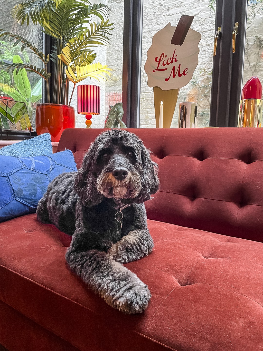
Then, out for a walk one day with his dog Dexter the cockapoo, came an out-of-the-blue, life-changing moment. “I was on a zebra crossing one minute, taken out by a car the next.” Luckily both he and Dexter survived, but the healing process took him 18 months – of physical and mental recovery. A long, slow period within which the seeds of his latest venture were sown. “It takes something like that to make you stop and think about what’s important in life.” He pauses. “Something changed. Then out of the darkness came two things.”
The first was the need for joy. “Joy brings purpose,” Matt says, “we all need more of
it.” And the second, following on from this, a method for spreading positivity. And so he designed his first print: the ‘Joy’ print. A framed square of yellow. Because joy is yellow.
From that first design more prints ensued, and from these first steps the Dept of Joy has followed – because joy is nothing unless it is shared – with Matt opening his shop last June. Mantras for daily life now appear on greetings cards and gift wrap in the shop itself: ‘Always keep a little joy in your back pocket’ one says, whilst ‘Something joyous this way comes’ is Dept of Joy’s strapline, used on stickers for wrapping at the cash desk.

“Joy brings purpose,” Matt says, “we all need more of it.” And so he designed his first print: the ‘Joy’ print. A framed square of yellow. Because joy is yellow
The space had been an art gallery before and Matt admits that people thought it was another gallery for a few weeks after opening – and after all the space has been artfully designed – with the bright colours of the prints and other merchandise popping out brilliantly from a soft grey backdrop. It’s an uplifting space to be in, and that’s the point really. “If people come in with a frown and leave with a smile, that makes me super happy,” he says. “They don’t even have to buy anything.” Although it’s very hard not to be tempted by the beautifully curated and joyous items on display: a small masterclass in how to bring more colour into your life.
Matt feels that – as well as joy – we all need more colour. “People are scared of colour.
It’s a confidence thing. Colour is something you practise. Colour therapy.” He muses, “Hmm, maybe I could even run little workshops – joyful and creative make-your-own sessions.”
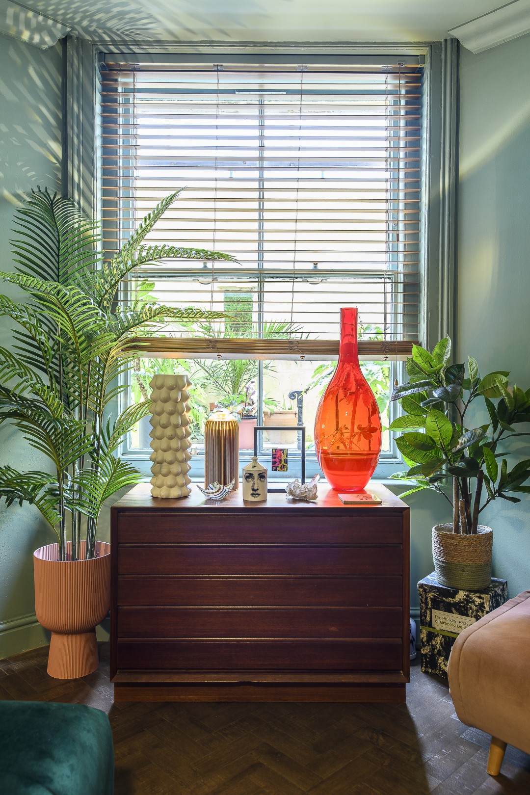
Interestingly, the soft grey background of the shop has not been replicated in Matt’s home. “I love colour, but the colours in my home are more muted than in the shop. I’m always playing with colour. I was talking with a friend and saying white’s going to come back. People want purity, but there are so many shades of white. Stark white is just too much; I like the brighter, paler tones in the shop, but in an interior it can be overwhelming. At home you need to relax and have a more subtle palette and a calmer feel.”

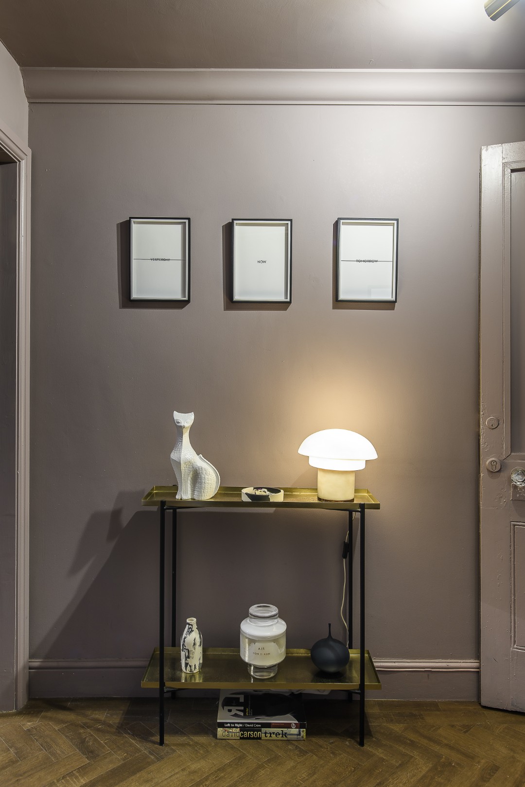
In the entrance hall the first impression is playful, but controlled. A Jonathan Adler cat and a mushroom lamp welcome you, along with a warning in three of Matt’s own prints above, where framed words ‘yesterday’ and ‘tomorrow’ are struck through leaving bare the central print ‘now’ – a reminder not to be caught either looking back or forward, and to live more in the present.
The colour on the walls – and ceiling – are a mushroomy pink that shifts as the light changes through the day, proof that neutrals don’t have to be beige and pink isn’t always sweet. The ceiling is painted in the same colour: Matt is “a big believer in ‘lids’”.
“It gives a complete sense of the space,” he says. “It makes you feel as if you are really in the room.
This whole thing of white ceilings is odd to me.” It’s one of his signature design tricks – colour that wraps. Walls don’t stop abruptly at the cornice, but continue up and across, creating an immersive, finished feel that also helps to make a smaller space feel deliberate and not compromised.
The floor is the same throughout, which brings a unifying underscore, but the process of uncovering the original floor and then laying the new one was a bit of an ordeal. “It was awful when I moved in, covered in a horrible carpet, and I thought to myself ‘once I lift this, there will be a good floor underneath’.
But it was concrete and all uneven and terrible. It took my builder brother a month to remedy it, laying individual LVT tiles throughout.”
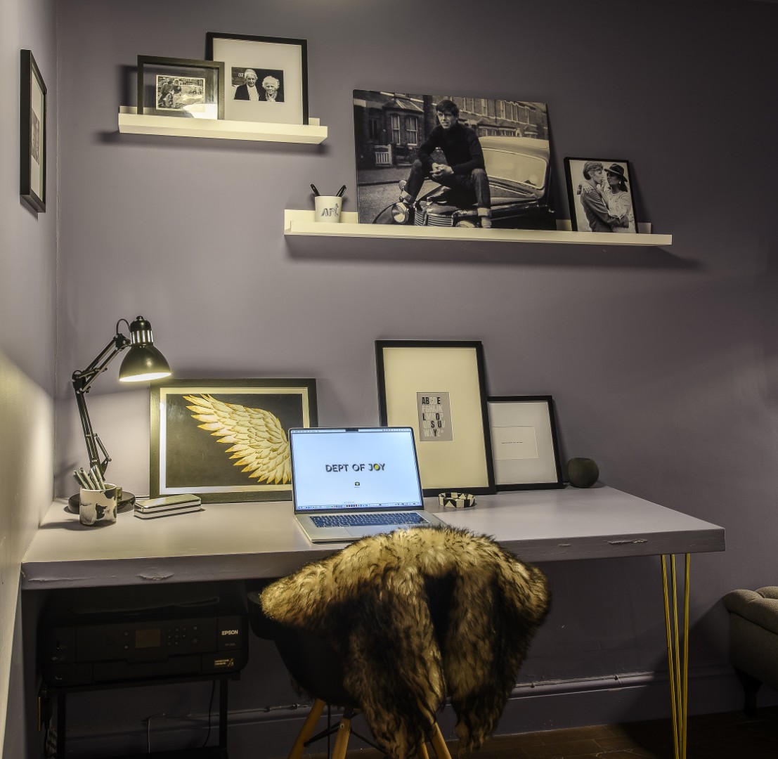
The main hall is a warm grey with a lilac undertone (from Valspar), chosen to combat the cold light of day, creating a softer and more atmospheric feel. Black and white photographs punctuate this space – his dad on a car, prints of David Bowie, Elizabeth Taylor, Jean Shrimpton – family and familiar icons mixing glamorously above his workspace. This is where Matt catches up on emails, a place to think and plan – a practical area that is just far away enough from the main living space to stop work from intruding into home life.
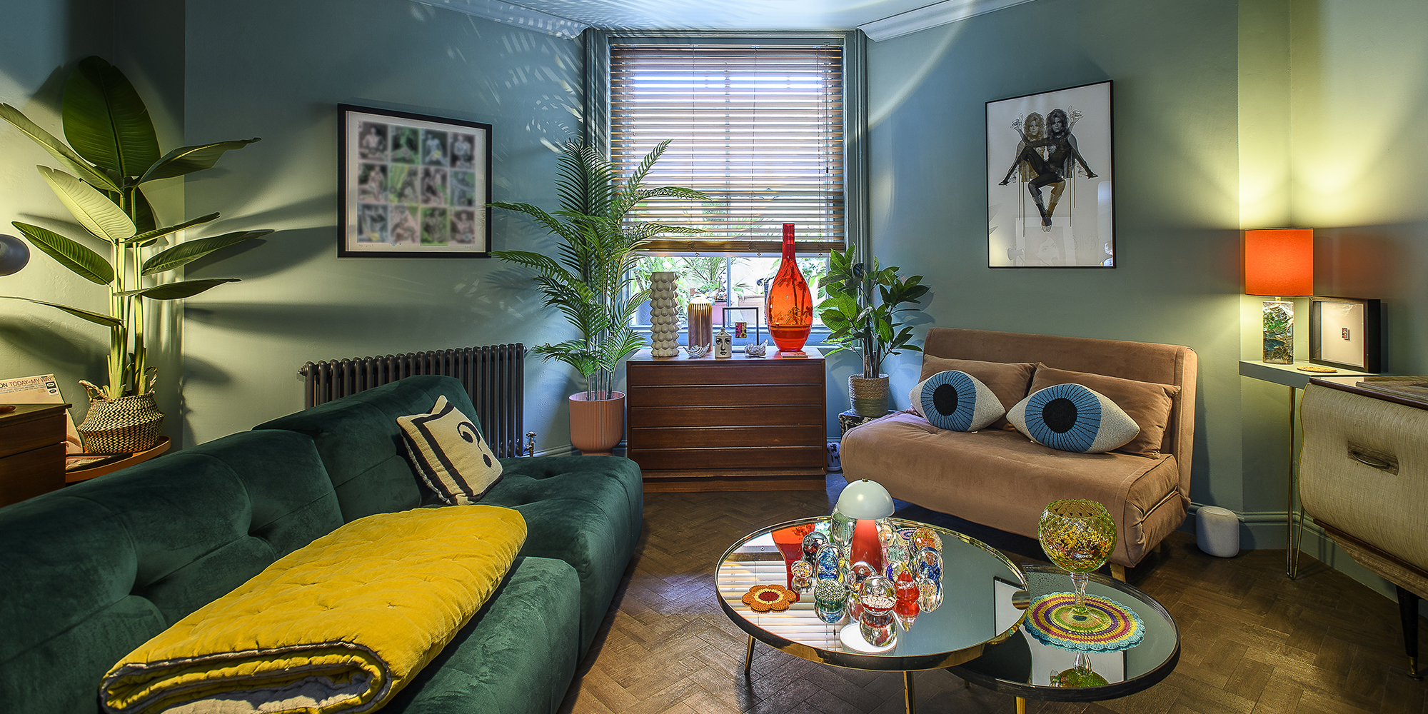
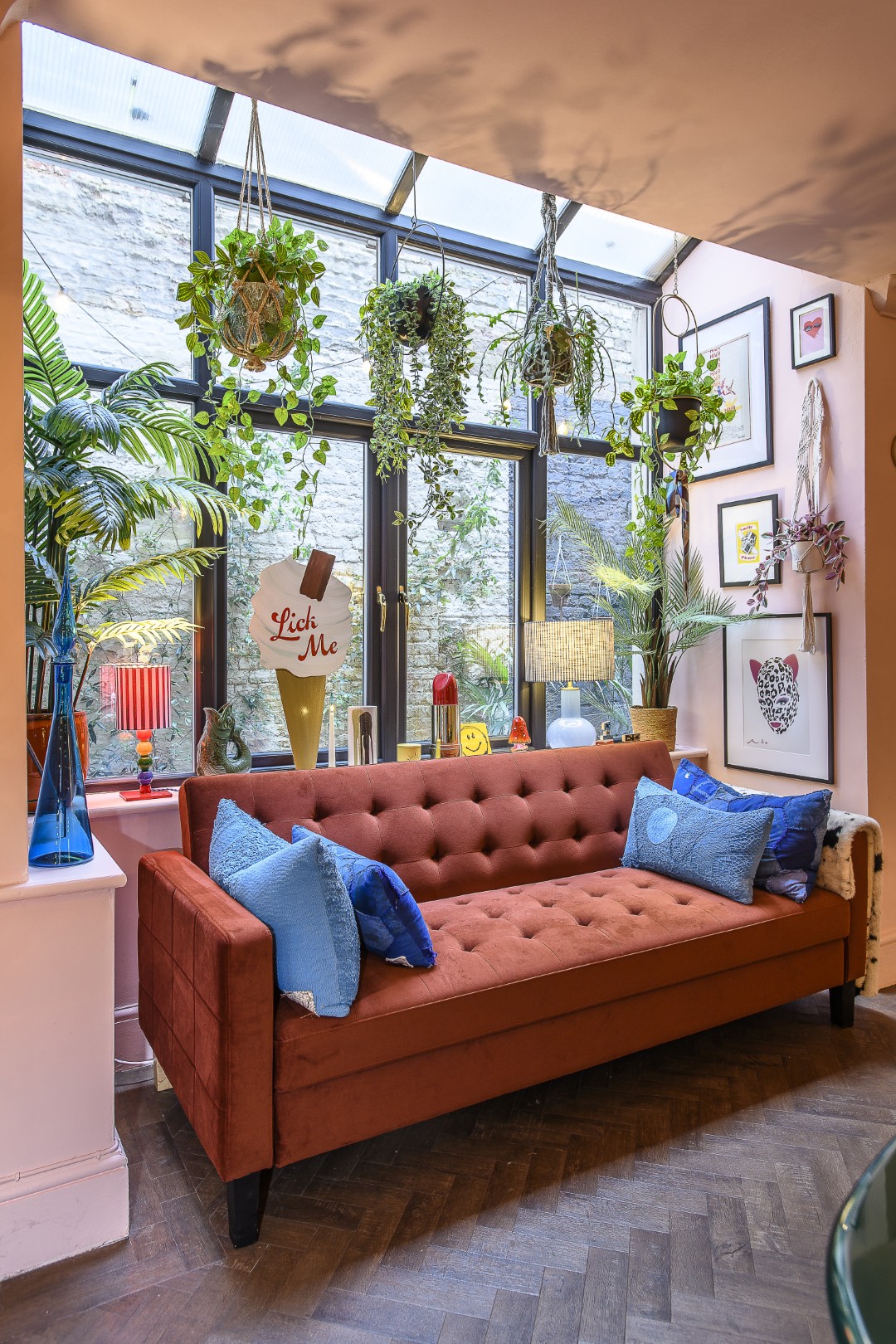
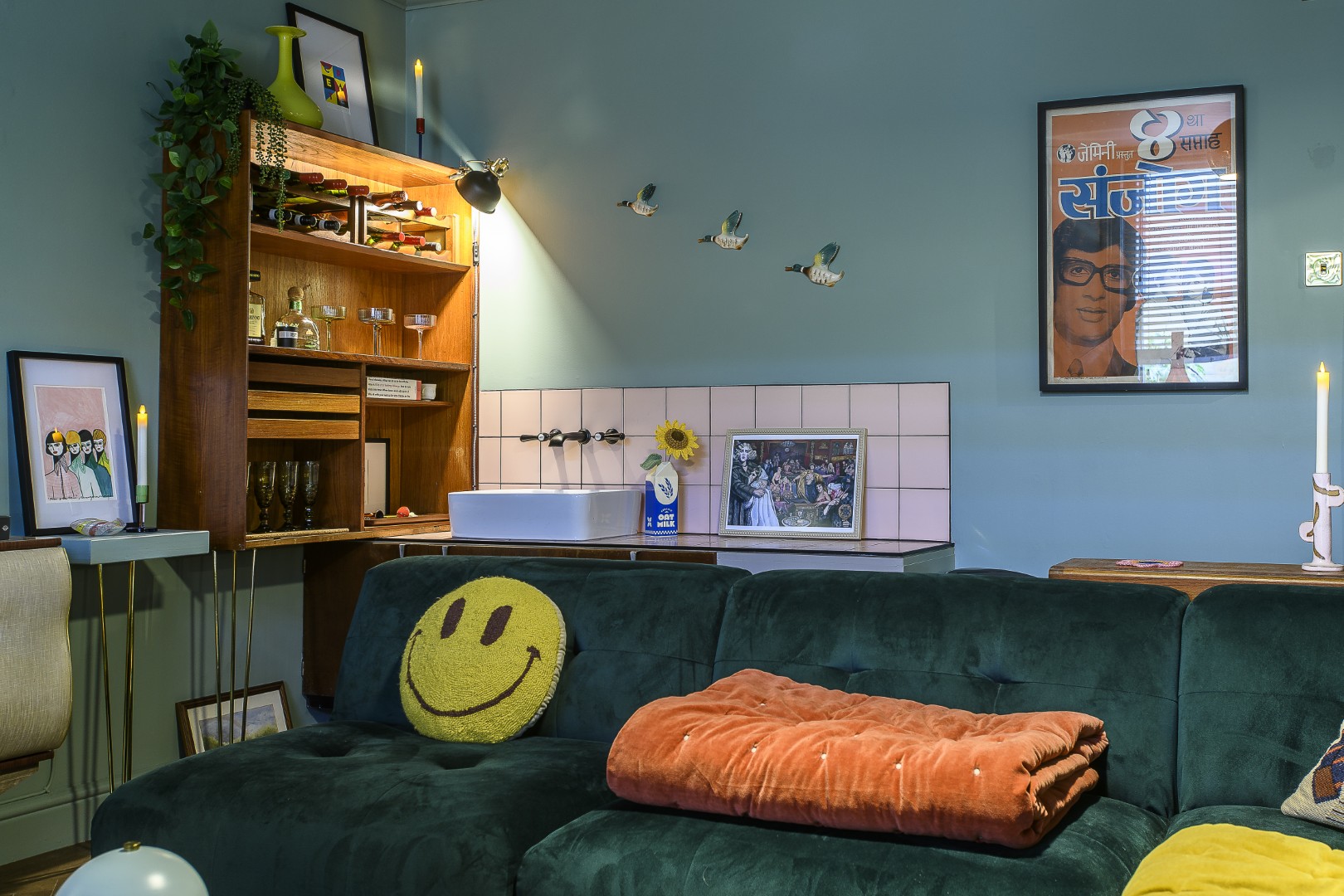
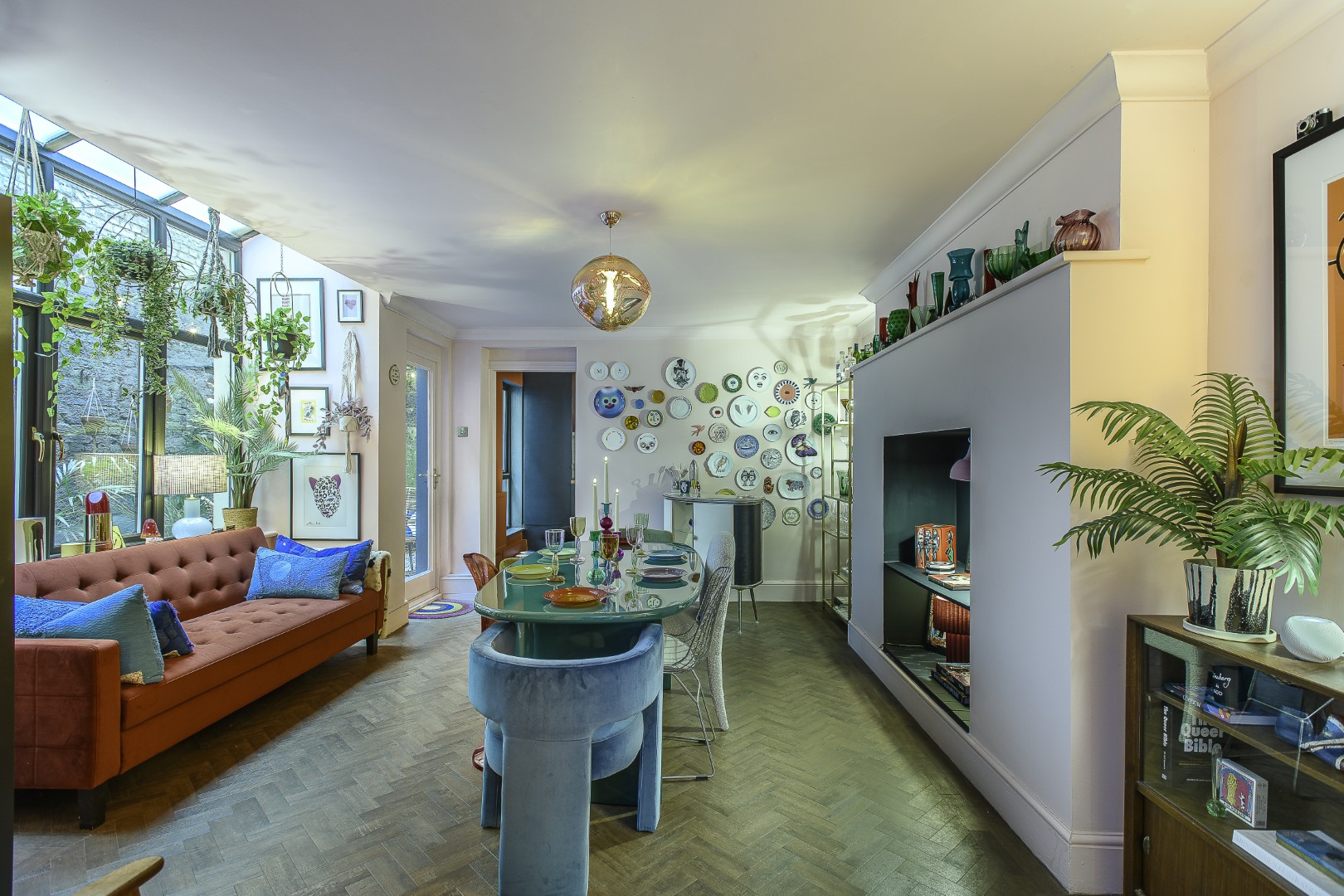
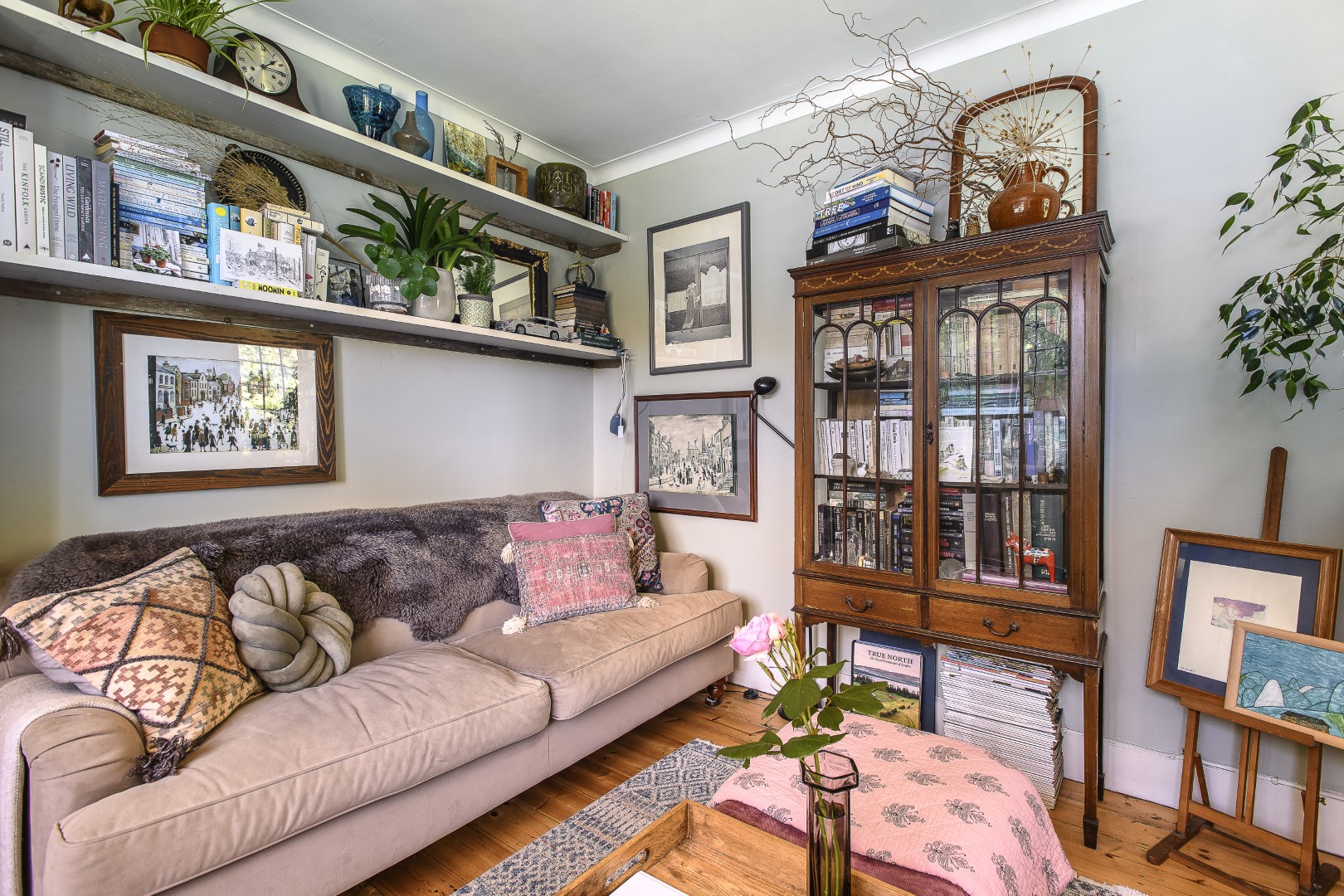
In the sitting room a velvety teal corner sofa anchors the cool blue-teal scheme. Strong colours are used sparingly and effectively in here, with pops of orange bringing small bursts of energy around the space. Light streams through Venetian blinds to catch and scatter in the array of glass paperweights on the central coffee table. A collector’s eye is at work in here – there’s the cheeky charm of Jonathan Adler’s provocative porcelain ‘boobie’ vase, graphic prints, street artist Shuby’s ‘Bananarella’ and latex artist Michelle Mildenhall’s ‘Alice’. Two Donna Wilson ‘eye’ cushions stare out unblinking from a blush pink velvet sofa.

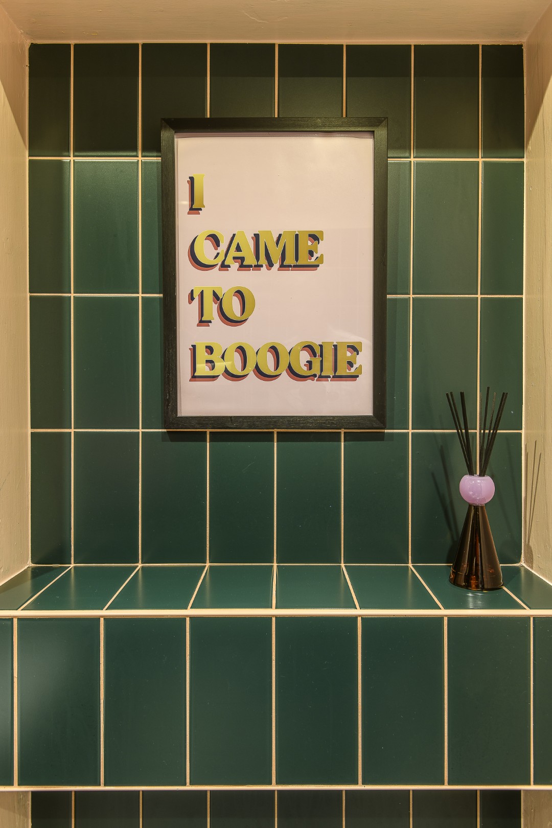
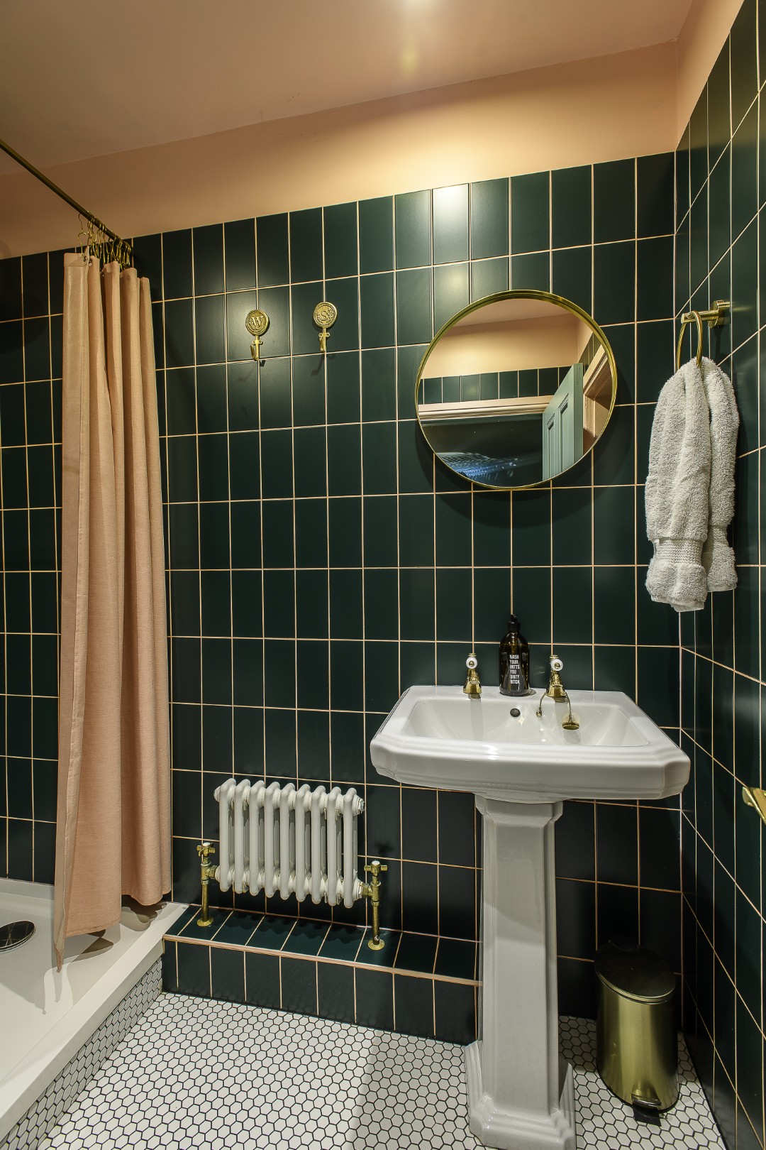
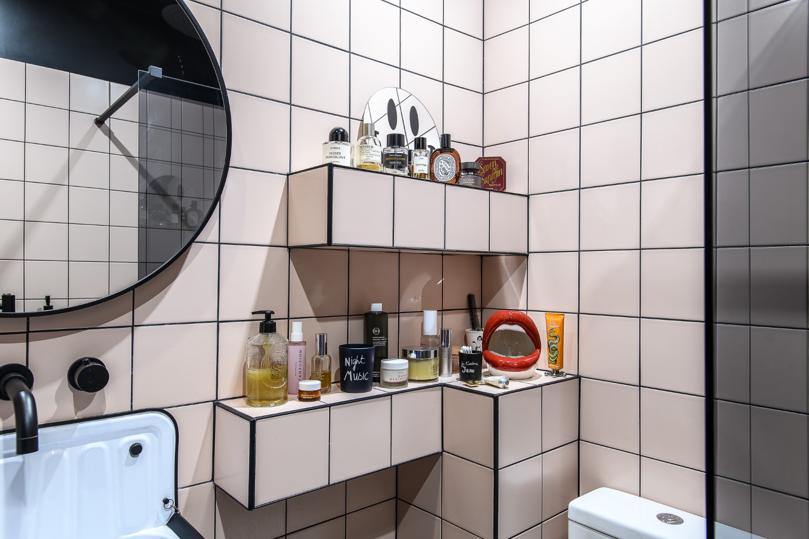
On paper the colour combination in the bathroom – dark green and pale pink – sounds an uneasy mix, but in reality, and in Matt’s capable hands, it’s a joyful combination, with detailing – mirror frame, taps and accessories – underpinning the scene with hints of gold. “If you’re frightened of using colour, take two main colours and then pick out the highlights in another. The finishing touches do not have to cost a lot,” Matt advises. Accessories from Dept of Joy (of course) include a cheeky ‘Wash Your Mitts You Dirty …’ hand soap dispenser and a great little WXY. Disco Diffuser, both of which add some bathroom fun.
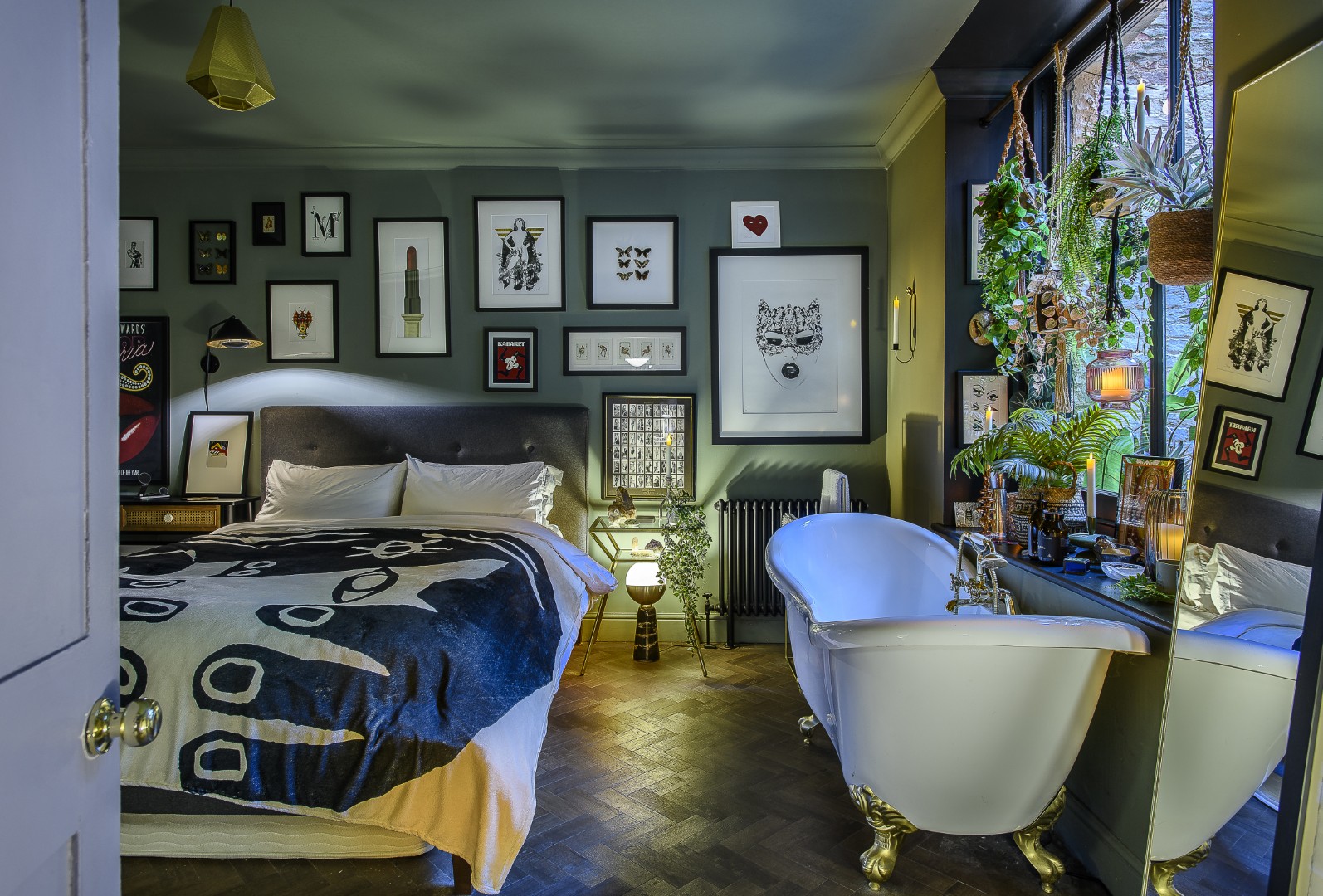
The en suite to Matt’s bedroom is also pink, though even paler in here and this time contrasted with black. “I wanted everything to be boxed in, and my lovely brother, who helped me with the place, suggested using the tiles like bricks to do just that. It’s quite Japanese, which I like.”
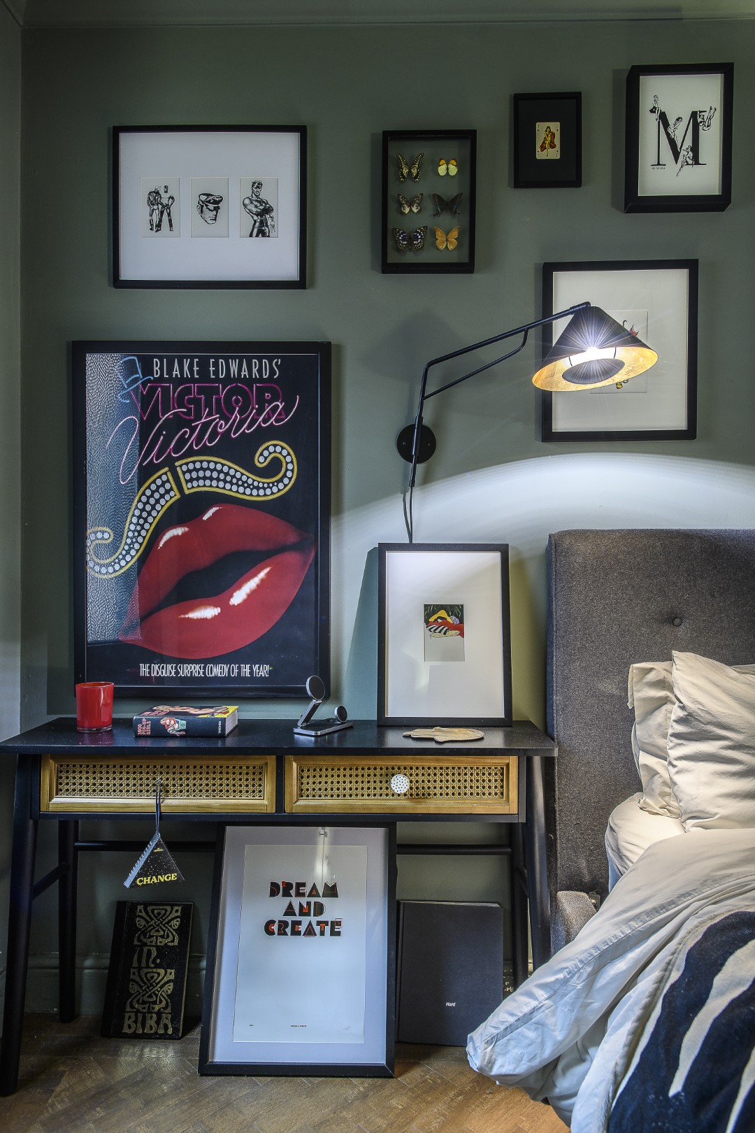
In the bedroom Matt indulges a long-held fantasy: a bath neatly tucked in front of a large window. “After years of travelling with work and being lucky to stay in some luxurious hotels I wanted to have some of that at home.” The result is sumptuous and slightly decadent: lots of pictures, sexy prints, candlelight… The walls are painted in Lick Green 03 – a colour that feels grown-up and enveloping, again used on the ceiling as well as the walls. The window frame is painted black, a clever designer’s trick that adds depth and draws the eye outward to the garden beyond. “It’s lovely in here when all the candles are lit up,” he says. And because the apartment occupies the basement level of the building, the whole space is incredibly private.
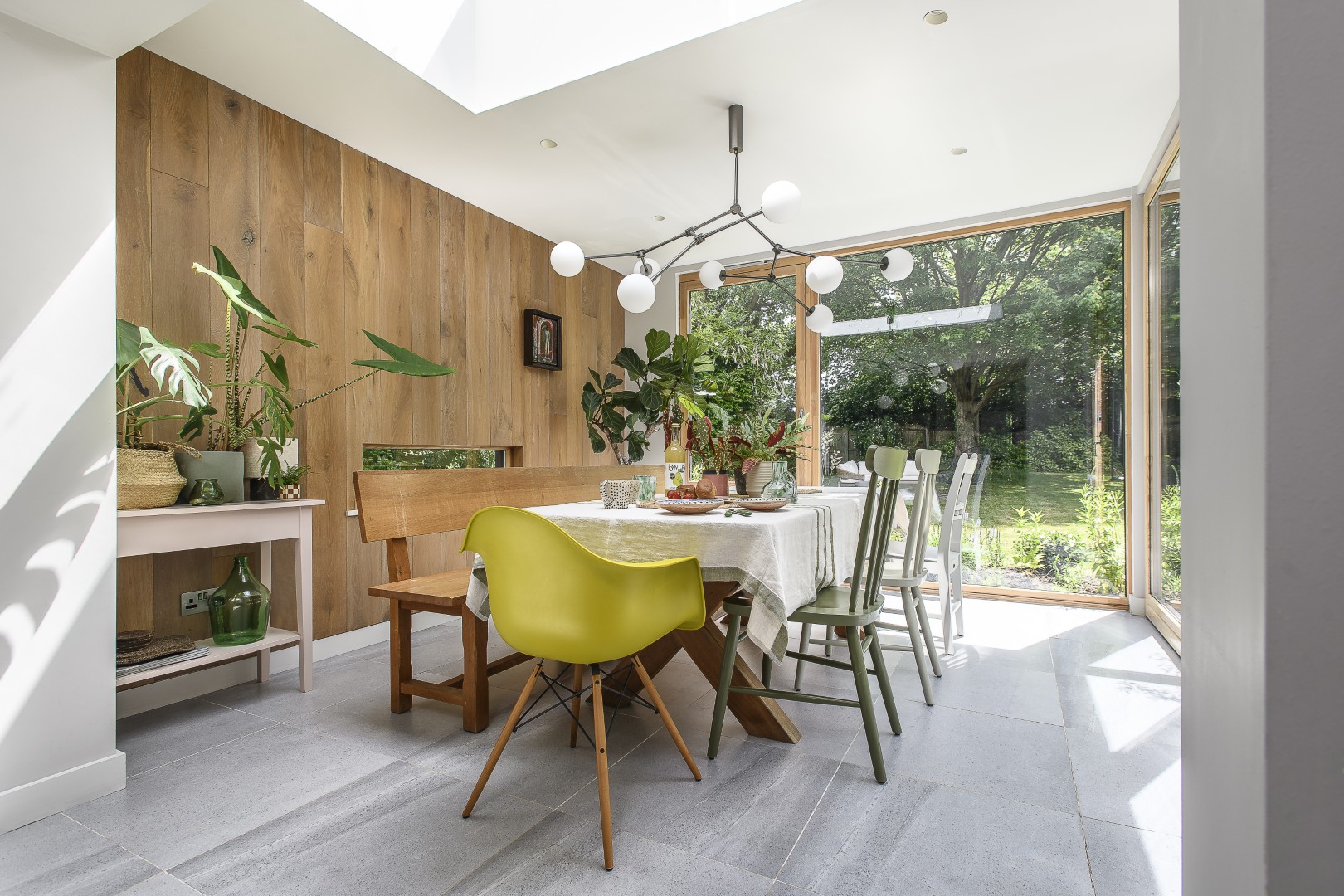
In the dining room, the mood shifts again: the wall colour here is Dulux Berry Whip, chosen in a flat matt that absorbs the light and gives a powdery feel.
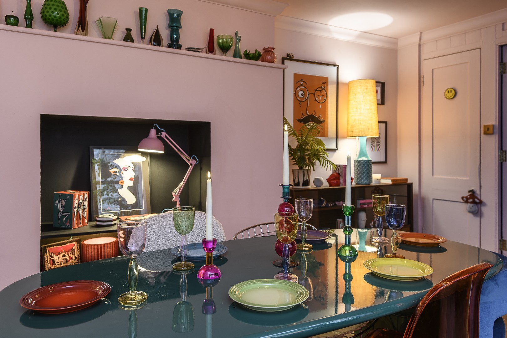
There’s a mix of vintage and new, finds from Matt’s travels near and far. There’s a chair in one corner bought at Camden Market that Matt has had re-upholstered in Missoni fabric – “the fabric cost more than the chair,” he laughs. There are colourful screen prints collected from time spent in India – he lived and worked there for around three years, mainly in Delhi and Mumbai. At one end of the room is Matt’s ‘plate wall’ – this is still under construction, displaying collectables from vintage fairs, markets and travels abroad. There are also objects in here that tie his home back to the shop. A sleek rocket shaped cocktail shaker on the bar is representative of so many of the things he sells – a quirky, artful, but perfectly practical piece.
That’s a key to life too – to make the functional attractive – and there are so many instances of that here. The huge window in the dining room being a case in point. “The window was here when I moved in – and it was horrible,” he says, “white UPVC.” Instead of replacing it, however, he painted it black with Rust-oleum, transforming the plastic into something that looks like a sleek black metal frame. A simple coat of paint has completely saved the window.
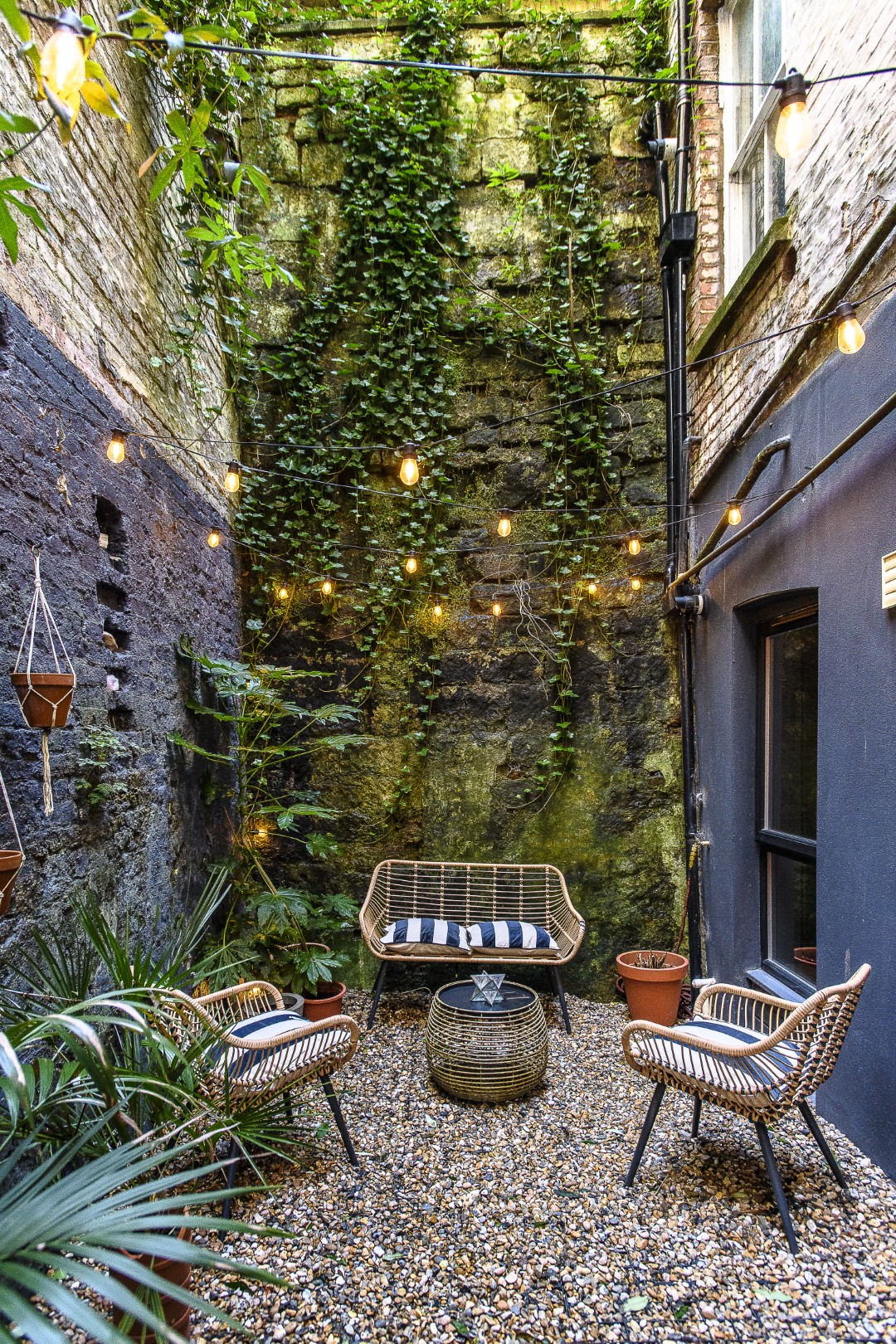
The courtyard garden is an enclosed inside out space, surrounded by high walls that Matt has made a feature of, painting them darker and lighter in sections. It’s well lit out here, the four walls criss-crossed with strings of festoon lights, so that it becomes an extension of the interior, a secluded outdoor room.
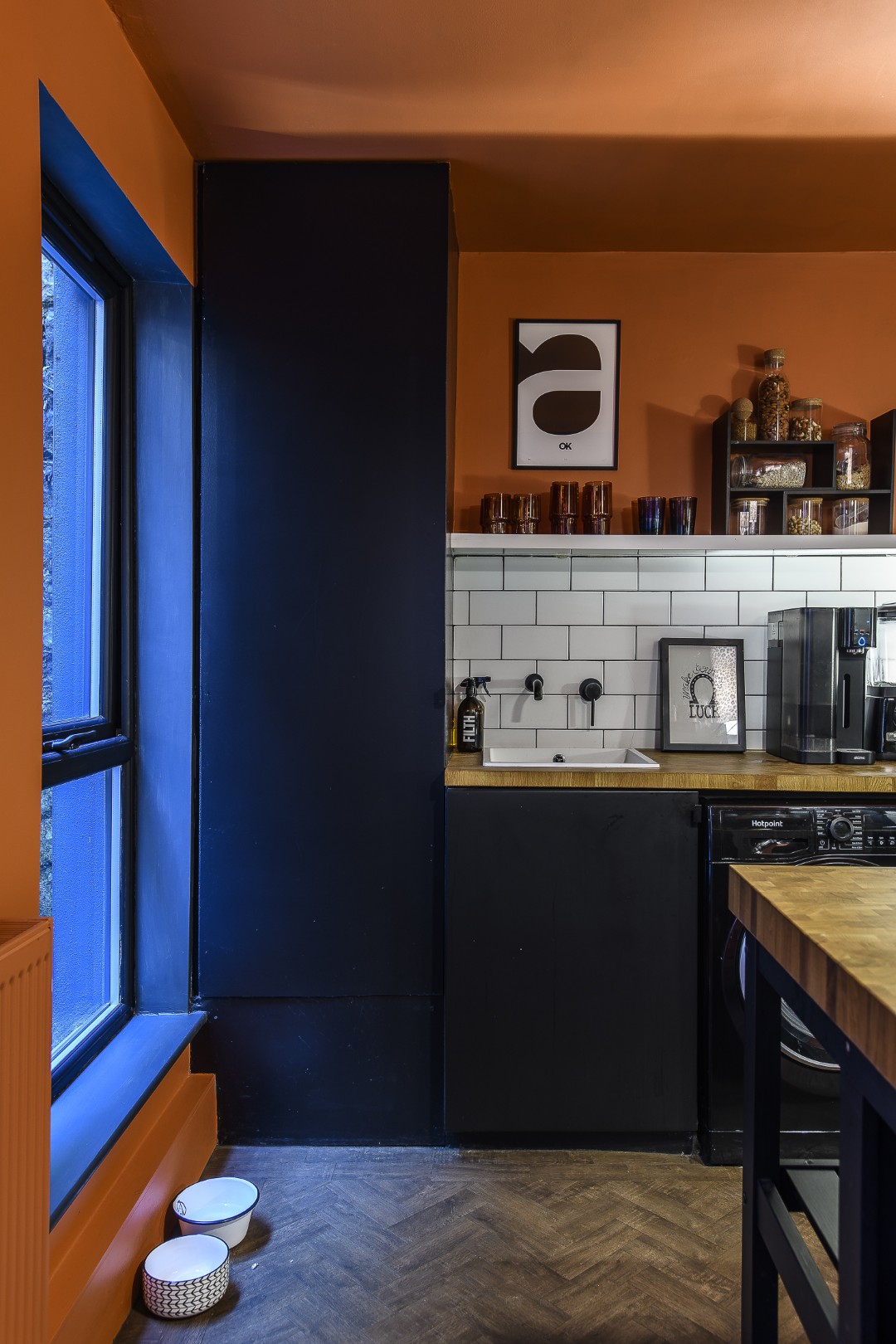
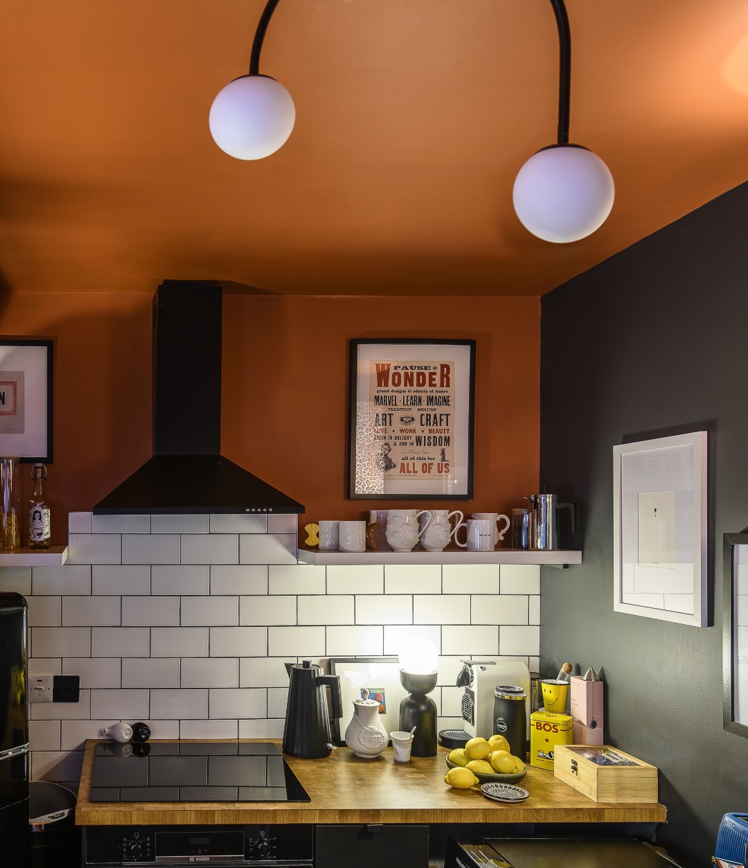
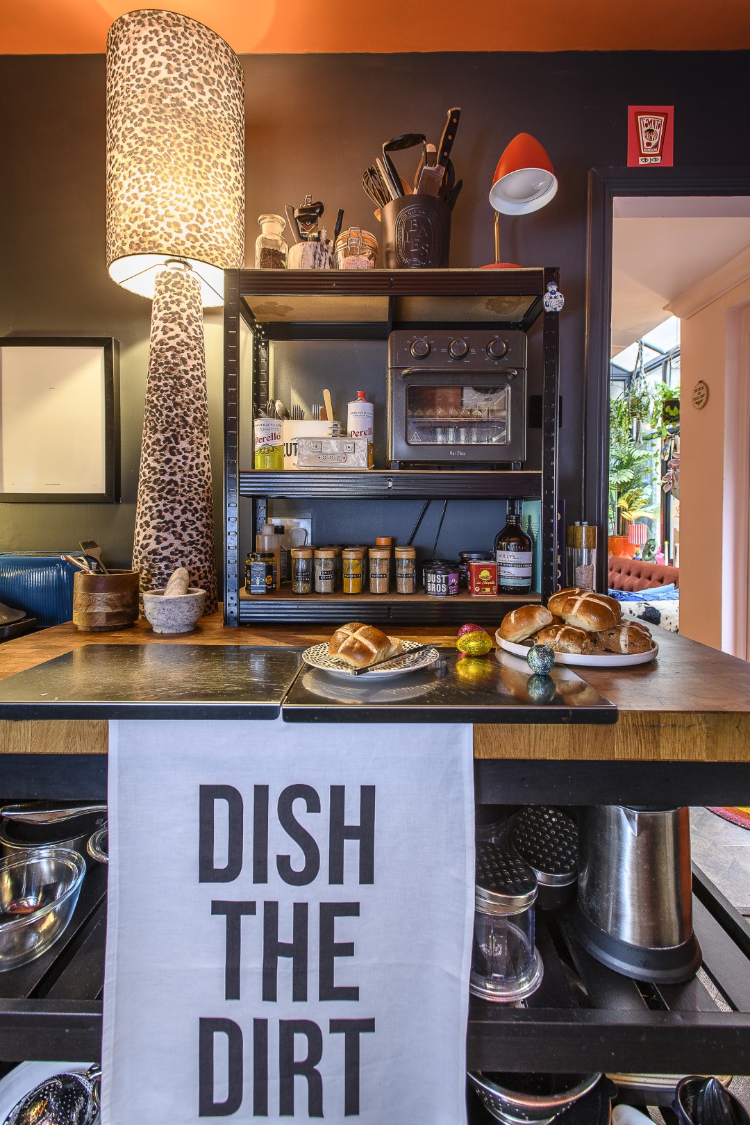
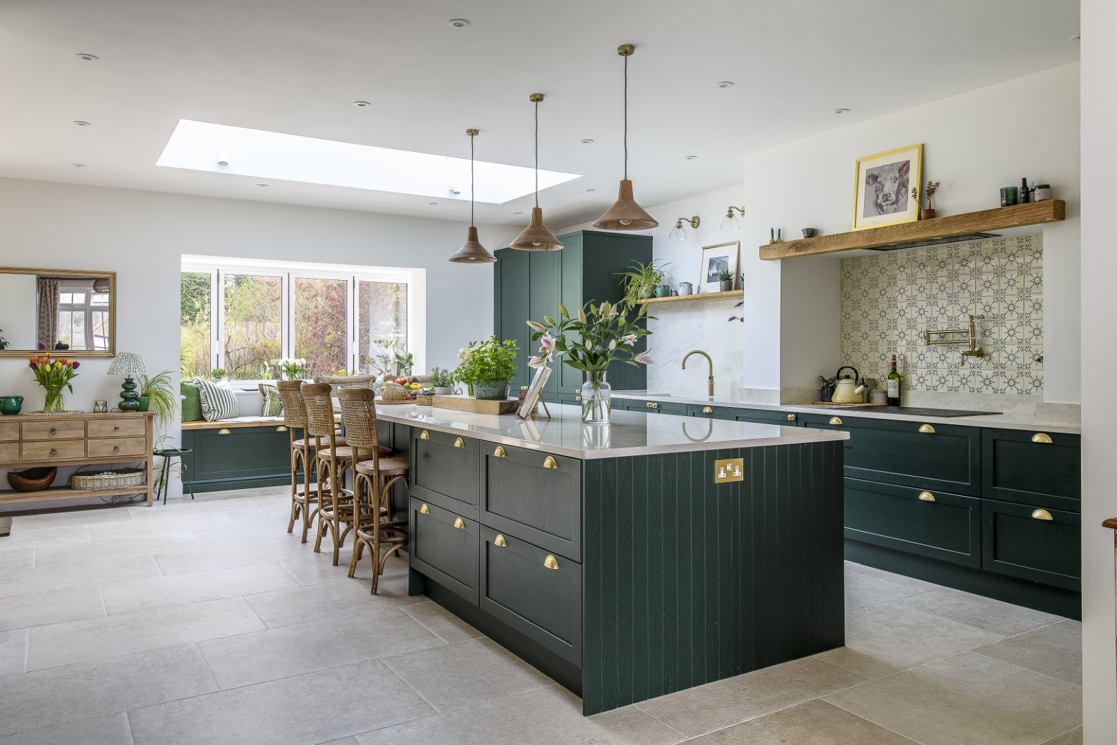
The kitchen is deep orange and black – a strong colour scheme set off by white splashback tiles. Orange, in Dept of Joy terms, represents desire; close to appetite-arousing red. It suggests warmth and comfort too, and is a fun space, where so many Dept of Joy items can be found – from a ‘dish the dirt’ tea towel to a ceramic strawberry milk carton jug.
“My approach to interiors is not about filling your house with stuff, it’s about choosing pieces that make you smile when you walk past them,”
Matt says. What makes this resonate is the story underneath. Dept of Joy isn’t just a clever brand name, it’s what happens when someone goes through something that forces them to re-evaluate what’s important – and decides that what matters is making people feel better. Matt’s insights and strong feelings about colour have now inspired him to start pairing scented candles with the colour prints that he sells at Dept of Joy. The scent of Joy? Lemongrass and ginger. Of course.
Address Book:
You can visit Matt at Dept of Joy from Thursday – Sunday at
1 London Rd, St Leonards, and shop online 24/7 at deptofjoy.co.uk
- words: Jo Arnell
- pictures: David Merewether
- location: Hastings
You may also like
Made to Last
Returning to the UK after a work stint in Dubai, Tracey and her family happened upon a house the likes of which they had never imagined living in before. Five years on, they still relish its clean lines, large windows...
Pretty much perfick
Garden designer Agnieszka Gebka found a horticulturist’s haven when she and her family relocated from Wimbledon to Sevenoaks and a former gardener’s cottage on the edge of a large country estate, a space that has allowed her to pursue her...
Love where you live
Careful to inject plenty of each homeowner’s personality into every project, interior designer Jenny Branson’s gentle and measured approach has won her many clients who adore her use of colour, pattern and mood-lifting design There is something instantly connecting when...