Award-winning architect Patty Leo embarked on a joyfully creative project to remodel a mid-terrace Victorian property for a mother and daughter, transforming it from cramped and awkward to spacious and expressive
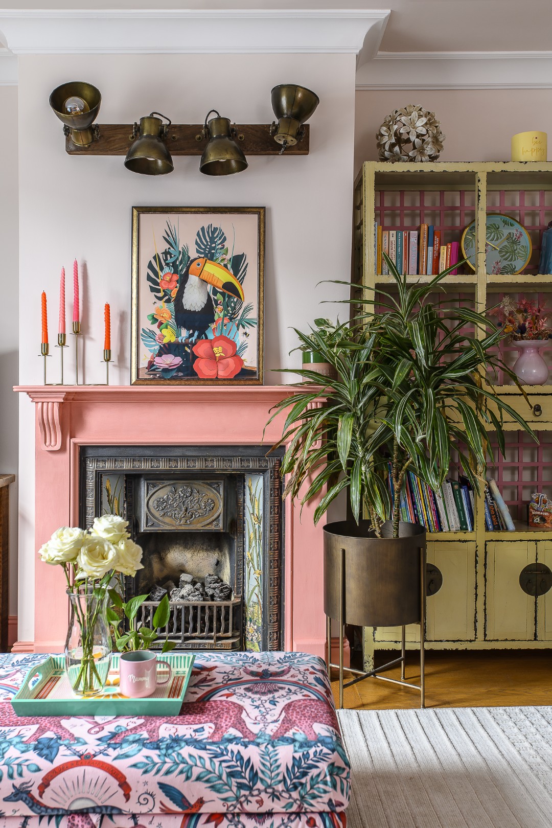
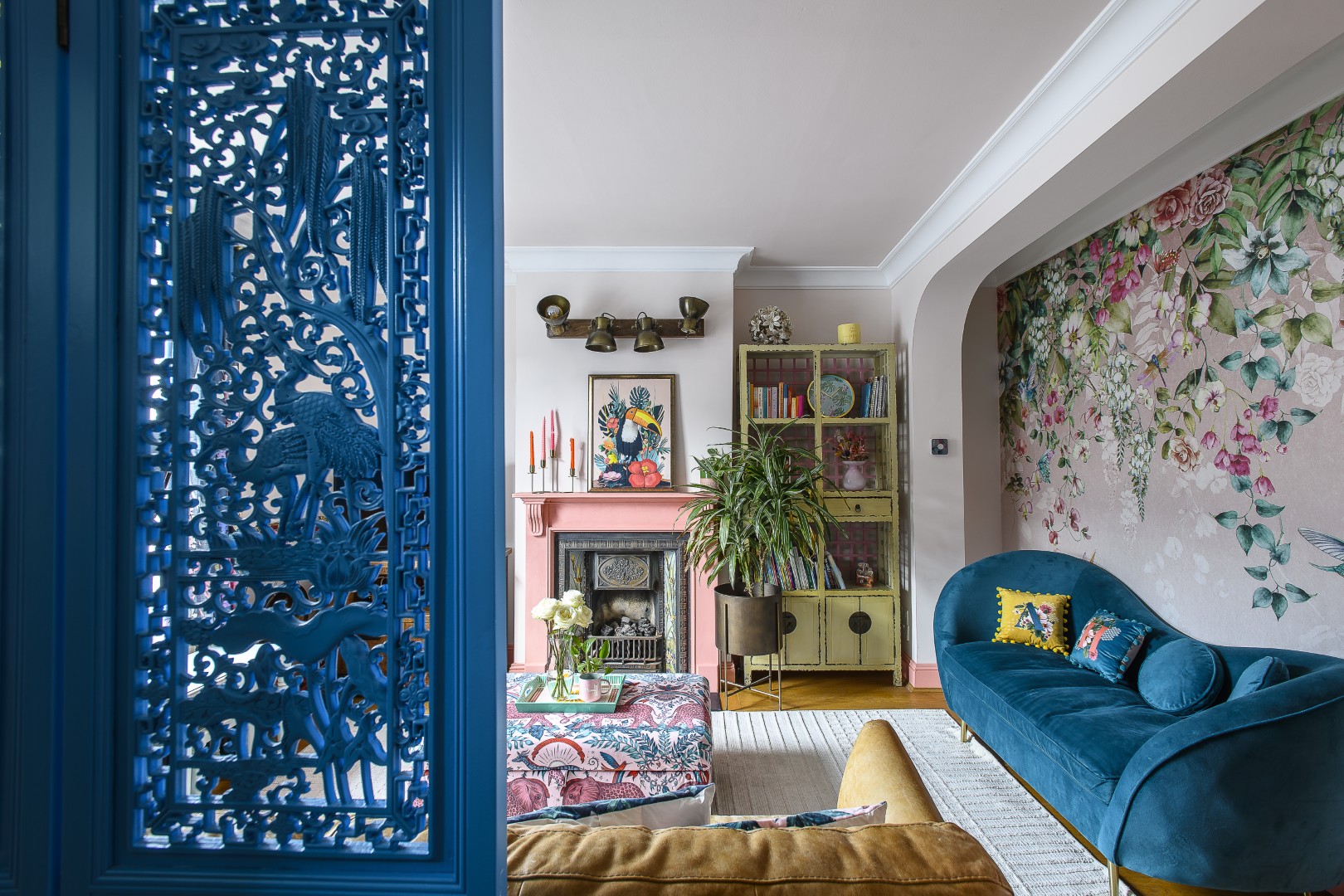
We all love colour but at home most of us play safe with neutrals – it does make things calm and soothing. And boring. Colour has a powerful effect on the way a room feels, and on the way we feel within it. There is something wonderfully life-enhancing about rooms that are not afraid of expressing some personality, but it can be tricky to get right – and colourful can easily tip over into chaos.
The owners of this three-bedroomed Victorian terraced house in Surbiton, a mother and her six-year-old daughter, had already done some decorating and dabbled with colour – they had a vision, but this had also highlighted the fact that behind the colour and decoration some structural changes and reimagining had to be done.
The existing layout was cramped and awkward, the house needed more light, more entertaining space, and somewhere to store their growing collection of equipment and ephemera – all the kit and clutter that builds up when creative spirits are at home.
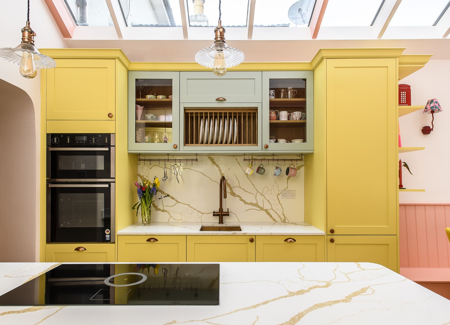
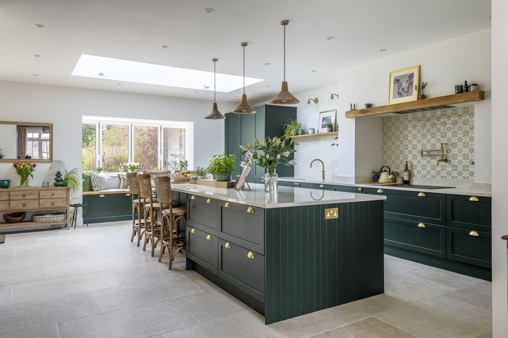
The kitchen, where most of the work has taken place, used to be in an old L-shape, with a little used side return. It did have a pink door and patio decking, hinting at this family’s playful sense of colour, but overall the space was lacking the light, storage, comfort and flexibility they needed – they craved a different atmosphere and somewhere that felt bigger, brighter and generally more expressive.
So the brief was clear, and making the space more useable and light filled was fairly straightforward, but the colour, well, the colour is another story. “I’m not used to these tones,” says Patty Leo, director and co-founder of Studio NP, the creative team behind this transformation. “Most of my clients opt for neutrals, so on this project we went all out.” Another important aspect was that the build was for a single mum and her daughter. “I knew this project was special,” Patty continues. “I also have a daughter: my client is juggling work and home on her own – and during the build was living with family, going to the tip all the time, working really hard to get all these things done.
“I knew this project was special,” Patty says. “I also have a daughter: my client is juggling work and home on her own – and during the build was living with family, going to the tip all the time, working really hard to get all these things done.”
“The interior was already painted in pastels and the back office was Barbie pink – they definitely wanted a colourful, but different look.” Undaunted by the change of colour palette, and despite the fact that the main hue (a coral pink) had to be used across several different surfaces – wood, metal and plaster – being mixed and matched each time, they stuck to the brief. “This is the client’s vision and we helped her to realise it,” Patty says simply.
Kitchens are the heart of most domestic spaces, but it was during Covid that this area really came into focus. Baking had become a huge part of life while they were stuck at home, but now they had collected a mass of tins, tools and ingredients – that all needed storing and reorganising. Add in art supplies and the everyday paraphernalia of family life and – familiar to those in creative households – a storage crisis was threatening to overwhelm them.
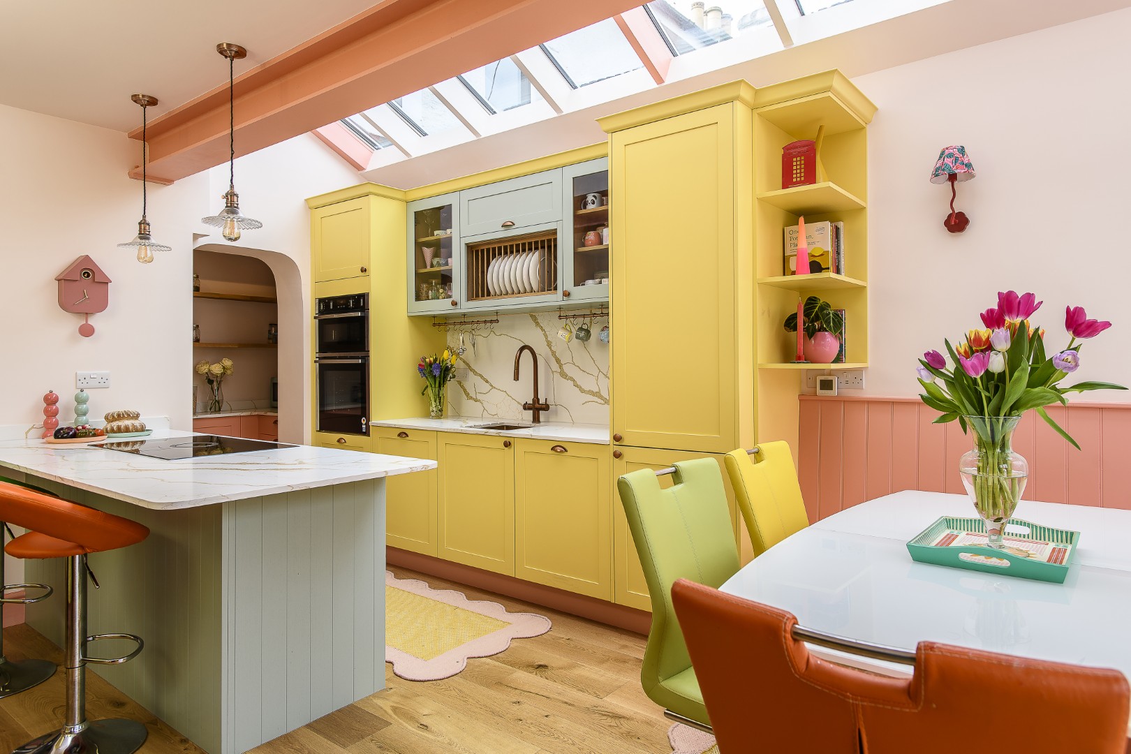
“They had begun to outgrow the existing kitchen,” says Patty. “The table was uncomfortable, storage was inadequate, and the whole space felt as though it was straining against the demands placed upon it. We wanted to make it bigger, more colourful and more joyous. This family like to entertain.” They needed to bring in more daylight too, especially to a gloomy corner, while at the same time have somewhere to store the art supplies and school equipment.
The team set to work on the structural side – installing an oriel window at one end of the kitchen and an impressive line of skylights above. Patty emphasises that this was a huge team effort. “I couldn’t have done it without such a good group of people around me, especially Dante Hall – he’s my work colleague and long time uni friend and he’s been essential to this project too.” Alongside Studio NP, they worked closely with structural engineer Ben Dean at Structures in Design and Surbiton-based building contractor Luke Garrard at PLG Construction.
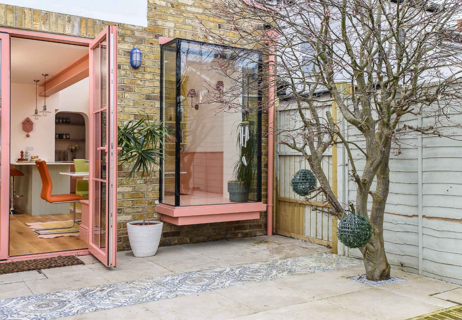
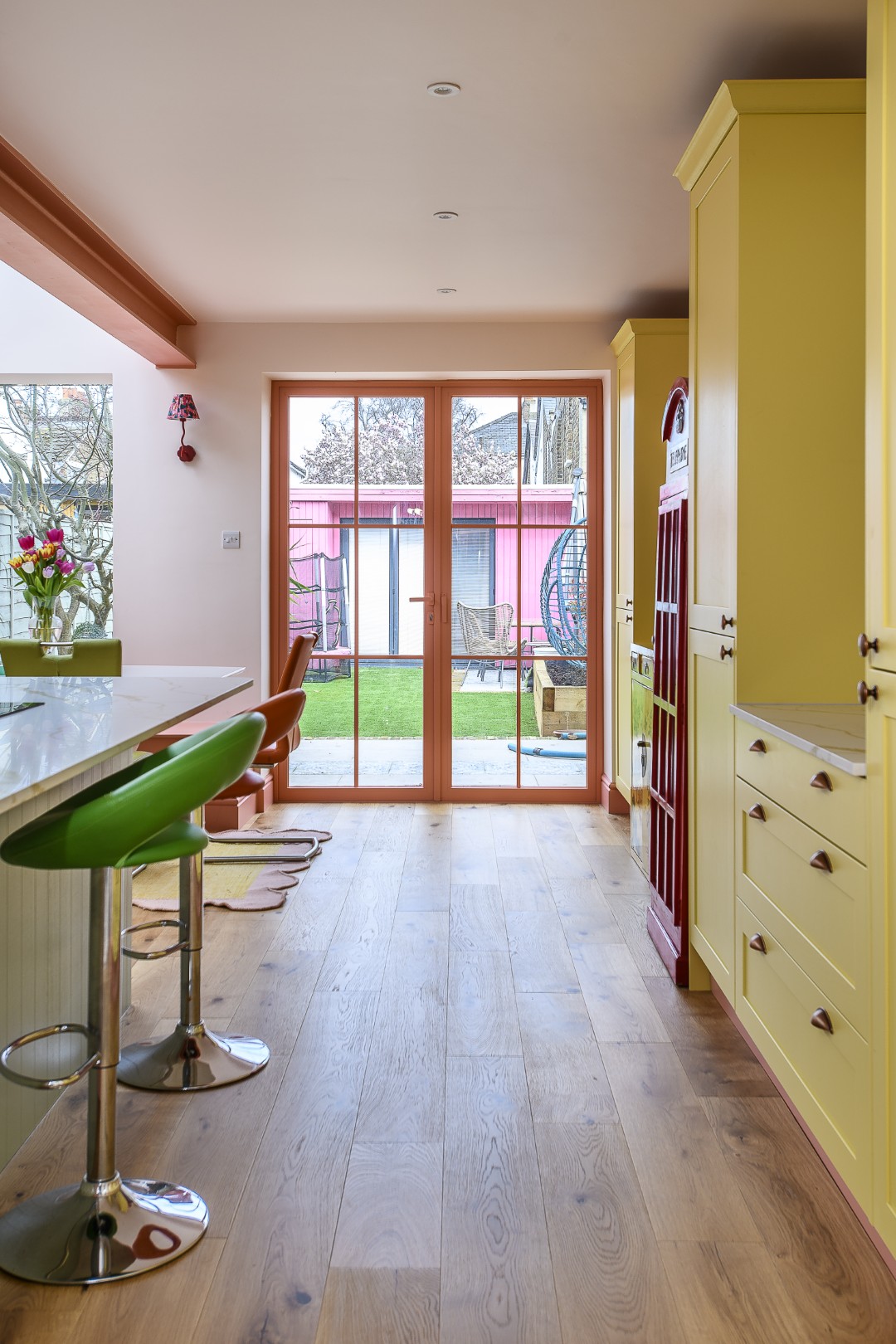
Other material decisions were just as important. Aluminium windows brought a crispness and modernity to the extension, while the skylights were left white, allowing the daylight rather than the colour to dominate overhead. That was a wise move. In a scheme with a strong chromatic identity, not every surface should demand attention – there needs to be some breathing space. The white skylights, with their patent glazing, help the incoming light feel clean and natural. Running the full five metres along the kitchen extension, these lantern lights bring masses of daylight into the room. It transforms the extension from an add-on into an integral part of the house, allowing light to pour in from above, subtly changing across the day.
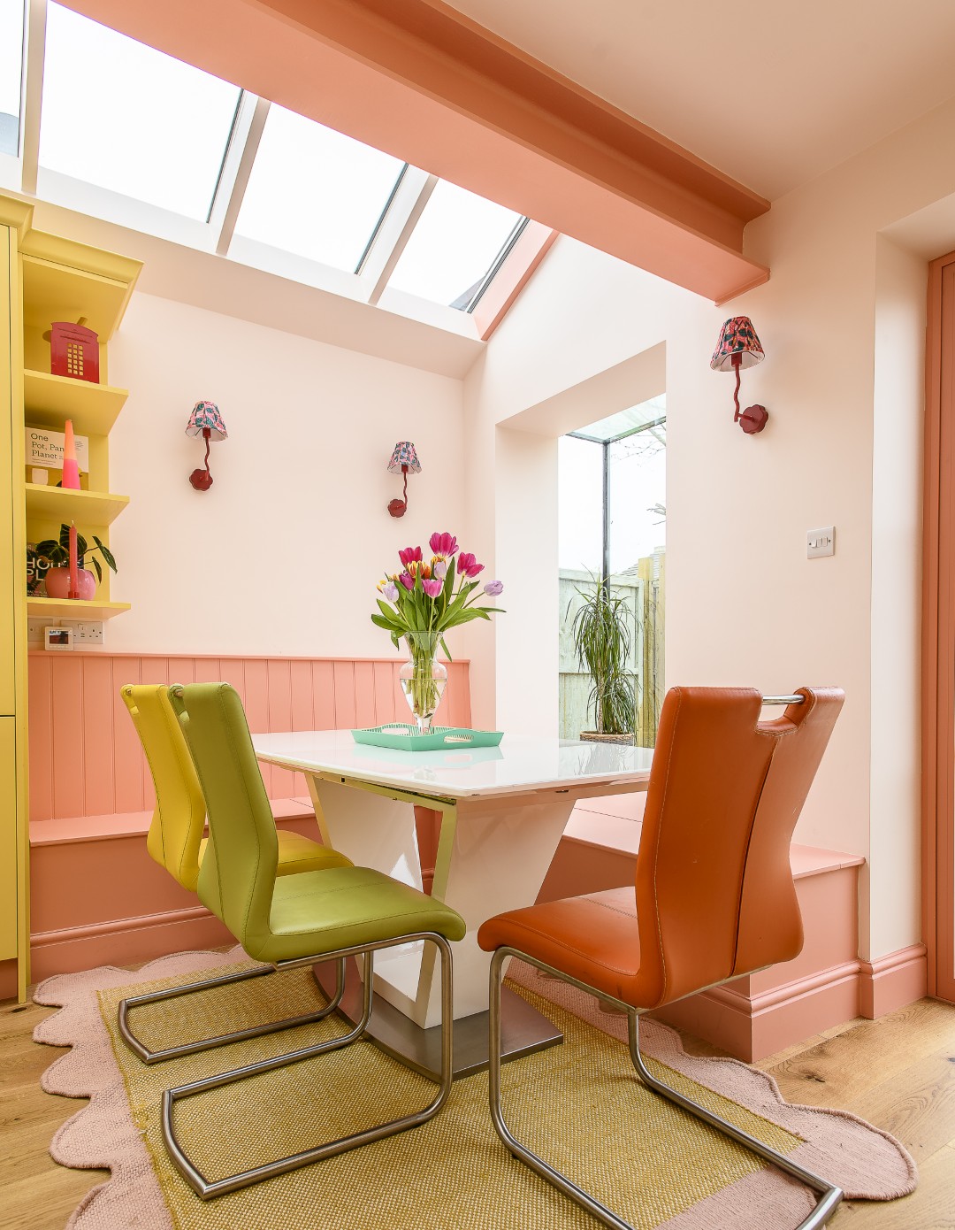
The new arrangement also needed to open up sight-lines, connect more strongly with the garden, and create a sense of openness. The new sitting area in the corner has a direct view onto the garden and this once gloomy space is now flooded with light and is inviting: a lovely place to eat, craft, or just sit and watch the garden and how the colours change in the leaves of the beautiful Acer just outside the window. “We were very careful about the Acer when the garden was being landscaped,” explains Patty. The garden makeover was also part of the project and this existing mature tree had to be preserved as a valuable and very beautiful part of the space; especially in the autumn.
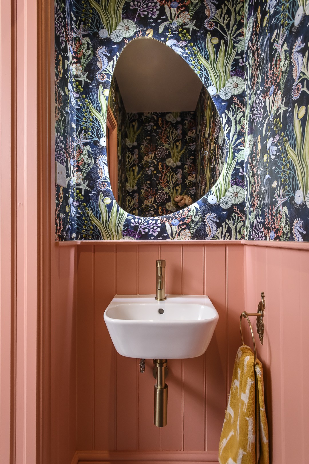
This connection to the garden was very important, and the installation of the huge window really brings the outside in. The client’s daughter loves animals and aquariums, and there is an imaginative quality in the framing of the tree, the large shadow frame on the window and the playful elements. Colour in a child’s environment matters and creates not just warmth, but an enveloping safe atmosphere.
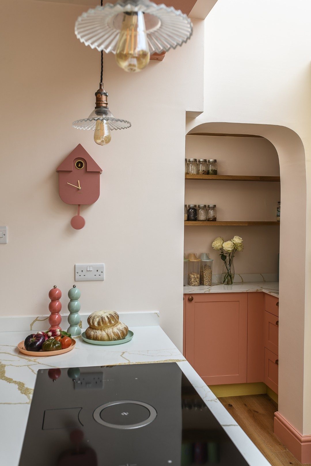
The dominant coral pink (Sublime Salmon by Dulux) appears on the plinths, but is counteracted by sky blue, which cools and lifts the warmer tones. The pantry became a combination of three colours, so that the layering of the scheme worked in unison within this room. This clever effect is what maintains control of the space: the colours are lively, but they are not scattered randomly, they are repeated and linked, which brings enough connection between the elements, but not so much that it is overwhelming. That is hard to do well – especially with such a vivid colour scheme – it needs to be fun and uplifting, but not so busy that it begins to fray the nerves of the people living in it. That process of turning instinct into reality is where good design really matters. It is one thing to love colour in theory; it is quite another to know how to place it in a room, how to repeat it, and how to combine bold shades with hard-working, practical materials.
The building materials themselves also played an important role in holding the whole project together. “Initially the counter top was going to be Terrazo,” Patty explains, “with all the different colours in it, but in the end we chose quartz with gold streaks running through, which matched with the copper sink – it really made it look classy. When you just have touches of the same colour running through as a link, these are the details that make the scheme pop.”
The addition of a loo and utility room was particularly important. The client did not want “just a kitchen”; she wanted the hard-working infrastructure that makes a family house function. That may not sound glamorous, but good domestic design is always about more than appearance. In a home with baking equipment, school bags, art materials and the day-to-day clutter of family life, utility space is not a luxury. It allows the visible areas of the house to remain calmer because the mess has somewhere to go. The wallpaper – from Lust Home – was used on all the walls above the panels. “It was the client’s idea and brings a different uptick in the bathroom. Graham & Brown was used in the playroom. Using wallpaper works really well in a small space like this.”
Open shelves in the kitchen, created by Smile Kitchens were chosen to show off plates, making everyday objects part of the decorative life of the room.
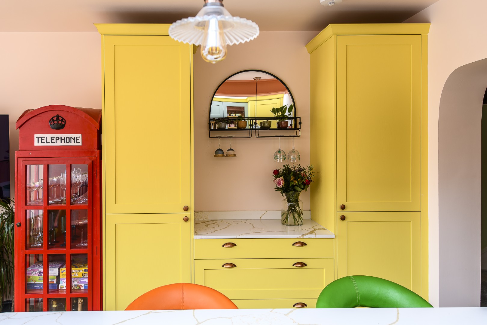
“The client already owned characterful pieces from Germany and Singapore, including the place mats, plates, a blue screen and several other objects that she wanted to be part of the scene. Even the chairs were already here,” she says. This is a real home, filled with mementos and existing possessions and part of the fun was weaving these into the new scheme – “apart from the telephone box!” Patty laughs, “that was a bit of a juggle. It stayed in the house during the build and we had to keep moving it around and covering it up during construction.”
The budget was tight. “It always is.” Patty sighs. “We try really hard not to go over budget, so for things like the cooking pans my client went to Next Home, where she also found the tea set in the living room and the red wall lights in the dining area. She had initially looked at Pooky for them, but discovered these lights instead that were £20 and they look really great,” she says.
Another case in point are the floorboards that run through the house. “My client was going to use tiles and I brought some samples to the house that I’d seen at the Business Design Centre. We only changed the tiles in the utility room in the end – they’re from Bert & May.” Floorboards are warmer than tiles and these bring a great sense of unobtrusive continuity when used throughout the space.
The feeling of flow extends out to the garden too – it was important that the exterior landscape worked with the interior and that the relationship between inside and out was cohesive. In the summer the garden is an extension of the living space and it now feels completely at one with the scheme.
The project was completed in October last year – just at the time the beautiful acer’s leaves began to turn. “The build took 4 months once we had finished the planning and design,” says Patty. “We were on schedule. It was a brilliant team effort. I like working with people I’ve collaborated with for a long time. We are all very passionate.”This passion shows in the end result, and in the feedback from the client – and happily from some of her neighbours and friends too. “They were very pleased – and we’ve had a few calls from the mums group and neighbours, which is great,” she says.
The finished interior feels personal, but beautifully thought out and executed. It is a lesson in the artful control of colour, jolting us out of any beige background bias and showing how uplifting it can be to immerse yourself in light and brights. Thanks to Patty and her team, this family’s life is reflected back at them in an exuberantly practical way – living proof that good design works on many levels and when it all comes together and is right, the result is joyous.
Address Book:
To find out more about Studio NP’s projects, visit Instagram
@thisisstudionp, email info@studionp.co.uk or see thisisstudionp.com
Ambience Hardwood Flooring ambiencehardwoodflooring.co.uk
Bert & May bertandmay.com
Easy Bathrooms easybathrooms.com/our-showrooms/weybridge-surrey-bathroom-tile-store
Farrow & Ball farrow-ball.com
Graham & Brown grahambrown.com/uk
Kitchen Worktops London kitchen-worktops-london.co.uk
London Building Control londonbuildingcontrol.co.uk
Lust Home lusthome.com
Next next.co.uk
PLG Construction luke@plg-construction.com
Smile Kitchens smilekitchens.com
Standard Patent Glazing patent-glazing.com
Structures in Design Instagram @structuresindesign
Wodar wodar.com
- words: Jo Arnell
- pictures: David Merewether
You may also like
Made to Last
Returning to the UK after a work stint in Dubai, Tracey and her family happened upon a house the likes of which they had never imagined living in before. Five years on, they still relish its clean lines, large windows...
Pretty much perfick
Garden designer Agnieszka Gebka found a horticulturist’s haven when she and her family relocated from Wimbledon to Sevenoaks and a former gardener’s cottage on the edge of a large country estate, a space that has allowed her to pursue her...
Love where you live
Careful to inject plenty of each homeowner’s personality into every project, interior designer Jenny Branson’s gentle and measured approach has won her many clients who adore her use of colour, pattern and mood-lifting design There is something instantly connecting when...