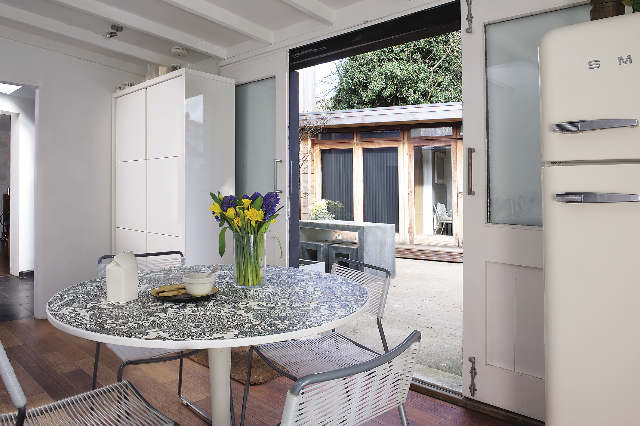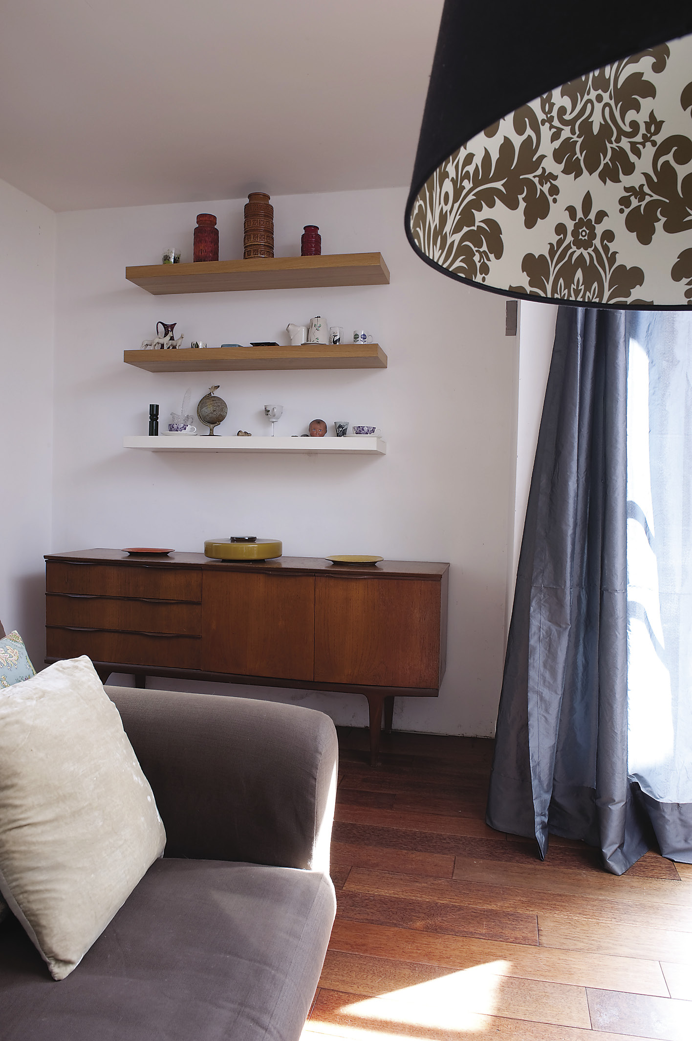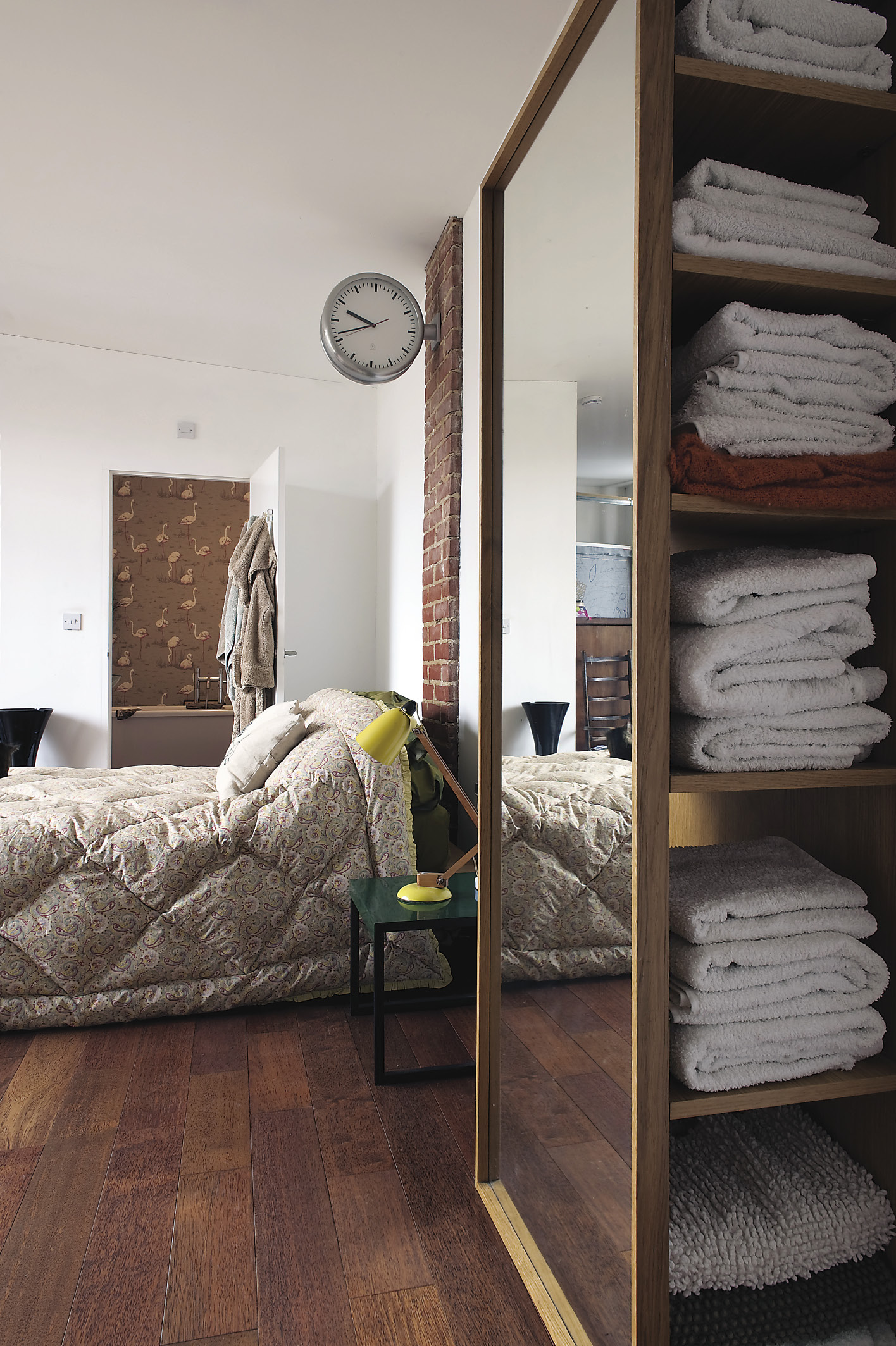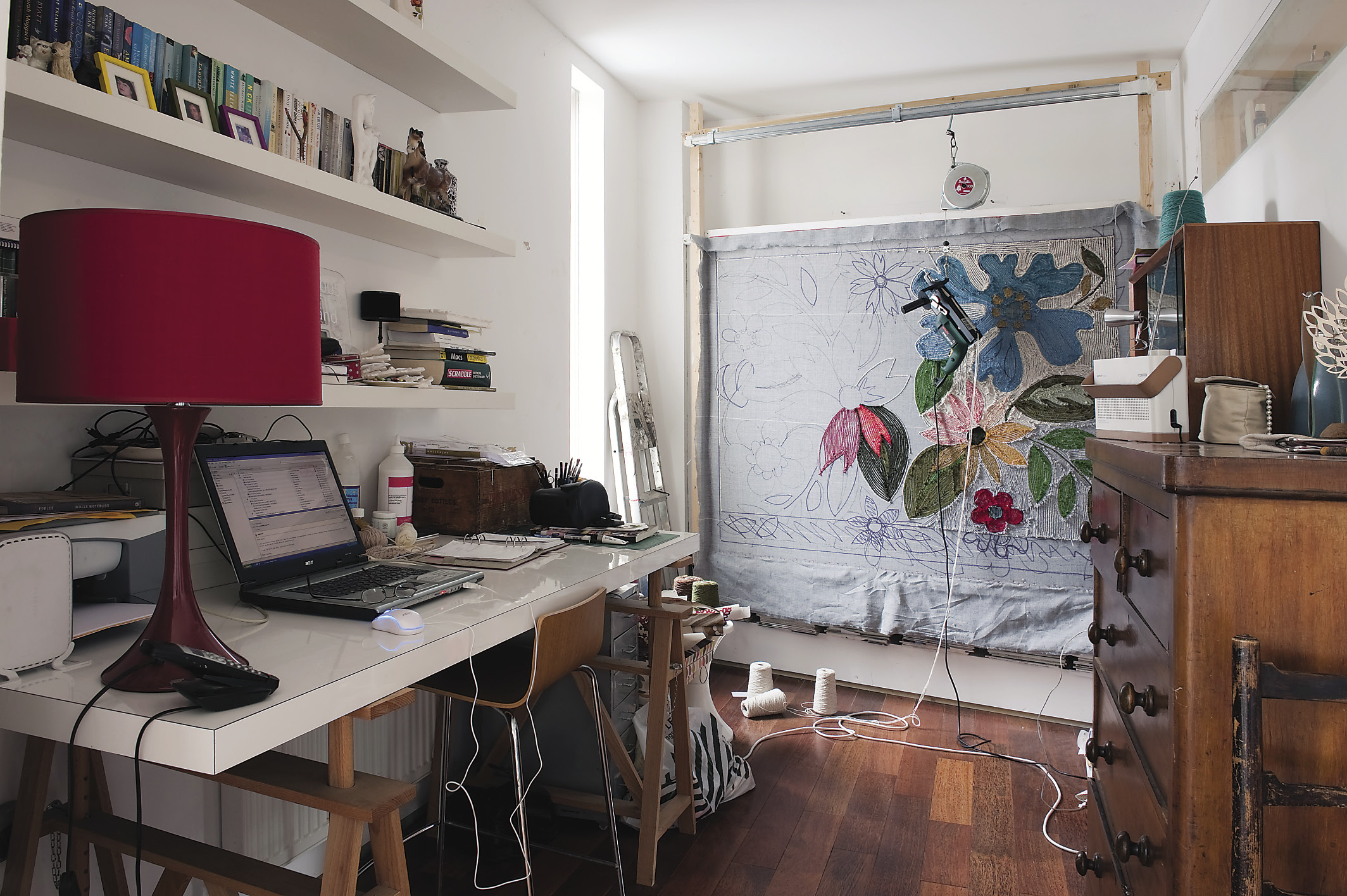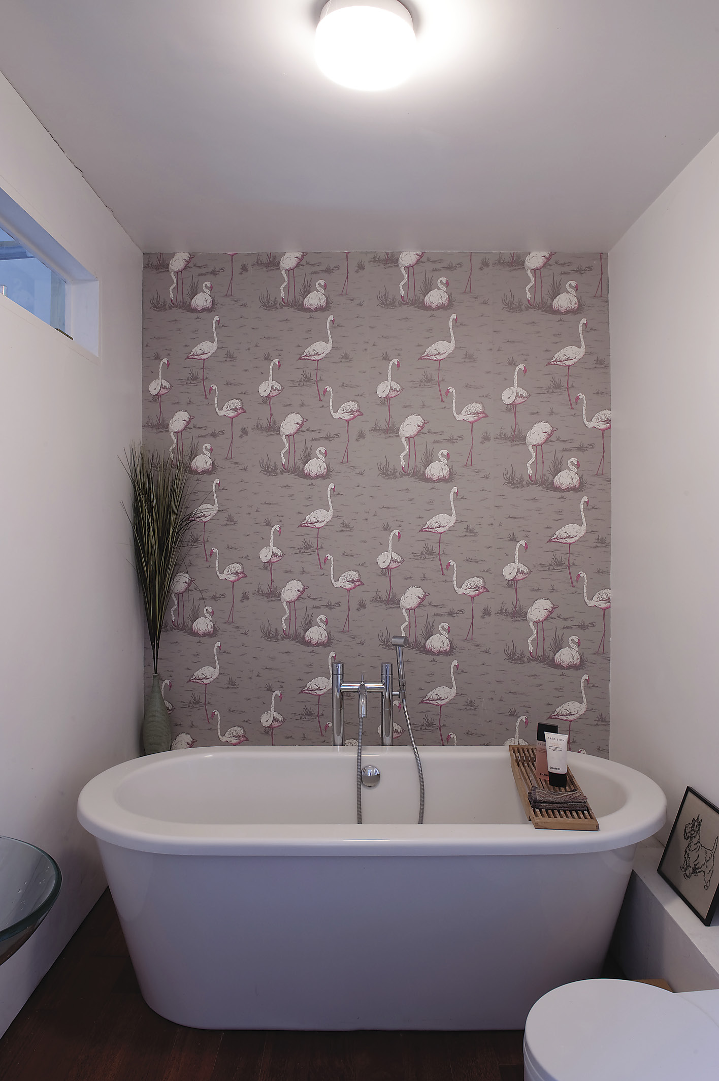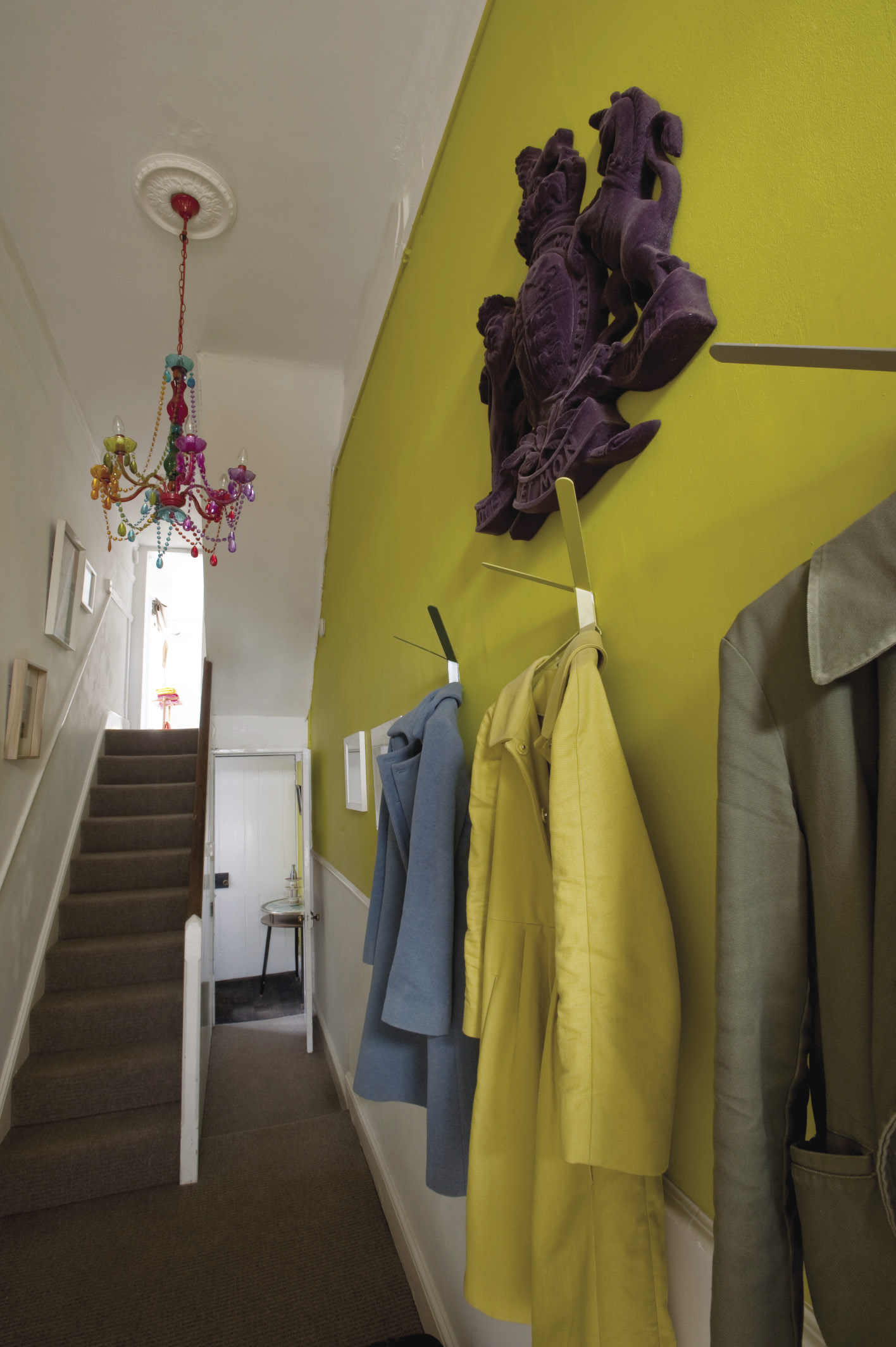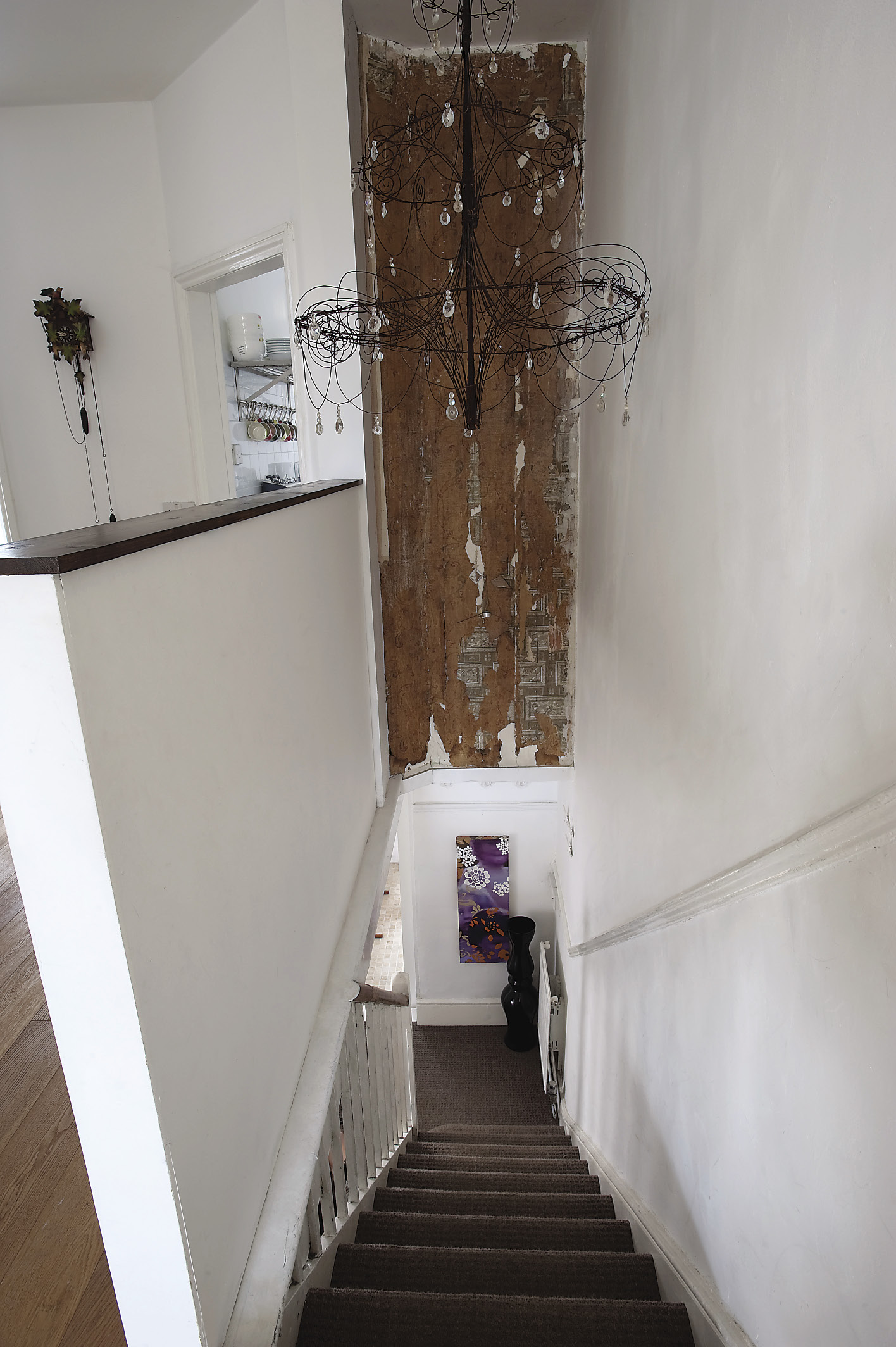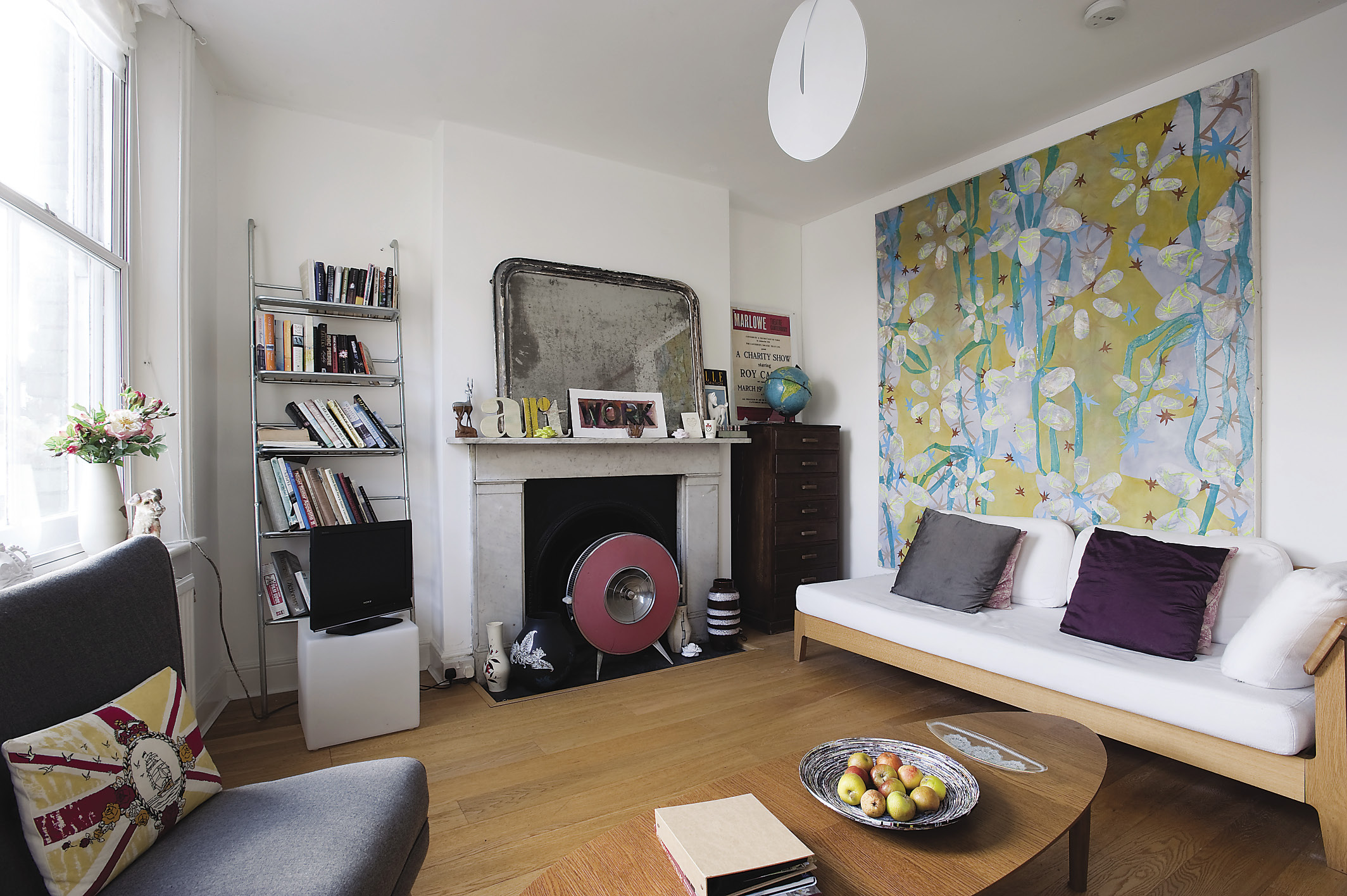
Behind the red brick façade of an early 20th century building, is a contemporary piece of architecture that is home to Anna Deacon and John Taylor, artists and designers with a prolific creative output and an extensive collection of art, part of which is on display to their bed and breakfast guests.
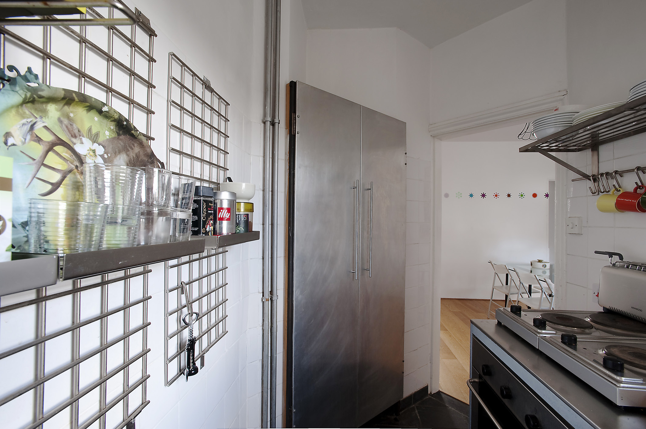
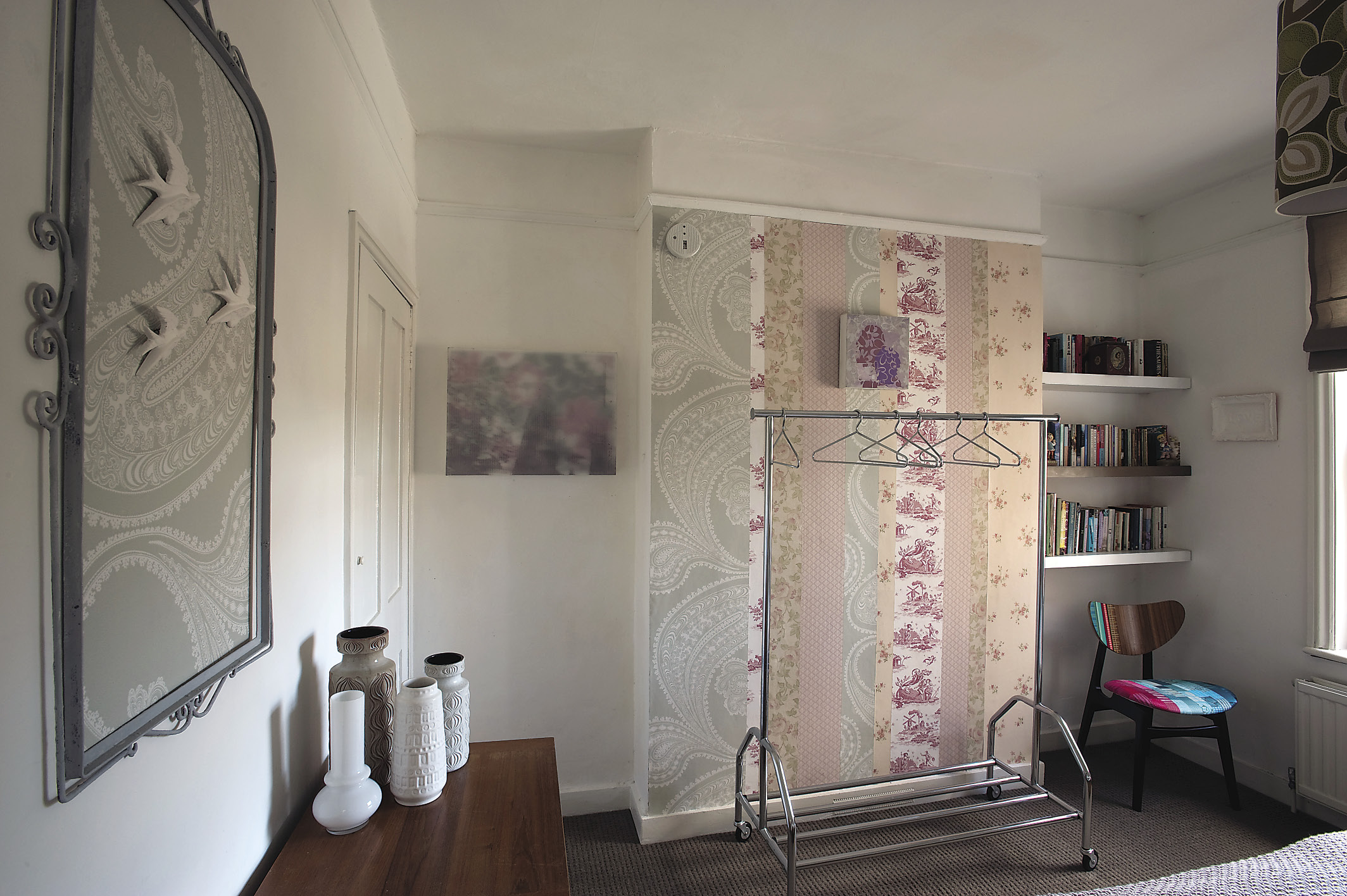
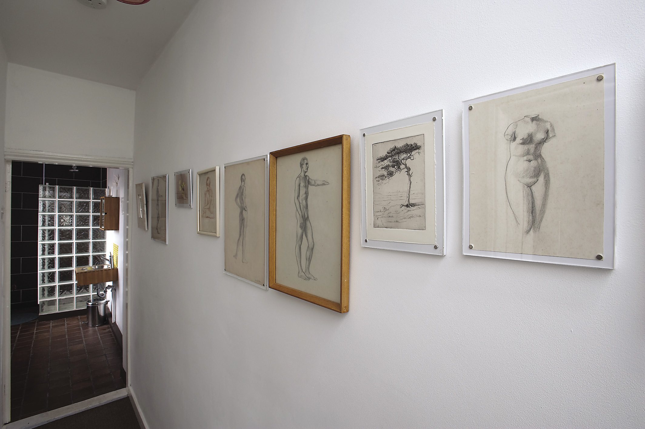
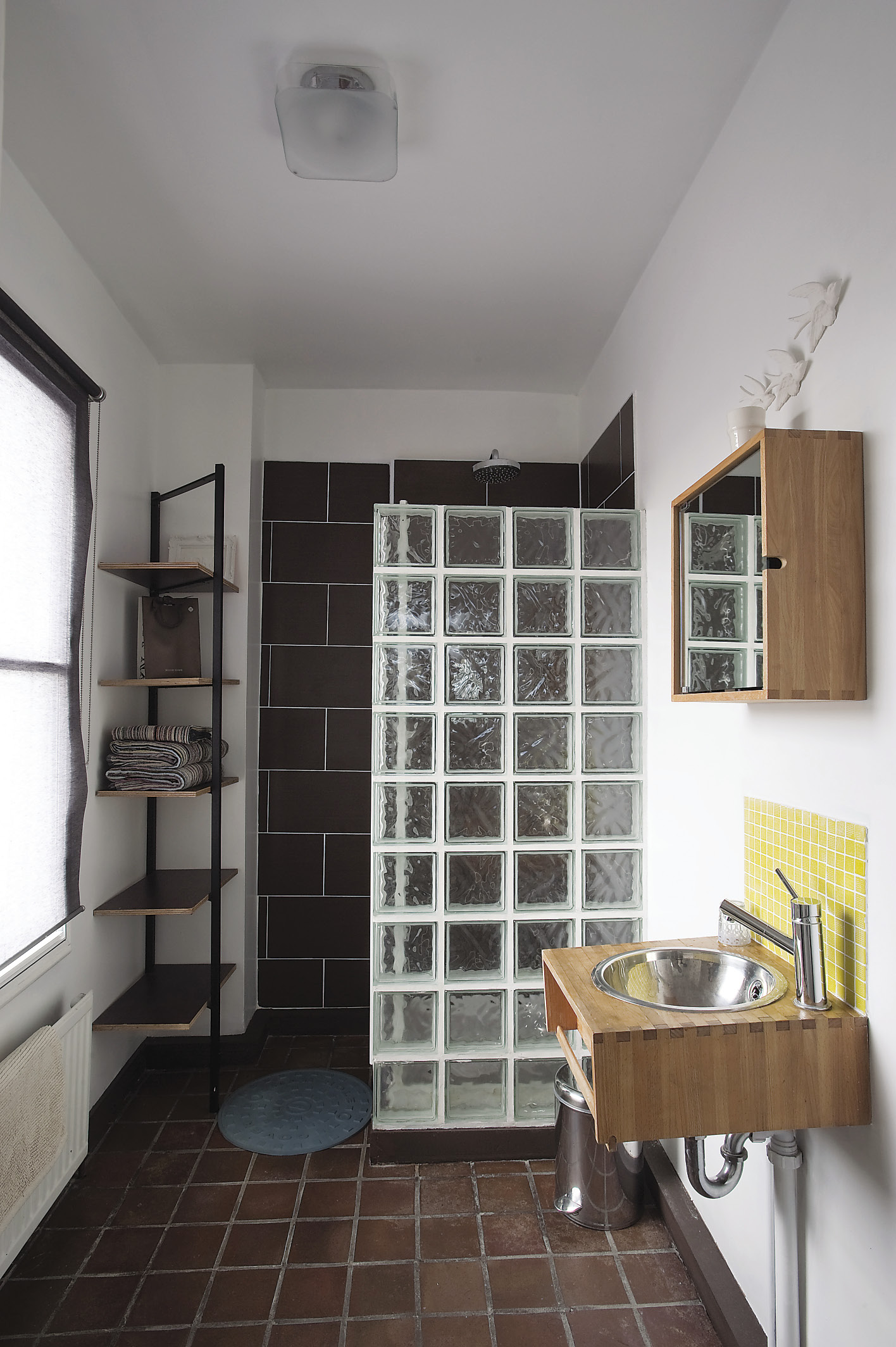
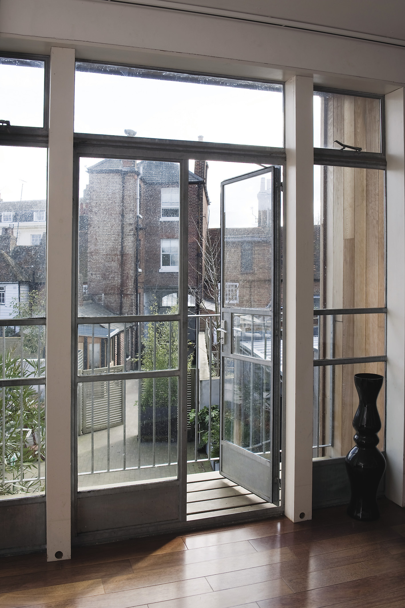
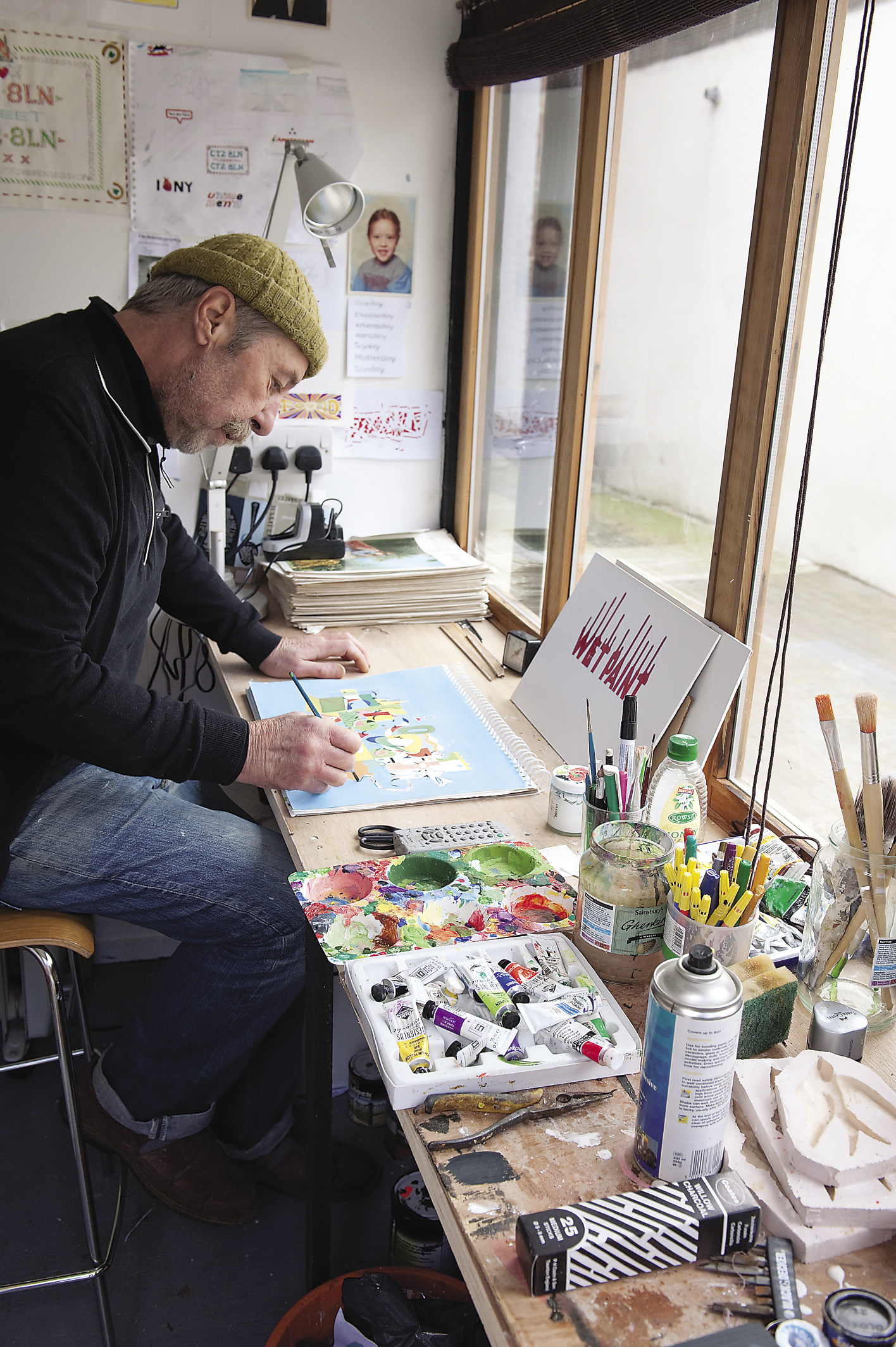
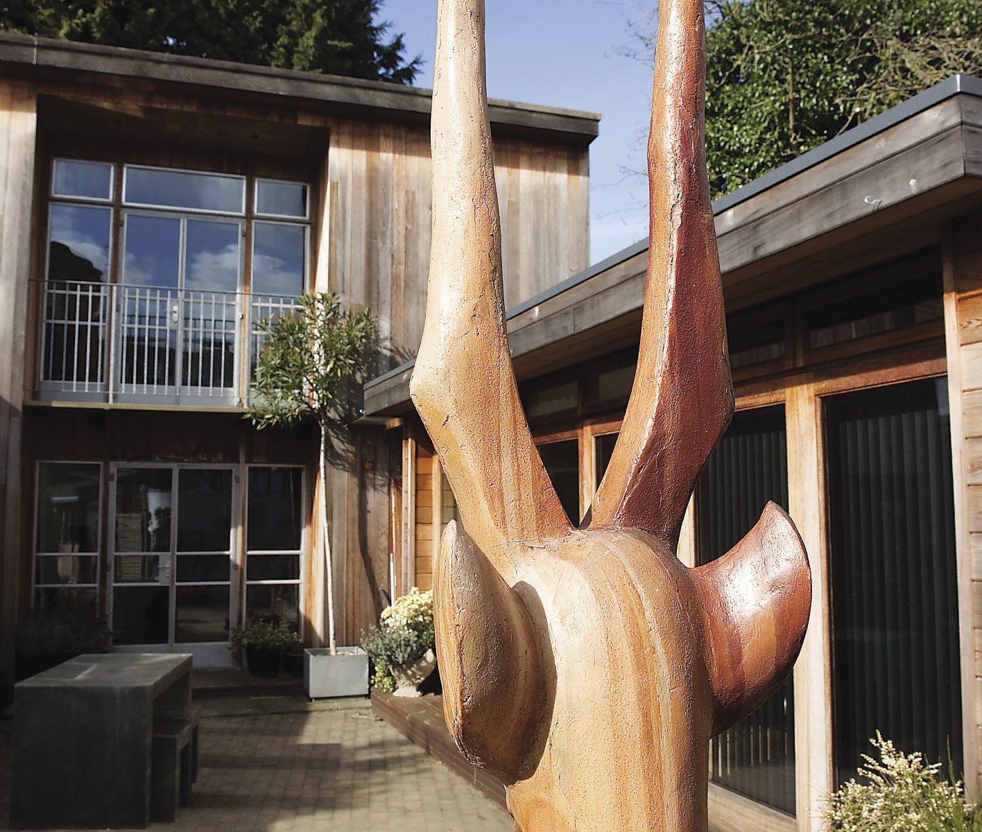
When they found the property, the couple had been living and working just outside Canterbury and really wanted a city centre base. They saw the Old Fire Station in St Dunstan’s but found that it had just been sold at auction. Undaunted, they offered the buyer an extra sum on top of what he had just paid. It did the trick. After some time using what was an old barn as a studio, the couple decided to convert and add to it. They realised that they could then run a bed and breakfast business from the Fire Station. “We felt we could offer something quite unique,” says Anna. “Because we have a sitting and dining room there too, families or groups of friends can have what is almost a self-contained apartment. Also, we didn’t want people to feel that they had to be ‘down to breakfast’ by a certain time, so we go in and lay everything out and then they help themselves and make their coffee when they’re ready.” Anna laughs as she says this, because as we talk, we are still waiting to take photographs in the B&B, but the guests aren’t out of bed yet, and Anna, true to her word, won’t disturb them. “We get really interesting guests from all over the world. It’s great to meet people who are studying or lecturing at the university and we’re really well placed here as there are so many interesting shops and restaurants nearby. We’re looking forward to when the Marlowe Theatre reopens as it would be lovely to have people from there too.” We chat in the kitchen of the U-shaped house that Anna and John commissioned. “We got Robert George, a friend and local architect, to design it for us. It was inspired by both Scandinavian design and the late 1950s, early 60s houses you see in the Los Angeles suburbs. Having a central courtyard is great. Each part of the U opens out onto it and it’s quite a suntrap.” The kitchen’s apparent simplicity is carefully considered. Three walls are pure white but the fourth is a striking duck-egg blue with no other adornment but a cuckoo clock. “We planned to paint an oversized chintz design on that wall, or a giant map of the world, but then we thought that it might feel as if the wall was coming towards you. Anyway, the blue offsets the colours on the clock rather well. Unfortunately, the cuckoo doesn’t stop “cuckooing” all through the night, so we don’t wind it any more.” Along the longest wall, glossy white cupboards from Habitat sit beneath a grey resin worktop naturally lit by a row of skylights. The room is quite plain except for a group of green Scandinavian glass vases on top of the 1950s style Smeg refrigerator and on another wall, three, black flocked birds, like a contemporary take on the traditional flying ducks. This is one of the home products that John and Anna design – the couple mainly supply independent shops, but also John Lewis. “In the 1990s we set up “Delusions of Grandeur”, John recalls. “Making wirework chandeliers, we began with a stall at the Top Drawer Show at Earls Court and sold everything in three days. We made more of course, and sold a huge one to Laurence Llewelyn-Bowen, as well as Heal’s, clients in Paris and Donna Karan in New York. It was an exciting time. Liberty’s had them in every window of one wing of the store and we even had Harrods and Selfridges fighting for an exclusive deal. Before long though, mass produced imitations from China started to appear, so it was time to move on.” With Anna’s background in fine art and an MA in textile design from Central St. Martins and John’s training in graphic design and experience as a toy and prop maker, they had a broad range of skills to draw upon. Although they still create products, these days, Anna particularly loves rug-making, while John has just built himself another, small studio next to the guests’ courtyard where he is working towards a forthcoming show. In the L-shaped dining and sitting room, the love of 1950s and 60s design is even more evident. A Danish teak sideboard, dining table and chairs set the tone. There is a small group of Fat Lava ceramics from Germany, their fiery oranges and reds sizzling against the pea green wall behind. Freestanding shelves display a set of blue and white ceramics by Janke Joubert. “We bought everything in her degree show,” says Anna. “They’re traditional blue and white china patterns, but she’s used parts of everyday plastic containers, such as the top of a Coca-Cola bottle to create jugs and eggcups with a twist.” In the sitting area, a sofa covered in grey herringbone fabric is punctuated with tangerine velvet cushions. With just one third of the sofa set against a panel of silver paisley wallpaper, the asymmetrical arrangement forms a series of pleasing rectangles and the Scandinavian style is underlined by a huge black shaded pendant light hanging at waist level. The wooden floor and the light from the double glass doors add to the sense of clean lines and purity of design. It’s like walking onto the set of Mad Men. “Oh we love that programme,” confirms John. “Every scene is like research for us.” Upstairs, there is a small balcony outside the main bedroom. Anna’s desk is against one wall and on another, a rug that Anna is currently making hangs from a frame. The design is based on the classic 1960s ceramics called “Elizabethan” by Portobello. A cat reclines in the sunshine that falls across the bed, unperturbed by the face of a black Scottie dog embroidered onto linen cushions. “These were inspired by pictures we found at a car boot sale. We thought of making them into home products and they are rather appealing, so we might still go ahead,” John says casually. The buzz of creative ideas in the house may be startling to the visitor, but it is simply part of Anna and John’s everyday life, as if art and design were as essential to them as eating and drinking. Inside the B&B at last, pictures by John and their friend Chris Smith draw the visitor up the stairs to the first-floor dining room. One wall is dominated by a large picture by Phil Wise, now a Royal Academician, who once worked with the couple. He has used an old photograph of two girls and set it against a Novamura wallpaper design then cut out parts of the floral elements so that they appear to float over the girls. The effect is as if the girls are ghostly apparitions glimpsed through a wall that has temporarily dissolved. Leaning against the window is a narrow portion of what looks like a Tudor portrait. It’s what John calls a “Tudorspective” and he has designed it as a visual joke, to be hung at right angles to the wall, as if the rest of the portrait is either escaping through the wall or about to emerge from it. In the adjoining kitchen the crockery has been designed by the couple and mugs, plates and bowls sport witty words made from Scrabble letters or simply say “Made in England”. The guests’ sitting room displays a huge painting in vibrant colours by Maisie Kendall, RA. There’s a sofa and chairs and shelves of real books as well as fake ones – another visual joke and one of John’s products, one “book” appears to hover on the wall, when in fact it’s a small shelf disguised as a novel. The relaxed atmosphere and sense of privacy here are worlds away from the kind of B&B where guests have to be up and out whatever the weather. Up a further flight of stairs, the bed in the front room is dressed with a grey and chartreuse green quilt by Orla Keily that contrasts with red and white pillows by Lisa Stickley. An original G-plan chair has been covered in fabulous citrus oranges and fuchsia pinks. “This is by Zoe Murphy” says Anna. “She uses old wedding dresses and screen prints the fabric then stitches the different panels together.” In the next bedroom, a second Zoe Murphy chair complements a blue and brown quilt, whilst one wall is covered in strips of different wallpapers. The corridor leading to the shower-room displays a collection of pencil and pastel drawings, some of which are by Anna’s aunt, Selina Bott-Slack, who studied at the Slade School of Art just after the First World War. Back through the courtyard, we have a brief private view of some of John’s work in progress in his studio. Working in a variety of media, his sense of humour is irrepressible. From “R.I.P.” ripped in linen, to spoof advertisements and a brown paper parcel in the shape of a boomerang with the clear instruction “DO NOT BEND” on the top, John delights in playing with words and images, though Anna says it can occasionally land him in trouble. “We have a website for the B&B and I offer some sign language lessons, so not to be outdone, John decided to offer yodelling lessons. He didn’t think for a moment that anyone would take him seriously, but we were filmed recently for a Channel 4 programme and one of the people on it that thought it was a serious misrepresentation!” What a pity to have missed the point of this place. It positively crackles with creative energy and ideas, and surely it’s a bonus if they are accompanied by a sense of fun.