Through pops of colour plus plenty of pattern and texture, Vicky Kieldsen has applied everything she loves about interior design to her own Tunbridge Wells home
For the uninitiated among us, starting a house renovation project and deciding to maintain the white walls in the main living space might prove an impossible prospect. Open any interiors magazine, Pinterest board or Instagram house account and you are overwhelmed with pictures of kitchen walls painted in every pink, blue, green and cream imaginable, but very rarely white. Who among us, when faced with unpacking boxes in a recently purchased home and planning a new kitchen, would be able to resist the desire to mark their territory with a colourful pot of paint? It takes a confident customer indeed to look at a space and decide that the existing white is in fact exactly what it needs.
Enter Vicky Kieldsen, a Tunbridge Wells-based interior designer who has transformed her home – originally a stable block converted to a single-storey house in 2005 – from a stark, grey and white shell into a characterful space pulsing with pops of colour, pattern and texture. Thank goodness for Vicky’s personable nature. It is only thanks to this that I am able to concentrate at all while she tells me about her degree in interior architecture, as I am constantly peeking over her shoulder and making a mental note of sunshine-filled prints and bright, eye-catching plant pots. Following work in hotel design and a stint as Editorial Assistant at Living Etc. magazine, Vicky started Hello Geronimo, where her initial focus was making pieces of art that were stocked in hallowed interior institutions such as Heal’s and Graham & Greene. However in 2019, she realised her raison d’être lay elsewhere. “I decided to go back to interiors,” explains Vicky. “It makes me really happy, working on the residential side, helping clients and making people’s houses colourful.” She laughs when I point out the literal blank canvas on the walls behind her, but much like her approach with her clients, Vicky tackled her own rooms on a case-by-case basis, acknowledging that if she were to live somewhere else she would most likely do the kitchen very differently. “I thought a lot about this room and what colour I would paint it,” Vicky says, “but it’s got really high ceilings and it’s so bright that it really does suit the white walls.”
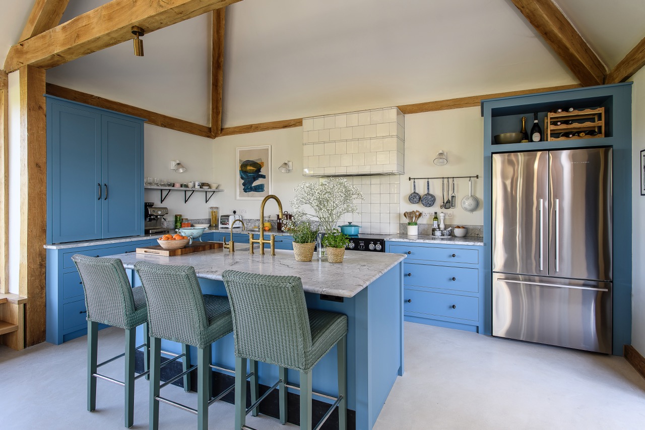
In 2016, living in London with a growing family, Vicky and her husband decided to move to Tunbridge Wells in search of more greenery, and immediately fell in love with the house and its spacious, airy feel. Backing onto a large and attractive public park, the house retains many original features including vents for the horses and porthole windows. “When we moved in,” Vicky says, “the décor was very ‘Scandi’. The kitchen was white, the worktop was glossy black, the cabinets were tired with cupboard doors falling off, it was all a bit characterless.” Knowing that vivid artwork, furniture and accessories would be used to decorate the room, Vicky opted to install a Magnet laminate kitchen in dark blue to offset the bright pops of colour. Keen to make the most of the space available, she continues, “We opted to go for higher cabinets because we’ve got the space to maximise storage there – it looks fresh and new, and it really suits the house now.” Vertical, striped tiling has been incorporated behind the range cooker, bringing interest to an often-overlooked area, and the whitewashed, engineered floorboards have been sanded back to neutral with the effect of warming up the room. Vicky also repainted a grey dresser in eye-catching green and added bobbin beading sourced from Decora Mouldings around the doors and drawers, lending depth and personality to a functional area. Externally, a pair of rotting, wooden French doors have been replaced by new aluminium bi-fold doors, letting in an abundance of light and allowing the trees of the adjacent park to feel like an additional colourful add-on! Vicky says, “It’s great when the doors are folded back, this space just opens out into the garden and it’s really good for entertaining.” It also allows for an open plan set-up that suits family life, where the grown-ups can be cooking and eating while still being able to see what the kids are doing – running in and out of the garden or watching TV.
Elsewhere in the house there are four bedrooms, with one currently being used as a snug.


The dark blue walls and rich, burgundy red velvet sofa give this room a cosier atmosphere, a cocoon-like space to retreat to and “a separate space for when my husband and eldest son want to watch football!” It is a far cry from the room they found when they first moved in, with a floating platform bed hung from the ceiling, accessed by a stepladder. “It was quite cool and obviously made use of the high ceilings, but just wasn’t very practical with young children!” The children’s bedrooms were styled by Vicky, who decided against using curtains in these rooms. “The shutters really suit this house – it needs simple and contemporary,” and painting the graded green walls in her son’s bedroom was an initial experiment into the use of colour in children’s rooms. “It was probably the first kid’s room I ever did, and I immediately started to gravitate towards playing with colour.”
The focus was always keeping their bedrooms interesting, and Vicky spent considerable time researching independent brands for colourful accents to create intriguing corners of space. During lockdown, Vicky also decided to enhance her focus on colour by conducting a wealth of research into colour psychology and the importance of using the right colours from the perspective of promoting good sleep, and creating a calm, welcoming environment: “I think it’s really important to get this right, especially with kids’ rooms. The colours on the walls can have an impact on sleep, mood, everything.”
Aside from one north facing bedroom, the rooms are all south facing, allowing plenty of light through the large, single panes of glass, and nowhere more so than the main bedroom which benefits from full height sash windows.


A mezzanine overlooking the bed exploits the amazing potential of the high ceilings, and carefully chosen artwork and furnishings contrast with the concrete-effect wallpaper, contributing to a more grown-up space and allowing the patterns and textures to speak for themselves. At the opposite end of the spectrum, the modular bathroom in place when Vicky and family moved in had a false low ceiling and was painted black, creating a dark, unwelcoming space. “It was like being in a bad hotel in the ’80s!” remembers Vicky. They decided to rip the whole thing out and to open up the ceiling to the pitch. “It made the room feel so much brighter, lighter and bigger. We added Fired Earth tiling to the walls and floor and boxed out the bath to hide some pipes, which also makes a handy ledge to sit on while the kids are in the bath.” The shower has also been cleverly incorporated into the room, with no shower tray or door, opening up the space even further.
Structurally, the house has not required any updating given its recent build date, and it has also benefitted from a series of experienced residents. Vicky explains, “The first buyer that lived here was an interior designer, and then a fashion designer lived here after that, and now of course there’s another interior designer, so the house has quite a good design history!” Vicky also credits her husband with transforming the garden. A rock garden and a vast bamboo bush taking up most of the space were painstakingly removed in favour of new trees, paving stones and an area of astro where the children enjoy playing football and cricket. Vicky adds, “He has completely changed everything out there and it’s now a lovely area to be in.” With the addition of a Big Green Egg and a Gozney pizza oven it has become a sociable enclave that’s used all year round.


Vicky has a number of go-to brands that fit with her contemporary style, including HK Living for lighting and ceramics, and Danish brand Hay for furniture and accessories: “Our dining table and chairs are from Hay, as are the outside table and chairs – they just do very well-made furniture,” she says. “I also love Loaf sofas; I think they’re really great and their colour options are amazing.” When designing someone else’s home, Vicky’s focus is always on playing with lighting and trying to create little pockets of brightness as opposed to flooding an entire room. Alongside this, incorporating colour and pattern is key: “If a client doesn’t want it on the walls, then I would always try to bring colour and pattern into upholstery and curtains and cushions and the floor.”
Vicky is also a fervent supporter of utilising stripes, believing that they provide interest and balance without being too ‘of-the-moment’. “I do like stripes. I think they will always be around. They’re timeless. But I try to rein it in a bit because not everyone likes stripes as much as me! My main obsessions are colour, pattern and texture. And I just want people to walk into a room and literally fall in love with it.”
Address Book:
Through her company,
Hello Geronimo, Vicky offers full interior design, single room design, room styling and more, with most services available in-person or remote. See hellogeronimo.com
Hay hay.dk
HK Living hkliving.com


- words: Fiona Patrick
- pictures: David Merewether
You may also like
Slow Grown
With a focus on quality and sustainable sourcing, designer Lucy Dwyer’s carefully considered family home is built to last We shape our buildings; thereafter they shape us.” – Winston Churchill. It’s a line often used to describe grand civic architecture,...
Family Connections
Step inside Leigh Butler Dawson’s creative outlet, an apartment renovation that epitomises his dark, dramatic aesthetic rooted in a love of texture, colour and tone There is something rather magical about arriving at Leigh Butler Dawson’s apartment, just north of...
Shop in Colour
Tucked away in a peaceful street, Matt Setchell’s beautifully colourful apartment is testament to the motivation to open his shop – to spread more joy We are in Hastings – the town that welcomes day trippers and here-to-stay creatives in...

