After years of living abroad, Mike and Caroline decided to move back to England. It was to be a permanent move, but they still travel extensively and so needed to find a place that would be easy to extricate themselves from and also be an appealing and welcoming home to return to. They had found an apartment in what was once an industrial building. “The battery factory had lain empty for a while and saw a variety of uses prior to its eventual conversion in the 1990s,” says Mike. “The developer that took it on made three units; two from the existing units and one purpose built, but constructed with character to maintain the uniqueness of the original building.” There are now 89 flats that form a complex within the grounds of the old factory. Mike and Caroline bought a 90 square metre studio apartment in one of the original units. Almost immediately they knew that they wanted to make some major changes. The previous occupants had made a very pleasant and perfectly acceptable job with the interior, but it wasn’t quite what the couple had wanted. They also knew what an upheaval an interior makeover could be. “After spending my youth renovating old properties and making too many trips to DIY emporiums, I knew I didn’t want to do that again,” says Mike sagely. “We loved the pared back, slightly industrial feel of the building,” he says, adding, “it was light, but with very high ceilings. We could have been minimalist and streamlined, but some of that style is too cold and clinical. We wanted to make it warmer without compromising the integrity of the space.” Not an easy task and one that would require considerable thought and expertise. Mike and Caroline made a bold decision and chose to commission an interior architect. “This was a once in a lifetime opportunity really,” Mike says, “although I was a bit sceptical at first. It is not an easy decision, especially when you’ve spent all your younger life doing DIY because you can’t afford to employ people.” They were clear in their requirements, but it took a while for them to find the right person. “We wanted to find someone that bonded the rigour of architectural planning with design flair.” It is a combination that is not often found within one person, or even a whole company, but they did eventually find the right man for the job. Enter Daniel Hopwood (he of the BBC’s amateur design programme The Great Interior Design Show and also President of the British Institute of Interior Design). Daniel is an architect by training, and having run Studio Hopwood for the last twenty years, is able to offer his clients that rare thing: design led architectural solutions. “The brief was to make a warm, manageable and efficient home: ‘a machine for living,’” says Mike, “but also one that would stand the test of time.” Having just returned from Dubai, they were in the useful, but slightly daunting, position of starting from scratch. “Being on the move the whole time means that you discard as you move and start to travel light. When we lived in England before, we had a Victorian house, and so none of our existing things really fitted the new scheme.” They began anew and pared everything back – literally, as the interior of the apartment was completely stripped back to a concrete shell. This meant that they could give Daniel a free reign with the overall design, but the couple were still completely involved in the process – going to showrooms, looking at samples and choosing colours and furnishings. Daniel’s team at Studio Hopwood took the legwork out of it for them, as Mike explains: “Their office did hours of meticulous – and probably tedious – work researching and sourcing. I came back for meetings every 6 weeks or so and probably had about 5 meetings and 3 site visits.” The turnaround from approved concept to finished project was impressive, especially considering that everything had to be taken up to an apartment on the second floor. “They started work in December 2015 and were finished by the following May,” says Mike. Much of this smooth running process was down to the construction team, a company called PSP Project Ltd. “Those guys were exceptional – meticulous and detailed. If it didn’t work, it was stripped out totally and re-done,” says Mike. “Of course you pay for it, but you get value for the money in the end. There was a cooling off period just after the job was finished, so they basically came back in September and did any snagging and any minor readjustments then – once we had lived with things for a while. There weren’t really any, but they are still in touch now, two years on, and would come and sort anything whenever we asked.” The high level of workmanship is plain to see, but it is the combination of Daniel Hopwood’s vision, together with the superlative finishes that brings the whole interior together. There are many ingenious practical ideas in this interior, but what is equally ingenious is that they combine so seamlessly and create a spacious and streamlined feel to the whole apartment. Daniel sees the space as one, so that each ‘zone’, as he would call it, works as an independent area, but also as part of the whole. “In order to maximise the available space, Dan talked us into doing away with the second bedroom, so that we could have two generous bathrooms and a larger hall.” This also means that there is no need to scrimp, or compromise. The result is that nothing looks out of scale and the proportions of each room are luxuriously spacious. With the overall idea of proportion and scale in his mind, Daniel also put in carefully sectioned suspended ceilings. Along with lowering the very high ceilings, this had the practical advantage of hiding the services and, Mike says, “it also delineated the different areas, helping to divide one large space into a hall, living room and kitchen.” Cleverly, this ‘zoning’ occurs at ground level too, as the floor surfaces change and align with the ceiling sections. The kitchen tiles are made from porcelain; the look is quarried limestone, but very functional, with none of limestone’s disadvantages. A herringbone of oak, stained to match the kitchen floor tiles, subtly indicates the change from kitchen space to living room, together with a thin brass rod that runs exactly parallel to the ceiling panel above. The linear brass inlays are picked up as a theme on the walls too, which are also made from grey stained oak. The golden lines serve to unite and streamline the space, running across the ‘hidden’ doors to the bedroom, bathrooms and a storage area. The attention to detail here is sublime – it is almost impossible to tell where the doors are, and the entrance way, with its artful piano coat rack is wonderfully uncluttered. There is also plenty of stylish trickery going on with storage in this property too. It has all been designed to maximise space, but has had to add to the overall aesthetic; everything has been very carefully chosen to work together and create one seamless look. There is a Bulthaup kitchen, which is deceptively large for a one bedroomed apartment. Mike smiles, “we had enough kitchen to go into a medium sized house, but it fits beautifully in this space.” I see no sign that it is an actual kitchen. “It is easy to put things away,” he stresses, “because there’s enough space; there are plenty of cupboards, and most of the time there’s only the two of us.” Adjacent to the kitchen there is a desk unit that holds a safe, a printer – basically a whole office in one small cupboard. In the bedroom there are other ingenious solutions to prevent any potential clutter. There is a wall at the end of the bed with storage behind that also serves to make a partitioned dressing area. Caroline even has a ‘pop up’ dressing table with a mirror that folds cleanly down into a base unit. The streamlined look is partly down to the fact that all the practical, fiddly details have been incorporated into the design – electric points are recessed and there are no radiators to worry about, because all the warmth comes from underfloor heating. The lights – well, the lights are the exception and have become works of art or design classics, so serve as focal points as much as anything else. The bathrooms in particular have excellent lighting. “All my adult life I’ve wanted an electric shaving mirror,” says Mike “and now we have two!” And (how luxurious is this?) the mirrors are also heated so that they don’t steam up. On the panel above the bed there is a pair of slinky and iconic Serge Mouille lights from the 1950s, but the most dramatic and alluring light of all has become the central feature of the apartment – a magnificently organic and sculptural chandelier by Lyndsey Adelman. It is one of her ‘Branching Bubble’ series and hangs with elegant poise above the dining table. This chandelier totally transcends the classic design mantra ‘form follows function,’ becoming a pure work of art. It is clear that art is important to Mike and Caroline, and their numerous pieces are shown off to good effect by the muted colour scheme in the open plan area of the apartment. The paintings in the bedroom contrast beautifully with the bedroom wall, which is a pure, strong blue. Vibrant accent colours are used elsewhere in the apartment, too – to draw the eye and to break up the neutrals. A deep orange vertical panel is particularly appealing (this is a favourite colour of mine, but I must learn from Mr Hopwood that less is more…). The restrained, seamless look is enhanced by using a limited colour palette across different textures and finishes. And by making sure that they encompass all areas, the elegant Minotti furnishings look effortlessly at home, and all the other details have been chosen to reflect the overall scheme. The entire apartment exudes a highly groomed and understated atmosphere of both comfort and self assured poise. Creating such a space from a stripped back concrete box, or ‘shellout,’ calls for a large shellout of another kind, but the results speak for themselves. It is a truly fabulous apartment. Having gone through the whole design and build process with the team they employed, would they recommend it? “Yes,” is the firm response. “But you really need to move out completely until the work is done. Be prepared not to be present.” The couple have achieved exactly what they wanted, and more. “I have now come to see the merits of really good design and contract work,” says Mike. “Overall it was like doing a Grand design,” he pauses and smiles “…without the hair pulling stage.” A measure of true success.
After years of living abroad, Mike and Caroline decided to move back to England. It was to be a permanent move, but they still travel extensively and so needed to find a place that would be easy to extricate themselves from and also be an appealing and welcoming home to return to. They had found an apartment in what was once an industrial building.
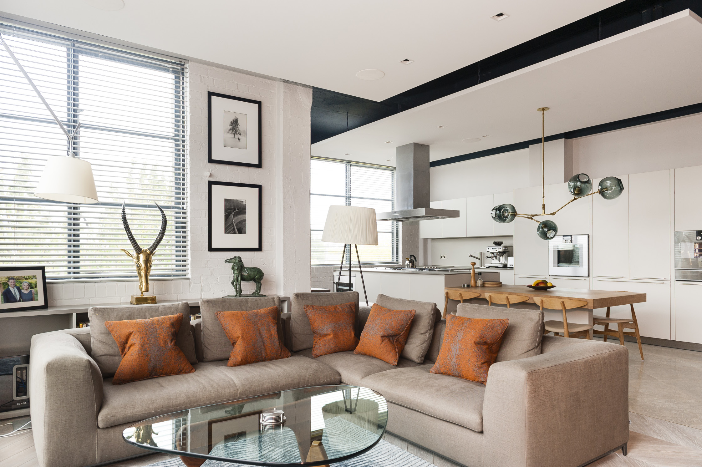
It is clear that art is important to Mike and Caroline, and their numerous pieces are shown off to good effect by the muted colour scheme in the open plan area of the apartment
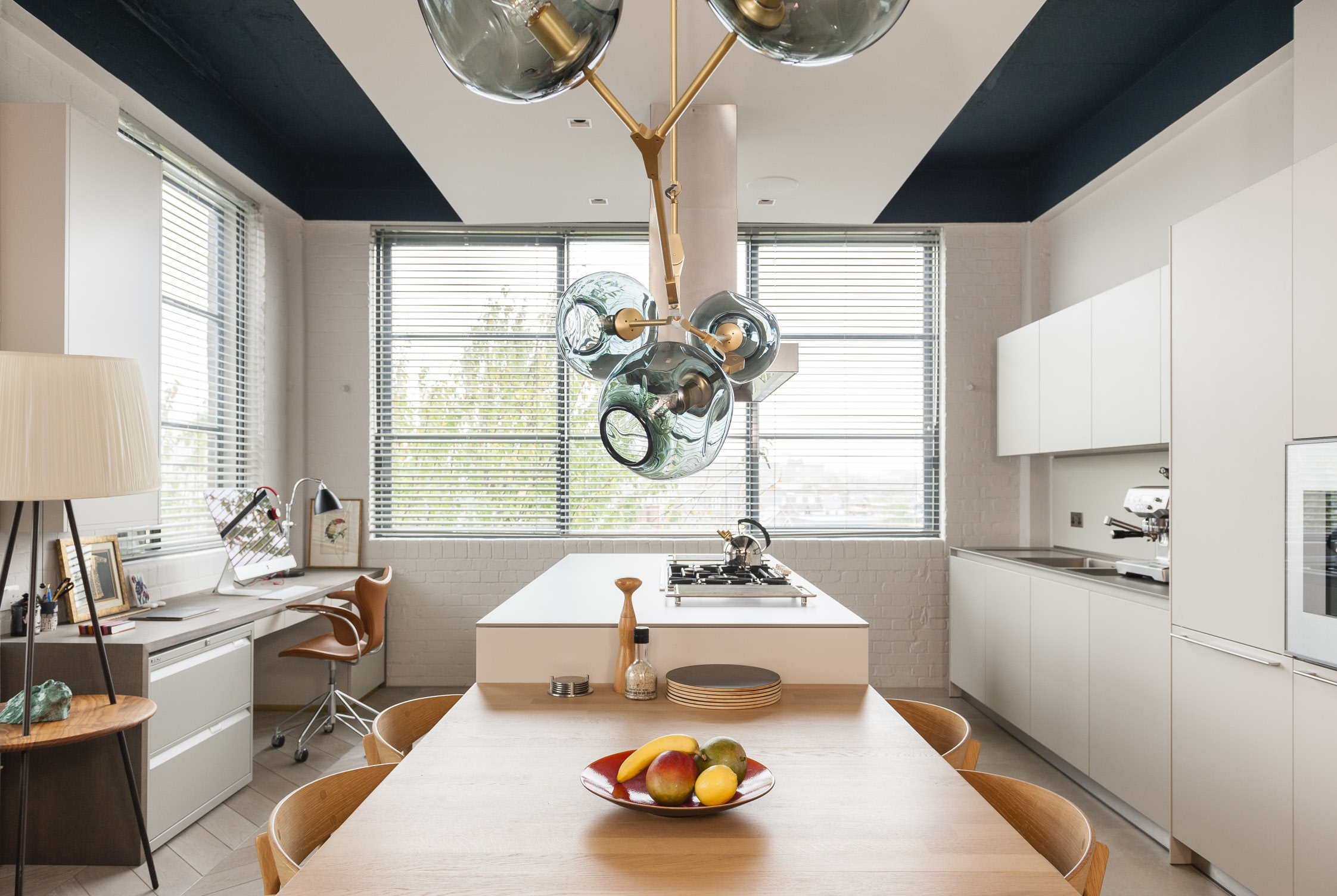
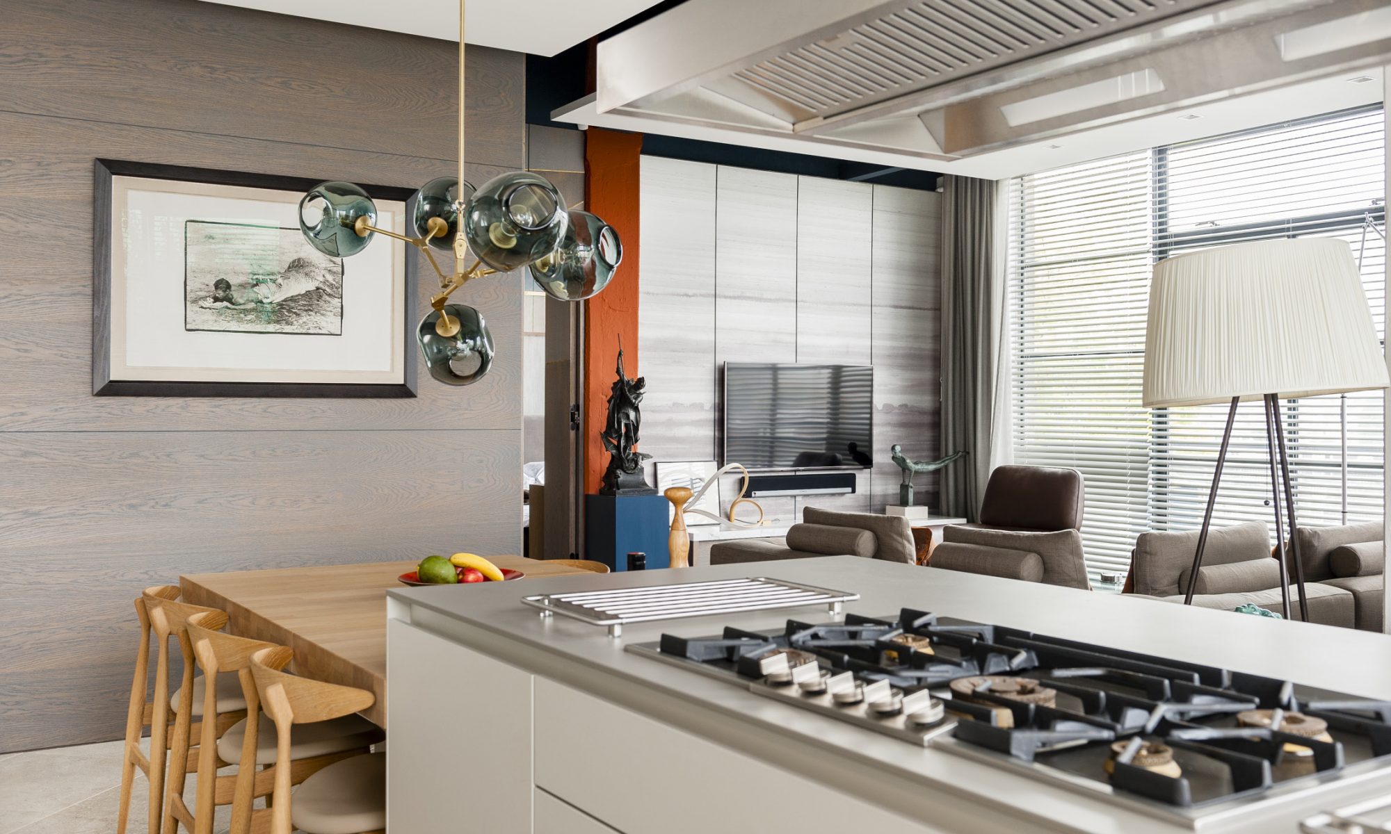
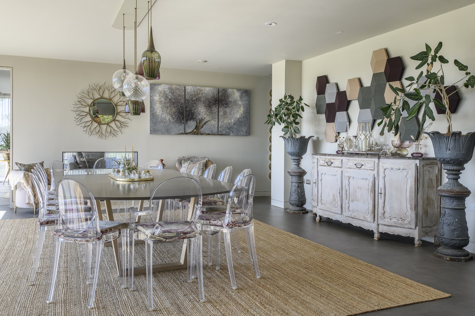
The kitchen, with its sculptural chandelier by Lyndsey Adelman, blends seamlessly into the living room
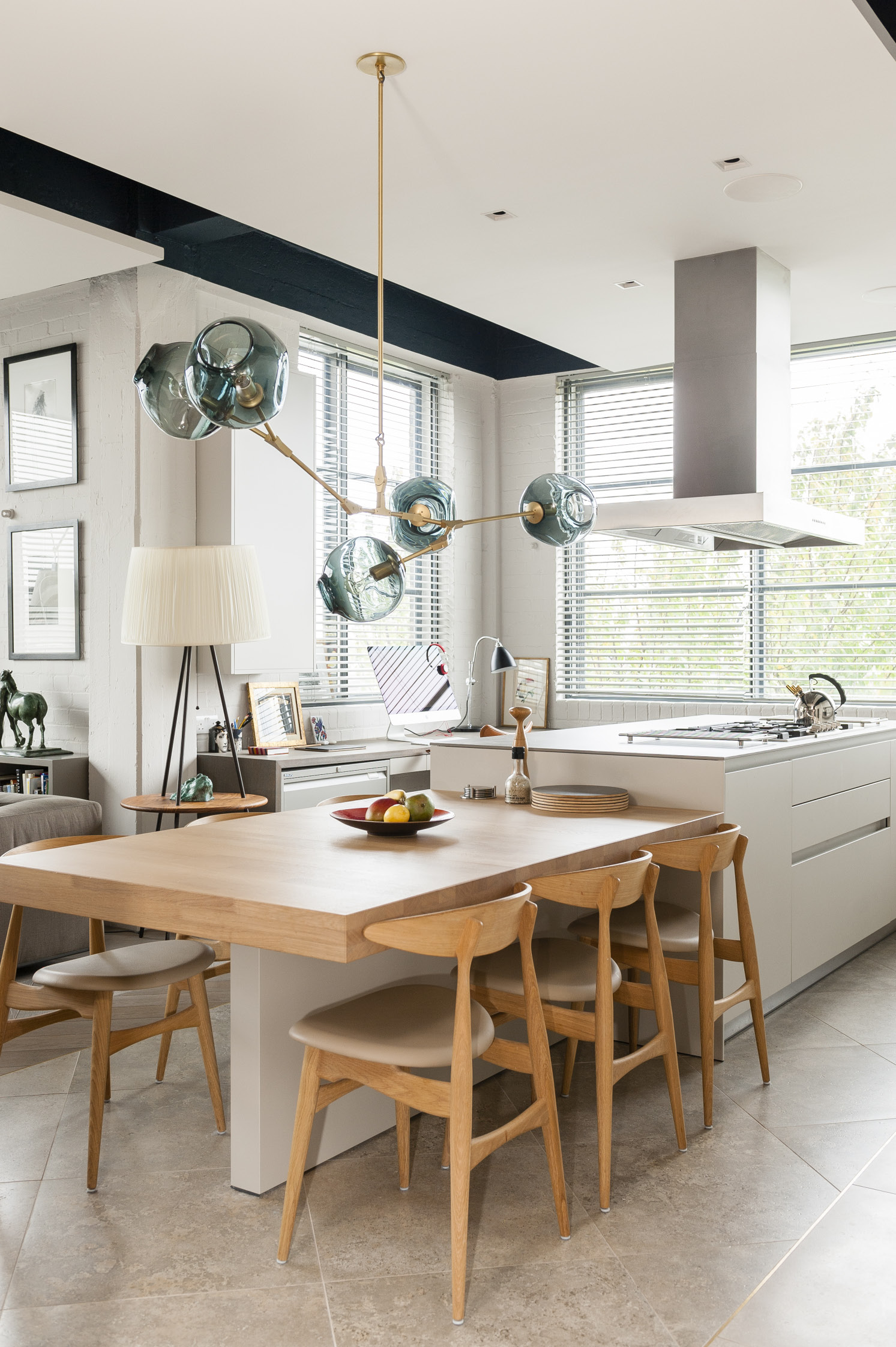
Adjacent to the kitchen, a desk unit acts as a home office
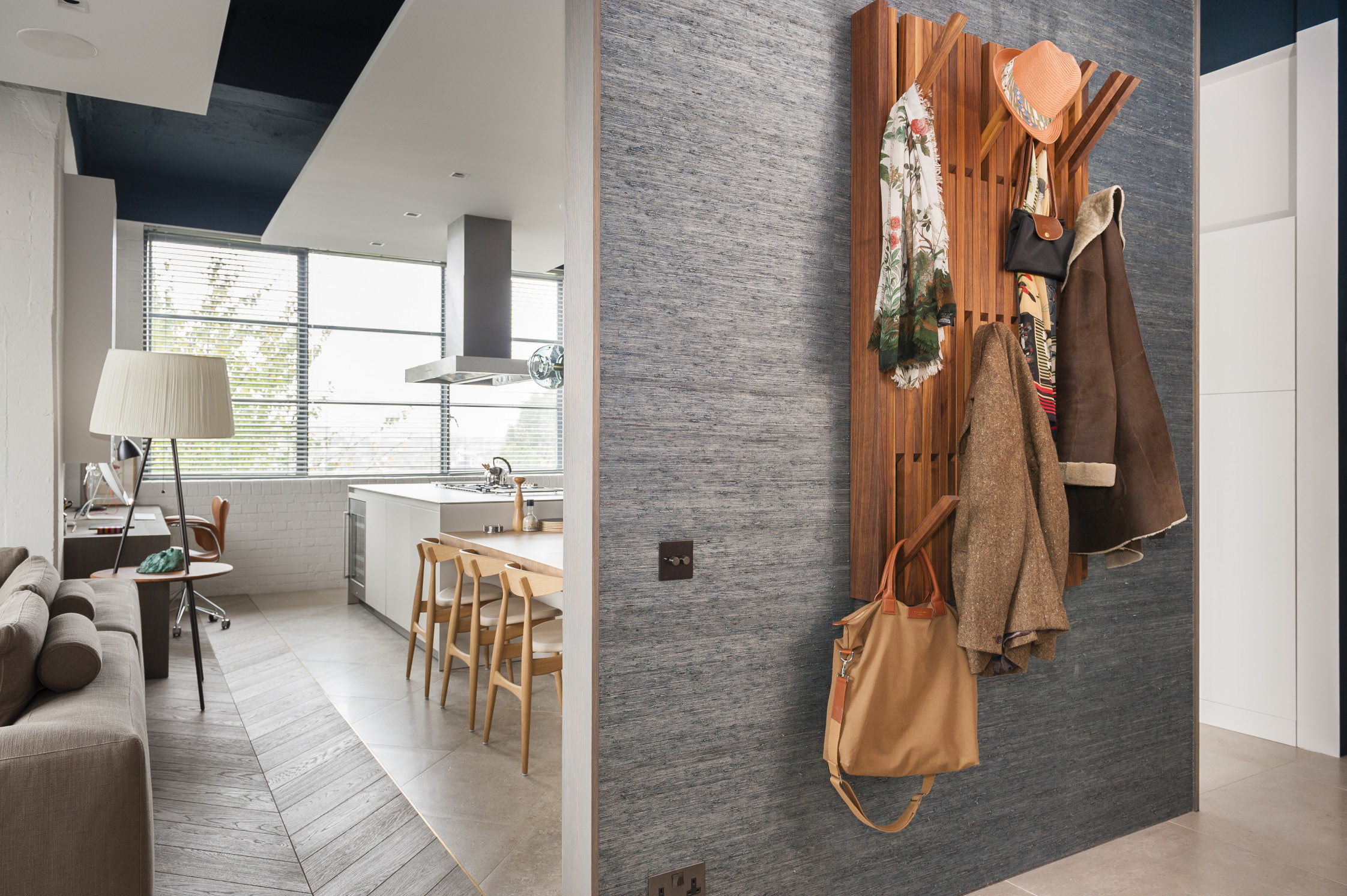
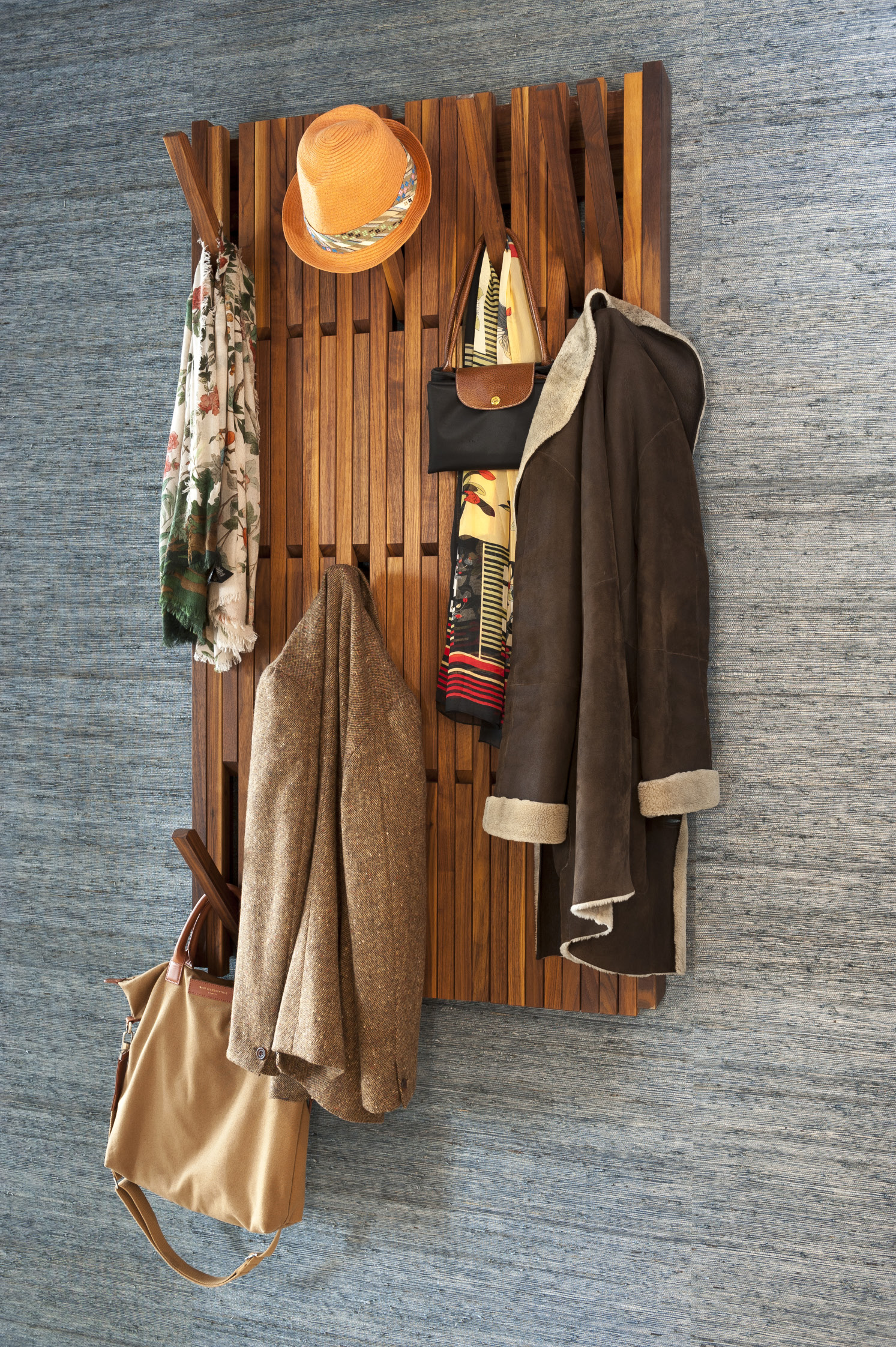
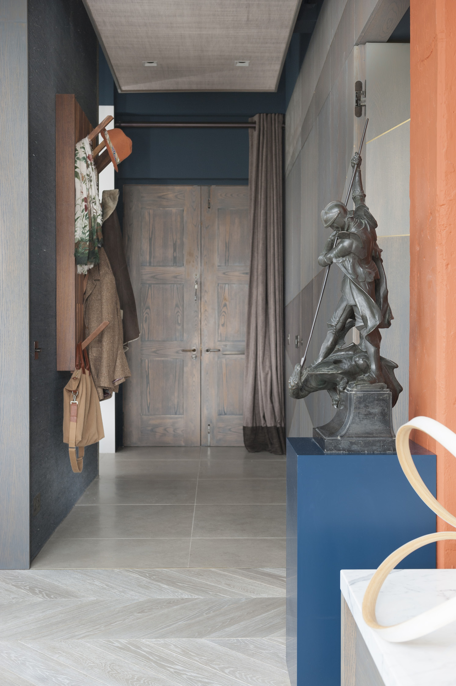
The spacious entrance way, with its artful piano coat rack is wonderfully uncluttered
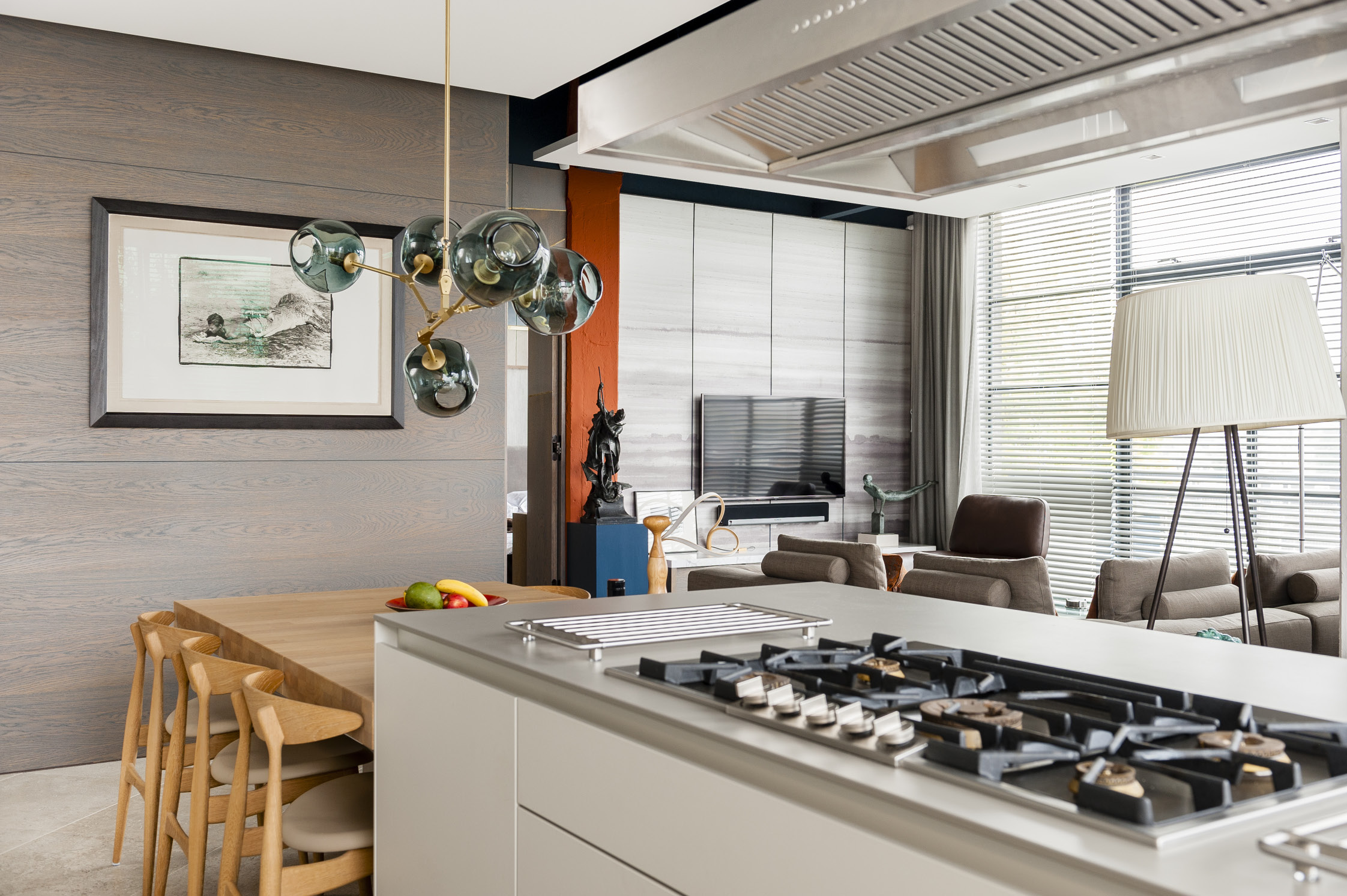
The Bulthaup kitchen is deceptively large for a one bedroomed apartment. “We had enough kitchen to go into a medium sized house, but it fits beautifully in this space,” says Mike

The streamlined look of the apartment is partly down to the fact that all the practical, fiddly details have been incorporated into the design – electric points are recessed and there are no radiators to worry about, because all the warmth comes from underfloor heating.
Mike and Caroline made a bold decision and chose to commission an interior architect. “This was a once in a lifetime opportunity really,” Mike says, “although I was a bit sceptical at first. It is not an easy decision, especially when you’ve spent all your younger life doing DIY because you can’t afford to employ people.”
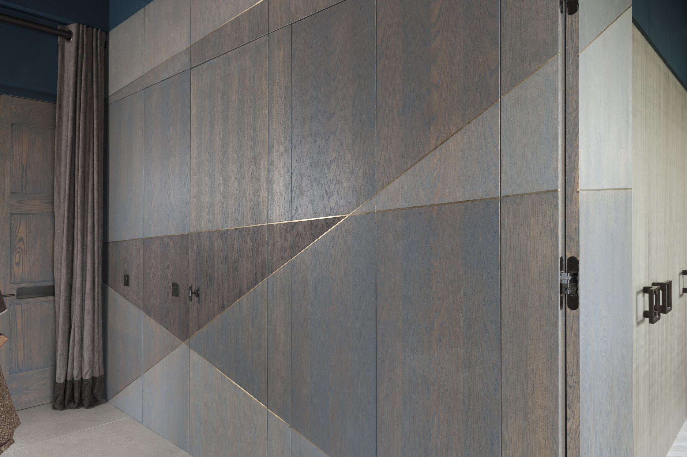
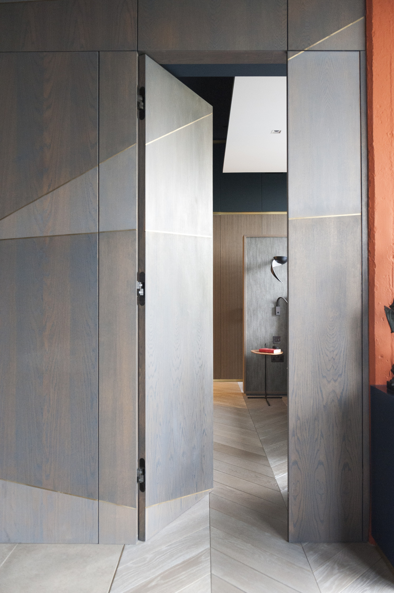
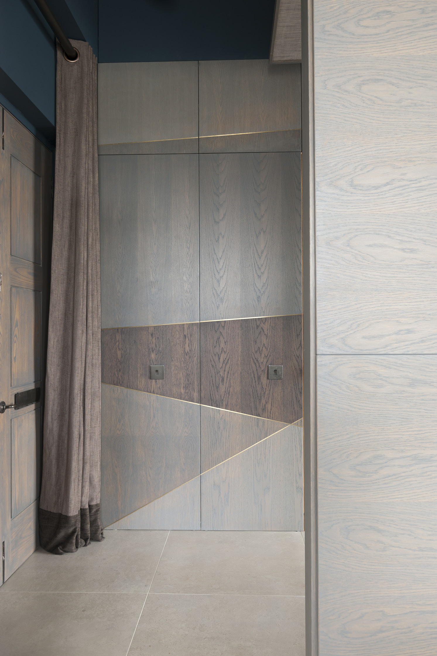
The linear brass inlays are picked up as a theme on the walls too, which are also made from grey stained oak. The golden lines serve to unite and streamline the space, running across the ‘hidden’ doors to the bedroom, bathrooms and a storage area
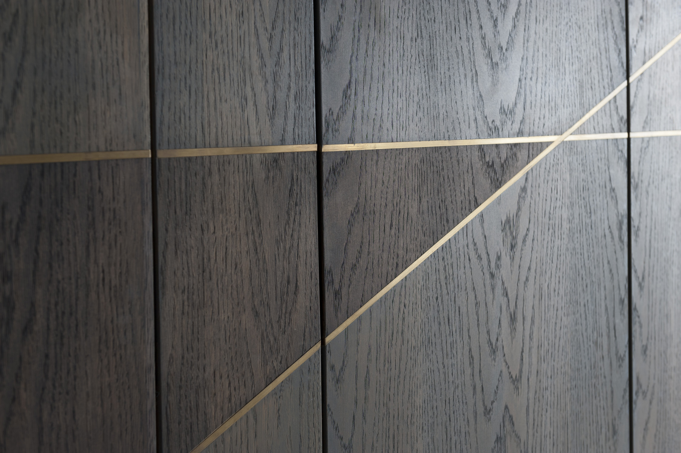

The attention to detail throughout the apartment is sublime – in a wall of beautiful geometric wood panelling, it is almost impossible to tell where the doors to the bedrooms and storage area are

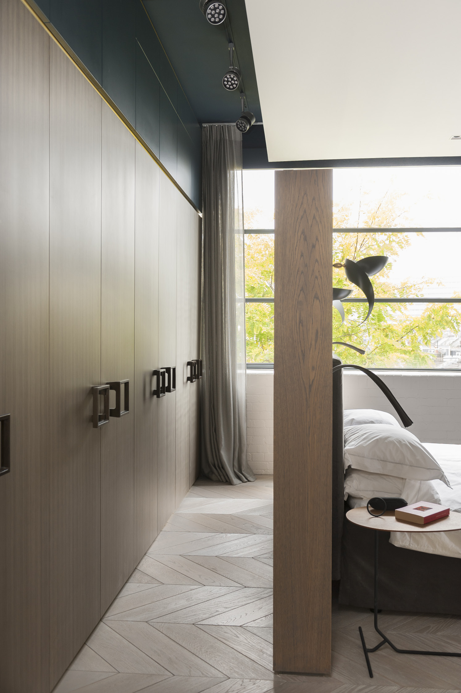
In the bedroom there are other ingenious solutions to prevent clutter.
A wall at the end of the bed features storage behind that also serves to make a partitioned dressing area
A herringbone of oak, stained to match the kitchen floor tiles, subtly indicates the change from kitchen space to living room and bedroom
What appear to be quarried limestone floor tiles are actually porcelain – very functional, with none of limestone’s disadvantages

With the overall idea of proportion and scale in his mind, Daniel also put in carefully sectioned suspended ceilings. Along with lowering the very high ceilings, this had the practical advantage of hiding the services and, Mike says, “it also delineated the different areas, helping to divide one large space into a hall, living room and kitchen.”

The bathrooms in particular have excellent lighting. “All my adult life I’ve wanted an electric shaving mirror,” says Mike “and now we have two!” The mirrors are also heated so that they don’t steam up.

- words: Jo Arnell
- pictures: David Merewether
You may also like
Love where you live
Careful to inject plenty of each homeowner’s personality into every project, interior designer Jenny Branson’s gentle and measured approach has won her many clients who adore her use of colour, pattern and mood-lifting design There is something instantly connecting when...
Design Partnership
A family home has been reconfigured for modern living with the help of an expert team of designer, builders and architects who have managed to bring a little South African al fresco living to the heart of Reigate There’s a...
A House With Purpose
Charity founder Katie Dockery’s incredible home, designed by Richard Hawkes on the site of a former Qatari prime minister’s stud farm, has allowed her to create a safe and welcoming countryside retreat where she and her team tap into the...