Using her own professional skills, Zoe Joannou has transformed a classic Tunbridge Wells villa into a glamorous space for modern living
I started off interviewing interior designer Zoe Joannou about her own house – but I was soon asking questions about my own. (Specifically, what heading I should have on the new curtains in my bedroom… there are so many choices and it’s so complicated, who knew?)
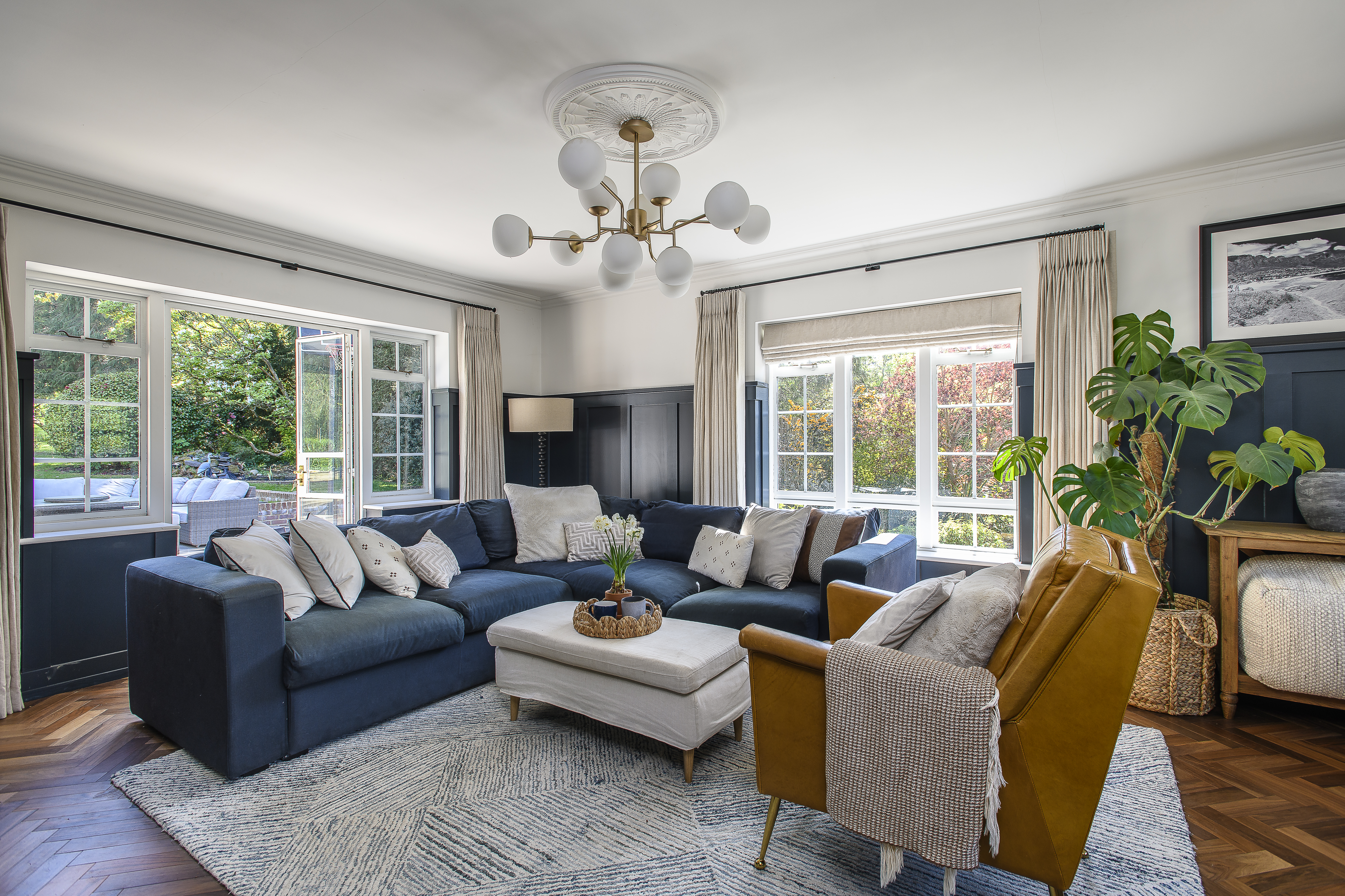
When you are in the presence of an expert professional, who has used her own skills and experience to transform a fairly standard three-bedroom Tunbridge Wells Victorian villa into a sleek contemporary four-bedroom dream home, with boutique hotel glamour, you’d be mad not to get some tips. For starters, one of the ways Zoe has effected such a striking change to her house is by going big. Really big. Not just the standard knock-through and living-kitchen extension, she has extended the house on all three floors, using reclaimed bricks, with new wooden sash windows. “We wanted to go big. While we were doing it, you could stand down here in the basement and see all the way up to the rafters…”
She also went that little bit further to raise the ceiling height in the basement to create the perfect kitchen/dining/family room leading out to the garden through Crittall-style doors. Or to put it another way: the current ideal. “We raised the ceiling height 30cms. It is the basement, but I didn’t want it to feel like a basement. It meant losing 30cms from the bedroom ceiling but it’s OK in there, to gain it down here.”
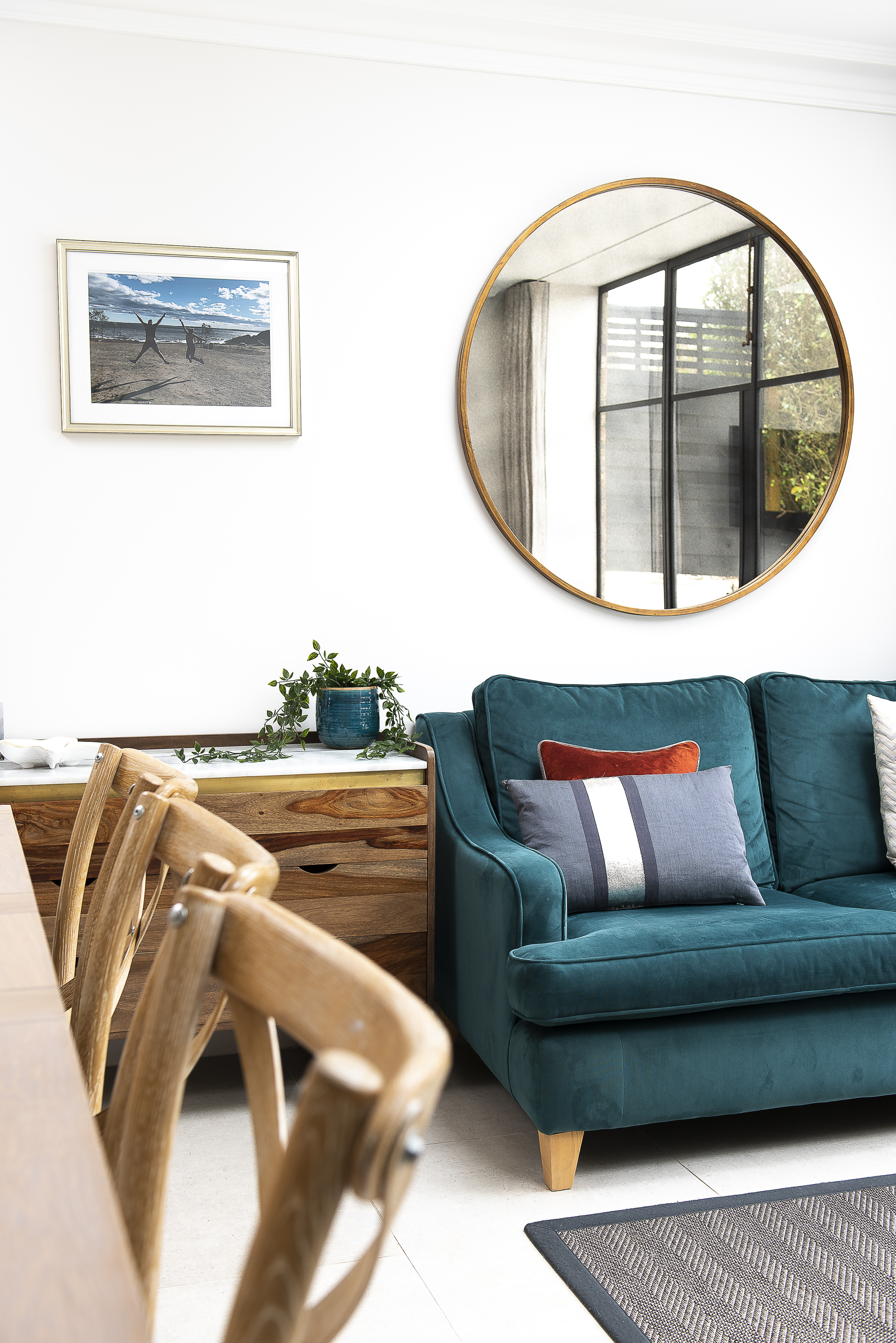
Sitting on one of the two facing teal velvet sofas, next to the rear wall of steel-framed windows and looking back and forth between the garden and the kitchen/dining area, I can confirm it was all worth it. And I’m not surprised to hear that several of Zoe’s neighbours have already made enquiries to ask if she could do something similar to their houses and at least one is already in progress. “I have got a lot of projects for my interior design company, House of Beulah, off the back of my own house,” she says.
Which has made all the extra investments that make a big difference to the overall experience of this property – such as really good quality contemporary furniture, including the Robert Langford brass and antique mirror coffee table between the sofas – more than worth it. The house is also in the ideal part of Tunbridge Wells to attract such business, in a street of lovely substantial early Victorian villas – in various stages of renovation – just off Camden Road, with its mix of interesting independent businesses, including a fantastic artisan bakery and café.
Close to the main shopping area and a 15-minute walk to the station, it’s perfect for the upwardly mobile, young family demographic – people like Zoe, her husband and their new baby. This is the generation that has come of age in the current era of the ‘social kitchen’ as the acme of modern lifestyle and so it’s no wonder that Zoe’s particularly appeals to them – having worked for Neptune, kitchens are one of her specialities.
It was while studying History of Art and Architecture at Edinburgh university, that Zoe realised houses and interiors were her thing. “It dawned on me that it was the architectural element of the course that interested me the most and since childhood I had been designing gardens and interiors for my parents. Then, when I first left uni and was working for a charity, I met a woman who was an interior designer and realised that was what I should be doing.”
After training in interior design at the KLC design school in Chelsea, she then worked for a London-based architect and interior designer. “Transforming houses very like this one… One of them had Crittall windows put in and I thought, ‘one day I want to have that…’”
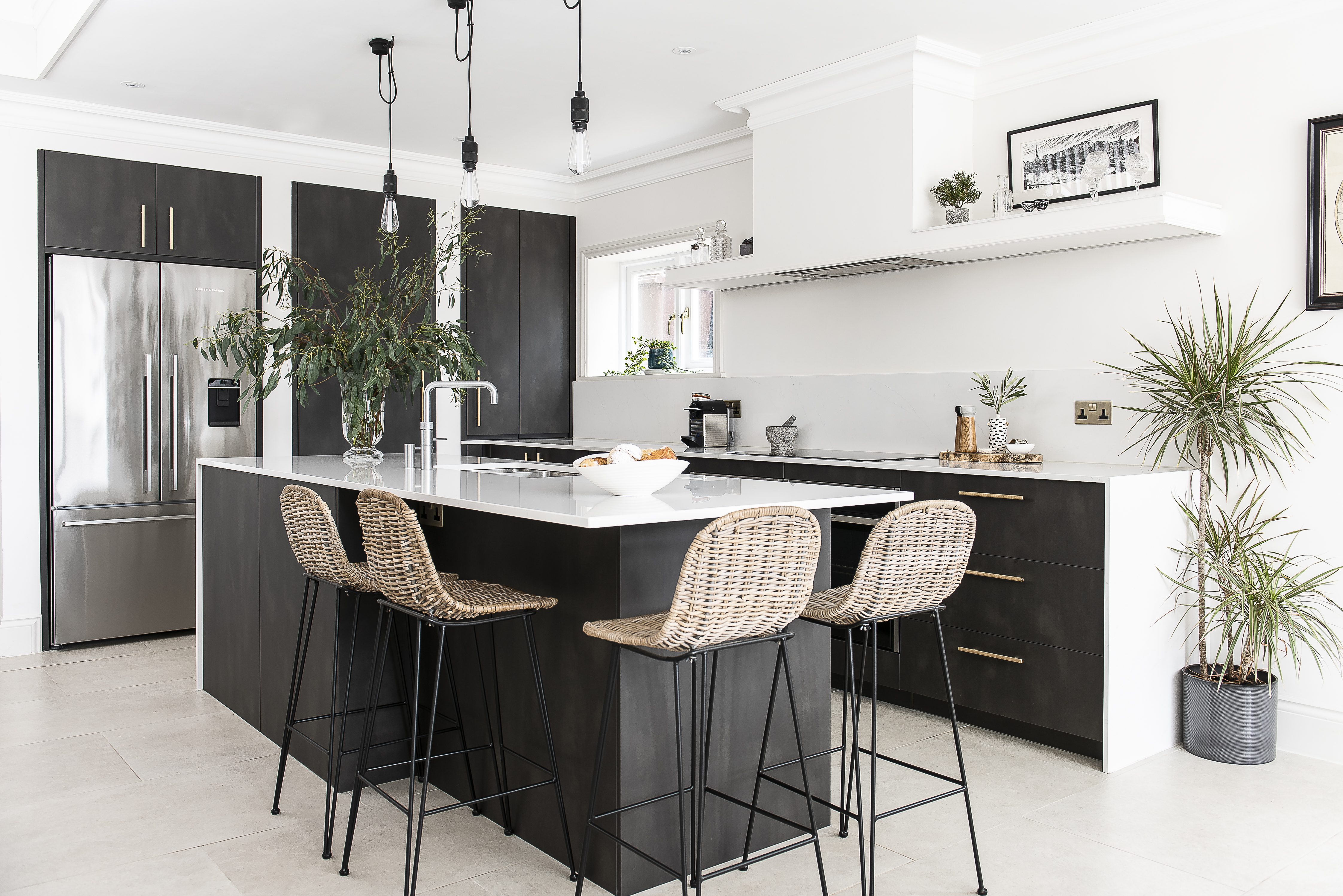
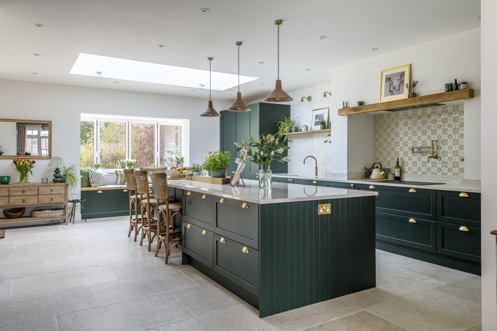
Her next job was with Neptune, training and experience she has found invaluable. “It is so great to understand the intricacies of kitchen design – fitting to make the most of the space, incorporating the electrics and plumbing – not just choosing fabrics and colours. My designs always start with the kitchen; it’s the wow factor now.” This particular kitchen has that and more, with bold charcoal grey cupboard doors, with a mottled satin finish, designed to look like polished concrete, set off by light-coloured worktops – which was where she spent a large chunk of the budget.
“The kitchen is from Leicht, a German brand, in Tunbridge Wells High Street, which offered very good value for the quality. I would love to have a solid-wood Neptune kitchen, but this is not our forever home, it’s an investment project, so I had to be restrained, but it is still a wonderful kitchen. It has German functionality, with glass-sided drawers and drawers within drawers.
“I spent a bit more on the worktops to have Silestone quartz – which looks like marble, but is much more practical – and on the appliances. We’ve got a Neff hide-and-slide oven, a Quooker for boiling water, a Fisher Paykel fridge…” I note that this splendid fridge is not integrated behind cupboard doors as they so often are in social kitchens, to blend in more. “It’s a beautiful fridge and I like exposing big appliances. It works in a modern kitchen.”
But while she’s happy to have the fridge on show, smaller appliances are not displayed. “All appliances – toasters, food processors, coffee machines – go in cupboards with plugs and we don’t have a kettle. I like rich minimalism.”
I also notice another detail I have deliberately used in my own kitchen: while the fridge, oven and mixer tap are all chrome, the door and drawer handles (from Dowsing & Reynolds) and electric sockets are brass. Was it deliberate? Yes. “Mixing metals doesn’t bother me.” Hurrah! I feel vindicated.
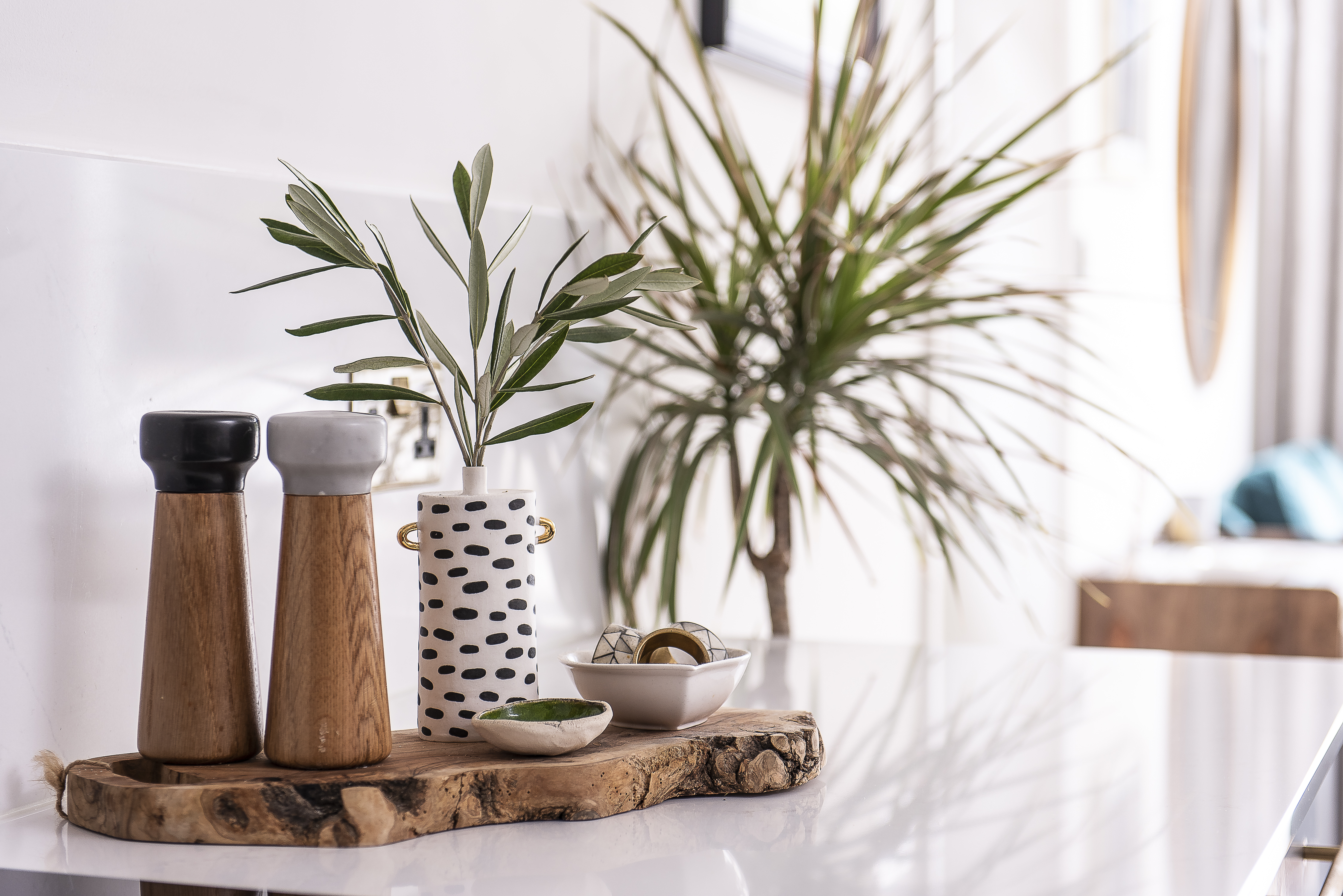
And before we move on from the kitchen, two more tips I picked up from Zoe: “I like to have an island in a kitchen, so the cook can remain part of the kitchen’s social hub, but slightly removed,” and, “I chose bar stools with backs for comfort. They work, because when friends come over we always seem to eat up there, we rarely use the dining table.” Heading back to the sitting area, I notice the lovely chest of drawers with a marble top by Atkin & Thyme, which sits next to the side entrance and is a great for making open spaces work, without lots of stuff lying around. “You need it for gubbins… That area, next to the outside side door, functions as a hallway, with the cloakroom for coats in the built-in cupboard opposite.”
Looking towards the garden, Zoe tells me that the windows are from Fabco Sanctuary, giving the Crittall look – less frame, more glass – at a more accessible price. I find myself taking a particular interest (see above) in how the curtains are hung here, using a wave system, recessed into the ceiling. “It means there is no bulkhead above the window.”
Looking out, I comment on the fabulous giant palm tree which is the main feature in the garden. “It’s actually a yucca and it was here when we bought the house. At first I was, ‘That is coming down immediately!’ but now I love it. I’ve got it uplit, so it looks beautiful at night.
“There is a whole lighting system in the garden – I am obsessed with lighting – the steps are lit, the plants in the border on the left are lit, there are box lanterns on the walls and strings of white festoon lights hung around.”
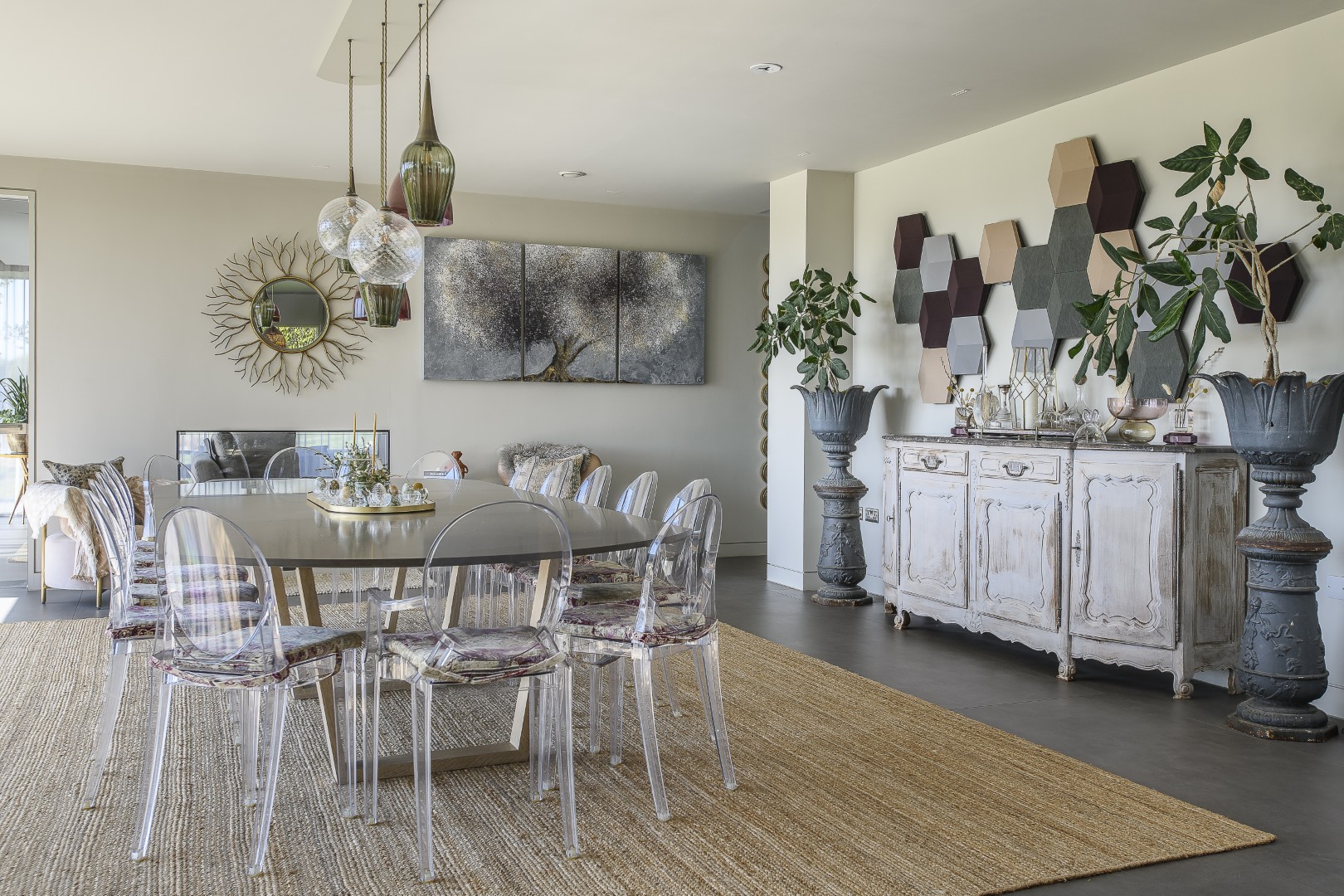
Heading back inside, Zoe’s lighting obsession can be seen again in the amazing light over the dining table, which is by Lindsey Adelman, and the three over the island, which are from Buster & Punch (which is where I bought my light switches – by this time I am feeling practically related to Zoe). Heading up to the ground floor – on the Unnatural Flooring Company sisal-effect, actually woven plastic, runner – Zoe points out another of her pro-decorator details. “The walls in the basement are Little Greene ‘Slaked Lime’ and ‘Slaked Lime Mid’ on the woodwork. On the upper floors, that combination is reversed, so there is the same two colours throughout the house, which creates a calm and flowing atmosphere.”
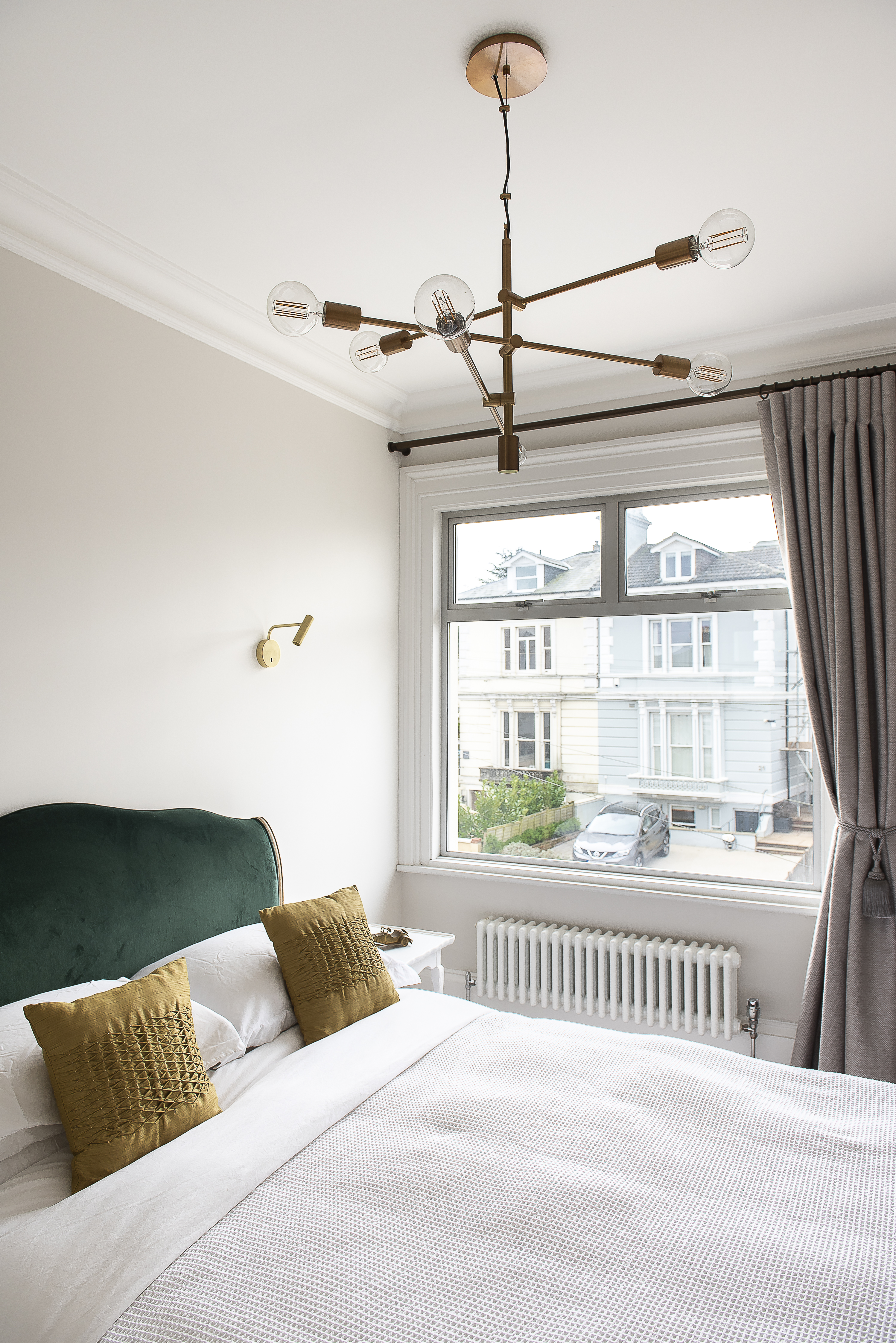
That feeling is also very much created in me by the master bedroom suite, which is a masterpiece of boutique hotel décor – as requested by Zoe’s husband. “My husband was my client and he said, ‘I want a hotel vibe’, so I made it very sophisticated and sleek.” The room is brought together by the beaded panelling on the walls which Zoe measured out to match up with the furniture. The bed is from Sweetpea & Willow, the headboard, upholstered in Zoe’s favourite flat velvet in a dark shade of teal. The bedside tables with drawers are from Robert Langford and have beautiful details, brass trim and drawers lined with velvet.
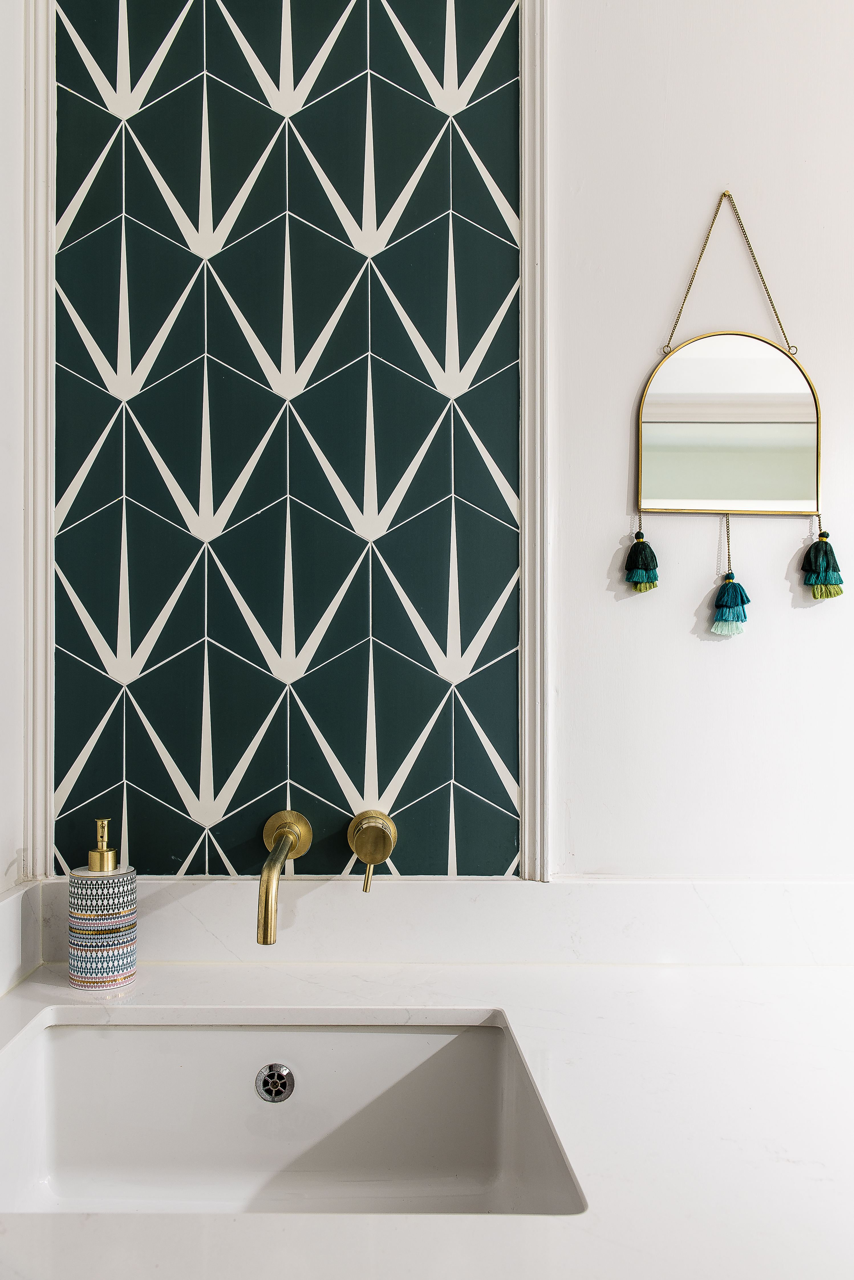
Once again, Zoe has taken great care with the lighting in this room, with three separate sources: reading lights, wall lights and ceiling spots. What particularly attracts my attention, of course, is the heading on the curtains – which are the same colour as the walls, to create the calm, continuous atmosphere Zoe likes, but with texture. This curtain heading is what is known as ‘cartridge’, round pockets, which Zoe likes because they stack neatly at each side when the curtains are pulled open. (I underline it in my notebook.)
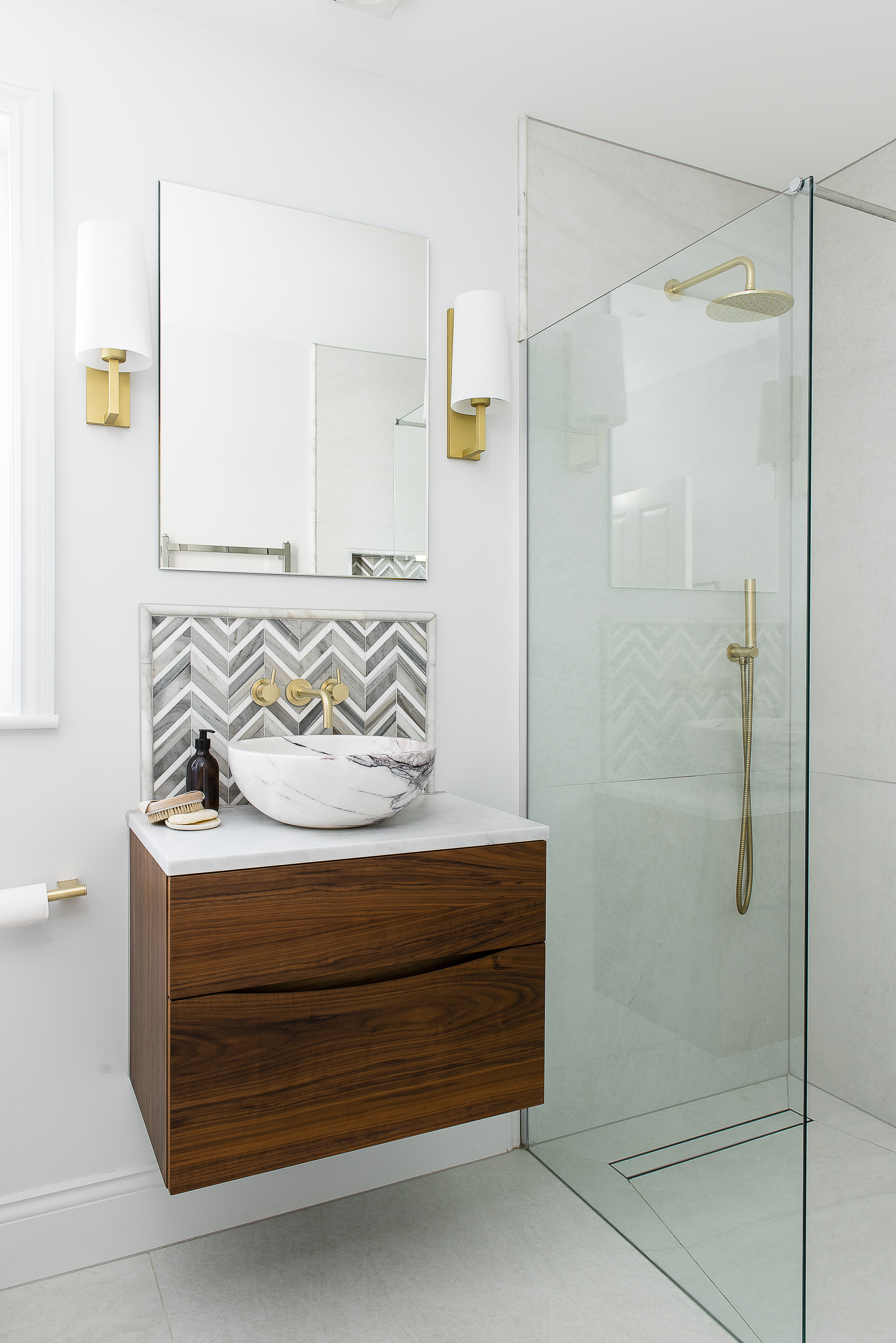
Next door, the en suite bathroom is equally swoonworthy, with a Carrara marble bowl basin on top of a walnut wood floating cabinet, with small marble tiles from Mandarin Stone in a herringbone pattern as a splashback. There is a large shower stall and all the fittings – including the wall lights – are brass. “I always put in a wide shower screen, I can’t stand things on the floor – you only need a gap of 600mm to get in and out. You can just get a large pane of glass, wet room style.”
I take note that the on-and-off valve for the shower is on the opposite wall to the shower head – a detail I wish I’d seen before I put my own en suite in…
In a nice detail, Zoe has left the original Victorian fireplace in here and painted it the same colour as the walls which creates a nice contrast with the so-sleek scheme. Heading out into the hall, we turn to take the stairs up to the top floor, where the baby’s room and bathroom are, plus an office and a spare room and all I can say is ‘wow’.
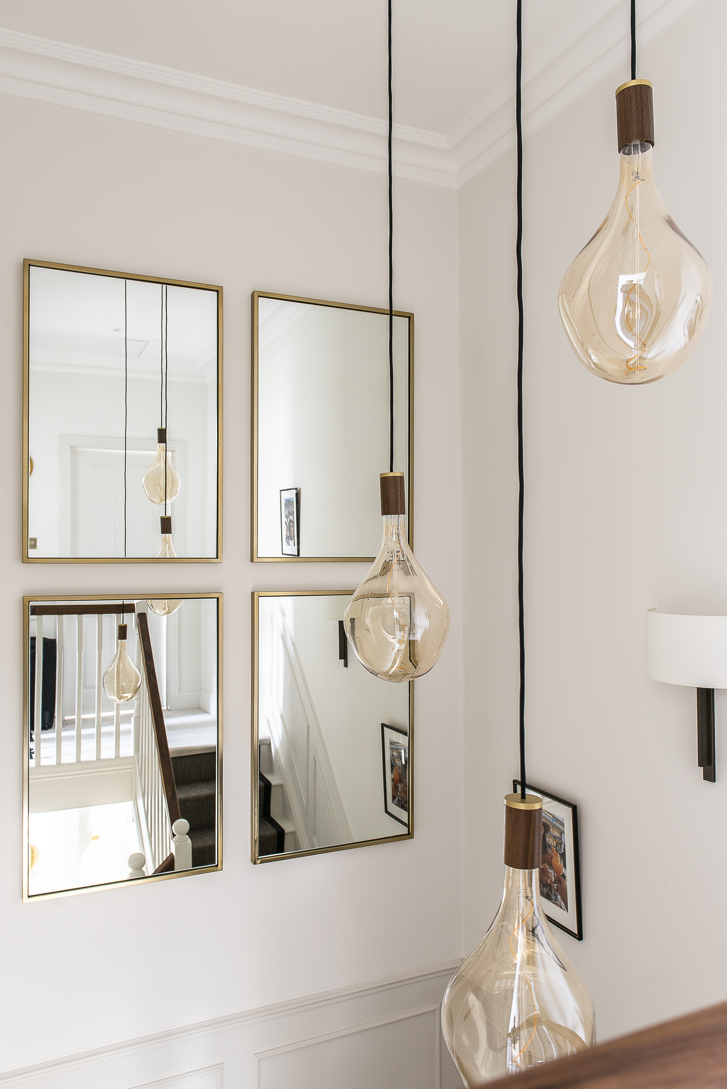
It’s such a simple set up, but four matching large rectangular mirrors, from West Elm, hung square at the half landing, set off by a very dramatic ceiling light, with three huge dangling golden glass bulbs – by Tala lighting – really makes you feel like you are in a New York hotel.
Zoe shows me that from the top of these stairs, you can look down over the bannister and see all the way to the basement living kitchen area – the opposite of the view up to the rafters they had during the six months of building work. Which shows exactly how much it is worth taking your project that exponential step further. They say ‘go big – or go home’. Zoe went big and made a home, a really fabulous one.
(And I chose cartridge heading for my bedroom curtains – thanks, Zoe!).
The open-plan kitchen and dining space
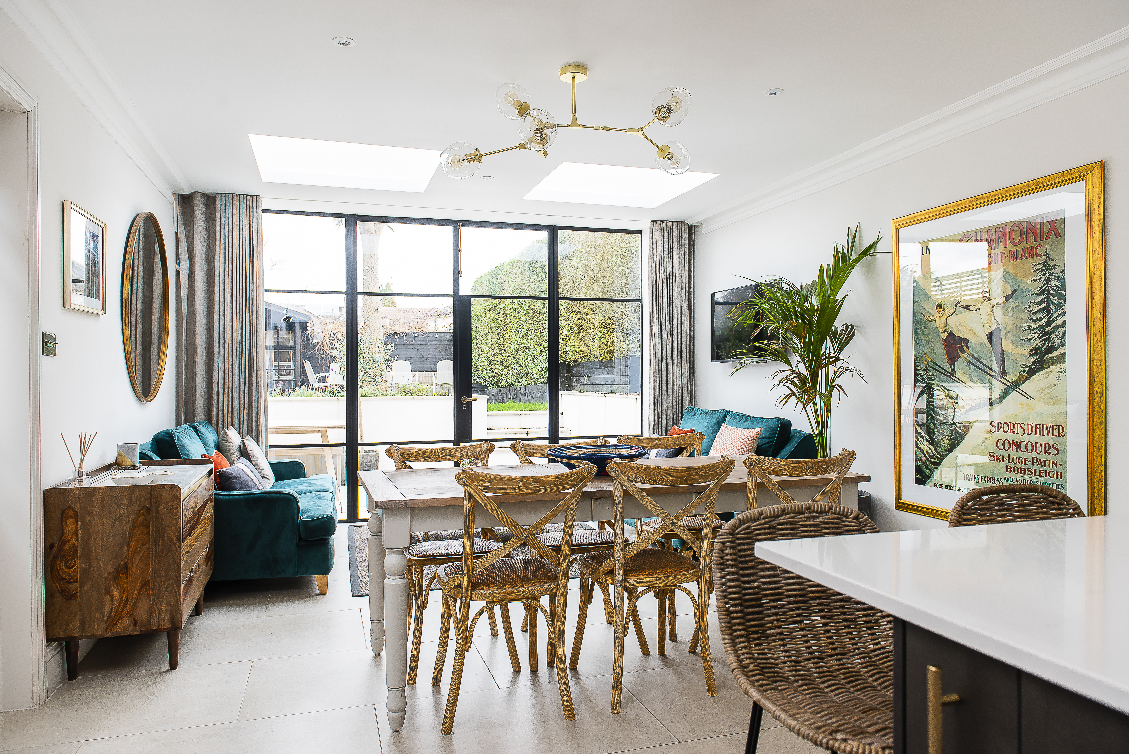
Crittall-style doors by Fabco Sanctuary lead out from the dining room into the raised garden. The amazing gold and glass light over the dining table is by Lindsey Adelman

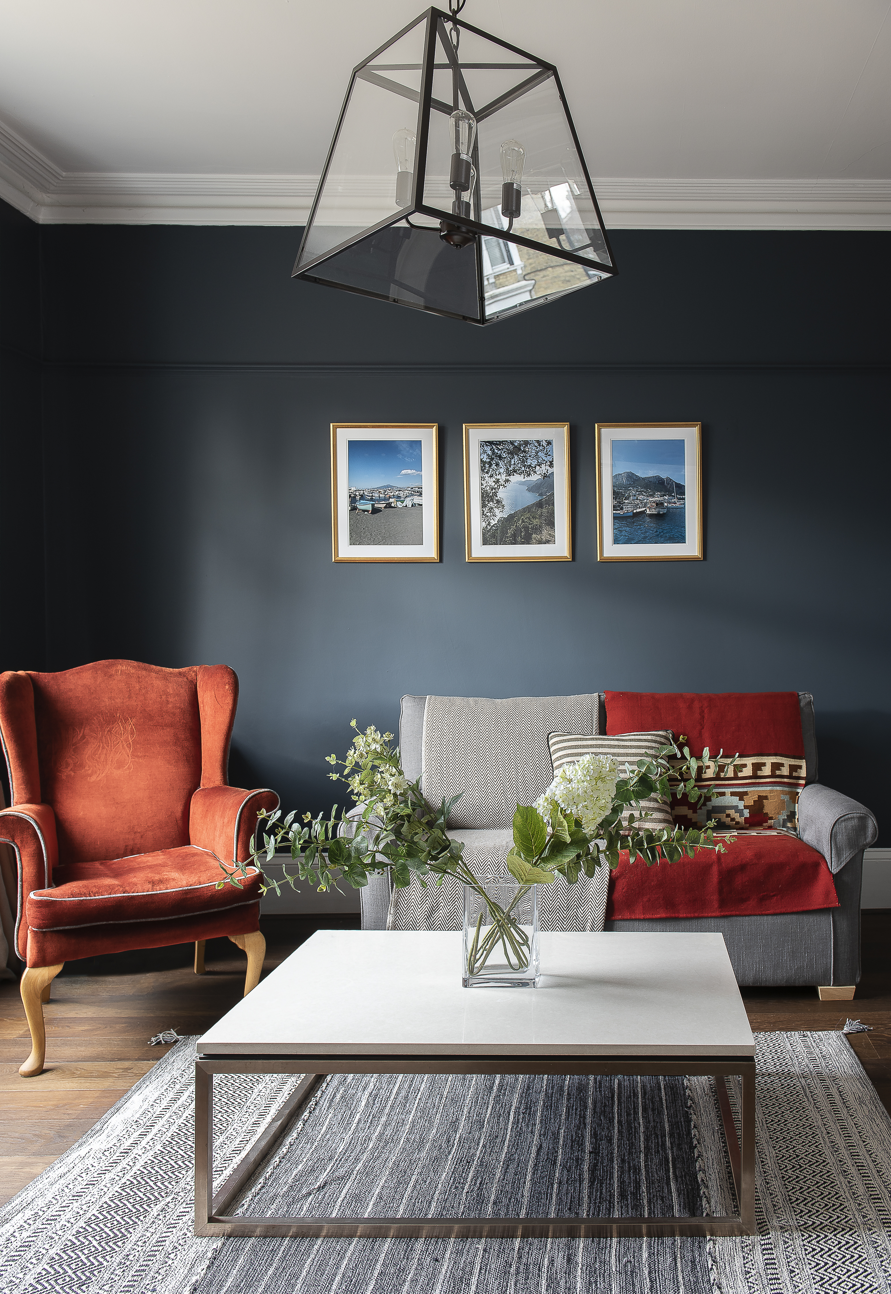
Lighting has been a important consideration for Zoe in every area of the house. With high ceilings throughout the house, she’s had plenty of opportunity to experiment
Lighting has been a important consideration for Zoe in every area of the house. With high ceilings throughout the house, she’s had plenty of opportunity to experiment

On her husband’s request, Zoe created a master bedroom with a true hotel feel with beaded panelling, a velvet bed – from Sweetpea & Willow – and luxurious bedside tables from Robert Langford, lined in velvet. The lights are by Astro Lighting
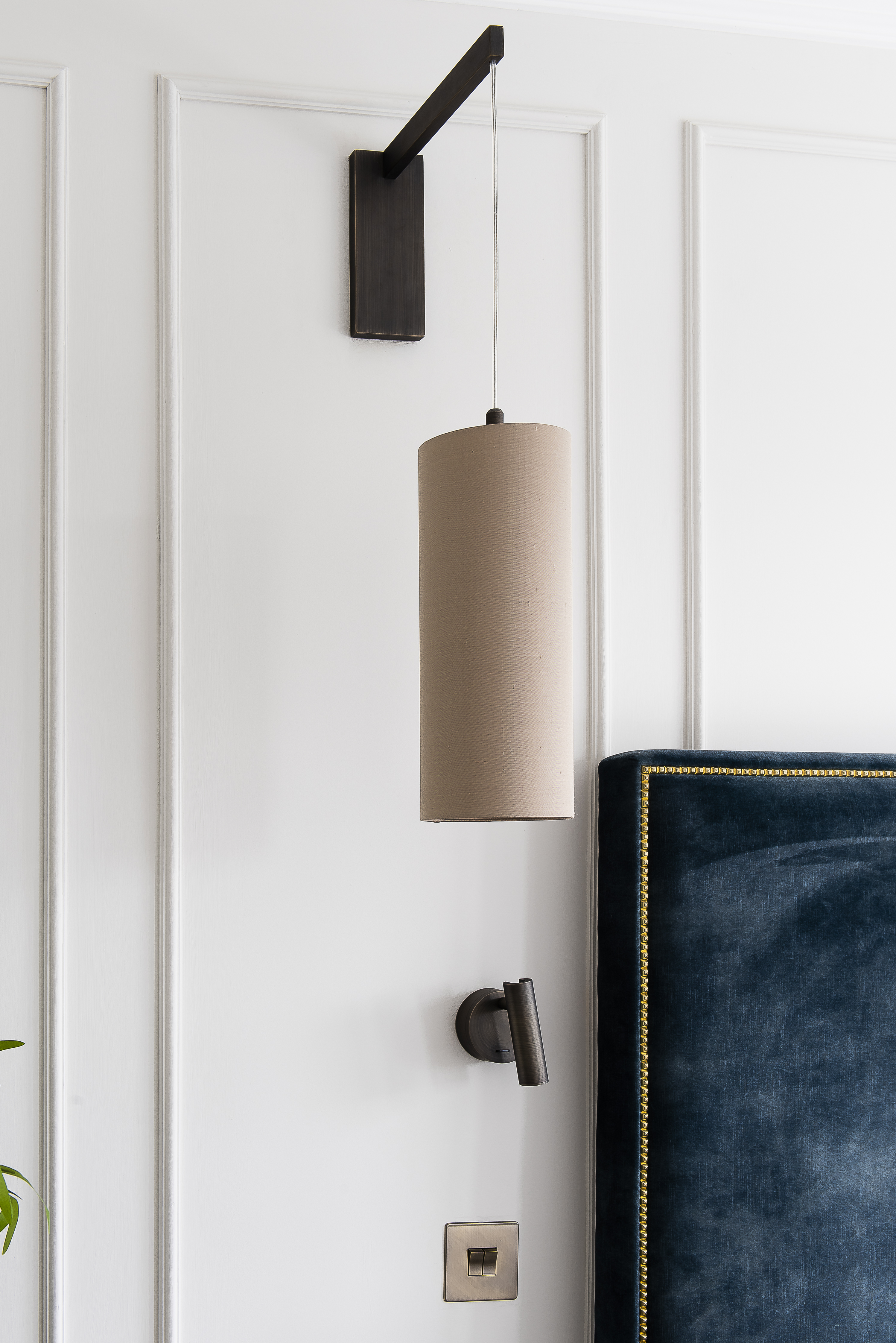
The heading on the curtains – the same colour as the walls – creates the calm, continuous atmosphere Zoe likes
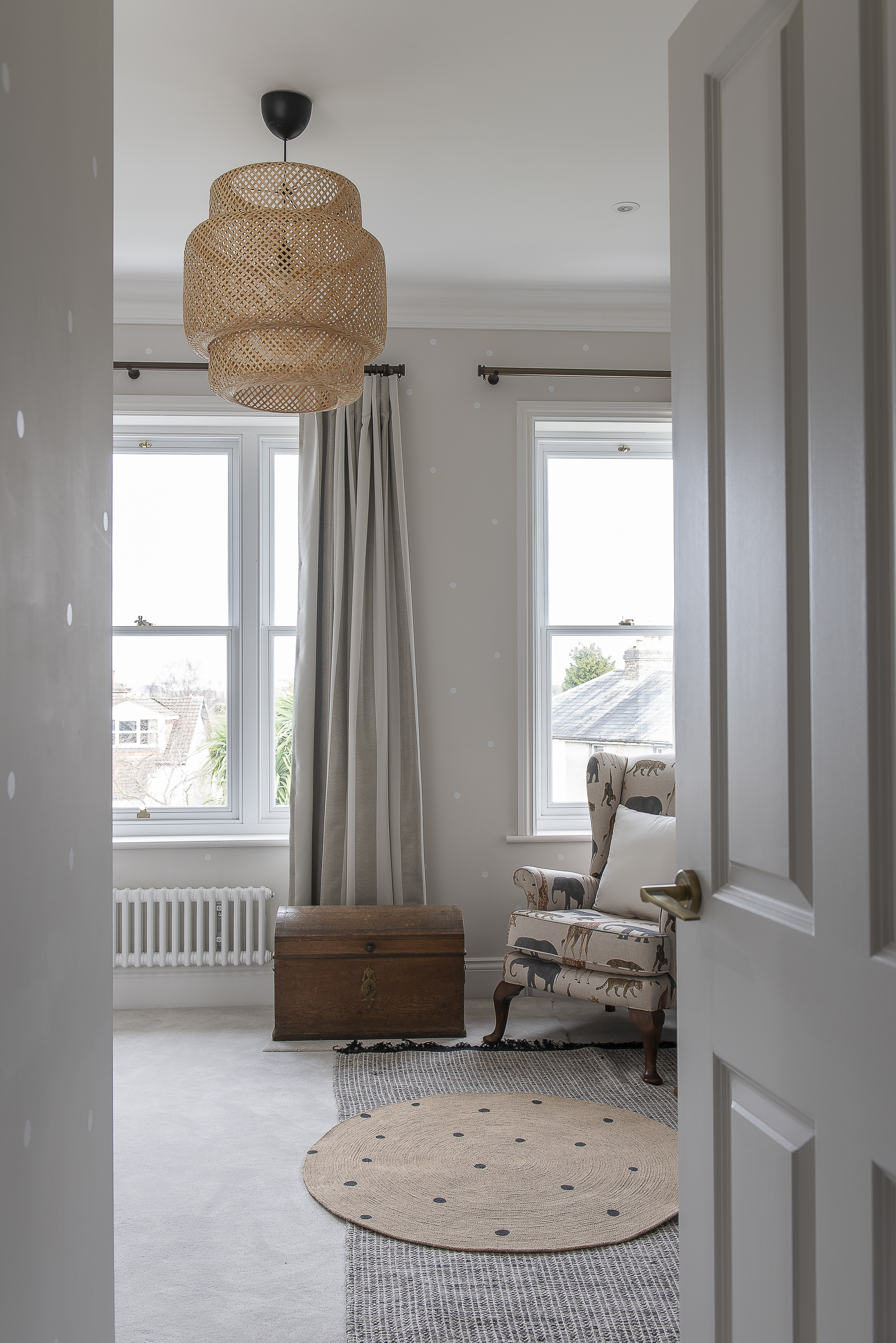
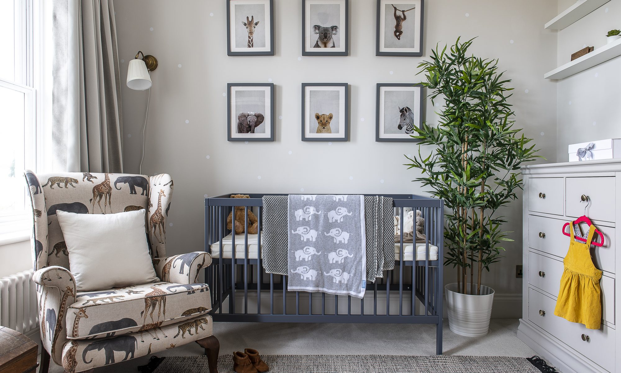
The nursery wallpaper features subtle polka dots on a soft grey background. Zoe had the chair reupholstered in African animal fabric

The nursery wallpaper features subtle polka dots on a soft grey background. Zoe had the chair reupholstered in African animal fabric
The master bedroom en suite features a Carrara marble bowl basin on top of a walnut wood floating cabinet, with small marble tiles from Mandarin Stone in a herringbone pattern as a splashback
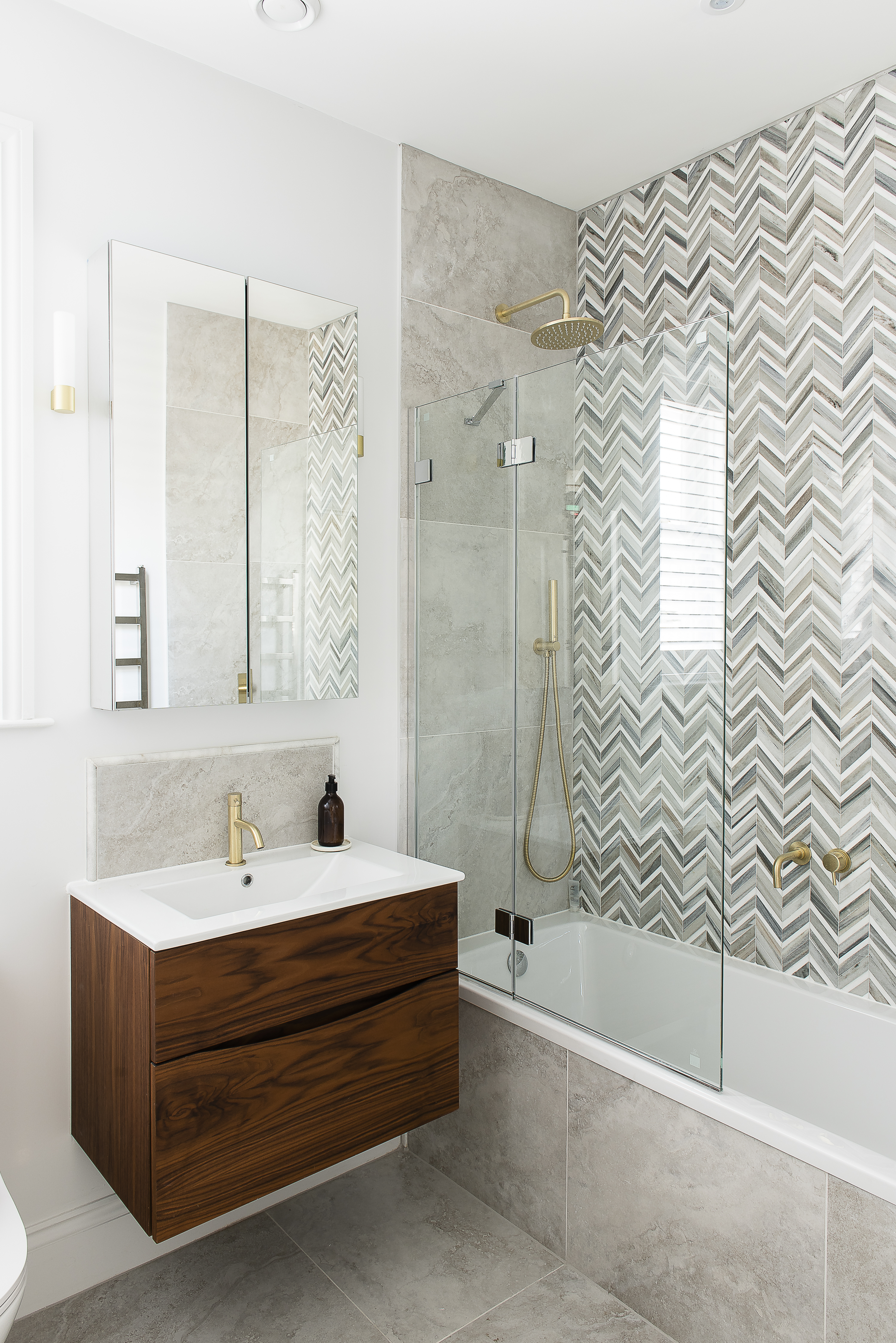
The same herringbone tiles form a beautiful backdrop to the bath and shower in a guest bathroom
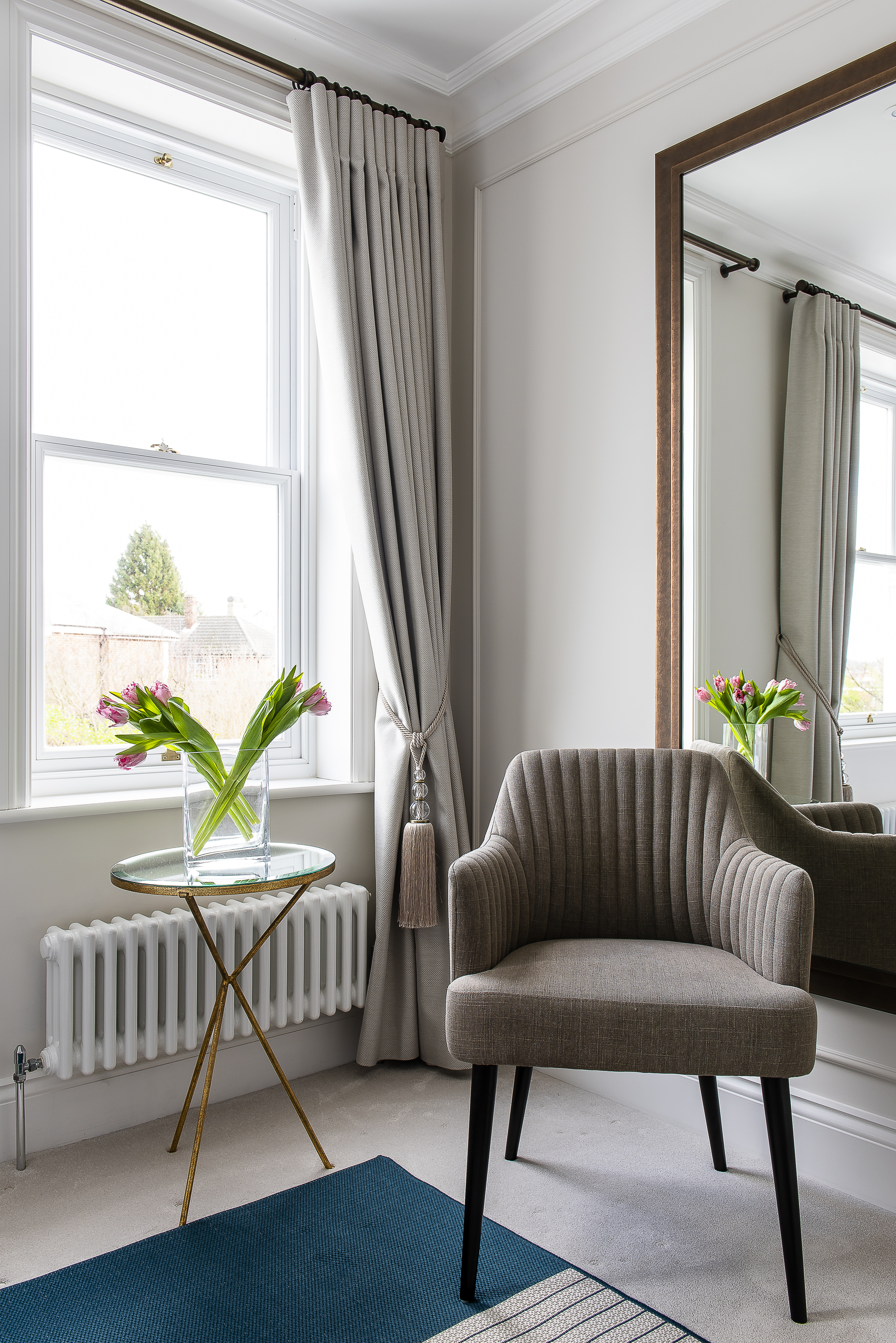
A guest bedroom is a tranquil space with a statement light by West Elm
A panel of tiles by Artisans of Devizes in the utility room
You may also like
Love where you live
Careful to inject plenty of each homeowner’s personality into every project, interior designer Jenny Branson’s gentle and measured approach has won her many clients who adore her use of colour, pattern and mood-lifting design There is something instantly connecting when...
Design Partnership
A family home has been reconfigured for modern living with the help of an expert team of designer, builders and architects who have managed to bring a little South African al fresco living to the heart of Reigate There’s a...
A House With Purpose
Charity founder Katie Dockery’s incredible home, designed by Richard Hawkes on the site of a former Qatari prime minister’s stud farm, has allowed her to create a safe and welcoming countryside retreat where she and her team tap into the...